I have previously carried out Usability Tests and rewritten copy in the onboarding section of the app, which improved the user experience.
However, until now, I still hadn’t addressed the imagery within the app.
To resolve this, I began by researching design theory regarding onboarding processes. I probably should have done this earlier in develop, but nevertheless, this app development is a learning process. Material.io has published some very useful guidance on this (Material Design, n.d.).
Reading the guidance, my attention was drawn to a few areas:
“Maintain visual continuity” i.e.: build upon the visual voice of the app e.g.: graphics, colours, typeface, tone of voice
“Simplify” i.e.: Onboarding images must have a simple concept and a focus point
“Don’t be UI literal” i.e.: Show the app’s benefits, rather than aspects of the app (such as screenshots) that users haven’t yet experienced
With these points in mind, I set about researching for imagery on the stock website, Pexels. I had previously used the this website for work and education purposes (such as my submission for DM7920). Images from this website can be modified “as [I] like” and “attribution is not required” (Pexels, n.d.). To my knowledge, this step clears the app (and myself) from copyright and attribution claims.
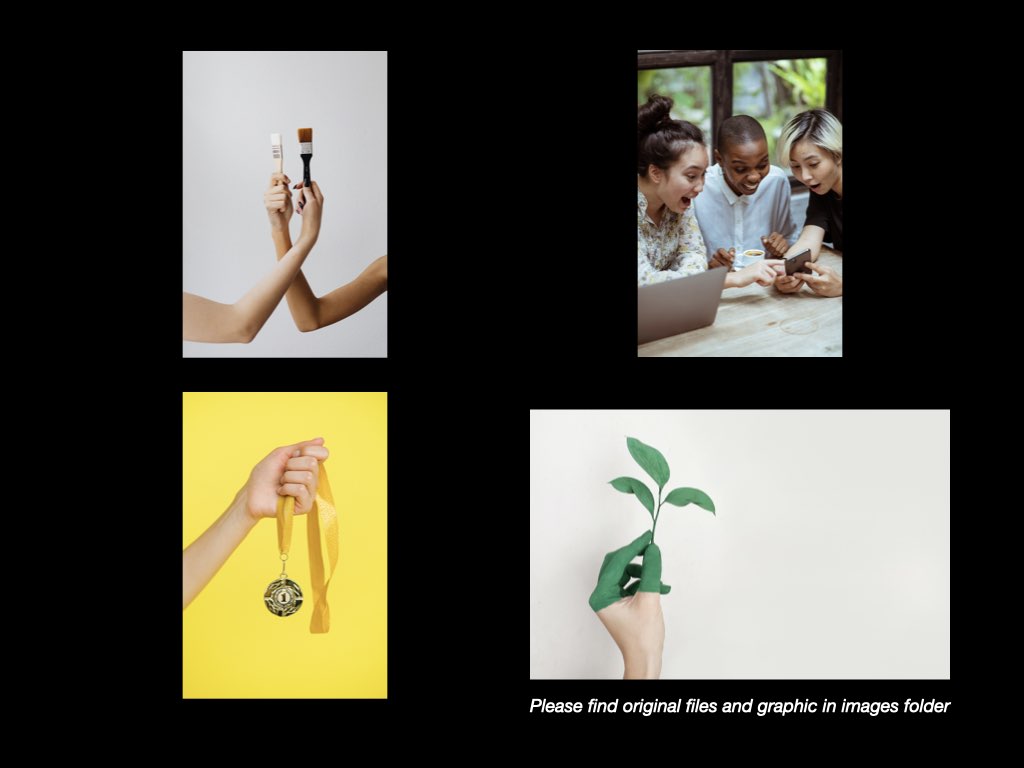
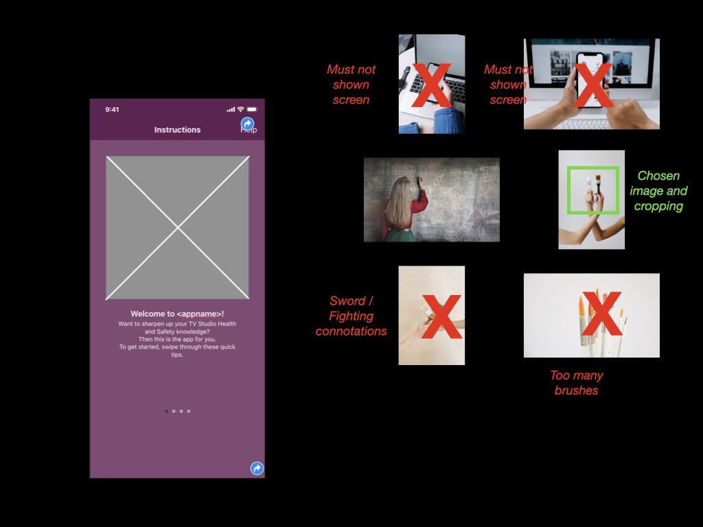
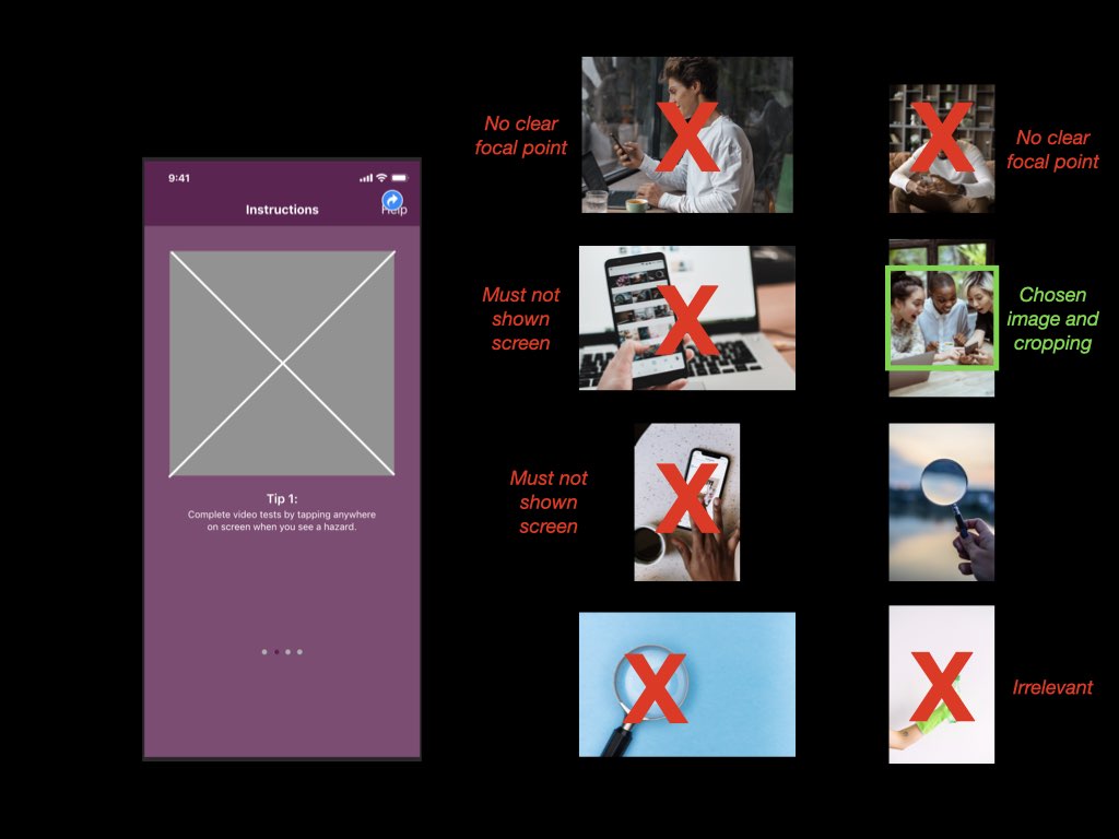
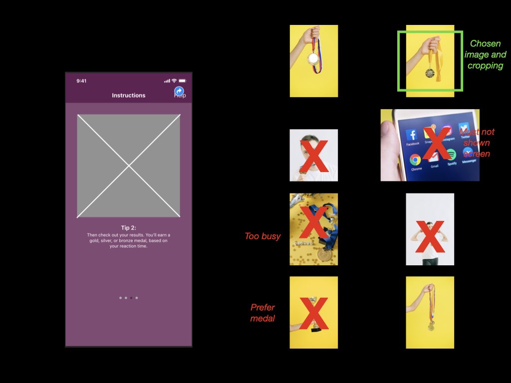
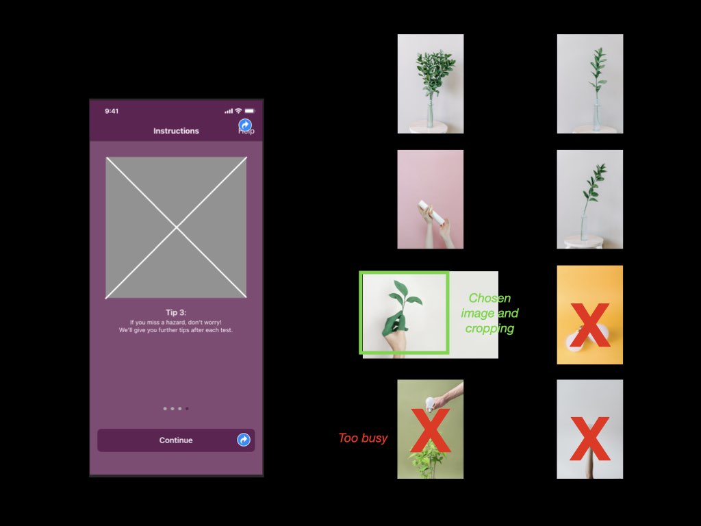
The four images, chosen from royalty-free image library, Pexels.
Each image was chosen for its link with the onboarding text, as below: Screen 1: “Brush up” > Image of paint brush Screen 2: “Completed a test” > Users having fun (laughing) with a phone Screen 3: “You’ll earn a gold, silver, or bronze medal, based on your reaction time.” > Images of a medal Screen 4: “We’ll help your knowledge grow” > Image of a plant (growing)
Four pages of Contact Sheets, depicting potential images for each onboarding screen, as well as the chosen image and cropping
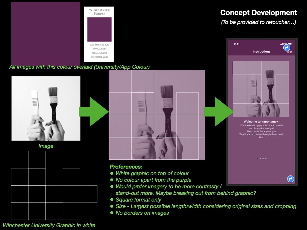
From my photography and marketing background, I was then able to draw upon my links with a professional retoucher, and provide him with a brief** that would note many of design choices to “maintain visual continuity”, including the University’s branding colours and graphics (Pexels, n.d.).
Concept Development page of the brief provided to retoucher, Rashpal Gurm
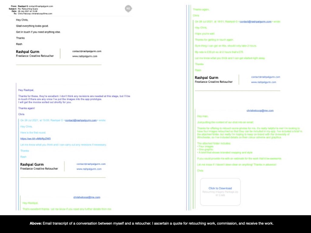
I contacted the retoucher, Rashpal Gurm, to brief him and attain a quote for the work. Upon agreement, he completed the work and delivered the images to me, ready to be included within the app’s design.
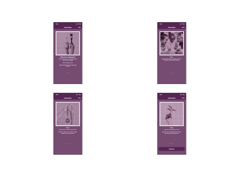
I’m pleased with the outcome of this process, and feel that the retouched images further the University’s brand while also relaying a fun and yet simple approach to the purpose of each onboarding screen.
A proof sheet of retouched images, composited onto a medium-fidelity prototype of the onboarding screens
** The brief provided to Rashpal Gurm was a PDF file comprising the first six images within this blog post
Material Design. (n.d.). Material Design. [online] Available at: https://material.io/design/communication/onboarding.html#top-user-benefits-model [Accessed 30 Jul. 2021].
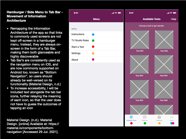
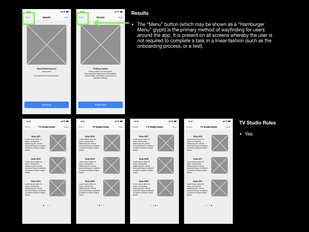
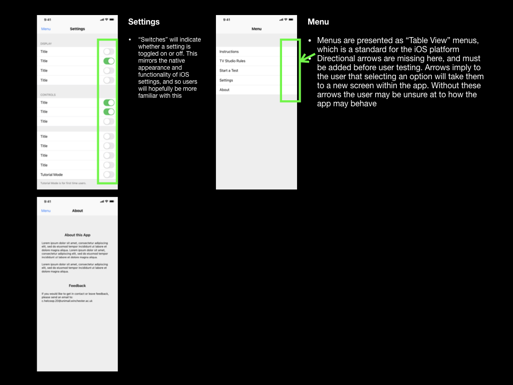
Hamburger / Side Menu to Tab Bar – Movement of Information Architecture
Following on from the 4th Usability Test, which highlighted discoverability issues with finding revision resources on trailing cables within the app, I have decided to challenge my choice to use a “Hamburger Menu”.
In an article written by Product Design, Luis Abreu, he identifies four drawbacks of Hamburger Menu (Abreu, 2014):
Lower Discoverability
Less Efficient
Clash with Platform Navigation Patterns
Not Glanceable
My main motivations for challenging the Hamburger Menu with the Tab Bar address drawbacks 1 and 4, however I can also understand the benefits relating to efficiency (measured by clicks/taps and length of navigation times), and Platform Navigation Patterns, as Apple has never included a Hamburger Menu within its iOS or its own apps.
Further to this, Mike Stern, Design Evangelism Manager at Apple has been quoted:
“Remember, the three key things about an intuitive navigation system is that they tell you where you are, and they show you where else you can go. Hamburger menus are terrible at both of those things, because the menu is not on the screen. It’s not visible. Only the button to display the menu is” (Limcaco, 2014).
Inspired by Abreu’s article, I have illustrated how I can move links to app pages from the Hamburger menu, and place them straight onto the home screen via a tab bar, making them highly glanceable and increasing discoverability. The coloured dots show the translation (see: below).
I may keep the links within the Hamburger menu as well to further increase accessibility, as I will be catering for varying user preferences, although I’m unsure if there is any Information Architecture research stating that I should not do this.
Abreu, L. (2014). Why and How to Avoid Hamburger Menus – Luis Abreu – Product Design. [online] lmjabreu.com. Available at: https://lmjabreu.com/post/why-and-how-to-avoid-hamburger-menus/ [Accessed 29 Jul. 2021].
Limcaco, J. (2014). Apple and Hamburgers. [online] Medium. Available at: https://medium.com/design-philosophies/apple-and-hamburgers-a17e4099fada [Accessed 29 Jul. 2021].
Material Design. (n.d.). Material Design. [online] Available at: https://material.io/components/bottom-navigation [Accessed 29 Jul. 2021].
Introduction given before recording started. Usability Tester and I had collaborated before, so they already knew the parameters of the test and that I would encourage them to speak their thoughts aloud
Briefing read to Usability Tester prior to test starting
1:49 – Assumption explained that user has already input their details into the “Email Address” and “Password” fields
2:02 – Thought: Usability Tester seemed confused about the “Submit” button, perhaps this should read “Log in” to explain what the button would do
2:02 – Title of page reads “Login”… Perhaps this should be changed to “Log in”
2:18 – Limitation of the prototype explained again for the Usability Tester – Keynote does not understand swipe gestures, so the user can only tap
2:35 – Usability tester understood onboarding process – “that all seems fine”
2:49 – Usability Tester has started a test despite the briefing which asked them to check rules on cabling. Why? Is this because the revision element is not clear and is hidden behind a menu that is not visible on screen? Is this a limitation of the hamburger menu style? (Note: I could not include a hamburger menu icon itself in this prototype, so have just put the word “Menu” for now)
3:03 – Trailing cable information is learned from the testing process. This is good, but not how I imagined the user to learn this information
3:25 – Briefing repeated for the Usability Tester
3:50 – At this point, having realised a design error resulting in the Usability Tester completing a test rather than revising information, I prompt the Usability Tester to look elsewhere for the information (and hopefully remind them to keep the phone “dark”). I found this process quite difficult, as it was hard to ascertain whether my instructions were causing confusion, or whether the app’s design was, all the while I was trying not to push the Usability Tester into producing any particular outcome
4:18 – Usability Tester asks whether there is a Dark Mode within the app. This is an interesting point… Should I respond to functionality questions like this, or should the Usability Tester just be told to look for themselves?
4:32 – Dark mode found successfully
4:50 – Usability Tester is still trying to gain information from tests, rather than looking it up in the TV Studio Rules area. This is definitely a design flaw. This functionality must be made more obvious and not buried within a menu. Thought: Would “TV Studio Rules” even be the correct name for this??
5:46 – Asked for thoughts, Usability Tester highlights that the app’s main screen, the “Start a Test” screen gave her the assumption that that was the way to find information. It was only when they entered the menu that they “realised” how to find the information
Summary
Usability Tester’s response to the onboarding screens are exactly as desired
I need to practice carrying out Usability Tests more. I was suffering from brain fog a lot at the time of the test, hence the “Ums” (and other utterances) and gaps in my speech. Despite this, I need to be more prepared for when the Usability Tester asks me questions – rather than giving them the answers, I need to try to direct them into finding the answers within the app itself
Hamburger menu structure may be stifling the user’s ability to navigate the app, and this should be researched more. Tab Bar may be the solution
Some potential name changes in copy may also aid navigation (see below)
Actions
Change “Login” page name to “Log In”
Change “Submit” button on “Login” page to “Log in” to describe the action of the button
Thought: The page name “Start a Test” is almost telling the user what to do when they enter the app, when really it is optional. The tests are visible for convenience, but there are other activities in the app that the user may need. Perhaps the page’s name should be changed to “Available Tests”?
Experiment with adding a “Tab Bar” for navigation, allowing users to notice and access revision information and settings more easily, rather than being hidden offscreen in a menu
Reconsider the page name “TV Studio Rules” to describe the pages purpose instead… Perhaps “Revise” or “Revision”
I’ve been studying the book “Paper Prototyping” by Carolyn Snyder, and it has a really interesting chapter on Task Design for Usability Testing. The chapter lists 6 steps towards creating tasks that can help me learn more from the usability tests I conduct. For this blog post, I’m going to follow these tasks:
Task 1: List User Goals
I’ll take this information from the ethnographic research I conducted in DM7920 (where relevant).
Have an active involvement in training (to hopefully remember the content)
Task 2: List Your Questions
How can the app cater for students wanting the revise anywhere/anytime? The app enables asynchronous learning, but what else can be done?
What accessibility barriers exist in the app currently? Can these be resolved?
Do users expect the tests to play automatically? (Previous usability test indicates not).
Is the hamburger menu system intuitive? Does the user navigate to it, guessing that they may find what they need? Or do they feel certain that that is the way?
What settings do users need within the app?
Task 3: Prioritise your Questions
Is the hamburger menu system intuitive? Does the user navigate to it, guessing that they may find what they need? Or do they feel certain that that is the way?
How can the app cater for students wanting the revise anywhere/anytime? The app enables asynchronous learning, but what else can be done?
What accessibility barriers exist in the app currently? Can these be resolved?
What settings do users need within the app?
Do users expect the tests to play automatically? (Previous usability test indicates not – will rank this lowest and include a setting in the app)
Task 4: Create a Task
Thoughts: I could combine the top two questions in the priority list, as the usability tester could be required to access the menu system several times. Below I have attached my plan.
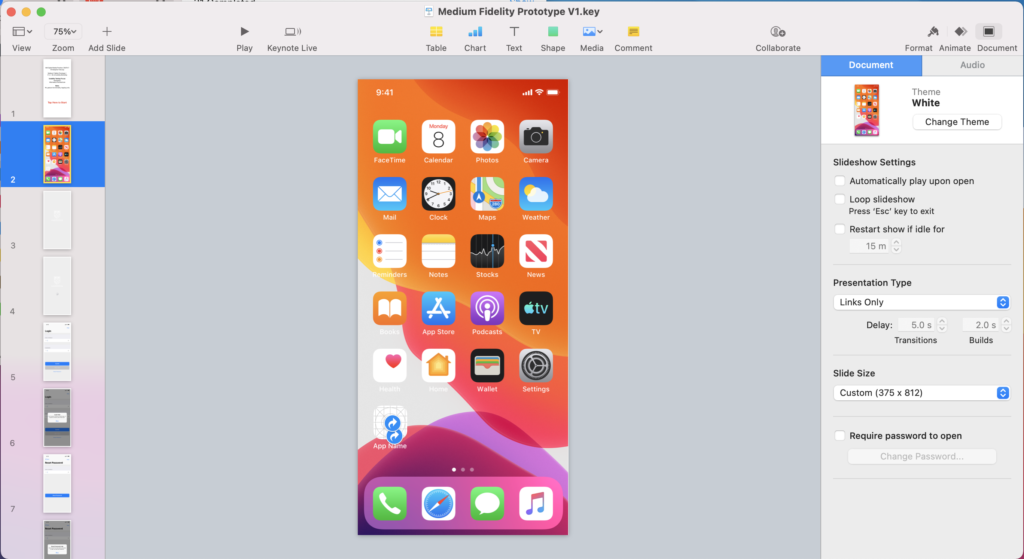
This week I started work on producing a Medium Fidelity Prototype to be used for future usability tests. To achieve this, I worked in Apple’s Keynote software, which runs natively on MacOS and iOS. The Keynote file will be accessible on an iPhone, so usability testers can use the prototype as if it were a real app, provided I make many hyperlinks between pages.
When transitioning my prototyping from paper-based methods to digital, there were a few things that I had to consider before starting. Firstly, I needed to consider the requirement for my prototype to be tested on an actual phone, as this would provide the truest reflection of the user experience. I’ve decided to use my iPhone 11 for this, so needed to make sure that I formatted my keynote file to the correct dimensions (375px x 812px).
Above: Image of the “Slide Size” being set to a custom setting (375px x 812px)
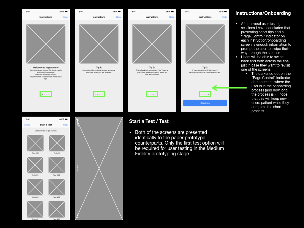
I also needed to adhere to the design principles set in Apple’s iOS platform so that my prototype would appear and behave in a manner that the user could expect. Apple’s Human Interface Design Guidelines and downloadable Keynote file included sample user interface elements, which could be integrated into a digital prototype. The navigation bar (at the top of each screen) and the tab bar (at the bottom of the screen) were commonly used elements across my app. I also made use of spinners (as loading indicators), “label”-style buttons, and “Page indicators”, which would communicate functionality and different states to the user.
Above: Images of the prototype’s layout from the first medium-fidelity iteration.
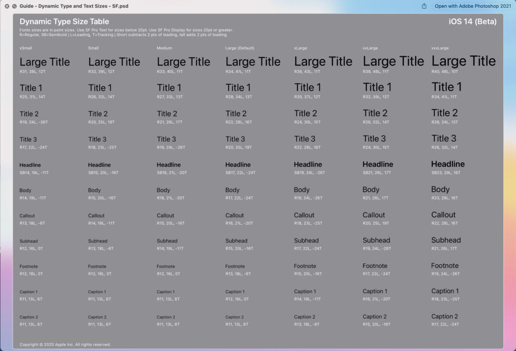
Apple’s guidelines also come with guidance on Apple’s colour palette and typefaces. Although I intend to replace the colour elements with those from the University of Winchester branding guidelines, I would be looking to adopt Apple’s typeface “San Francisco”. The San Francisco “Pro” typeface is commonly present across iOS as it is the default system typeface. Apple describes the font as “a neutral, flexible, sans-serif typeface,” the “sans-serif” element increasing the typeface’s legibility and scalability (Apple, 2019). The typeface also comes in 9 weightings, which can be used alongside variations in sizes to create a hierarchy of information.
Above: Dynamic Type Size Table from Apple’s Human Interface Design Guidelines
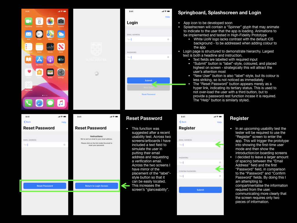
Once I had created a rudimental version of the prototype, with its intended information architecture, layout, and hierarchical elements, I had to give it functionality. I did this by using hyperlinks to link the users between each of the screens. For “label”-style buttons, it was important to make the entire button a hyperlink rather than just the button text. This would result in a larger tap-target, which would suit usability testers and users who have large thumbs!
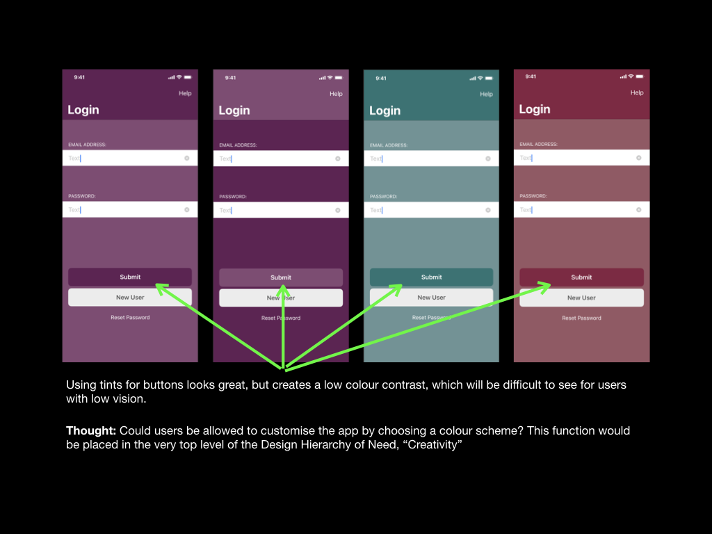
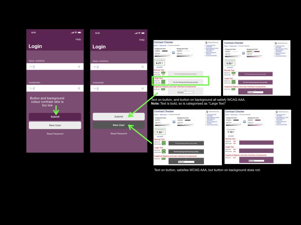
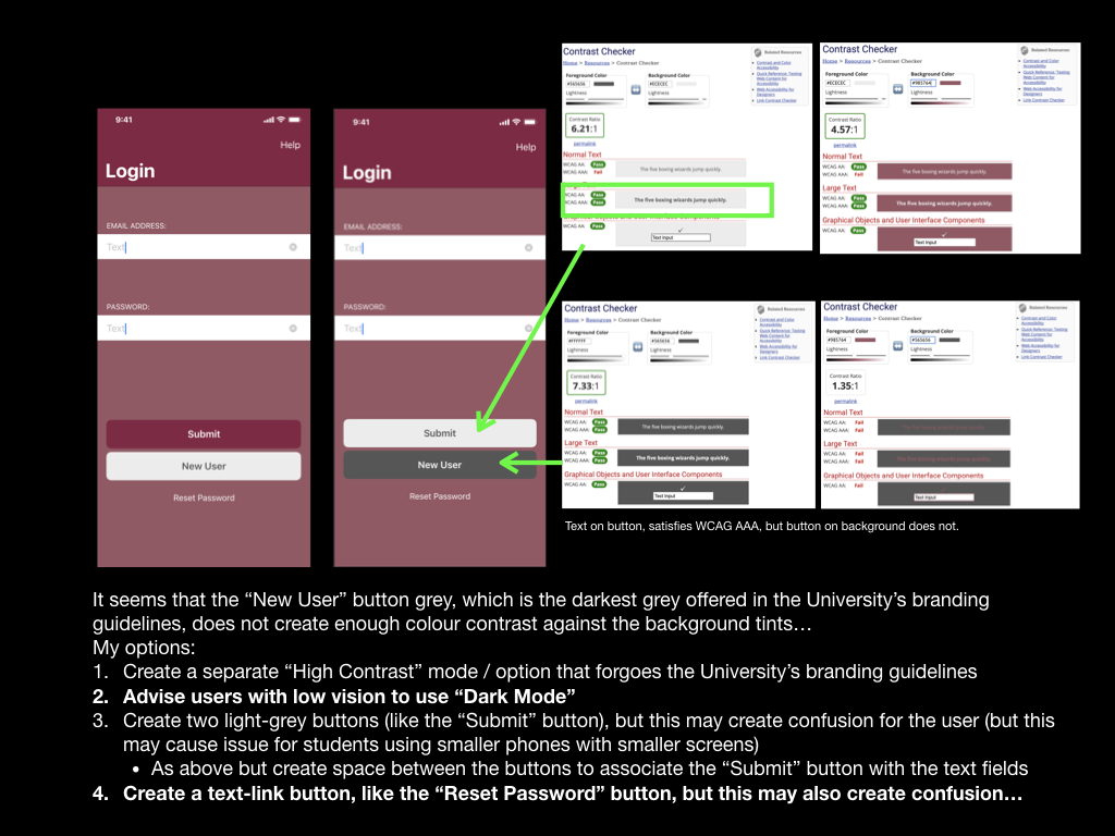
Next, I had to begin tailoring the app towards the University of Winchester’s branding. The primary method of achieving this was to incorporate the universities colour palette. The branding guidelines stated that I could combine any university’s main colours with its accompanying tint, however, I could not combine different colours. This guidance alone allowed me to create pages that had “depth” to them, rather than appearing one-colour and “flat.” Where possible I will try to use as high colour contrast as the colour palette would allow, however, this often fell short of WCAG standards – this would be especially problematic with interactive elements, such as buttons, that would have a low colour contrast ratio with their backgrounds.
Above: Reflections on design experiments using some of the University’s colour palette
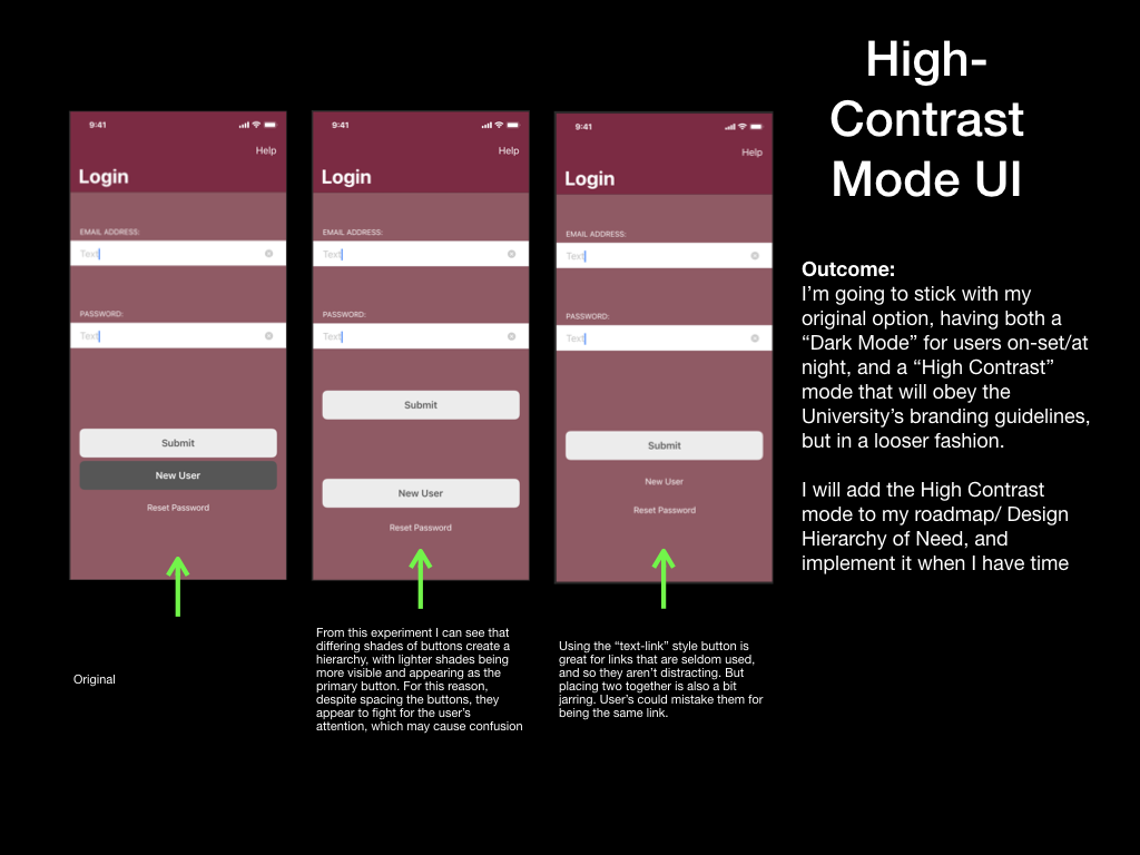
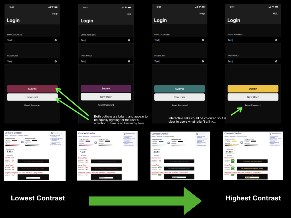
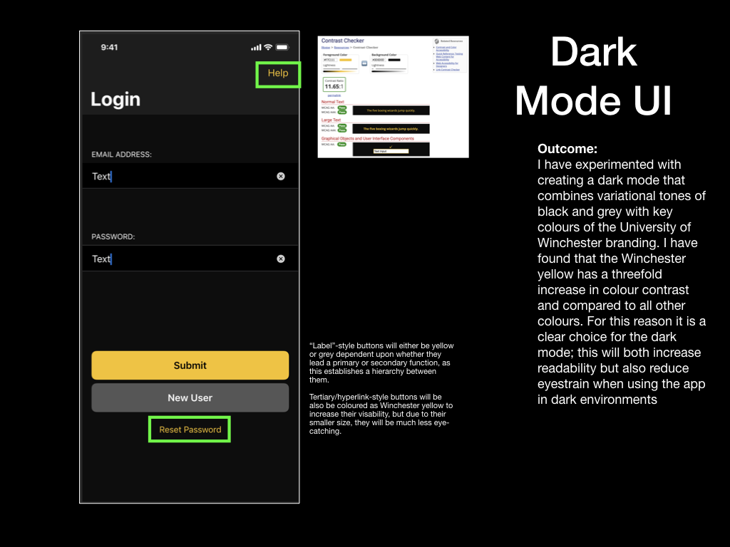
Having experimented with producing colour schemes using four of the University’s colours, I decided that I must create a high-contrast mode or “Dark Mode” so that I could increase accessibility for users of the prototype with vision impairments. A high contrast user interface would attempt to adopt the University branding as much as possible but would make compromises to prioritise high-colour contrast and readability when concerned with interactive elements like buttons, text fields and even labels for text fields. On the other hand, a dark mode would also feature high contrast elements, but with the bonus of being less bright and thus reducing the chance of the user developing eyestrain. Due to this added benefit, I prioritised creating the dark mode and included it as part of this prototype (Cole, 2019). The high contrast user interface could be developed at a later point in time.
Above: Contemplations on button style in High-Contrast UI mode
I am very pleased with the visual outcome of this prototype. Its adherence to Apple’s Human Interface Design Guidelines, although not pushing many creative boundaries, has resulted in a professional appearance. This prototype is a true reflection of the application I wish to create at this stage, and so gaining valuable insight through a usability test will be key in identifying improvements for the next prototype. In particular, I’m interested to know whether a user could intuitively activate Dark Mode within the prototype and then seek some information in the “Revision” section. I will focus on producing a usability test that requests this.
Above: Development of the “Dark Mode” theme and contemplations regarding button styles, visibility, and colour contrast
I have noted a limitation of creating a medium-fidelity prototype using Keynote. I have listed these below and will inform my usability tester before testing: • Interactions such as swiping are not supported on the iOS version of Keynote – usability testers will be advised that they may only tap during the test. This limitation will be resolved and tested using a high-fidelity prototype and different prototyping software
Note: I have since carried out Usability Test 4 and the report can be read as a separate blog post. I have also made adjustments to my prototype based on feedback.
Apple (2019). Fonts – Apple Developer. [online] Apple.com. Available at: https://developer.apple.com/fonts/ [Accessed 23 Jul. 2021].
Cole, S. (2019). Dark Mode Isn’t “Easier on the Eyes” for Everybody. [online] www.vice.com. Available at: https://www.vice.com/en/article/ywyqxw/apple-dark-mode-eye-strain-battery-life [Accessed 23 Jul. 2021].
0:10 – Usability Tester is given a contextual statement about the state of the application (On the “Register” screen as a first time user, who has already completed the Email Address and Password fields)
0:35 – Usability Tester given instruction to proceed to starting their first test
0:46 – “Submit” button pressed
0:50 – Loading icon presented while screens are changed
1:05 – Usability Tester is shown the amended onboarding screens. Text has been amended since previous usability Test (see below section)
1:30 – Usability Tester confirms that the text is clear and they understand that they need to “scroll through” the onboarding process
2:25 – Usability Tester confirms that they understand the need to ’swipe’ due to the Page Controls or “dots”
Updated Test for Onboarding:
I have re-written the text on the onboarding screens to offer tips, rather than direct instruction. I am hoping that this will remove any confusion for the user on when to execute those instructions.
Onboarding text for iteration 3:
Tip 1: Welcome to <app name>. Want to sharpen up your TV Studio Health and Safety knowledge? Then this is the app for you. To get started, scroll through these quick tips.
Tip 2: Complete video tests by tapping anywhere on screen when you see a hazard.
Thought: Can I make an assumption that smart phone users will know they need to tap on a test thumbnail to start a test? They’re used to tapping on things, right? – 3rd Usability Test indicates that I can rely on this knowledge, yes.
Tip 3: Then check out your results. You’ll earn a gold, silver, or bronze medal based on your reaction time.
Tip 4: Did you miss a hazard? We’ll give you further tips after each test.
Thought: I’ll use the “Results” screen to point users to the “TV Studio Rules” section… In fact, could this be renamed as the “Revision” section? This name would explain the purpose of the page. – A point for the next Usability Test
Summary
I successfully managed to reduce the lengths of this test by giving the Usability Tester one instruction / and endpoint to reach. The Usability Tester had to then find their way to that endpoint. I crafted this session to that she would be forced to navigate through the onboarding process, which was the subject of the session
I’m pleased that the Page Controls were understood correctly and that the Usability Tester did not try to execute the onboarding tips on the pages, which is an improvement upon the previous two tests
Actions
I am now able to proceed to create an medium-fidelity prototype, which will allow me to include colour, typeface and other UI elements, which may affect the functionality and usability of the app
I must craft a plan for the next Usability Test that allows the tester to use the app more naturally, rather than me telling them which page to go to.
I must also consider how I could test the current page names. “TV Studio Rules” may not directly explain the use of the page, whereby “Revision” might…
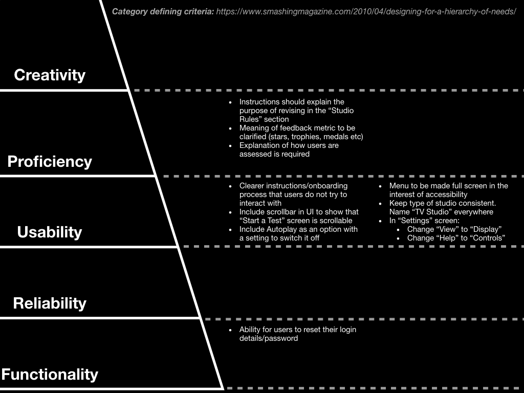
The second Usability Test raised many issues and suggestions for feature changes; admittedly, these made me feel quite overwhelmed. I appreciate that feedback is invaluable and leads to improving iterations of prototypes, however this feedback needs to be prioritised or categorised in some way in order for me to process it.
I’ve reflected upon my first module on the MA programme, when I discovered the Design Hierarchy of Need. I could categorise the feedback I received from each Usability Test into the five categories: functionality, reliability, usability, proficiency, and creativity. Then, I will prioritise resolving issues based upon which category they call into, starting at functionality, moving towards creativity. This article in Smashing Magazine was helpful, providing defining criteria for each category: More Info: https://www.smashingmagazine.com/2010/04/designing-for-a-hierarchy-of-needs/
Above, you can see that feedback concerning “[the] ability for users to reset their login details/password” is high priority, falling into the functionality category. Many suggestions have also fallen into the usability category, which I may be able to focus on in my next iteration of a paper prototype. However, I am acutely aware that I must move on to producing a medium-fidelity prototype very soon in order to keep to my time planning.
02:51 – Log-in screen shown to tester. “It is clear, and easy to understand what I need to do”
03:20 – Premise of app is explained to tester (I almost forgot this)
03:45 – First task given “to register as a new user”
04:10 – Tester highlights that there is no option to reset login details “There isn’t an option to say that I’ve forgotten my login details”
05:15 – Open questions being asked
“Is that [screen] what you would expect to see, or not?”
“What would you expect to do on this screen?”
“Could you show me how you would interact with that screen?”
05:45 – I’ve started including an overlaid keyboard, as there is potential for this keyboard to obscure important aspects of the UI
06:25 – I explain a privacy motivation for why passwords are represented as stars / hashed
06:45 – Tester explains that they wouldn’t expect to be able to copy their new password to the ‘confirm password’ field. I ask “Why?” to clarify the tester’s reasoning
09:15 – Tester asks to clarify the purpose of the Instruction screen. “So is this the home page? Is this the first thing you’d see every time?” I explain that a new user would see this, and for further clarity. “It feels like you’re getting straight into performing the test without having selected to do it?”
I ask the tester to volunteer what they’d expect to see. “Maybe a Home Screen? A menu that allows you to click on ‘Start a test, or start an activity… So you know what you’re doing”. I feel that they (just like the previous tester), have misunderstood the step-by-step instruction process. I need to reconsider the onboarding process for the next iteration.
Tester continues, wanting to act-out with the instruction process, rather than just swiping and reading. They expect the pages to swipe automatically once they’ve carried out the written actions
12:00 – Tester would expect the second instructions screen to have a video that can be played-on-click, then they would interact with it as they would the actual test
13:16 – Tester would expect analysis on their performance after completing the test, as well as explanations of hazards that they missed. Further H&S tips would be appreciated, to explain the outcome of missing hazards
15:05 – Tester feels that the “Studio rules” section reference in the Instruction process is unclear… They’d rather be told where to find that section. “In the menu…”
“What’s the purpose of revision?” Need to make clearer
17:55 – Tester assumes that the “Help” button in the top bar is unique to each page. This is my intention. At this point, I explain to the tester that they are following the instructions and I appreciate their thoughts.
19:20 – Tester correctly identifies that they can scroll on the “Start a Test” screen, but only due to the paper prototype’s form. They would prefer a scrollbar on the UI to make this clear
19:50 – Tester would prefer an explanation of the content of each video, rather than a thumbnail – I’m unsure of this as I do not want to give the answer/allude to the hazard of each test
21:09 – “One video [per line] in the list and the explanation to the side of it, to make it clearer”
21:39 – Tester would have expected to press a play icon to start a video when ready, rather than autoplaying once the test is selected
22:45 – Tester feels unclear where on the screen to tap when a hazard occurs, and whether they must tap the screen on the first run through of the video, or if they watch is first, then tap the next time.
Tester also sees the play button screen as an opportunity to give final instruction on what to do
24:25 – Tester was unaware that they needed to rotate the phone, this is likely due to the wireframe being visible and no imagery being present
26:55 – Tester expected feedback to be given to them in landscape mode following the video, as they were not prompted to rotate their phone back to portrait mode
28:10 – Tester unclear of meaning of stars. “Are they a reflection of how many I got right?” The number aspect of these stars could be misleading.
Tester is also uncertain about whether this is the best possible performance… 5 of out what?
29:40 – “What goes into the 5 star performance… if there’s only one hazard to spot?” “1 star for speed, 1 star for accuracy” “I don’t see what [the 5 stars] are based on”
31:10 – “What’s going to be here?” Tester would like a still/screenshot of the video to be used in the results, rather than a generic image. “It cements in my mind what I’ve spotted”
33:09 – Tester expected to return to the “Start a Test” screen after having finished reading her test results
33:55 – Tester liked being able to see which tests they have already completed. A percentage of completion could also be good.
35:05 – Tester correctly identified and used the hamburger menu
35:41 – Tester would expect the menu to fill the screen rather than half of it. Accessibility point raised – filling the screen is ‘clear because there’s less content in the background”. I push for further explanation. “If you’re on a phone, if you’ve got a small screen… You think you’re clicking on instructions but the screen thinks you’re clicking on what’s behind it” Then the app would not function as the user intends
37:10 – Clarity wanted on type of studio. TV Studio, music studio? Etc
38:04 – “Studio Rules” screen appears as tester expects
Page controls correctly tell Tester that they can swipe on the page
Tester prefers this layout for the “Start a Test” screen as it can include explanation about content of each test
Tester asks whether they can click on each image on the Studio Rules screen. If so, they could to more closer at each image to see more detail.
Tester contemplates whether it could be useful to have an explanation in the Studio Rules menu, to read before the user reads the rules
42:42 – Setting screen appears as tester expects, including the “sliders”
43:27 – Tester would expect current “View” section to read as “Display”
43:50 – “Help” section is confusing because “Help” already appears in top bar. “Controls” could be better
Summary
I must shorten my usability tests to focus on short task flows. Watching the recording back and making notes takes a considerable amount of time, so I can understand why professional user testing includes a facilitator, ‘computers’, and observers
Usability test was much longer than I had anticipated as tester had many views to share and I often asked for expansion upon them
I was also keen to stick to the tasks that I had written down, as this would be an improvement on my first usability test. I subsequently realised how long it would take to complete each task flow
Seemingly obvious interactions and not necessarily obvious in a paper prototype, such as the need to rotate the device. They are not as ‘intuitive’ as I thought, and perhaps this is due to the lack of rendering in the prototype I used? (Lack of imagery)
I’m beginning to realise that testers will cast light on so many potential issues. I must develop a method of prioritising them in-order to progress to a high-fidelity prototype and proof of concept. Mapping them to the Design Hierarchy of need could be useful here
Sliders, scroll bars, and page controls – all part of iOS Apple’s Human Interface Guidelines are very recognisable to this tester. For the sake of completing this project, perhaps I should make the same assumptions about Android developer guidelines https://developer.android.com and the Android community
Actions
Include an option/screen for users to reset their login details/password
Iterate on instruction screen that that users can clearly see that it is set of instructions, and not pages to interact with
Map suggested improvements to the Design Hierarchy of Need, as there are many improvements being suggested and I must prioritise
Rewrite instructions to clarify the purpose of revising in the Studio Rules section
Include scrollbar in UI to show that “Start a Test” screen is scrollable
Include Autoplay as an option
Switch Autoplay off by default
Stars meaning is unclear (numeracy of stars is problematic – what’s the best amount? How did I achieve them?)
Explanation of how users are assessed is required
Consider switching stars to Platinum, Gold, Silver, Bronze medals?
Menu to be made full screen in the interest of accessibility
Keep type of studio consistent. Name “TV Studio” everywhere
Change “View” to “Display” in settings
Change “Help” to “Controls” in settings, perhaps? Is there a better name? Research other apps
Before conducting my next Usability Test, I’ve adjusted my paper prototypes to the feedback I was given. This includes:
Log-in and Registration screens:
App should require an email address and password for log-in, rather than a username and password (it’s worth matching these to the University credentials)
Results and Start a Test screens:
Add a star rating for users to glance at and see their previous performance(s)
Results screen:
Provide more detailed feedback for the hazard within each test, including the outcome of the hazard if it wasn’t noticed
Change the “Continue” button at the bottom of the screen to either “End Test” or “Finish”
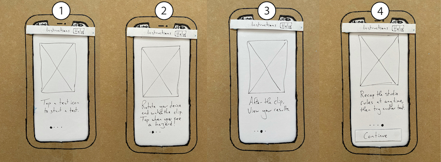
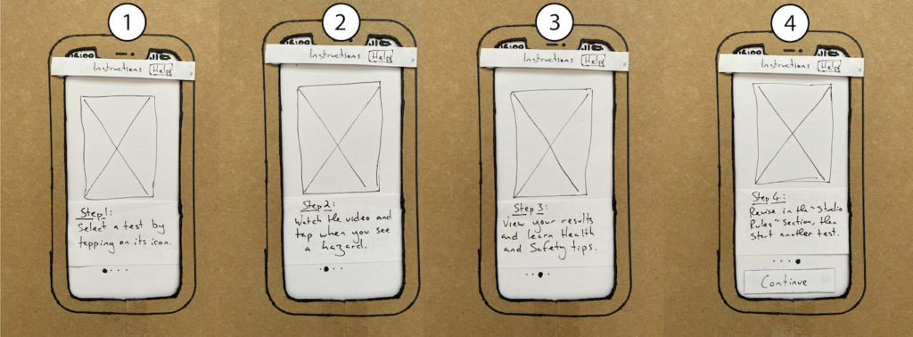
Instructions screen:
Remove the Hamburger menu button from the screen, as this took users out of the onboarding process
Rephrase the onboarding process – perhaps remove command words from the beginning of each sentence to prevent users acting them out during the process
Maybe reconsider how wayfinding methods could inform users about where they are in a process, such as “Step 3 of 5” (see below images)
First iteration of Instructions / onboarding screensSecond iteration of Instructions / onboarding screens
00:10 – Introductory script read to test participant – I lost my place while reading the script, so deviated from the script momentarily. This could affect the reliability of my user tests as this introduction is not consistent.
02:20 – Testing process begins with a brief explanation of the app. This should be included in the introductory script
02:36 – First explanation of what the participant is seeing. This gives some context. “You have just opened up the app, and the app is going to load”
03:00 – Tester is shown first screen and asked an open question. “What would you expect to do on this screen?”
03:07 – Tester would expect to use University credentials to log in to app. Perhaps using Microsoft Single-Sign on, in line with other University online platforms
03:29 – First task objective given to tester, “Create a new account”.
I ask “How would you interact with this screen?”. Tester presses the “New User” button as expected
03:45 – Loading screen is shown to give me time to change the paper “screens”. I incorrectly refer to it as a “loading screen,” when “loading animation” would be more accurate
04:06 – I ask “What would you do on this screen?”
04:15 – Tester expresses wish for “chosen password manager” to integrate with the password fields during the registration process
04:41 – Tester asks “So this doesn’t require an email?” – I hadn’t thought about users using their email address to create an account. Thought: Why do companies require email addresses and email address verification? Research this later. I didn’t know what to say, my response was “OK, excellent, that’s a good thought. For the sake of this test, at the moment there is no email address required, but it’s a good point.”. What could I have said different? 04:55 – To get back on track I asked the user how they would interact with the on-screen prompt.
05:30 – Tester is presented with the “Instructions” screen and asked “What are you thoughts on the screen that has just appeared on screen in front of you?”… While setting up the screen I realised that the overhanging extra pages on the test screen would reveal to the tester how they must interact with the screen, rather than only relying on the contents of the screen within the cardboard cutout…
05:35 – Tester assumes that the picture box with a cross (a standard symbol for an image on a wireframe) is something interact with, and tries to tap on it. I later discovered that this is because he was trying to follow the written instructions below the image “Tap a test icon to start a test”… This took me by surprise and I did not know how to react. I tried to stay on course with how the app would respond; I told the tester that nothing has happened following the tap on the image and clarified why nothing had happened… I wasn’t sure that they understood the symbol for an image
06:00 – Tester decides to access the menu screen by pressing the “Hamburger Menu” icon. At this point I realised that I should have given the tester a task objective. He was leaving the “Instructions” screen potentially as I hasn’t given him an objective, so was now wandering the app with no objective. In my mind it was too late now, but I was curious about what may happen, as this is a learning experience
06:20 – Tester presses the “About” page. I hadn’t prepared this page, as I didn’t expect the test to go off-track! I explain this to the tester The tester asks what would be on the “About” screen, which I also did not expect
06:45 – User presses the “Start a Test” button in the menu
07:23 – “Start a Test” screen is presented. Tester understands that they can scroll up and down the screen and tap to start a test. “I assume that is where I hit the bottom [of the screen]. Thought: Do I need to make this clearer?
07:50 – I insert a landscape oriented screen in the portrait position, as I assume that this is how the user will still be holding their device. I hope that this will prompt the tester to rotate their device, which they do.
08:24 – Tester wants to clarify whether the screen will rotate 180 degrees if the user rotates their device. I respond positively as that is my intention
08:49 – I ask the user whether they’ve completed a hazard perception test before… I would have explained how the test works if they had not.
08:53 – Tester interacts with app as expected when a hazard arises… They tap on the screen. Perhaps I should ask the tester what they think the flag means?
09:21 – I ask “Is that what you’d expected that screen to behave like, or not?”… An open question, adding “or not” helps to stop the question becomes a “leading” question
Tester: “The flags indicate what I’ve said is a hazard… Whether or not I’m right at this given time, I assume it will tell me at the end”. Tester is expecting feedback after the test.
10:04 – I present the results, in the current orientation of the device. The tester rotates the device as expected
I ask “What are you thoughts on this screen?”. The tester responds “I assume I didn’t get five stars” even though it is written on the screen that they did. Maybe I should ask the tester to read the feedback before responding? OR, perhaps I need to show an image on five stars so that they DO NOT have to read?
10:32 – Tester presses “Continue” which takes them back to the “Start a Test” screen
11:00 – Tester did not expect to see the “Start a Test” screen. “I would have expected [the screen] to have more extrapolations on the hazard it was highlighting, potentially, especially if I had missed one”
11:32 – If [the app] were to go automatically back to [this screen], even if I had passed with flying colours, rather than [the button] saying “continue”, [it should say] “end test” or “finish”. That would make more sense because I would be confused. I would feel I have done something incorrectly, coming back to this after pressing “continue”
11:50 – Tester pressing the hamburger menu button. We’re going off-track here again, as I’m failing to give the tester any objectives. He tries to see the settings screen, which I hadn’t made yet, as it wasn’t supposed to be part of this test! I explain this, but am keen to hear the testers thoughts on the screen
12:25 – Tester is looking for a notification to show which hazard perception tests they have passed or didn’t pass. I did not include this in the second event of the “Start a Test” screen. This is easily remedied and a very good point for allowing the user to see their previous scores and improve upon them!
12:59 – I ask an open question to the tester, inviting any final thought about the test
Tester explains that they would expect the “Studio Rules” page to be a non-interactive list of rules, but be more confused if there were more tests on that page that are not included on the “Start a Test” page. I agree, and have not planned to include any tests there.
Tester also explained that when clicking on a test, it would be nice to be told what they are looking for and why they are looking for it. I’m unsure whether this would be a good idea (from an assessment perspective) as it may give away the answer to the test so will need to give this some thought
Tester also explains that feedback would be more useful if it explained the outcome of missing a hazard.
Summary
I must practice keeping the tester on-track and guiding them to test the screens that I need to have tested
Allowing the tester to wander the app without an objective did allow me to test their natural flow through pages of the app, however without objectives some pages were missed
I was pleased with my attempts to ask open questions that were not leading the tester to an answer
The hamburger menu button on the “Instructions” screen permitted the tester to avoid reading the instructions
The tester tried to act out the first instruction using the image above it. Perhaps I could improve the “onboarding” process by:
a) Rephrase the instructions,
b) include a moving animation for each picture to be more clearer than it is not interactive,
c) make the picture interactive for the user,
d) remove the “Instructions” page and opt for a breadcrumb trail throughout the app for first-time users
An “Under Construction” screen could appear more professional than explaining “I don’t have that screen yet” when a tester goes off-track
Actions
Require an email address and password, rather than a username and password, on the “Registration” page
Add option to log-in using University credentials
Add Stars to the “Results” and “Start a Test” screen for users to glance at and see their performance(s)
Provide more detailed feedback for the hazard within each test, perhaps on the “Results” screen, including what could happen if the hazard was not noticed
Change the “Continue” button at the bottom of the “Results” screen to either “End Test” or “Finish”
Remove the Hamburger menu button from the “Instructions” screen
Rephrase the instructions screen – perhaps remove command words from the beginning of each sentence
Maybe reconsider wayfinding can to inform users where they are in a process, such as “Step 3 of 5”