DM7920 Week 9 – Sustainable Development Compliance

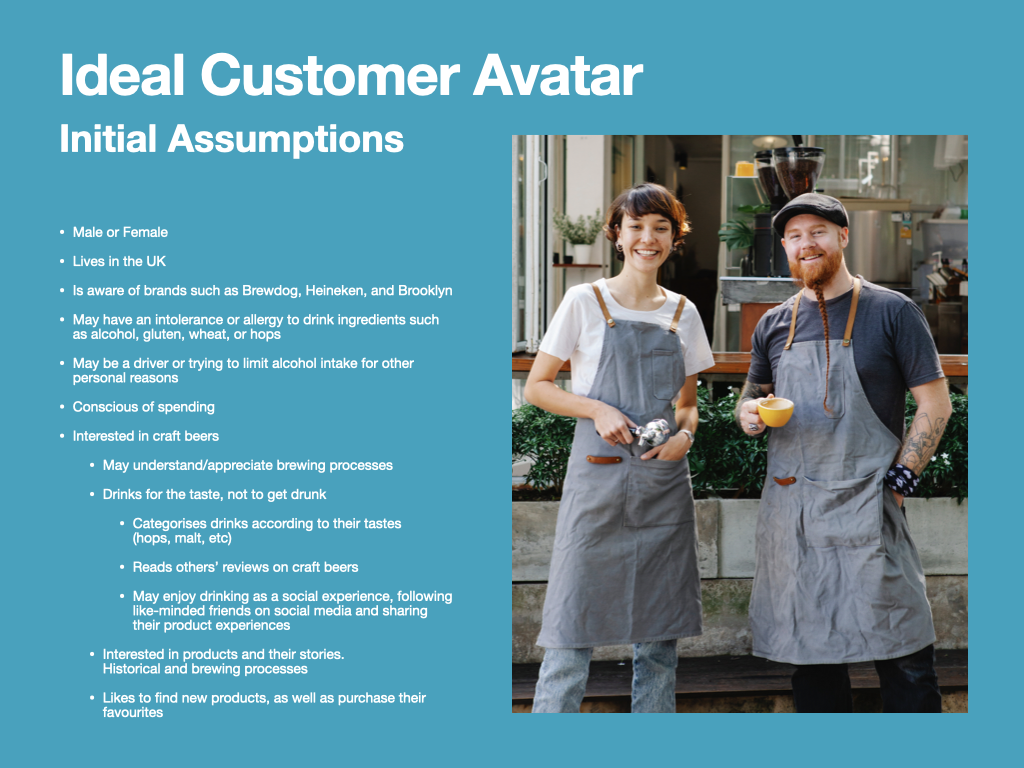
In line with the Learning Outcome: D, “Publicly demand and support the development of policies promoting health and well-being in relation to Sustainable Development Goal 3 – Good Health & Well-Being,” I have spent my time this week exploring how my role as a Design Communicator could help my client promote good health and wellbeing. 

My first area for exploration was the United Nations’ Sustainable Development Goals website. The website identifies target 3.5 as strengthening the prevention and treatment of substance abuse, including narcotic drug abuse and harmful use of alcohol. Point 3.5.2 elaborates to state that a measure of achieving this target is the monitoring of consumption of alcohol per capita.

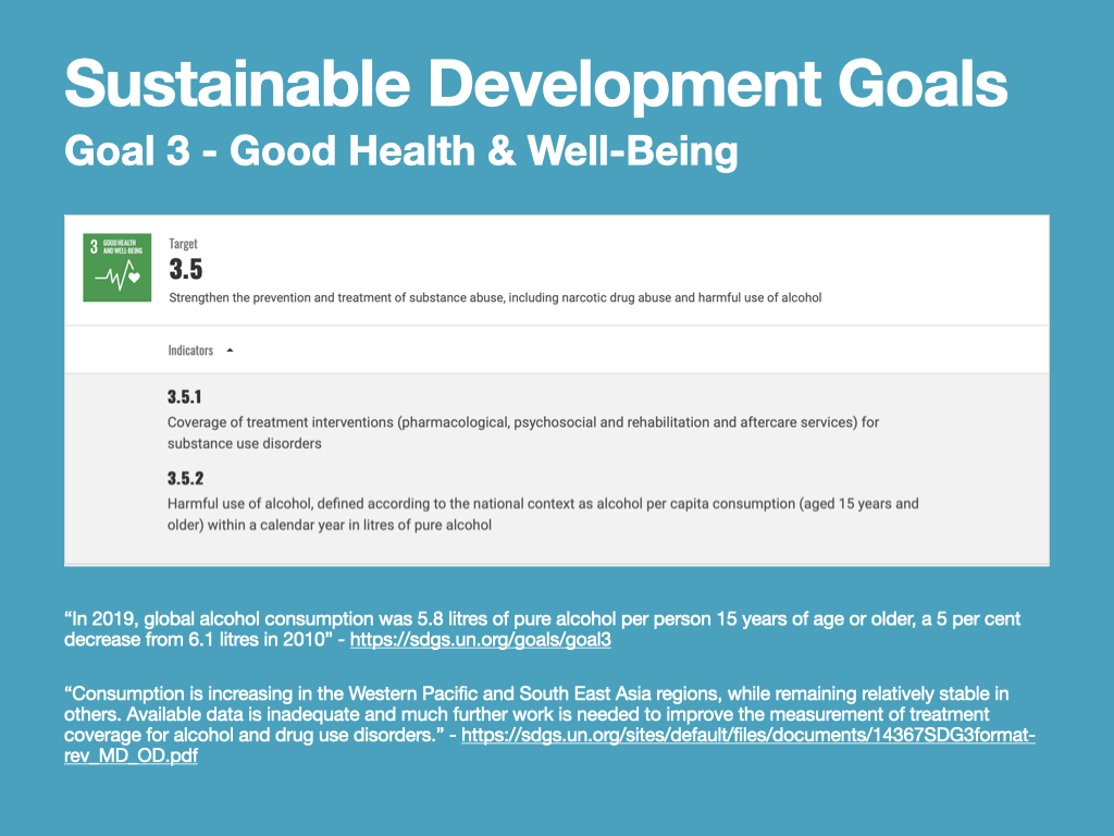
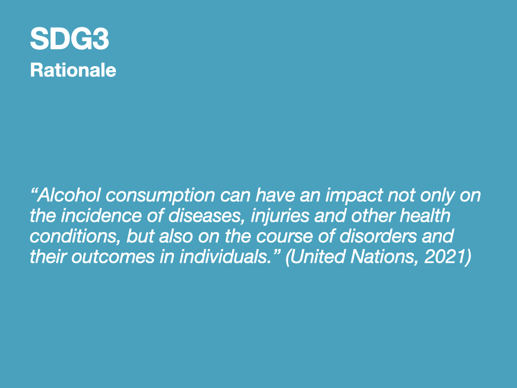
According to the United Nations, alcohol consumption impacts the chance of ‘developing diseases, injuries and other health conditions’, and can also negatively impact the course of ongoing illnesses (United Nations, 2021). E-retailers such as Sober Sauce choose to encourage alcohol-free drink consumption by describing the health benefits of reducing alcohol intake, including rehydration, lower sugar intake, and no hangovers (Sobersauce, n.d.).

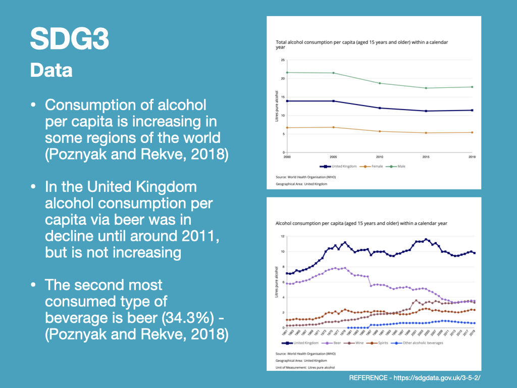
Consumption of alcohol per capita is increasing in some regions of the world while being stable in others. In the United Kingdom  alcohol consumption per capita via beer was in decline until around 2011, but has since steadily began to increase, making it the second most-consumed alcoholic beverage (Poznyak and Rekve, 2018). Meanwhile, consumption of wine and spirits in the UK has increased steadily since 1961.

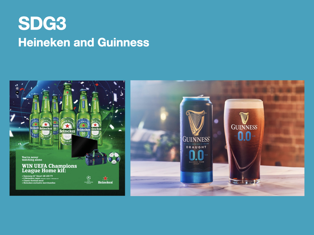
In response to these trends, it may be appropriate to encourage alcohol free/low alcohol e-retailers to publicise the benefits of alcohol free products more prominently. However, this may be a matter for government intervention. Competing brands within the drinks industry, such as Heineken and Guinness, have began advertising the alcohol free versions of their drinks alongside the alcoholic counterparts.

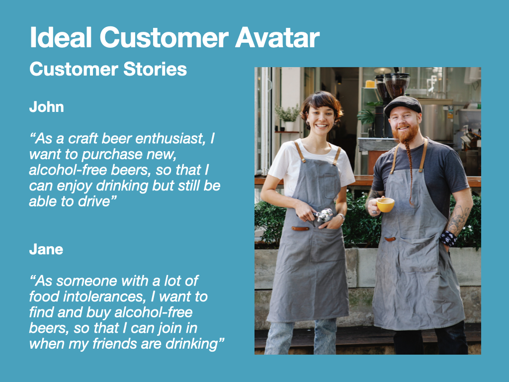
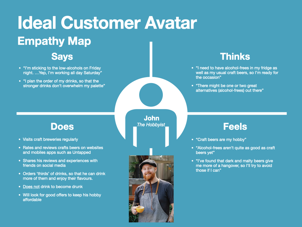
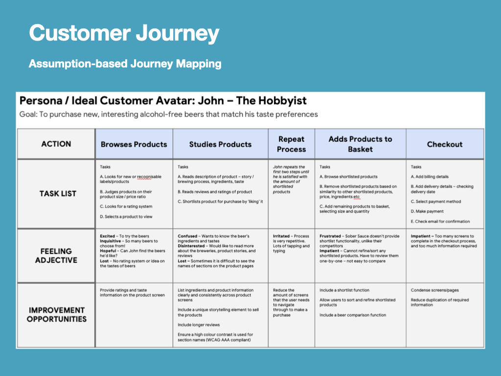
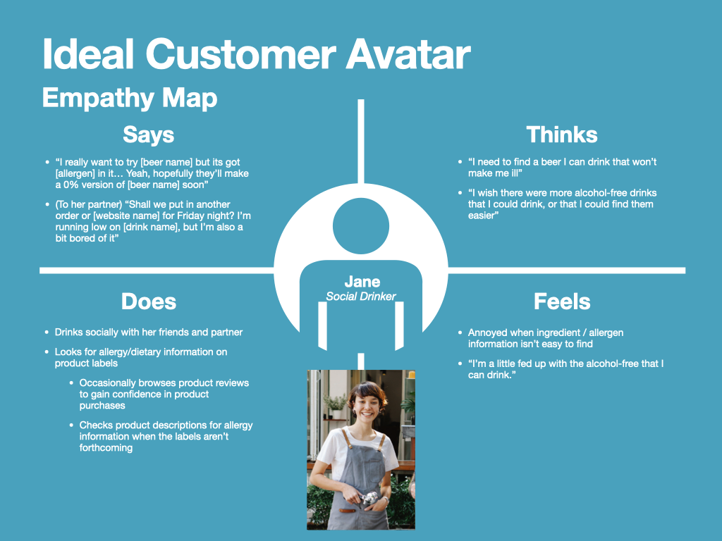
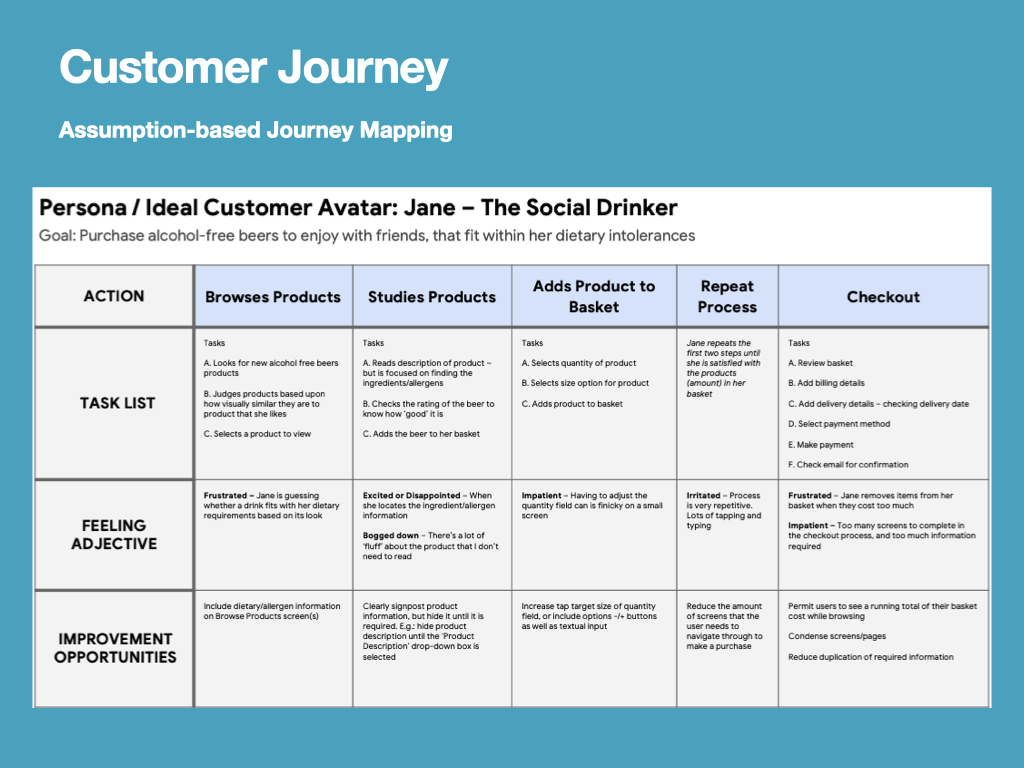
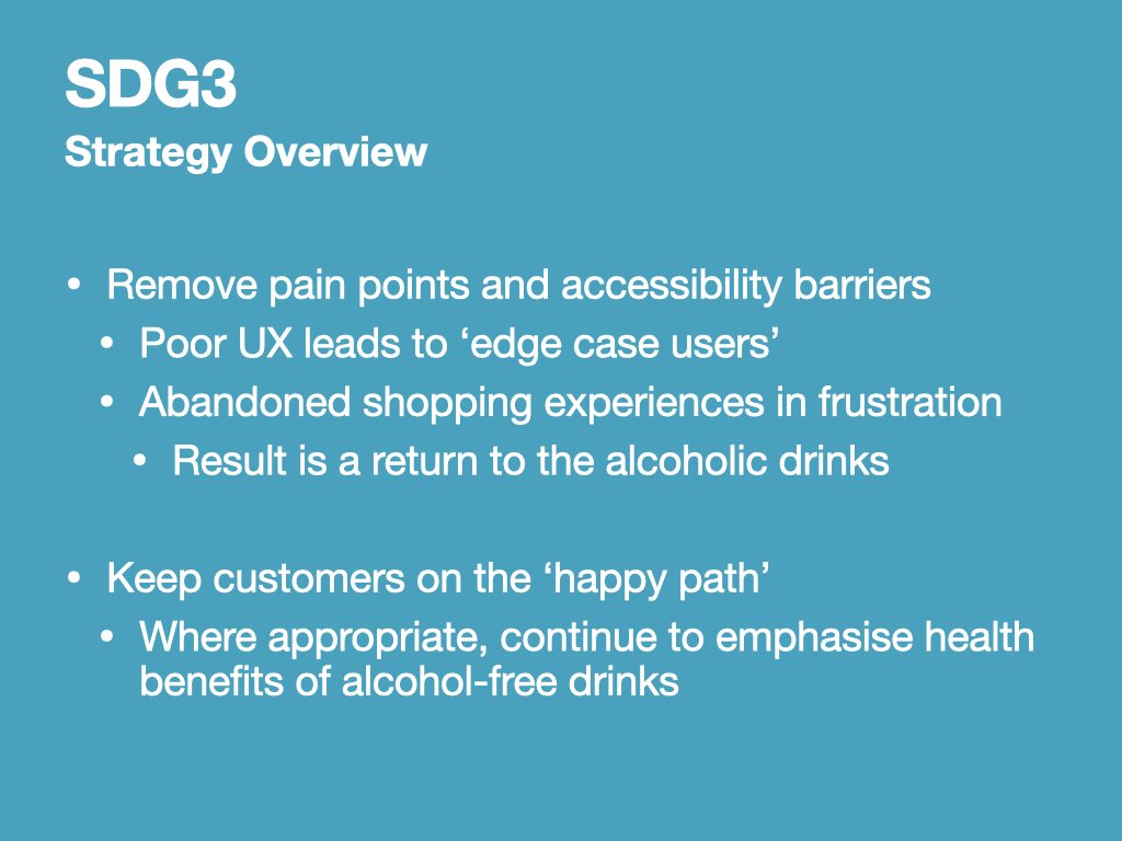
As a designer undertaking a ‘Design Communication’ module at university, I feel the extent to which I can promote health and well-being through reduction of alcohol intake is to remove pain points and accessibility barriers that my client’s customers may experience. Some customers may be trying alcohol free drinks for the first time, and poor UX could cause them to become an ‘edge case user’, abandoning their shopping experience in frustration, to return to the alcoholic drinks within their comfort zone (Google, n.d.).

By keeping my client’s customers on the ‘happy path’ within the UX, and emphasising the health benefits of alcohol-free drinks, customers can be encouraged to participate in alcohol-free experiences and hopefully enjoy a healthier lifestyle.

References

Google (n.d.). Start the UX Design Process: Empathize, Define, and Ideate: Week 3 – Crafting User Stories and User Journey Maps. [online] Coursera. Available at: https://www.coursera.org/learn/start-ux-design-process/home/ [Accessed 22 Mar. 2022].‌

Sobersauce (n.d.). About Us. [online] Sobersauce. Available at: https://sobersauce.co.uk/pages/about-us-1 [Accessed 10 Feb. 2022].‌

Poznyak, V. and Rekve, D. (2018). Global Status Report on Alcohol and Health 2018. [online] www.who.int. Available at: https://www.who.int/publications/i/item/9789241565639.‌

United Nations (2021). SDG Indicator Metadata. [online] United Nations Statistics. Available at: https://unstats.un.org/sdgs/metadata/files/Metadata-03-05-02.pdf.‌

DM7920 Week 8 – Early Sketches and Wireframes

This week I began producing early sketches and wireframes for the project. This allowed me to think broadly about how the information architecture and the webpage layout could be adapted to meet my three objectives.

On each of the below slides I have recorded several iterations of my designs and have not omitted anything. A key mantra of my design decision making came from within a paragraph in User-centred Web Development by Jonathan Lazar, which reads:

“In general, users will not spend a lot of time trying to learn the interface of a web site. If previous knowledge is required, or if the interface is confusing, or if the user cannot find the necessary information or has to ask for outside assistance, he or she might just access another website, since there are virtually not costs involved in switching web sites” (Lazar, 2001)

This mantra, coupled with the knowledge from my Competitive Audit, highlighted that I should adhere to common layout and information architecture conventions established across similar websites, as this would be key to understanding users’ prior knowledge. The analytics in my Competitive Audit also established that the alcohol-free drinks market is especially competitive, so it would be true that users can switch to accessing another website if the Sobersauce interface was confusing.

I resolved to design my initial sketches by borrowing from the conventions of Sobersauce’s competitors. However, I restricted the conventional elements I borrowed to those that satisfied the Functionality, Reliability, and Usability layers on the Design Hierarchy of need, as this would be most efficient (Bradley, 2010).

At this stage, if this project were to be a live brief, I would ensure that the client is shown the sketches alongside their competitor’s websites, then allowed to offer their insights and ideas before I commit more time to the project. Beyond the sketching and wireframing stages the designs would take longer to produce and iterate upon, so it might not be efficient to include any late-arriving feedback.

Wireframing

Satisfied with my early sketches, my attention turned to producing wireframes. 

Wireframes are very similar to early sketches, however they are clearer and more refined, allowing for “focus on screen order, organisation, and function” (Hagen and Golombisky, 2017). Although not usually focused upon aesthetics, I decided that as my wireframes were scaled, I could experiment with applying the gestalt principles; this meant I could also consider how proximity and similarity could be used to group sections of the web page together. In the below example I have left too much gap between the ‘Trending Drinks’ header and the product listings below, causing the header text to appear lost. By reducing the white space / proximity between them, I could anchor the header to the content.

Wireframing – Second Iterations

A couple of changes were made in the second iteration of the wireframe. These were all on the ‘Shop for Beers’ screen. Based on my two personas/Ideal Customer Avatars, and some of the practices I observed in my competitive audit, I’ve now included customer product ratings and allergy labels. By including this information I’m satisfying John’s desire for seeing ratings from other craft-beer hobbyists, and building Jane’s confidence to purchase by displaying allergy-based information.

This information is also transferred onto the popout screen of the ‘Shop for Beers’ page. 

This page also benefited from some further user interface changes. Firstly I have placed across in the top left corner of the popout, making it clearer how to close the popout window. As a result I’ve been able to remove the ‘back’ option from the bottom of the window, replacing it with a ‘More Information’ link, which will take the user to a page where they can read more about the brand and product. This would satisfy John’s need to learn more about the product, while keeping Jane happy by not diluting key allergy information with less important details.

Finally, I’ve been able to add a share sheet icon next to the product rating. Depending on the mobile platform being used, for example iPhone or android phone, the platforms share sheet will appear enabling the user to share the product listing on social media. This is suitable for John’s persona, as he can share the product with friends as he intends on his empathy map.

I’m satisfied with the placement of these elements, so they should be carried across to the first paper prototypes. 

References

Bradley, S. (2010). Designing for a Hierarchy of Needs. [online] Smashing Magazine. Available at: https://www.smashingmagazine.com/2010/04/designing-for-a-hierarchy-of-needs/ [Accessed 5 Jul. 2021].‌

Hagen, R. and Golombisky, K. (2017). White Space Is Not Your Enemy : a beginner’s Guide to Communicating Visually through graphic, Web & Multimedia Design. Boca Raton, FL: CRC Press, Taylor & Francis Group.‌

Lazar, J. (2001). User-centered Web Development. Boston: Jones and Bartlett Publishers.‌

DM7920 Week 8 – Proposed Solutions

Having completed a competitive audit and an audit of the Sobersauce mobile experience and customer base, resulting in the production of some customer assumptions, this week I have focused on proposing and justifying my response. 

I began by outlining three clear objectives that will measure the success of a redesign of the Sobersource of mobile experience. 

Initially, I must add clear purpose and hierarchy to the webpages. The current information architecture of the website is too confusing, with long webpages that have little hierarchy. Many webpages serve a multitude of functions with no clear, singular call to action. As a result, the intended purpose of each webpage is unclear, as is the expected behaviour of the customer. 

Next, I must strengthen the brand presence and improve wayfinding across the website. I must find a balance between promoting Sobersauce’s unique brand presence, and improving accessibility for visually impaired users. Previous research into the brand has outlined some weaknesses in compliance with Web Content Accessibility Guidelines (WCAG), resulting in the website falling short of both WCAG AA and WCAG AAA standards. I aim to produce a user interface dad here’s to both sets standards and also showcases the corporate image of the brand. 

Finally I intend to streamline the shopping and checkout process. Currently the site structure appears to separate out products into different shopping experiences, which could confuse users. The user flow charts for the shopping experience also contain many repetitive steps with a high interaction cost. This increases the risk of users note reaching the checkout process, and could explain why the website suffers a high abandonment rate.

By focusing on these three objectives I believe that I can offer an improved mobile experience for the client, and justify my design decisions against the outcomes from my research of the clients current offering. Improving upon the websites current faults in these three areas should result in a lower abandonment rate and potentially increase the amount of customers returning to the website.

Time Planning and Design Theories

I will also be adhering to the traditional design process, as outlined in UXPin’s Ultimate Guide to Prototyping. This linear model accurately depicts the roadmap for a UX redesign, taking the design from rough and inexpensive sketches to record ideas and experiments, to more refined outcomes as we reach the prototyping stage (UXPin Inc, 2015). However, this model can ‘[vary] based on the project’s needs, resources, and limitations’ – within my project I am likely to produce a paper prototype that I can use for usability testing, before producing a digital mock up and then further hi fidelity prototype’s afterwards. My reasoning for doing this is that paper prototypes can be produced quickly and easily amended during testing. They also do not appear very refined, which encourages participants to criticise them honestly (Nodder, 2017). 

Site Structure

By analysing Sobersauce’s current site structure, I have identified some painpoints that could frustrate both of my Ideal Customer Avatars. 

A) The repetitive process of adding products to a basket

B) Findability – it is difficult to find products that meet the user’s needs

C) The checkout process is too long, requiring too much information on too many page

On the left hand side of the screen is Sober Sauce’s current site structure, and on the right hand side is a suggestion for how the current site structure could be compiled into a simplified solution. Minimising the amount of pages/screens the user encounters will help to lower the interactivity cost of the experience, while retaining all the product as a filterable and sortable ‘Shop Beers’ page, should make them easier to find.

Although this structure works in theory, it must be tested. Initially, this testing would come in the form of Content Directories, Sketches, and Wireframes. These processes will ensure that all information the user requires can sit within the proposed Information Architecture. 

Finally (and beyond the scope of this project), running some unmoderated usability testing could explore whether the Information Architecture is logical for the user. This form of testing would require the website to be uploaded to a software application, which usability testers could access en mass. Their interactions with the website would then be recorded, yielding a large amount of behaviour data for UX designers (including myself) to respond to (Whitenton, 2019). 

Design Hierarcy of Need / Prioritising

In order to meet my three objectives and to produce a strategy for redesigning the Sobersauce website, I have categorised issues and observations from my audits according to the Design Hierarchy of Need (Bradley, 2010). When creating sketches, wireframes, and prototypes, I will be addressing these features by working from the lower-most layer of the Design Hierarchy of Need, to the top. Due to time constraints, this project may have to prioritise features; for this reason I intend to address the functionality, reliability and usability features. It may be the case that proficiency-related features are to be considered in a later review of the website.  

Content Directories

Across both Content Directory slides, I have mapped all of the information on webpages/screens in the current Sobersauce site structure against my proposed new structure. The outcome of this process also serves as a handy guide for making sure that all content is included in early sketches and wireframes.

References

Bradley, S. (2010). Designing for a Hierarchy of Needs. [online] Smashing Magazine. Available at: https://www.smashingmagazine.com/2010/04/designing-for-a-hierarchy-of-needs/ [Accessed 5 Jul. 2021].‌

Design Council (2019). What Is the Framework for innovation? Design Council’s Evolved Double Diamond. [online] Design Council. Available at: https://www.designcouncil.org.uk/news-opinion/what-framework-innovation-design-councils-evolved-double-diamond [Accessed 30 Aug. 2021].‌

Nodder, C. (2017). Become a User Experience Designer Pt.2. – UX Design: 1 Overview. [online] LinkedIn. Available at: https://www.linkedin.com/learning/ux-design-1-overview-2/welcome?contextUrn=urn%3Ali%3AlyndaLearningPath%3A56dfbc9b92015a33b4908fdd&u=89462170 [Accessed 8 Jul. 2020].‌

UXPin Inc (2015). The Ultimate Guide to Prototyping. [online] UXPin. Available at: https://www.uxpin.com/studio/ebooks/guide-to-prototyping/ [Accessed 31 Jan. 2022].‌

Whitenton, K. (2019). Unmoderated User Tests: How and Why to Do Them. [online] Nielsen Norman Group. Available at: https://www.nngroup.com/articles/unmoderated-usability-testing/ [Accessed 12 Mar. 2022].‌

DM7920 Week 7 – Customer Assumptions

Based upon outcomes from my research, such as my competitors audit and my audit of the Sobersauce website, I have attained enough information to create some assumptions about Sobersauce’s customer base / target audience. This week, I’m presenting this information in a variety of ways including customer stories, empathy maps, and journey maps. My intention is to create two Ideal Customer Avatars / Protopersons / Personas, which will allow me to document the motivations and aspirations of the Sobersauce user base (Ferrer, n.d.).

Later, these customer assumptions will inform some of the design decisions involved with a redesign of the Sobersauce mobile experience.

Firstly, I have written a short Customer Story for each avatar that will help me to prioritise my design decisions and empathise with these particular users needs (Ferrer, n.d.). 

John is a craft beer enthusiast who would like to buy alcohol free beers that he can enjoy on evenings when he also has to drive. We also have Jane, who admits to living with a few food intolerances. For this reason, Jane would like to find a buy alcohol free beers so that she can join in with her friends are drinking. 

John and Jane present two unique scenarios, and to be successful, my redesign of the Sober Sauce mobile website, should appeal to both sets of needs.

Next I decided that each Ideal Customer Avatar would require an empathy map so that I can understand what they say, think, do, and feel in relation to purchasing alcohol free beers. This is a process that I learnt during earlier module (DM7921: Design Research), which is serves as a helpful reference point when deciding how new features and functions of prototypes may be received by the customer.

John loves his craft beers. He believes that they are hobby of his, and looks forward to attending craft breweries and trying the latest offerings. He will regularly review craft beers on websites and apps, browsing other reviews and sharing his own on social media. He doesn’t mind drinking alcohol frees, especially when he needs to be driving on the following day. However, he feels that alcohol-free craft beers are not as good as ‘the real thing’. John also has some reservations about ingredients in craft beers, as he thinks they give him stronger hangovers.

Once I had developed a thorough understanding of John and his preferences towards purchasing alcohol-free beers, I could focus on illustrating his purchase journey. 

A journey map like the one on screen depicts how the customer achieves a specific goal. In this scenario I can review all of the steps required to achieve that goal, such as buying alcohol free beer, and consider any pain points that may occur on the way. There is also space for me to note how I could improve upon those pain points. On screen I have used a template for a journey map, produced by Google. By using templates I can make sure that I am working to an industry-accepted standard, which is rigorous-enough for the requirements to redesigning the UX of a website. 

Another good reason for creating journey maps is that it can help me avoid designer bias… This is where the designer (me) designed the website for my needs rather than the needs of the intended audience (John and Jane). Every design-based decision should be considered from the point of view of the Ideal Customer Avatar, the customer story, empathy map, and customer journey map.  

So, looking at John’s customer journey map, I can see there are a few situations whereby he becomes irritated or frustrated. For example, he is irritated by the repetitive nature of adding products into his shortlist or basket. I’ve also noted that there is an opportunity to improve this by reducing the amount of screens that need to be navigated in this process.

Secondly, we have Jane. Jane is a social drinker and so enjoys her alcohol-free drinks as a social experience. She has an undisclosed intolerance to an ingredient frequently used in craft beer making. For this reason she is intent on reading information about drinks before she purchases them, and can become irritated when the information is not easy to find. She finds that a lack of drink variety due to her intolerance can be limiting (and perhaps avoidable if ingredients were labelled properly), and so gets bored of her drinks.

Jane’s customer journey map places a little more emphasis upon the availability of information on the Sober Sauce website. The information architecture makes dietary and allergen information difficult to find, especially considering that there is information about the product that Jane does not want to see. This is somewhat conflicting Johns preferences, as he would like to learn as much as possible about the products before he purchases them. This conflict presents an interesting challenge for me I will need to consider in the latest design phases of this project.

However, we can see that Jane becomes impatient and frustrated in the same way that Jon does, when they experience repetitive processes such as adding products to the basket and completing the required information in the checkout process. Finding these agreements/similarities allows me to be confident in prioritising the remedial work on these issues above others.

A downloadable version of the Journey Maps is available here:

References

Ferrer, M. (n.d.). Online Course – Introduction to UX Writing (Mario Ferrer). [online] Domestika. Available at: https://www.domestika.org/en/courses/798-introduction-to-ux-writing [Accessed 28 Feb. 2022].‌