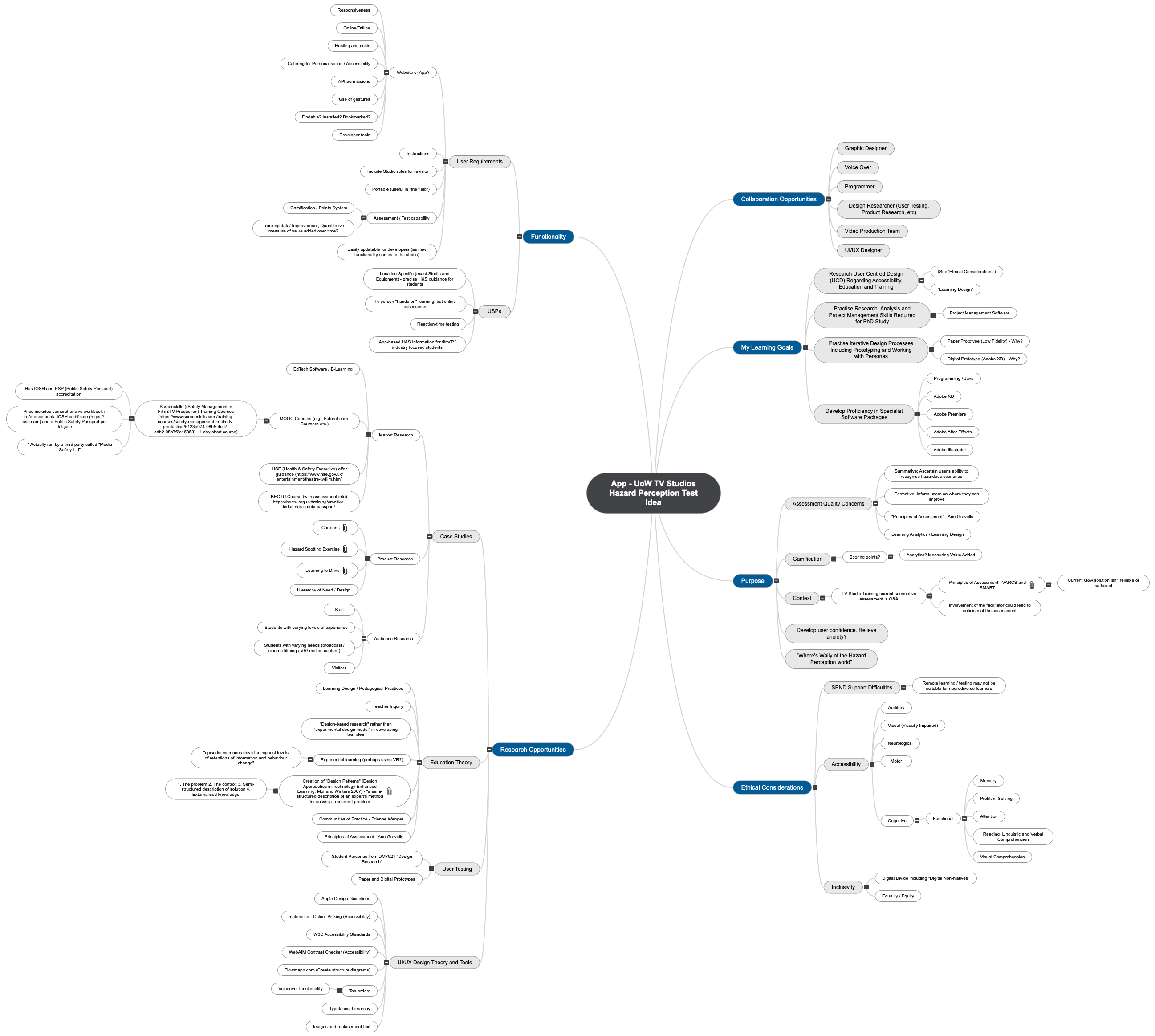
DM7917 Emerging Media Student Directed Project
Introduction
In DM7917, I decided to produce a working proof-of-concept prototype for a mobile application. Its purpose would be to assist students at the University of Winchester to work safely in the University’s TV Studios; it would feature reminders of TV Studio rules as well as health and safety prompts, culminating in a digital assessment experience, much akin to the Hazard Perception tests that learner drivers undertake.

I had originally made some considerations towards developing a website, which could be accessible on mobile devices as well as desktop computers, however upon further consideration, creating a mobile application would suit the Multimedia Centre’s requirements best. A mobile applications would offer better use of gestures, such as swiping, as well as offering access to a large range of APIs (Application Programming Interface) to support accessibility, as well as UI kits. I was particularly interested in trying to develop a prototype application that made use of Apple’s UI Kit and dark mode support.
I created a brief pros / cons chart to weight up the creation of either a website of mobile application (see below).
Timekeeping for my previous two modules had been planned and managed on a Gantt chart, however this presented challenges when particular tasks overran, or when new tasks needed to be introduced. Any changes would result in a need to readdress the timing for every future task. On both occasions, this caused the latter stages of my projects to feel rushed.
For DM7917, my initial plans would still be made using a Gantt chart, however, I would then transition that data to Trello and adopt an Agile workflow to monitor my progression across each task. A few relevant positives of using an Agile workflow on Trello include:
- An agile workflow would permit me to move tasks back and forth across the workflow as they progress, stall, or need a further iteration. Whereas a linear model (such as a Gantt chart) would need constant revisions
- All collaborators with a Trello account could view and adjust their responsibilities. They would not need to ask me to make adjustments
- Collaborators could also see the state of the project; they could see my progression, all collaborators’ progression, and the holistic project progress
- Task responsibility could be handed-off between collaborators and myself
The employment of an agile workflow would prove instrumental in managing this project, as I had intended for the collaborative element of this project to involve usability testers. Their involvement and feedback would be prioritised according to the Design Hierarchy of Need, and potentially implemented into each iteration of the prototype.
Learning Goals
To assimilate with my wider learning on the MA Digital Media Practice programme, I decided to review my Learning Goals before continuing with the project. I listed each Learning Goal and mapped one or two processes from this project which would contribute to them.
- Research User Centred Design (UCD) Regarding Accessibility, Education and Training
• Identify flaws within the current TV Studio training assessment process and design a digital assessment solution to improve them. This information can be found within my previous module, DM7921: Design Research (Helcoop, 2021)
• Research, examine, and note accessibility flaws in existing hazard perception applications. Improve upon these floors in the development of my own application
- Practise Research, Analysis and Project Management Skills Required for PhD Study
• Develop and use an ‘agile’ workflow to manage the development of prototype versions of the application, informed by feedback from usability tests
- Practise Iterative Design Processes Including Prototyping and Working with Personas
• Use collaboration opportunities and prototypes to carry out a process of usability testing to inform the development of a working proof-of-concept prototype
- Develop Proficiency in Specialist Software Packages
• Learn and use a digital prototyping application such as Adobe XD or Figma, working through stages from paper prototyping to a final, digital, high-fidelity prototype
I will address Learning Goals further in my Reflective Process Report.
Market and Product Research
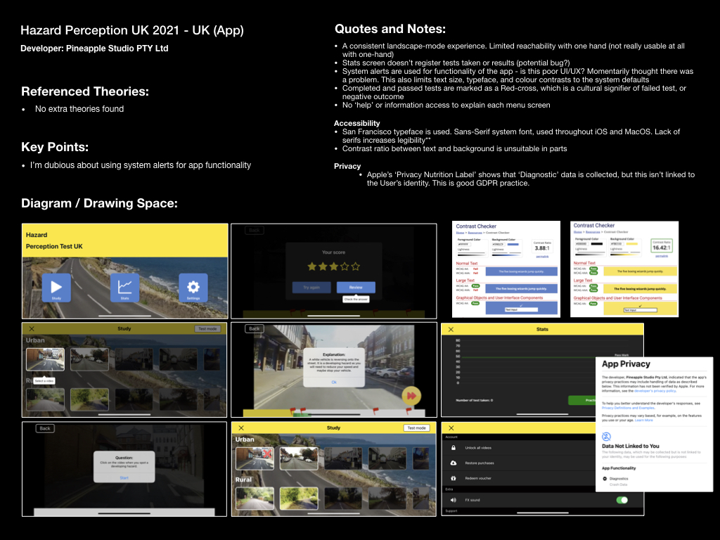
In terms of Market Research, I intended to discover whether there were similar applications already in the market for users to access, and if not, whether there were similar websites or training solutions on offer. I identified accessibility barriers to similar training courses on the market, but did not find any similar mobile applications. Limitations of training opportunities included, being in-person, requiring a fee, providing little or no revision material, or being strictly limited to production company employees. There were some valuable learning outcomes in completing this task, as I was able to identify that no competing mobile application existed, except for several driving-based “hazard-perception test” applications available on iOS devices. There was a clear unique selling point in applying the “hazard-perception test” methodology to training students in at TV studio.
Further to this, my product research permitted me to make some observations about user experience issues within similar iOS applications. These issues would often impact users with vision impairments, such as user interfaces having low colour contrast ratios, of interactive features that were not positioned consistently across different screens.
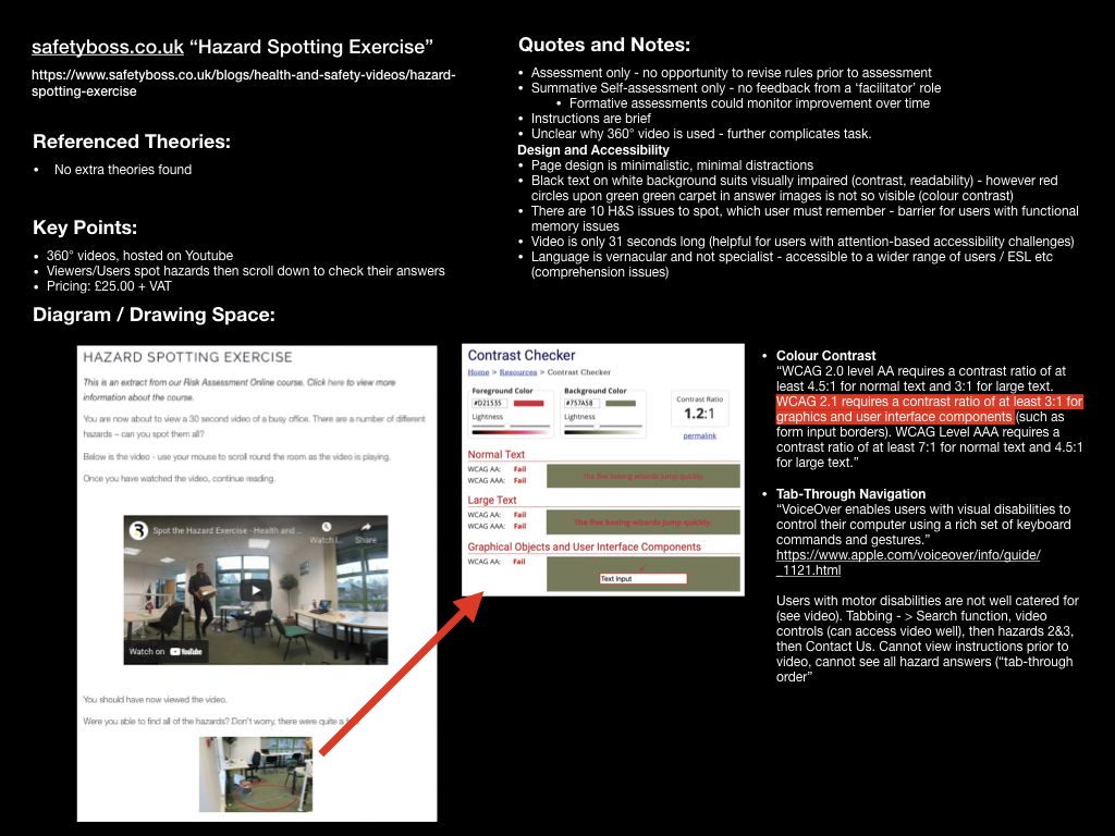
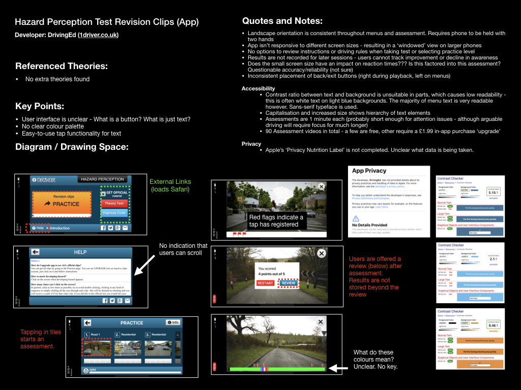
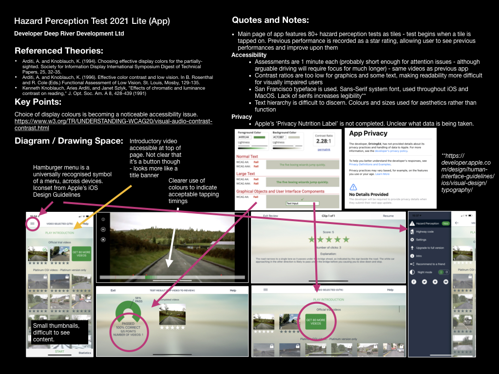
I have collated my research of three similar mobile applications, and three similar websites- a PDF is downloadable here: https://www.dropbox.com/s/7bhzwp33imt2066/Market%20%26%20Product%20Research.pdf?dl=0
Moreover, I concluded with the following accessibility issues and thoughts:
- All applications researched on the iOS platform use Apple’s default system typeface, “San Francisco”; a Sans-Serif typeface, used throughout iOS and MacOS. Lack of serifs increases legibility (Apple, 2019a).
- Instructions were often brief and to-the-point. Quick to read, requiring little of my time to get started. These were sometimes in the form of a ‘bread crumb trail’, whereas in other cases these were short, written instructions, to be read before proceeding
- Assessment activities were usually short, about 1 minute each (probably short enough for attention issues – although arguable driving will require focus for much longer), with only one hazard for the user to spot
- Many UI issues present accessibility challenges:
- Two apps featured inconsistent placement of back/exit buttons in apps (right during playback, left on menus)
- One app featured text hierarchy that was difficult to discern. Colours and sizes used for aesthetics rather than function.
- Many colour contrast issues are notable in current Hazard Perception tests, which may present a barrier to learning and readability issues for students with visual impairments
- One app did not feature any ‘help’ or offer and information access to explain each menu screen, beyond the initial breadcrumb trail
- One app featured buttons that were linked to external pages (loading up Safari and taking the user out of the app), while others buttons would not. Inconsistency was irritating to use, and felt jarring
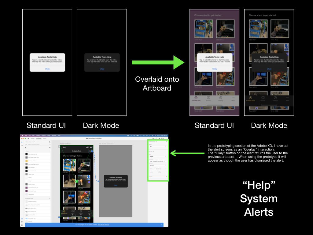
- One app used system alerts for functionality of the app – I felt that this was poor UX design, as I momentarily thought there was a problem with my phone or the app. This feature would also limit the text size, typeface, and colour contrasts to the system defaults, rather that allowing the experience to be tailored to the user’s needs in-app
- One app marked completed and passed tests as a Red-cross, which is a cultural signifier of failed test, or negative outcome. Confusing.
Initial Development
By creating initial sketches, my intention was to stimulate my thought processes – “How many screens will the app need?”, “What functionality should this application have?”, “Which elements would need to be on each page?”, “How will the user interact with each element?”
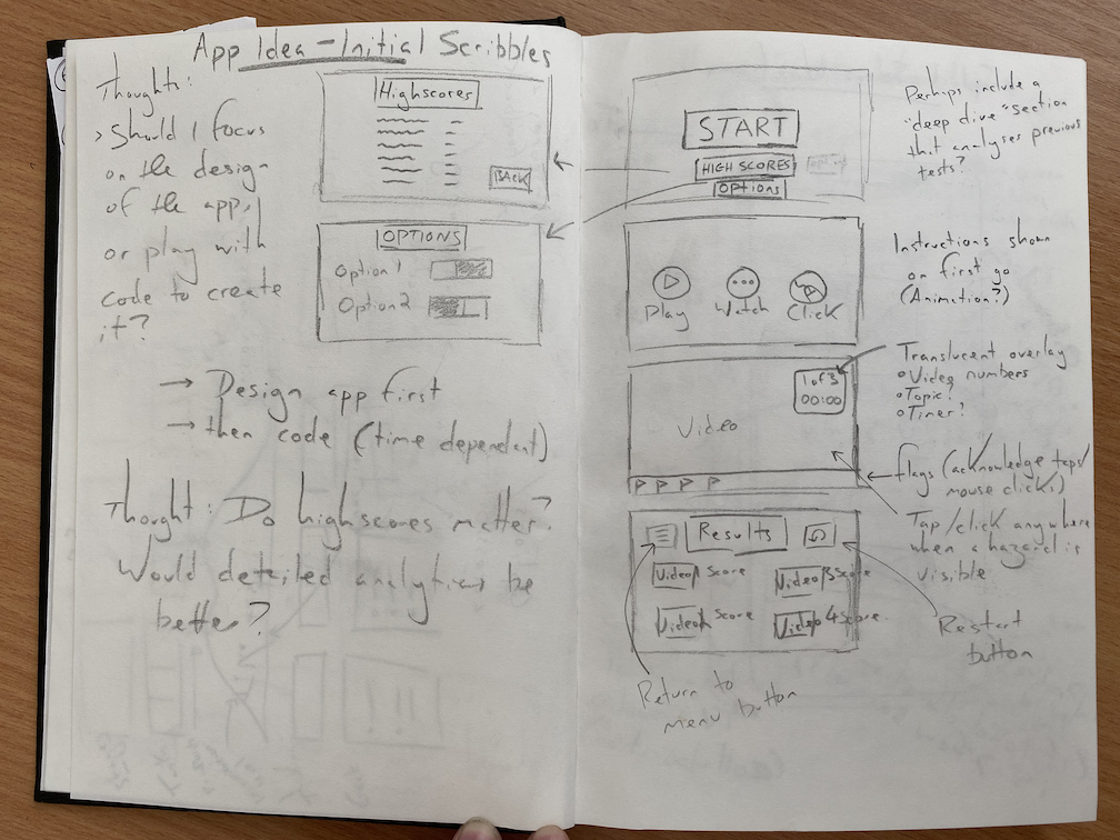
This first page of sketches brought about a lot of thoughts, which was overwhelming, and didn’t produce many comprehensible design solutions. I decided that I needed a more methodical workflow to make sense of all the variables first, so I began to plan the Information Architecture; this would include a “Structure of Experience” akin to a Site Structure Diagram, a Content Inventory, and a User-Flow Map. I did this by first producing a small mind map of the screens I would need, expanding on this to produce a Content Inventory, then using the website flowmapp.com to visualise a user’s flow between each screen. Standardised, universally recognised symbols were included, such as diamond shapes for decision-making and rounded rectangles for user input – by adopting these standards within design documents I could easily communicate my thoughts to potential collaborators or University tutors.
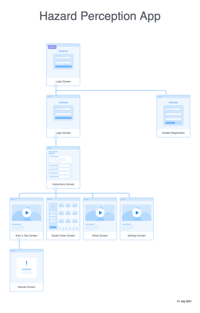
Creating the Structure of Experience allowed me to take my initial mind map of screens and visualise how they might link together. By producing a holistic view of how each screen would link, I could make sure that the Information Architecture of the app was logical and that there were no structural issues.

The Content Inventory was my first opportunity to think expansively about which app elements belonged on each screen. I was aware that this process could require me to adjust my Structure of Experience, as I may have omitted required screens – one good example of this is that I did not include a Settings screen, and realised this when I considered that a “Dark Mode” option could be desirable, but had no obvious destination to place a toggle switch.
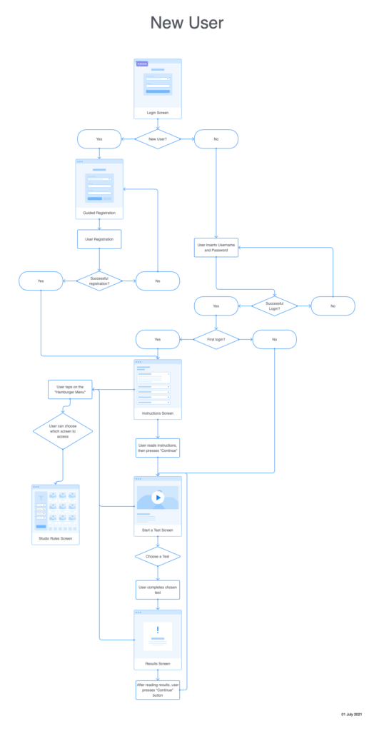
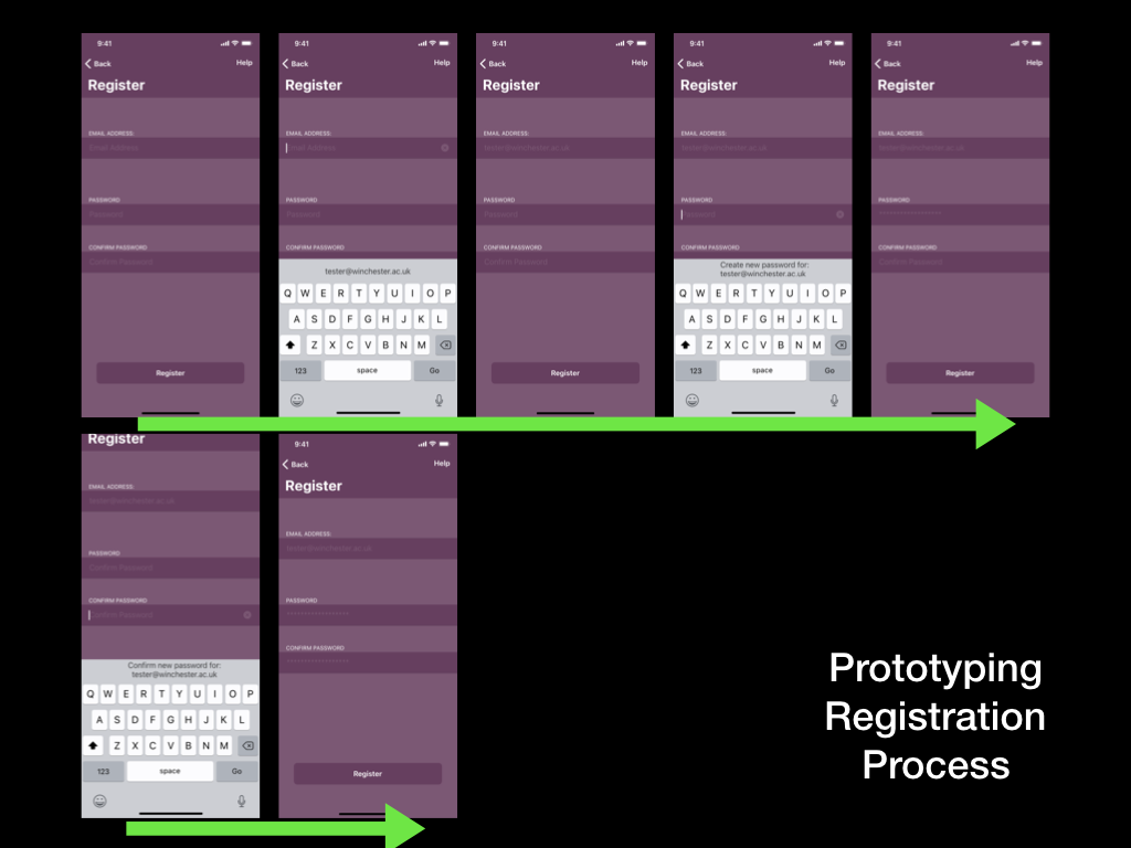
Production of the “New User” flow map was the most critical part of producing the information architecture. It required me to revisit both my Content Inventory and Structure of Experience, as considering how the user flowed between each screen revealed a lot of omitted elements. My first challenge was to realise that new users could not log in as they did not have an account; I would need to factor in a Registration page and the required elements such as email and password fields. This process also reminded me that mobile applications almost always have menus to allow the user to navigate between pages – this is a critical part that I had not yet considered; as a result, menu functionality is not present in the first iteration.
New User Task Flow Iterations
Typically, prototypes designed for usability testing will not include all the features and navigation possibilities as the final application. This is because it is neither efficient nor relevant to build aspects of a prototype that do not contribute to gaining the required feedback from the usability tester. For this reason, I had to pick a “Task Flow” to focus upon in my first usability tests – I settled upon the flow that a new user would experience.
This particular diagram is focused on the task flow for a new user who is moving from the registration process to reviewing their performance in their first hazard perception test. I will also explain how I iterated upon this first attempt to include further functionality such as wayfinding mechanisms.
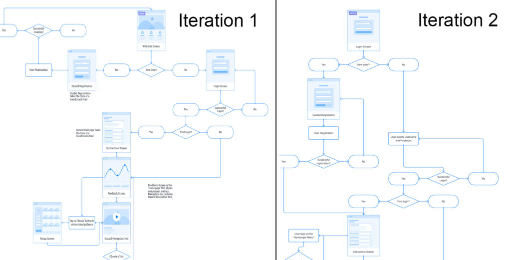
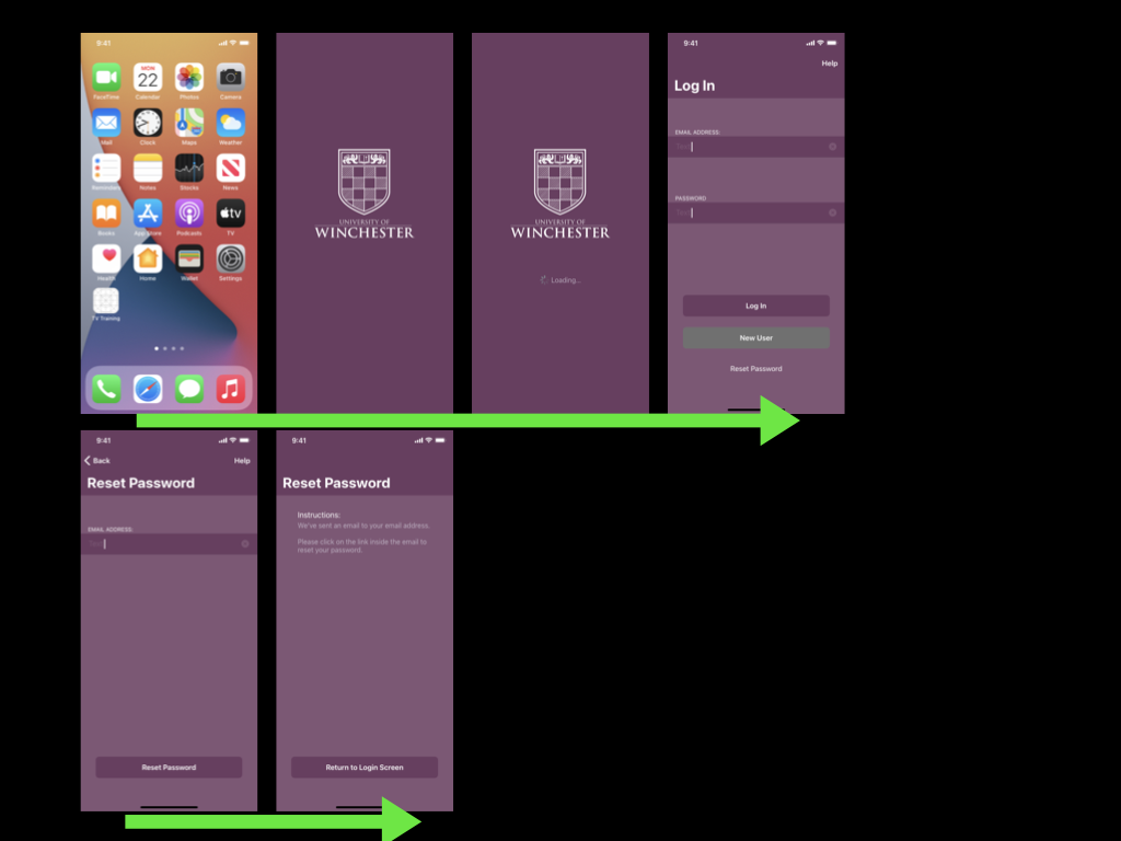
In my first iteration I included a welcome screen, which might feature elements such as the University logo and buttons to allow users to login or register a new account. Later in my second iteration I realised that the welcome screen would not be needed as it had a little functionality. It would make more sense for users
Once the registration process is complete, the user would be brought to the instructions/onboarding screen. The screen would outline the basic flow for a user to complete a hazard perception test and review their results. Once viewed the user would proceed to the Start a Test screen, where they can select a test, complete it, and review their performance on the Test Results screen.
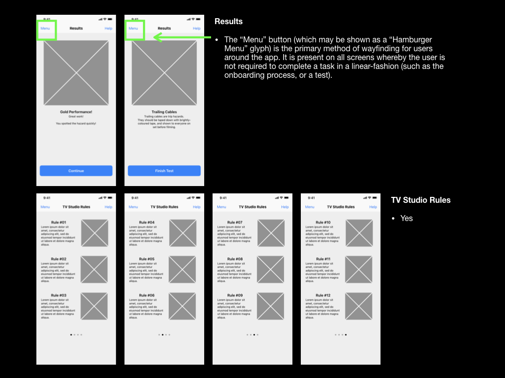
Prior to taking the test, I realised that some new users may wish to revise the TV studio rules. To integrate this I added a wayfinding mechanism to my second iteration of wireframes in the form of a Hamburger Menu. Hamburger Menus are universally recognised by three horizontal lines. Including a “Hamburger” menu would also allow users to move between different pages fluidly and in a non-linear fashion. I hope that being able to move between screens so freely will minimise any pain points relating to navigation around the app.
Initial Wireframing and Further Iterations
To produce this first set of wireframes I relied heavily upon the product research I had recently carried out. I tried to bring across many of the common UI elements that I had seen in similar apps, and combined those with standards that I had found on Apple’s Human Interface Design Guidelines.
Focusing upon user experience and navigation, I aimed to plan many elements within the application to be consistent, for example: all screens would be vertically scrollable, and would feature a coloured navigation bar and navigation elements in the exact same position.
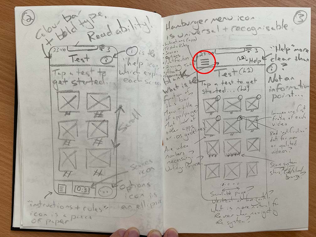
To further aid navigation I experimented with including a tab bar at the bottom of each screen as well as a “Back” button in the top left. This is directly opposed to my previous consideration of including a “Hamburger Menu”… Both of these appeared to be common features of many popular apps on the iPhone so their use and expected behaviours would be recognisable to users.
When planning to include a tab bar, I had to consider that a tab bar only contains enough space for a few navigational elements, and if using glyphs I would need to make sure that they are symbolic and recognisable as to not confuse the user.
At this stage, I leaned towards including a “Hamburger Menu” as it could hold more links to other pages within the app. In their Human Interface Design Guidelines, Apple address the limitation on tab numbers: “If some tabs can’t be displayed due to limited horizontal space, the final visible tab becomes a More tab”, which is a viable solution (Apple, 2019c).
This decision between including a tab bar or a “Hamburger Menu” would continue to be deliberated throughout many iterations of the prototype, so will be touched upon later in this write-up. I would need to put more research into this element, as navigation would be a key point of disseminating information across the app.
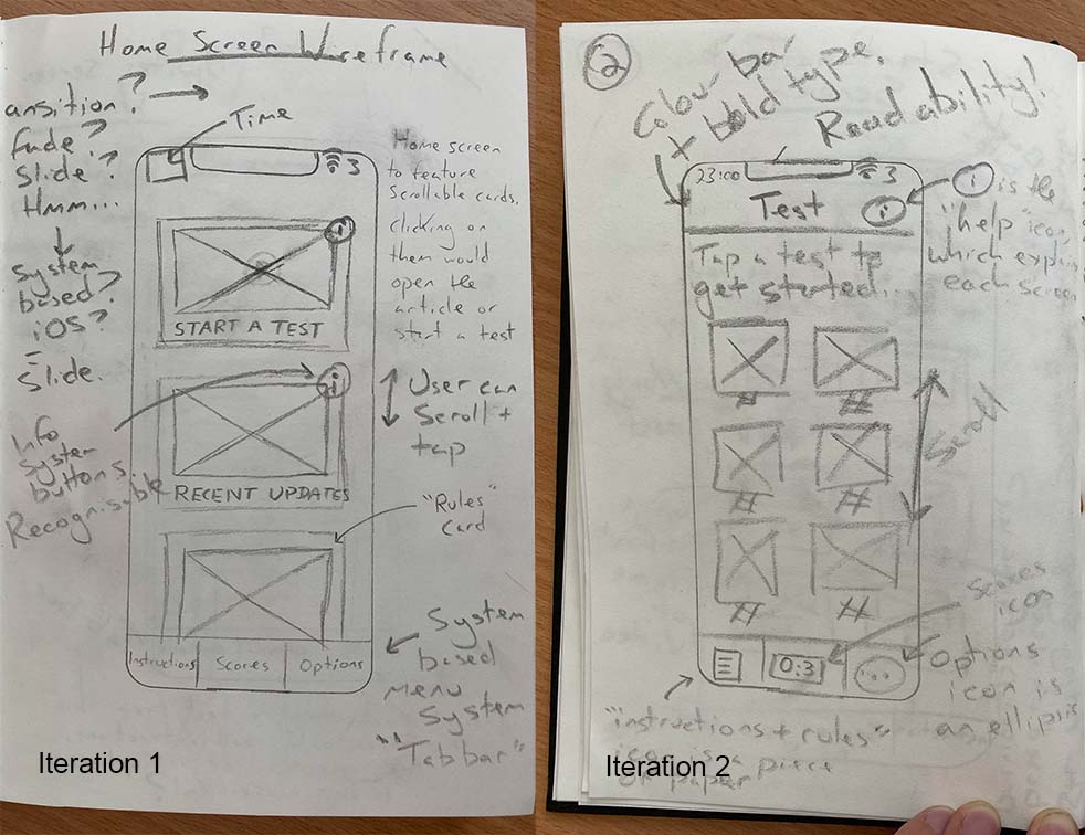
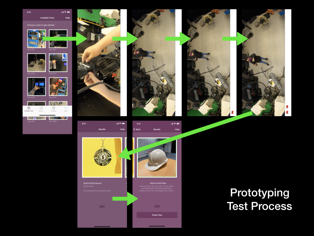
My initial wireframes also addressed the “Start a Test” screen, whereby users would be able to start a new hazard perception style test by tapping on a test thumbnail. Each thumbnail would feature an image/frame of the test video, alongside the test number and a star rating based upon the user’s previous performance. This idea is adopted directly from one of the apps that I have researched, and is notably used on other apps such as Duolingo, so I hope that it’s meaning will be instantly recognisable.
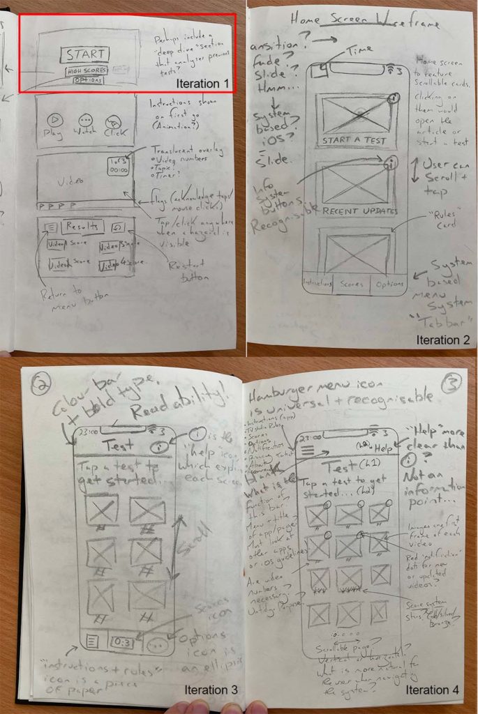
Despite the positive effects of adopting consistency and users recognising features and their expected behaviours, I had suspected that there were other wayfinding and hierarchal practices that could be implemented into my wireframing. One example of this, is deviating from vertically scrollable screens to a paging mode, which involves “swipeable” screens, that would be indicated via a page indicator.
Screens in paging mode come with a user expectation that the screens will reveal information in stages. Provided that I use a page control element, which is available in Apple’s UI Kit, users should understand that they need to scroll horizontally rather than vertically. See the below quote from Apple’s Human Interface Design Guidelines:
“Consider showing a page control element when a scroll view is in paging mode. A page control shows how many pages, screens, or other chunks of content are available and indicates which one is currently visible. If you show a page control with a scroll view, disable the scrolling indicator on the same axis to avoid confusion” (Apple, 2019b).
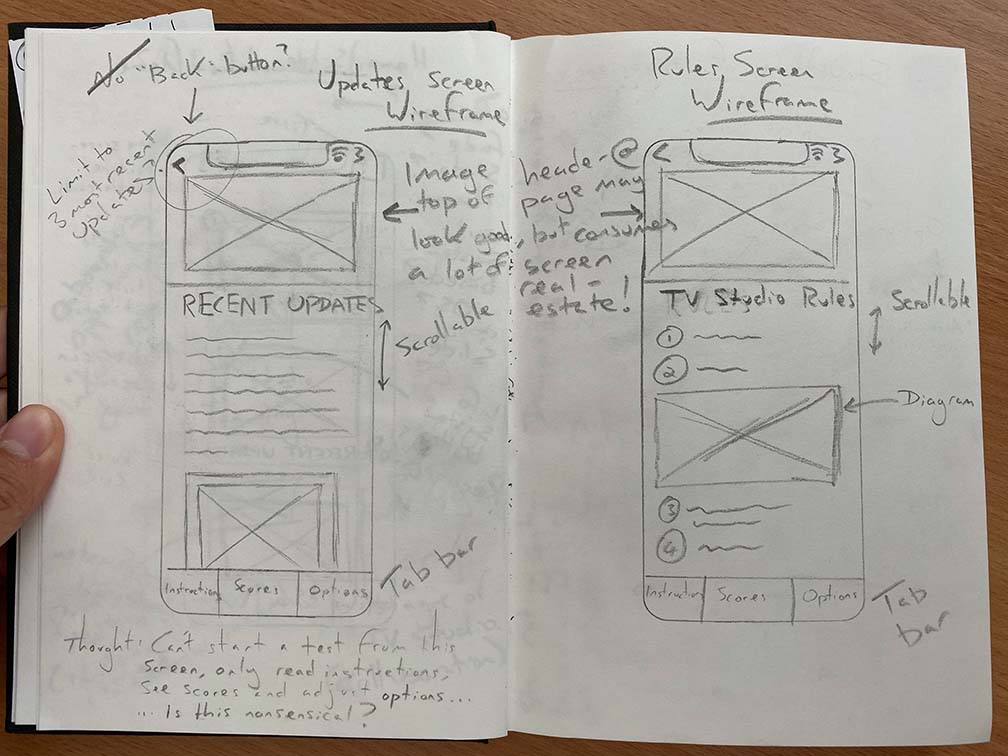
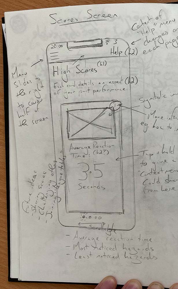
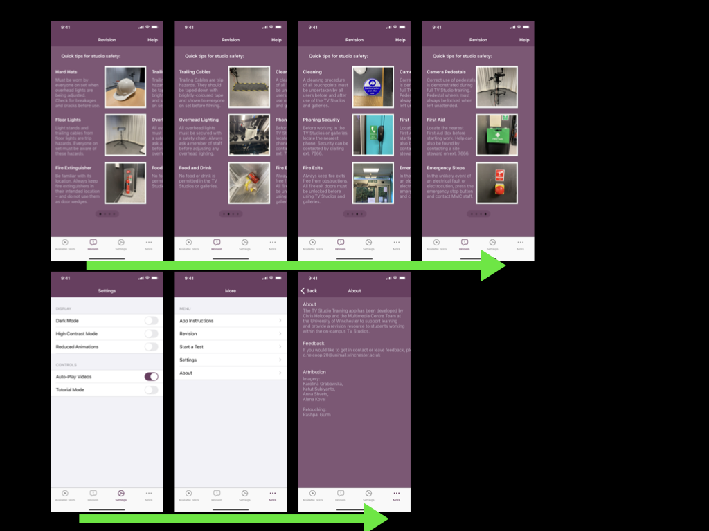
Paging mode could be used on the “Start a Test” screen to divide tests into sections based upon the difficulty level, this is illustrated in Iteration 4 above. Swiping between pages should be an indicator that psychologically divides the tests into differently themed groups. This methodology could also be used for the steps of the onboarding process, and on the Scores/Results screen to provide different metrics such as average reaction time, most noticed hazards, and least noticed hazards.
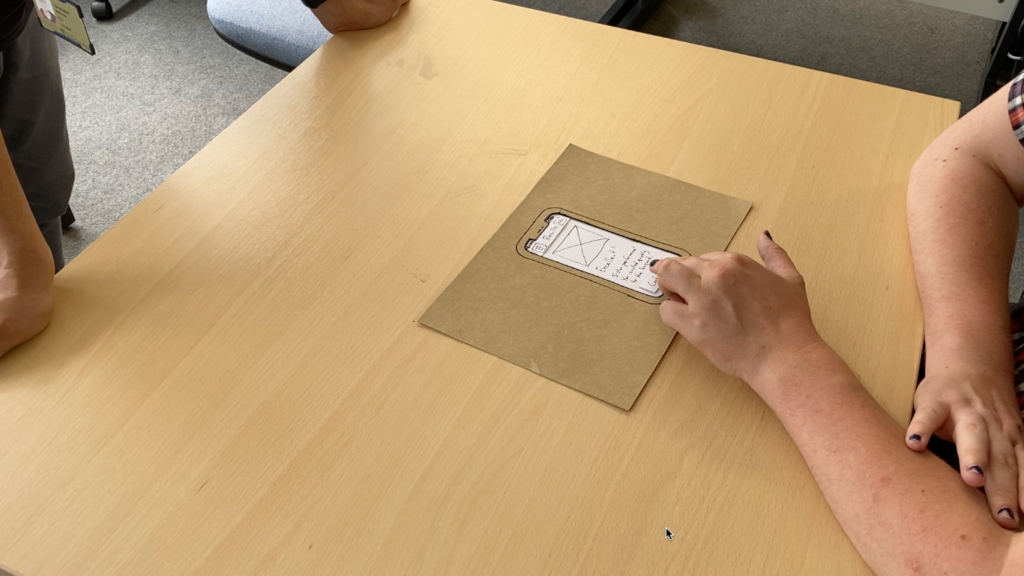
Paper Prototyping and Usability Testing
Comfortable that my wireframing process and Structure of Experience diagram had produced a clear view of the mobile application’s information architecture, I could progress to creating the first paper prototype.
Using paper, card, some blue tac, and a pen, I produced a set of paper slides that depicted each screen of the app, as well as a loading animation, system alert, and a menu.
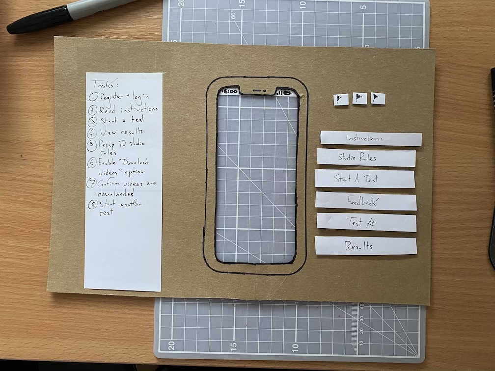
I also created a “blinder” out of cardboard, which could be used during my usability tests to focus the usability tester’s attention on each screen of the paper prototype. As I was attempting to prototype for a small-screen interface, this method would also ensure that I account for the display’s size when producing each prototype.
Prior to carrying out my first Usability Test, I picked up a copy of Carolyn Snyder’s book “Paper Prototyping” at the University’s library, and have found quite a few tips inside.
Firstly, I made sure that I had a short list of tasks, that I would guide the tester into completing. I also made sure that I had a suitable camera on hand to record the test, as I would be hosting the test by myself, so would need to carry out the follow of facilitator, computer, and observer. These roles would usually be delegated to members of the research team however (Snyder, 2003).
Next, I prepared a few key speeches, phrases, and questions, which I could rely upon to make sure that the tester remained informed and not led during the test. For example, I have adapted a usability testing script to make sure that I consistently introduce the tester(s) to each test. Any diversion from this introduction could lead to the tester reacting differently in the test itself.
I had to ensure that questions and affirmations that I gave in my facilitator role during the test were unbiased and did influence the testers actions. To do this, I ensured that my questions were open, and ended with “or not” if there were questions. E.g.: “Is this what you would expect the screen to look like, or not?”. I would also make the tester aware that I may not be able to answer the questions that they ask in the test, as to not influence them or their feedback.
After completing each usability test, I would write a short report, logging the tester’s actions, summarising my findings, and noting remedial actions that could inform the next iteration of the prototype.
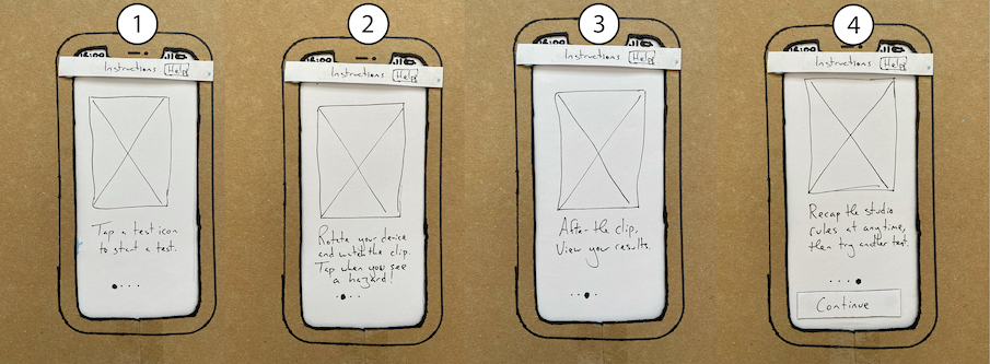
In the first usability test, focused upon the “New User” flow remedial work mainly referred to the wording of various buttons and the ability for a new user to skip the onboarding process by tapping the “Hamburger Menu,” which needed to be removed.
Prior to skipping the rest of the onboarding process, the usability tester was trying to action the written text upon the onboarding screen itself. My use of instruction that begin the imperative words, such as “Tap a test icon to start a test” was being understood literally, causing the onboarding process to break down. I would need to reword this as part of the next prototype iteration.
Features such as a star-rating were also suggested for users to see their previous performances on tests. I struggled to keep my tester on track during this first usability test, and admittedly lost control of the session as they seemingly aimlessly explored the prototype. The experience opened my eyes to how difficult it would be to keep a tester on-course but not influence their decision making and feedback.
The full report for the first usability test can be found here:
The second usability test was completed much more successfully, albeit the process took a bit too long, but that could be improved later. I had completed and documented the remedial works for next prototype iteration, enlisted another usability tester, and focused upon completing the exact same “New User” flow. By carrying-out the same flow, I could focus upon improving my own performance as a facilitator.
This time around, feedback indicated that the application’s UI was communicating reasonably well with the tester. The tester could navigate the prototype as intended for the most part, although there were some pain points to be actioned – for example, the tester was unclear that they needed to rotate the device to landscape mode to watch a video, however this could also be due to the nature of a paper prototype not actually including a live video.
This usability tester also found issue with the language I used within the onboarding process. Despite clearly writing each instruction as a “step”, I still wasn’t communicating clearly that the actions did not need to be completed during the onboarding process. This would require another revision before creating a digital prototype.
Other elements of feedback addressed the naming of particular sections with the app, and requirement to include a scrollbar to communicate whether a screen is scrollable.
The full report for the second usability test can be found here:
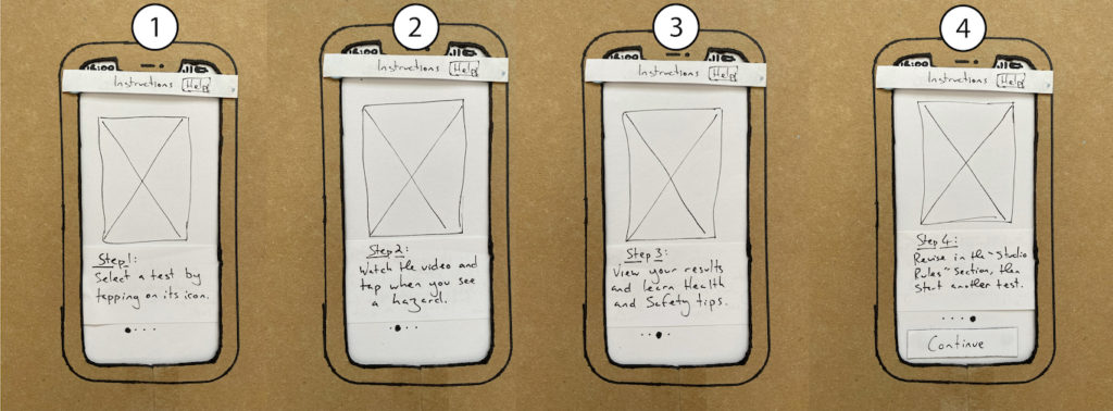
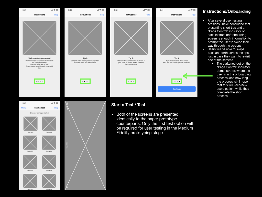
A third usability test also took place during the paper-prototyping stage. This test particular focused upon the onboarding stage, as I needed the user to read and swipe through the instructions, rather than try to complete them straight away. This iteration would present “tips” rather than steps, informing the user of the application’s functionality in a linear order, rather than directly instructing them how to use the app. This approach would prove to be successful.
The full report for the third usability test can be found here:
Design Hierarchy of Need
Each usability test raised a mixture of pain points and feature changes; admittedly, these made me feel quite overwhelmed. I appreciated that feedback is invaluable and leads to improving iterations of prototypes, however this feedback needed to be prioritised or categorised so that I could process it and maintain a reasonable workload.
I decided to categorise the feedback I received from each usability test into the five categories: functionality, reliability, usability, proficiency, and creativity, according to the Design Hierarchy of Need. I would then prioritise issues based upon which category they fell into, starting at functionality, moving towards creativity (Bradley, 2010).
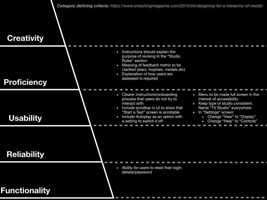
In the above example, feedback concerning “[the] ability for users to reset their login details/password” was high priority as it was categorised as “functionality”.
Medium Fidelity Prototype Development
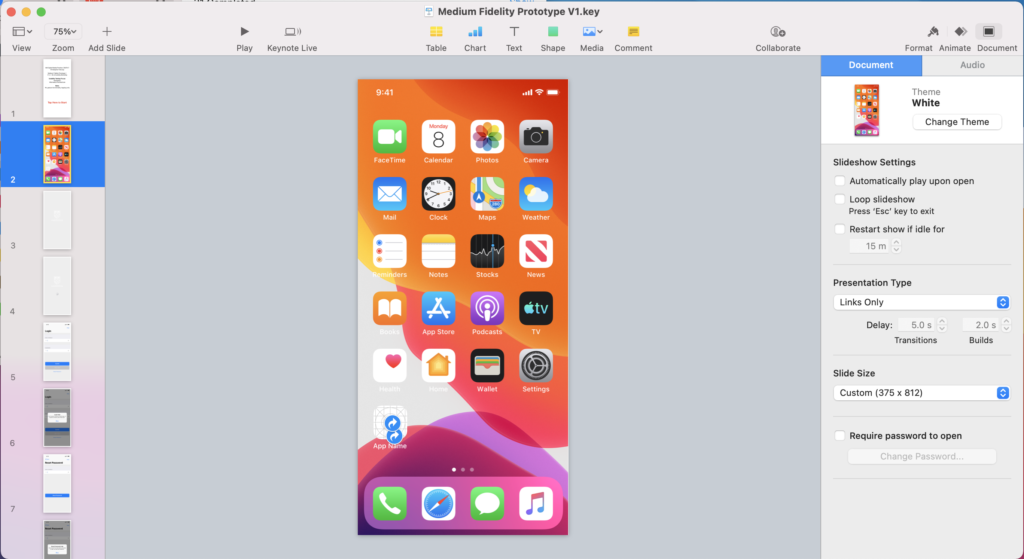
To produce my medium-fidelity prototype I worked in Apple’s Keynote software, which runs natively on MacOS and iOS. The Keynote file would be accessible on an iPhone, so usability testers could use the prototype as if it were a real app, provided I make many hyperlinks between pages. As I had used Keynote before, I would be keeping the learning curve small, and the pace of my iterations and testing fast, which was key as the prototype was still in its infancy.
When transitioning my prototyping from paper-based methods to digital, there were a few things that I had to consider before starting. Firstly, I needed to consider the requirement for my prototype to be tested on an actual phone, as this would provide the truest reflection of the user experience. I’ve decided to use my iPhone 11 for this, so needed to make sure that I formatted “slide size” of my keynote file to the correct dimensions (375px x 812px).
I also needed to continue adhering to the design principles used in Apple’s iOS platform so that my prototype would appear and behave in a manner that the user could expect. Apple’s Human Interface Design Guidelines and downloadable Keynote file included sample user interface elements, which could be integrated into a digital prototype. The navigation bar (at the top of each screen) and the tab bar (at the bottom of the screen) could become commonly used elements across the prototype. I also made use of spinners (as loading indicators), “label”-style buttons, and “Page indicators”, which would communicate functionality and different states to the user.
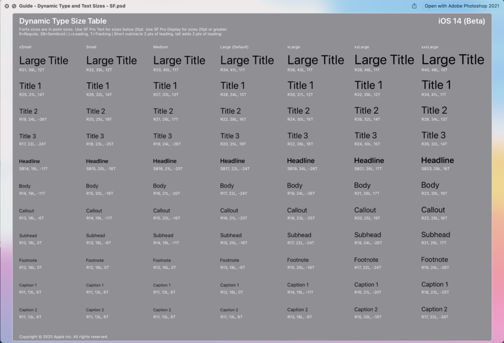
Apple’s guidelines also provided guidance on Apple’s colour palette and typefaces. Although I intended to replace the colour elements with those from the University of Winchester branding guidelines, I would be looking to adopt Apple’s typeface “San Francisco”. The San Francisco “Pro” typeface is commonly present across iOS as it is the default system typeface. Apple describes the font as “a neutral, flexible, sans-serif typeface,” the “sans-serif” element increasing the typeface’s legibility and scalability (Apple, 2019d). The typeface also comes in 9 weightings, which can be used alongside variations in sizes to create hierarchy within the information architecture.
Once I had created a rudimental version of the prototype, with its intended information architecture, layout, and hierarchical elements, I had to give it functionality. I did this by using hyperlinks to link the users between each of the screens. For “label”-style buttons, it was important to make the entire button a hyperlink rather than just the button text. This would result in a larger tap-target, which would suit usability testers (and users who have large thumbs)!
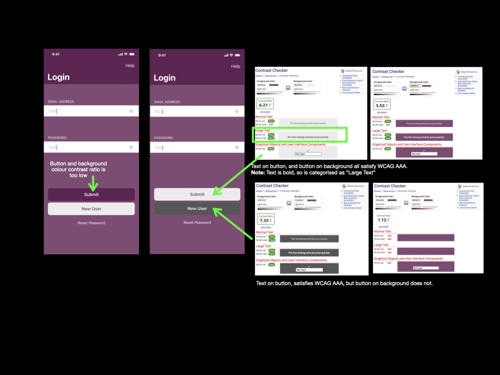
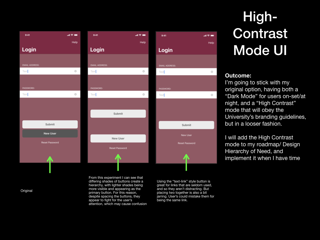
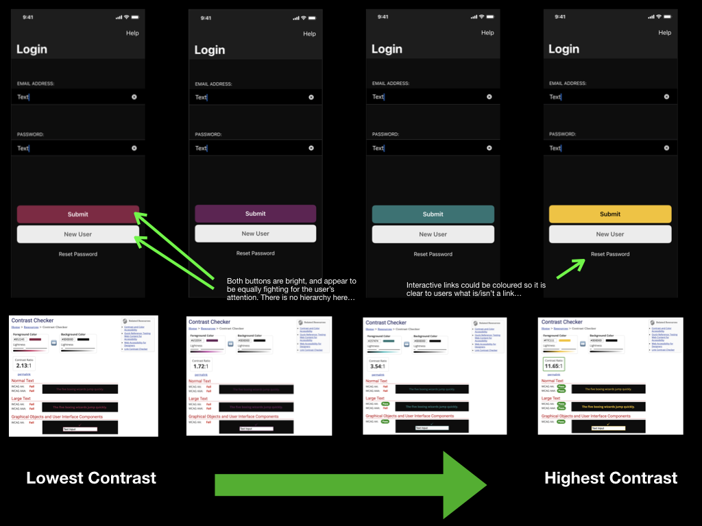
Next, I had to begin tailoring the app towards the University of Winchester’s branding. The primary method of achieving this was to incorporate the university’s colour palette. The branding guidelines stated that I could combine any of the university’s main colours with its accompanying tint, however, but I could not combine different main colours. This guidance alone allowed me to create app screens that had “depth” to them, rather than appearing monotone / “flat.” Where possible I would try to use as high colour contrast as the colour palette would allow, as this would increase accessibility for users with low vision. However, my efforts often fell short of WCAG standards – this would be especially problematic with interactive elements, such as buttons, that would have a low colour contrast ratio with their backgrounds (WebAIM, 2021).
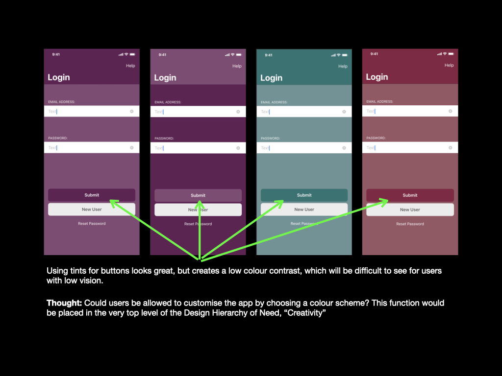
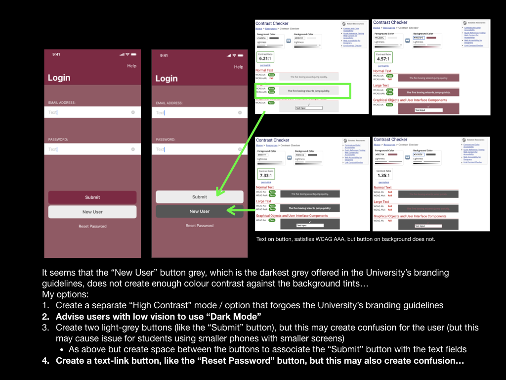
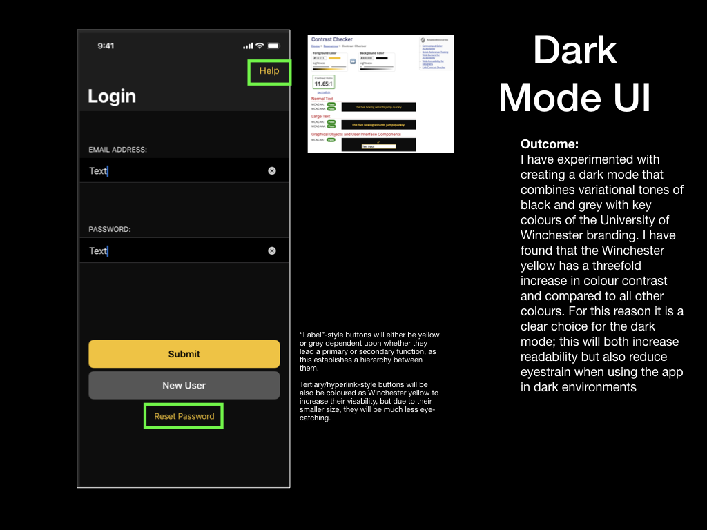
Having experimented with producing colour schemes using four of the University’s colours, I decided that I must create a high-contrast mode or “Dark Mode” so that I could increase accessibility for users of the prototype with vision impairments. A high contrast user interface would attempt to adopt the University branding as much as possible but would make compromises to prioritise high-colour contrast and readability when concerned with interactive elements like buttons, text fields and even labels for text fields. On the other hand, a dark mode would also feature high contrast elements, but with the bonus of being less bright and thus reducing the chance of the user developing eyestrain. Due to this added benefit, I prioritised creating the dark mode and included it as part of this prototype (Cole, 2019). The high contrast user interface could be developed at a later point in time.
Working to Apple’s Human Interface Design Guidelines, although not pushing many creative boundaries, resulted in a professional and recognisable appearance. With this design, the prototype became a truer reflection of the application I wished to create at this stage, and so gaining valuable insight through a usability test would be key to identifying improvements for the next prototype. In particular, I was interested to learn whether a user could intuitively activate Dark Mode within the prototype and then seek some information in the “Revision” section.
I noted one noticeable limitation of creating a medium-fidelity prototype using Keynote. I have listed it below and informed my usability tester before testing:
• Interactions such as swiping are not supported on the iOS version of Keynote – usability testers will be advised that they may only tap during the test. This limitation will be resolved and tested using a high-fidelity prototype and different prototyping software.
Usability Test 4
The fourth usability test was carried out on the medium-fidelity prototype, focused upon using the application in a real-world scenario. From my reading of the book “Paper Prototyping” by Carolyn Snyder, I identified a chapter that helped me to organise my usability tests so that the tester can use the prototype with more freedom while still achieving the required tasks.
This method resulted in me providing the tester with their task in the form of a short paragraph, rather than direct instruction:
“You’re a Floor Manager in a TV Studio. You’re on set and a broadcast is live, so you must keep your phone dark to not cause an interruption. A camera operator raises a query with you about a trailing cable on the studio floor. Refer to the app for information on trailing cables, while keeping your phone as dark as possible”
The plan for the fourth usability test can be found here:
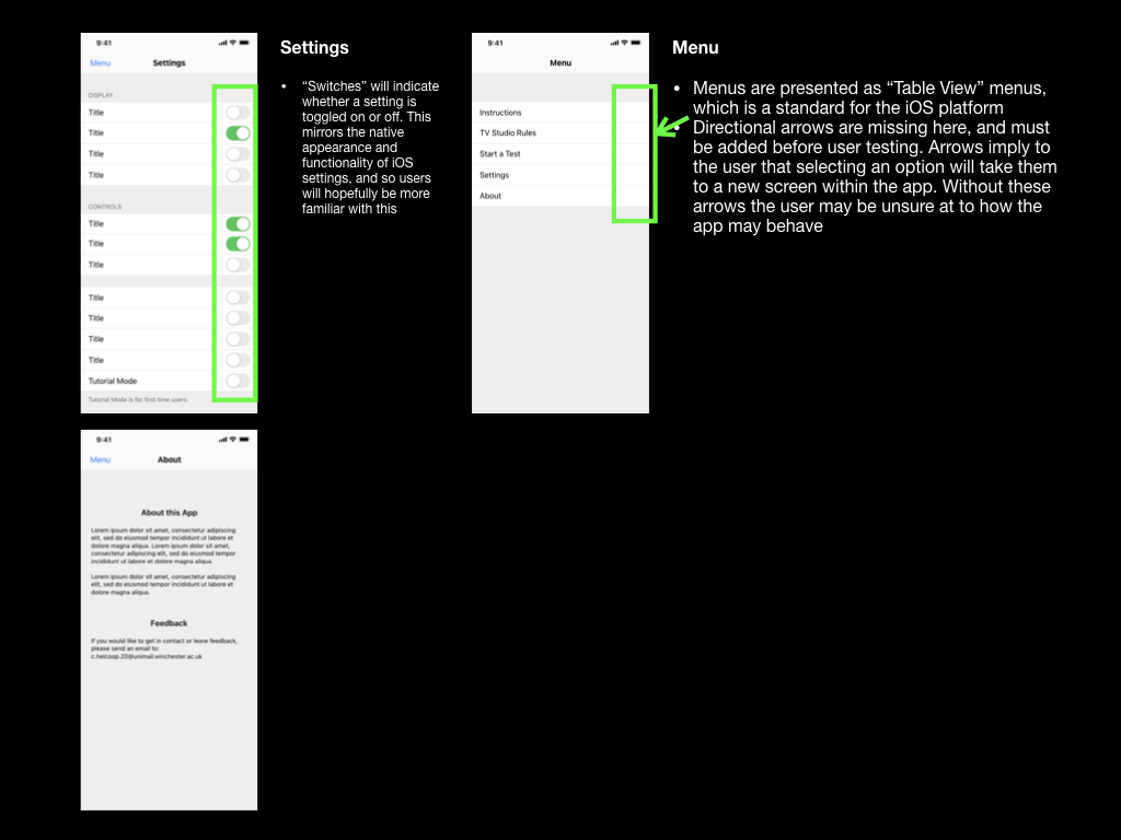
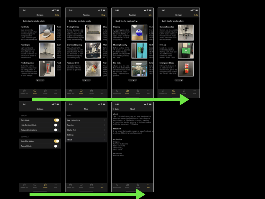
The fourth usability test was successful, with feedback mostly addressing navigation and discoverability of functions within the prototype. It seemed that features such as the Revision section are not obvious if they are not screen. A user may access the “Hamburger Menu” if they suspect that a feature they need is located there, but otherwise they may not think to access it… Remedial works would mostly include changing the name of a few pages, and implementing a tab bar to increase discoverability (more details in the next section of this write-up).
The full report for the fourth usability test can be found here:
Tab Bar Implementation
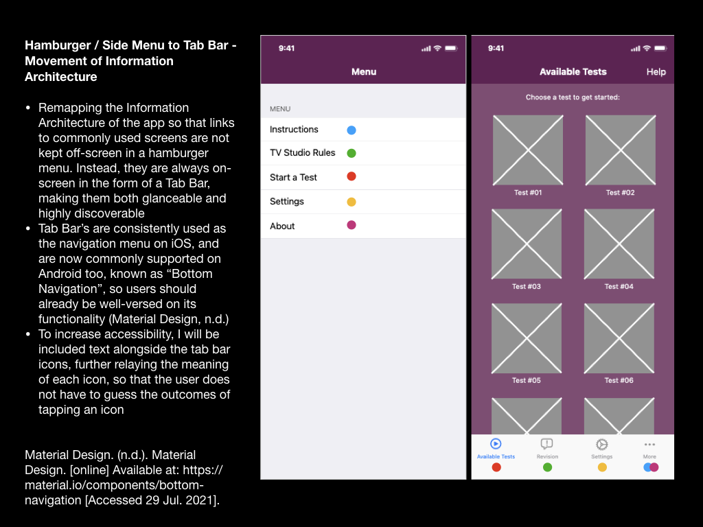
Due to the discoverability issues from usability test 4, which concerned the user’s ability to locate revision resources, I have decided to challenge my choice to use a “Hamburger Menu”.
In an article written by Product Designer, Luis Abreu, he identifies four drawbacks of Hamburger Menu (Abreu, 2014):
- Lower Discoverability
- Less Efficient
- Clash with Platform Navigation Patterns
- Not Glanceable
My main motivations for challenging the “Hamburger Menu” with the tab bar address drawbacks 1 and 4, however I can also understand the benefits relating to efficiency (measured by clicks/taps and length of navigation times), and Platform Navigation Patterns, as Apple has never included a Hamburger Menu within its iOS or its own apps.
Further to this, Mike Stern, Design Evangelism Manager at Apple has been quoted:
“Remember, the three key things about an intuitive navigation system is that they tell you where you are, and they show you where else you can go. Hamburger menus are terrible at both of those things, because the menu is not on the screen. It’s not visible. Only the button to display the menu is” (Limcaco, 2014). His quote directly addresses the suspicions I had about my recent usability tester’s feedback.
Inspired by Abreu’s article, I have illustrated how I planned move links to app pages from the Hamburger menu, and place them straight onto the home screen via a tab bar, making them highly glanceable and increasing discoverability. The coloured dots show the translation (see: below).
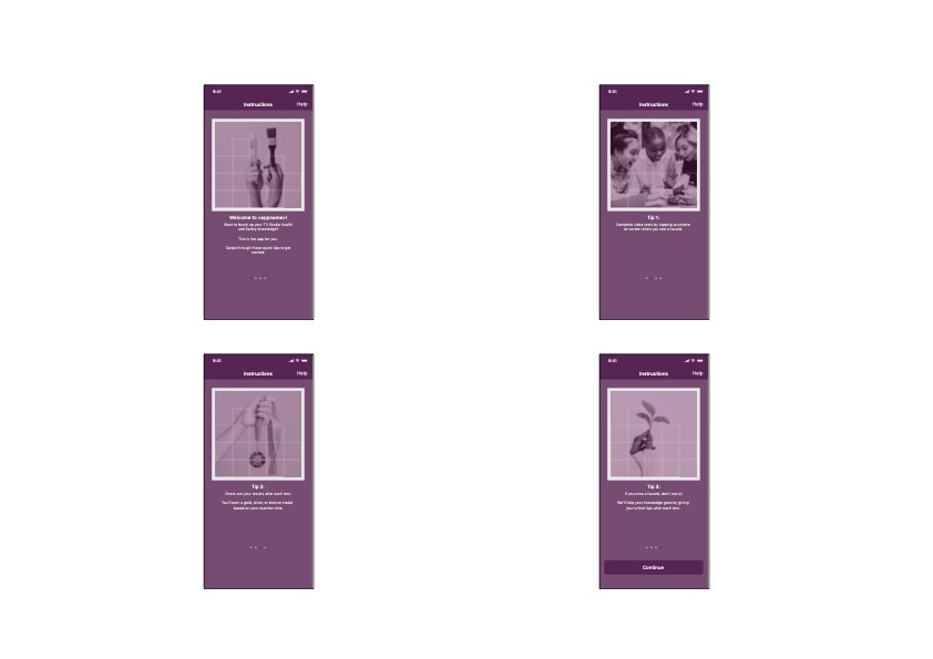
Collaboration with Retoucher for Onboarding Images
Despite the development and usability testing so far, I still hadn’t addressed the imagery within the app.
To resolve this, I began by researching design theory regarding onboarding processes. I probably should have done this earlier in develop, but nevertheless, this app development is a learning process. Material.io has published some very useful guidance on this (Material Design, n.d.).
Reading the guidance, my attention was drawn to a few areas:
- “Maintain visual continuity” i.e.: build upon the visual voice of the app e.g.: graphics, colours, typeface, tone of voice
- “Simplify” i.e.: Onboarding images must have a simple concept and a focus point
- “Don’t be UI literal” i.e.: Show the app’s benefits, rather than aspects of the app (such as screenshots) that users haven’t yet experienced
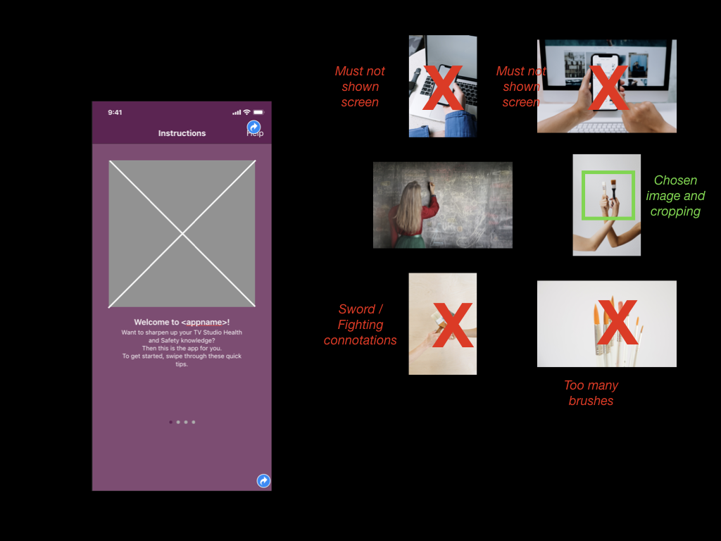
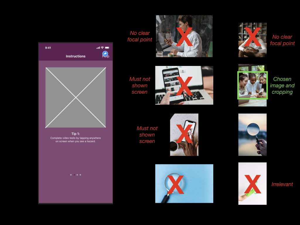
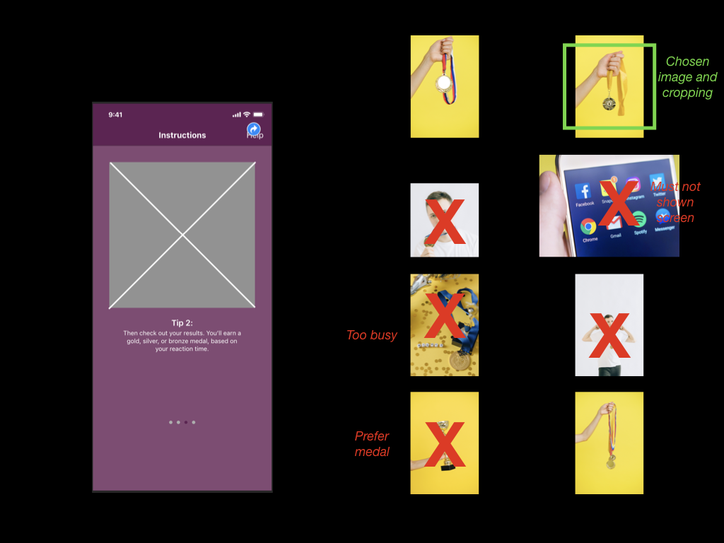
With these points in mind, I set about researching for imagery on the stock website, Pexels. I had previously used the this website for work and education purposes (such as my submission for DM7920). Images from this website can be modified “as [I] like” and “attribution is not required” (Pexels, n.d.). To my knowledge, this step clears the app (and myself) from copyright and attribution claims.
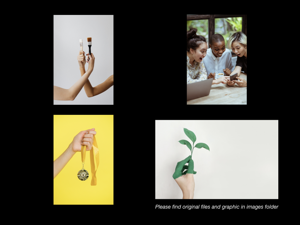
Each image was chosen for its link with the onboarding text, as below:
Screen 1: “Brush up” > Image of paint brush
Screen 2: “Completed a test” > Users having fun (laughing) with a phone
Screen 3: “You’ll earn a gold, silver, or bronze medal, based on your reaction time.” > Images of a medal
Screen 4: “We’ll help your knowledge grow” > Image of a plant (growing)
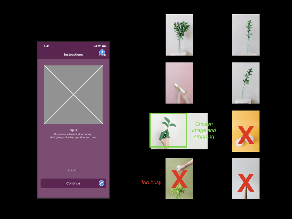
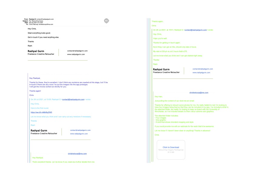
From my photography and marketing background, I was then able to draw upon my links with a professional retoucher, and provide him with a brief** that would note many of design choices to “maintain visual continuity”, including the University’s branding colours and graphics (Pexels, n.d.).
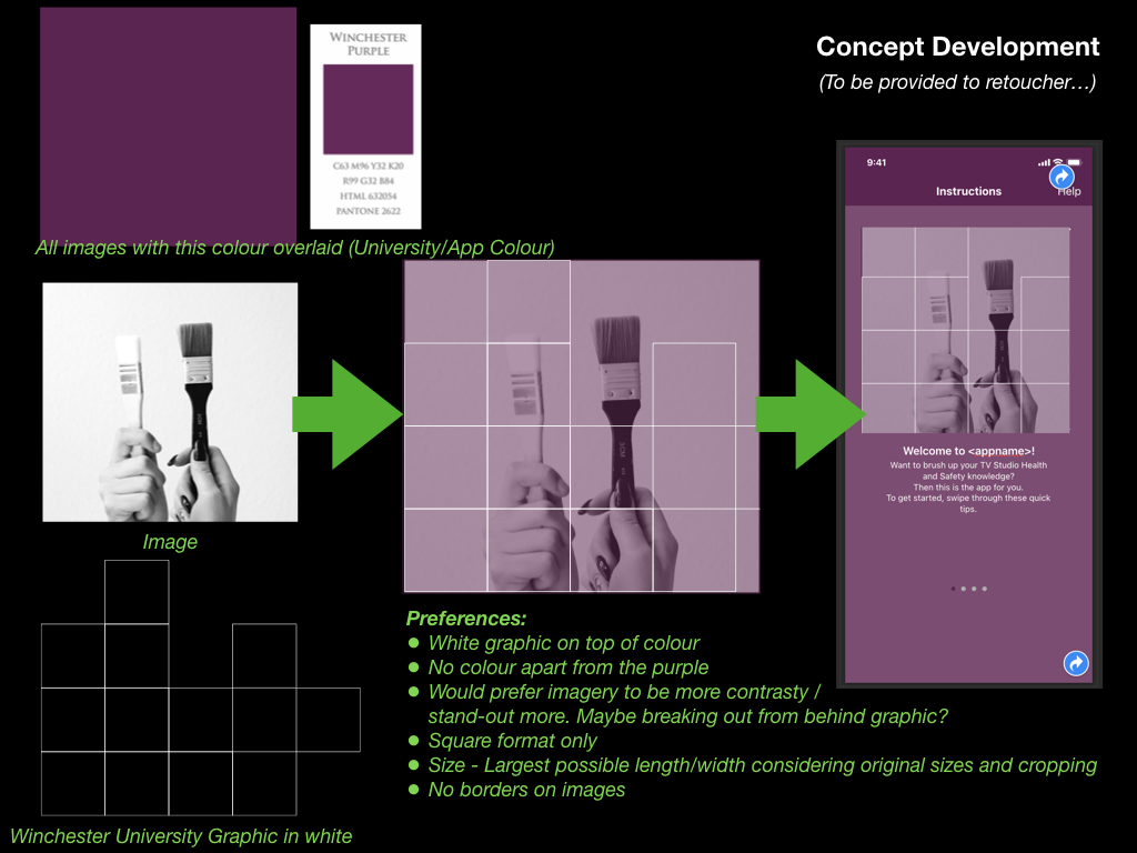
I contacted the retoucher, Rashpal Gurm, to brief him and attain a quote for the work. Upon agreement, he completed the work and delivered the images to me, ready to be included within the app’s design.
I was pleased with the outcome of this process, and feel that the retouched images further the University’s brand while also relaying a fun and yet simple approach to the purpose of each onboarding screen.
App Icon Design
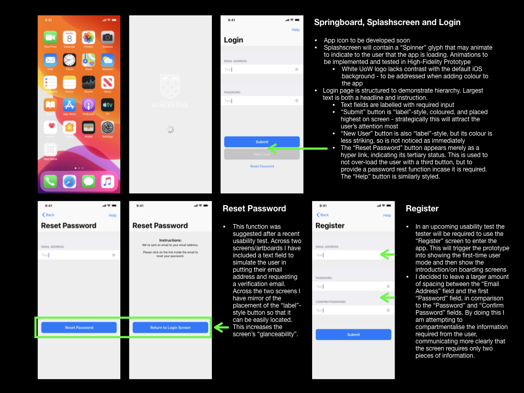
Each of my digital usability tests placed the tester at the springboard/home screen as their starting position, requiring the tester to tap the app icon to launch the app within the prototype. To increase the sense of realism here, I decided to create a mock up of the app icon.
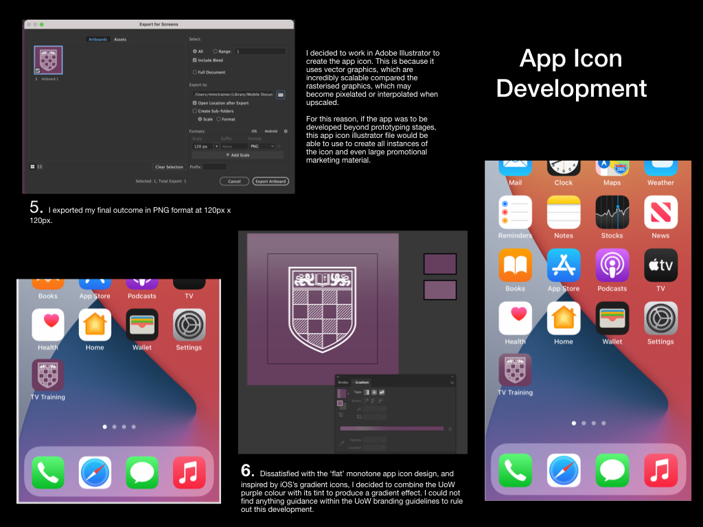
I was interested to learn all of the constraints that Apple place upon designers for something as small as the app icon. I followed many of these constraints, such as only including necessary text on the icon (none in this instance), producing the icon in PNG format (to permit transparency when imported into iOS), and creating the icon at the correct 2x resolution for prototyping on an iPhone 11.
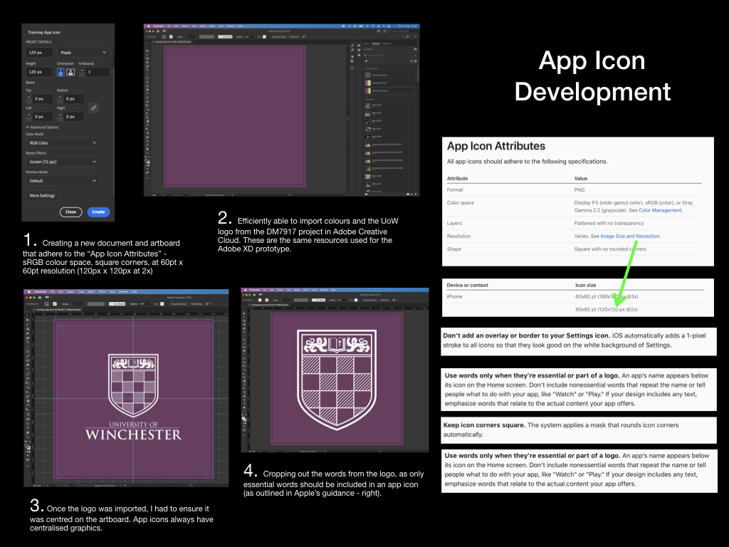
Not satisfied completely with a “flat” colour design, I decided to introduce a gradient to the icon, as to assimilate better with the current trend on iOS devices.
I decided upon the temporary app name “TV Training,” which could be used throughout further prototyping – making it easy for usability testers to discern the app from others on the springboard/home screen.
High Fidelity Prototype Development
The remedial actions required from my fourth usability test were mostly small changes, such as the names of different screens within the app. However, the feedback I gained also suggested that I should introduce a tab bar to the application, rather than forcing users to rely on a “Hamburger” menu for wayfinding. This change would intend to improve user navigation within the app and the discoverability of the Revision section.
To reach this point I decided to rebuild the prototype using Adobe XD rather than Apple Keynote. This change would permit me to carry out a usability test that allows the tester to use gestures such as swiping, and to test animations between different screens.
I hadn’t used Adobe XD before, so, admittedly I relied on several YouTube tutorials to grasp the basic concepts and controls.
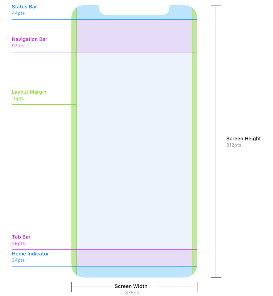
I began by downloading Apple’s Human Interface Design Guidelines so that I could access basic user interface resources that I could create a basic layout from. Further research on the Reddit user interface/user experience community revealed a more accessible set of guidelines for designing for iOS; this included guidance on adhering to strict layout conventions (including 16pt margins, and correct placement of both the navigation and tab bars).
Source: Denis Rojčyk
I needed to closely consider the sizing of the iPhone 11 screen that I will be using for my usability tests. When designing for iPhone displays the designer must use “points” (pt) as the unit of measurement; points are a resolution-independent measurement, which allows for scaling between different iPhone displays. With future development in mind, I developed this prototype at “1x”, where 1pt = 1px (pixel). The iPhone 11’s display is known as a “Retina display” and thus has higher pixel density – I would need to upscale my prototype when exporting by 2x to meet this requirement (Mynttinen, 2020).
I was also made aware of Adobe XD features such as responsive resizing, however as a newbie to the software I decided that this would be a feature for a future prototype, alongside the ability for the user to resize on-screen text.
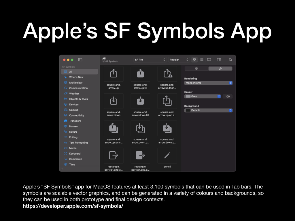
I found the glyphs to complete the navigation and tab bars within Apple’s “SF Symbols Beta” app on macOS. This is essentially a library of glyphs used across Apple’s operating systems. The glyphs I chose would be used for the sections of my tab bar, and the “back” button in the navigation bar. As these are “wayfinding” methods I had to consider how well each glyph communicated its functionality. For example, as the hazard perception tests within the prototype are videos, I decided to use a “play” triangle glyph for the “Start a Test” tab bar section. Similarly, I decided to use the ellipsis glyph for the “More” menu, as this is a common convention across iOS apps. By taking this approach I reduced the need for the user to guess the functionality of each glyph – instead opting to use their prior knowledge of symbols used in other media.
With the layout established, I set about implementing the University of Winchester colour palette and creating a dark mode, much akin to the previous prototype. This process was much quicker using Adobe XD, as it had some efficient features that enabled me to extract colour palettes from images and to quickly apply them across all artboards in the prototype. The same methodology was also applied to typefaces; it was incredibly quick for me to locate the typefaces in Apple’s Human Interface Design Guidelines, extract the typeface weightings and sizes that I needed, and then apply them across all of my artboards/screens.
Artboards that contained repeating elements such as the Available Tests, Revision, and Results screens, could be quickly created using the Repeat Grid function in Adobe XD. This function would intelligently recognise patterns in the placement of shapes, images, and text fields, then offer to repeat them. Although I struggled with this method at first, I can see how efficient functions like this speed up the process for a User Experience Designer to produce a quick digital prototype.
Filling the prototype with copy and placeholder images was also very efficient in Adobe XD. I prepared the copy into a basic text file and then dragged this information to the correct artboard – the information would then automatically populate the correct fields. This negated the need for me to import text, or copy and paste repeatedly. I photographed a variety of items that are referenced in the current the TV Studio training provision; items such as hard hats and trailing cables, which could be imported into the prototype. Importing images worked in a very similar fashion, provided I had numbered them correctly.
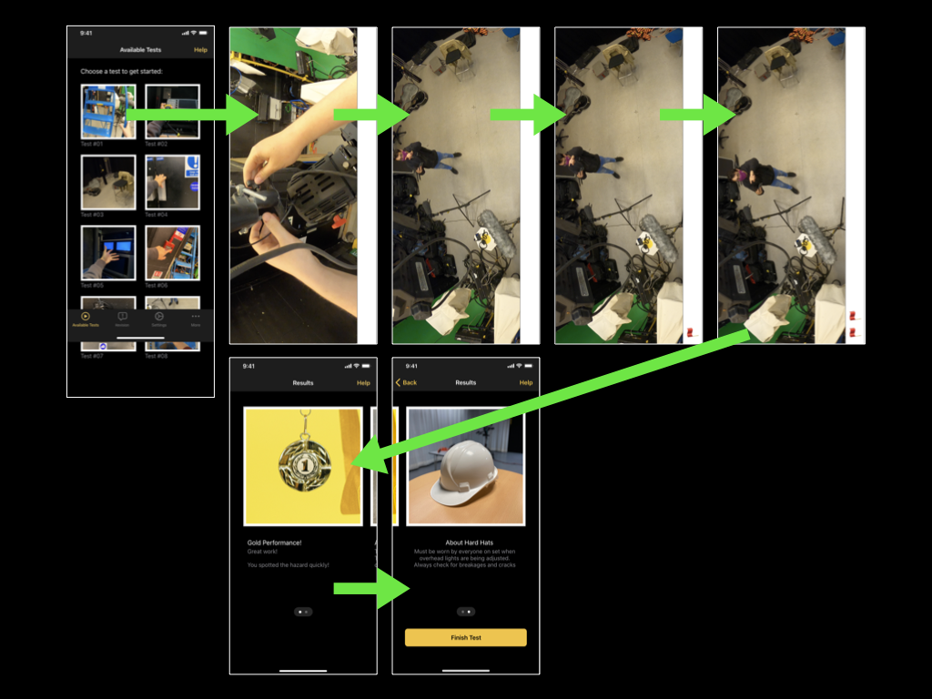
In collaboration with a fellow technician, I also filmed a very short prototype of a hazard perception test. I didn’t want to spend too much time planning the test, as the mobile application itself is the main focus of my project, however, by equipping a Go Pro to the technicians hard hat we were able to film a short test video.
The video features a first-person perspective of making an adjustment to an over-head light. The hazardous scenario comes to light when the technician looks at myself, stood on the studio floor and not wearing a hard hat – a clear violation of the TV Studio’s Health and Safety rules. Unconcerned about the video’s sound (due to it being a first prototype), the technician can be heard talking to himself (getting into character), while I can be heard directing him.
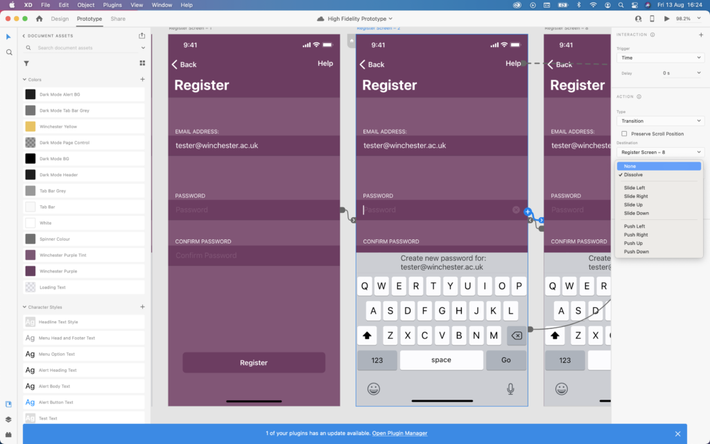
The final aspect of the developing process for this prototype was to implement links between pages and add animations. These animations would take place once a user had tapped on a hyperlink, and for this reason, it was important for the animations to communicate correctly. When selecting a tab in the tab bar there would be no animation – the user is taken straight to their destination promptly, causing the application to feel fast and responsive.. However, when tapping on a test icon on the Available Tests screen, I have decided that the test video should “push-in”/slide on-screen from the right. I hope this animation prompts the user to rotate their phone (as if the video slid onto the screen from the bottom) – hopefully, I will receive feedback on this from the next usability test.
I’ve also used the swiping gesture in combination with the auto-animate feature in Adobe XD to simulate the effect of swiping across paged information on a screen. For example, on the revision screen, the user will be able to swipe their way through sets of tips that they believe are all on the same screen, however behind-the-scenes they will be navigating between different artboards/screens in Adobe XD.
Finally, Adobe XD features a handy mobile application for iOS, which I planned to use for the final usability test. It allowed users to preview the prototype as if it were a real app on their phone. I expected that this would be an improvement upon using Keynote for prototyping, as the tester would be able to complete the usual gestures they become accustomed to on current touchscreen devices. They could also view all glyphs and animations as if they were native on the device.
Usability Test 5
I produced a final usability test for this module, to be conducted using the high-fidelity prototype. The task requested the tester to register a new account within the TV Training app, revise the TV Studio rules, and then complete a hazard perception test.
This task would be prompted by the following contextual statement, which gave the usability tester freedom to navigate the application in a way that felt natural to them:
“You have just downloaded the TV Training application for the first time. You do not yet have an account on the application, but would you to revise the TV Studio rules, and complete the first available test”
I will be recording the full usability test so that I can produce a final usability test report.
Overall, the final usability test proved the tester’s ability to navigate the application, despite only having a contextual statement, have pleased me. They moved through the “Revision”, “Available Tests”, and “Results” section with ease, and were able to locate the necessary information efficiently. I noticed that some unexpected behaviour occurred when the tester tried to tap on a rule in the “Revision” screen, but this did not derail their experience. I was most pleased to see that the tester swiped through paged screens as expected. I suspected that the onboarding process and page indicator element evidenced this possibility to the tester, and then they identified it correctly on subsequent screens.
You can read the full report for Usability Test 5 here:
Accessibility Audit and Statement
Completing an Accessibility Audit would inform the app’s Accessibility Statement and future development (potentially in my next module). For public sector bodies such as the University of Winchester, the requirement to make applications and websites “perceivable, operable, understandable and robust” is mandated by the Public Sector Bodies (Websites and Mobile Applications) (No. 2) Accessibility Regulations 2018. It is possible that the app may not need to adhere to these regulations. The UK Government state: “mobile apps for specifically defined groups like employees or students are not covered by the regulations,” however, completing an accessibility audit will be a good learning experience for me and will highlight areas for improvement that could be implemented in my next module, DM7903 Design Practice (Government Digital Service, 2018).
An Accessibility Audit would usually be carried out by an external, trained professional, as this would ensure high quality and impartial assessment against the “WCAG 2.1 AA accessibility standards”. In the interests of my learning journey, I completed the audit myself and recorded reflective thoughts, as detailed in the below blog post:
Leading on from my accessibility audit, I decided to write an accessibility statement for the TV Training application. Although I did not strictly need to do this at the prototyping stage, I was interested in the accessibility of digital technologies, which I may focus on in my next module, so felt that it could be an interesting exercise to complete.
Before this project, I was unaware of accessibility statements and their purpose, although my exploration into colour contrast ratios led me to the Web Content Accessibility Guidelines (WCAG) and the UK Government website. Handily, the UK Government website includes a template for writing an accessibility statement, which has notably been used by other developers of websites and mobile applications, such as the NHS (The UK Government, 2020; NHS, 2020).
From reading example accessibility statements, I observed that the information in an accessibility statement needed to be presented clearly and concisely, stating the features and limitations of the application concerning accessibility. The language was plain (including little terminology as to be more accessible to users), and directed users to contact the developer, should they have further queries or suggestions.
As someone who regularly makes use of accessibility features such as screen readers and dictation functionality, I could appreciate why the UK government is enforcing the need for accessibility statements in the Public Sector Bodies (Websites and Mobile Applications) (No. 2) Accessibility Regulations 2018.
I have written the accessibility statement for the TV training application in the below blog post. In part, I have not adjusted the UK Government’s template, as the wording relates to legalities, such as the “enforcement procedure” section. This document would be placed on my portfolio with the most recent application prototype.
Deliverables
As my project draws to a close, I have turned my focus to delivering a final outcome. Similarly to how a prototype could be delivered in industry, I am going to be supply a link to an online version of the high fidelity prototype, created in Adobe XD. In industry, this link could used to present the prototype for client or stakeholder review, or to inform a developer who will be tasked with creating the mobile application.
The process of developing this prototype through several iterations, from paper to high-fidelity, has given me a new-found appreciation for working in the user-experience field. Studying feedback on each prototype and completing usability tests has been instrumental to the decision making between iterations of the prototype, I intend to carry forward this method of working. In particular, I felt a great sense of achievement when I resolved the communication issues between the prototype and the usability tester relating to the onboarding process. There is potential for me to focus more heavily in this area during the upcoming DM7920 Design Communication module, however, in the meantime I plan to focus my attention on accessibility in the next module, DM7903 Design Practice. Design features such as responsive screen sizing, text resizing, and colour contrast, were all touched upon during this module, however I would like to expand my knowledge on them further, while building my understanding of how design can be more inclusive.
For further reflection, please read my Reflective Process Report.
The high fidelity prototype of the TV Training app for the “New User” task flow can be accessed at the following link:
https://xd.adobe.com/view/9bd68b07-e26a-4d55-95d6-1893b5c8692b-ce85/?fullscreen
References
Abreu, L. (2014). Why and How to Avoid Hamburger Menus – Luis Abreu – Product Design. [online] lmjabreu.com. Available at: https://lmjabreu.com/post/why-and-how-to-avoid-hamburger-menus/ [Accessed 29 Jul. 2021].
Apple (2019a). Fonts – Apple Developer. [online] Apple.com. Available at: https://developer.apple.com/fonts/ [Accessed 23 Jul. 2021].
Apple (2019b). Scroll Views – Views – iOS – Human Interface Guidelines – Apple Developer. [online] developer.apple.com. Available at: https://developer.apple.com/design/human-interface-guidelines/ios/views/scroll-views/ [Accessed 2021].
Apple (2019c). Tab Bars – Bars – iOS – Human Interface Guidelines – Apple Developer. [online] Apple.com. Available at: https://developer.apple.com/design/human-interface-guidelines/ios/bars/tab-bars/.
Apple (2019d). Typography – Visual Design – iOS – Human Interface Guidelines – Apple Developer. [online] Apple.com. Available at: https://developer.apple.com/design/human-interface-guidelines/ios/visual-design/typography/.
Cole, S. (2019). Dark Mode Isn’t “Easier on the Eyes” for Everybody. [online] www.vice.com. Available at: https://www.vice.com/en/article/ywyqxw/apple-dark-mode-eye-strain-battery-life [Accessed 23 Jul. 2021].
Government Digital Service (2018). Make Your Public Sector Website or App Accessible. [online] GOV.UK. Available at: https://www.gov.uk/guidance/accessibility-requirements-for-public-sector-websites-and-apps.
Helcoop, C. (2021). How Virtual Reality Could Transform the Training Provision for the TV Studio at the University of Winchester’s Multimedia Centre. The University of Winchester.
Limcaco, J. (2014). Apple and Hamburgers. [online] Medium. Available at: https://medium.com/design-philosophies/apple-and-hamburgers-a17e4099fada [Accessed 29 Jul. 2021].
Material Design. (n.d.). Material Design. [online] Available at: https://material.io/components/bottom-navigation [Accessed 29 Jul. 2021].
Material Design. (n.d.). Material Design. [online] Available at: https://material.io/design/communication/onboarding.html#top-user-benefits-model [Accessed 30 Jul. 2021].
Mynttinen, I. (2020). The iOS Design Guidelines. [online] Ivo Mynttinen / User Interface Designer. Available at: https://ivomynttinen.com/blog/ios-design-guidelines [Accessed 8 Aug. 2021].
NHS (2020). Accessibility Statement – NHS website. [online] NHS.uk. Available at: https://www.nhs.uk/accessibility-statement/.
Pexels. (n.d.). Legal Simplicity. [online] Available at: https://www.pexels.com/license/ [Accessed 30 Jul. 2021].
Snyder, C. (2003). Paper Prototyping : the Fast and Easy Way to Design and Refine User Interfaces. San Francisco: Morgan Kaufmann Publishers.
The UK Government (2016). Making Your Service accessible: an Introduction. [online] Gov.uk. Available at: https://www.gov.uk/service-manual/helping-people-to-use-your-service/making-your-service-accessible-an-introduction#what-to-do-in-alpha [Accessed 22 Jul. 2021].
WebAIM (2021). WebAIM: Contrast and Color Accessibility – Understanding WCAG 2 Contrast and Color Requirements. [online] WebAIM: Contrast and Color Accessibility. Available at: https://webaim.org/articles/contrast/#intro [Accessed 8 Jul. 2021].