DM7900 Week 5

As a formative piece of assessment, this week I gave a presentation about my plans for the DM7900 module and the rest of the MA programme. 

I began by listing my learning goals: 

  1. Research UCD (User Centred Design) theory in relation to accessibility and education
  2. Practise iterative design processes as well as prototyping and working with personas
  3. Develop proficiency in specialist software packages such as Adobe XD, Figma
  4. Practise research, analysis and project management skills required for PhD study

I felt well prepared for the presentation as I could include my study plans, which I’d been working on for quite some time. I explained the modules I intend to study, my motivations for studying them, and presented a Gantt chart to explain how I’d tackle these in the following two years.

A considerable amount of my presentation explained how I plan to learn a variety of software packages as well as some key concepts within UX design, which I currently understand very little about. I drew upon David Kolb’s Experiential Learning Cycle as well as Jean Lave and Etienne Wenger’s Community of Practice model to address two strategies that I’ll use to pick up these skills; this was well received. My lecturer felt that I’d evidenced enough material to create a written proposal for submission.

As part of the feedback I gained from this, my lecturer let the group know that we have an educational licence for Invision Studio, a software package for prototyping mobile applications.

My lecturer also mentioned that we could work together as I work on my PhD application. She’s currently studying her own PhD, so it’d be really useful for me to work alongside someone who has experienced the processes before me, so I’m looking forward to that!
DM7900 Week 4

This week’s lecture focused on Accessibility issues on the web, such as functional and clinical disabilities. Barriers to accessing digital content can stem from visual, auditory, mobility, dexterity, and cognitive function difficulties.

This is a subject area that I currently know little about, yet I’d love to address it within future modules on the course.

Following the lecture, I’ve evaluated the BBC Good Food website in accordance to the W3C Accessibility Principles. I enabled tab-navigation and voiceover functionality on MacOS and Safari, then avoiding looking at my screen.

Initially, I found the experience frustratingly slow. Waiting for the voiceover to stop speaking before pressing tab again really lengthened the process of exploring the landing page. Tabbing faster just seemed to cause a loud din, which further irritated me.

However, bearing with the process for a few more minutes, I began to  appreciate the patterns of speech within the voiceover: ‘Link. Parsnip Recipes’ or ‘Visited. Link. Parsnip Recipes’ if I had visited the page before. 

Images were correctly captioned, so the voiceover explained what was depicted, and I was able to build a mental picture of the website. 

One limitation of the voiceover was its pronunciation of some common words like ‘Favourite’. After some research, it appears that this could have been caused by using an incorrect lang attribute within the page’s code.

I also found some issues in relation to colourblindness and colours chosen for rollover button on the website, however this wasn’t widespread. Emboldening text, or changing the shape or size of the button would have been a more suitable roll-over animation.

Readability was good, which could be expected as the website appears to use the BBC’s sans serif font, “BBC Reith”.

When designing the mobile and web experiences that I have in mind for later in the course, I’ll need to bear these accessibility considerations in mind. I’m particularly interested to apply this same evaluation to a virtual learning environment, such as Canvas – lack of consideration in this area could be a large barrier to learning for some students.

In the meantime, I’ll try to find some books in the University’s library addressing accessibility in User Experience Design.

DM7900 Week 2

In this week’s lecture, we were introduced to the Design Hierarchy of Need, which is based upon the Hierarchy of Need, coined by Abraham Maslow. 

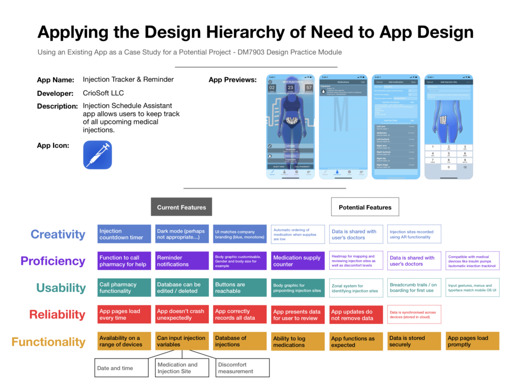
My Case Study, applying the Design Hierarchy of Need to App Design

The Design Hierarchy of Need places design features into five categories based upon their importance. The order of categories, from most essential to least, reads: functionality, reliability, usability, proficiency, and creativity.

As part of my lecture, I’ve analysed an injection tracker application by CrioSoft LLC, which is available in the Apple App Store, applying the principles of the Design Hierarchy of Need, which is pictured above. I assessed the current features and placed them in the categories according to how fundamental I believe they are to the product.

To go one step further I’ve also considered some potential features that I might include as updated if I was a developer of the application.

In practice, the Design Hierarchy of Need is useful because developers can focus on achieving features that are in the functionality, reliability, and usability categories of the scale first. This would allow them to distribute their application to the public for testing and even potentially begin developing a revenue stream from it before completion. From there they could continue working on less essential features while the application is live, feeding these to users via incremental updates.

I hope to make use of this knowledge in a future module. I definitely plan on either creating a website or an application at some point during the course. I imagine that as each module is only 12 weeks long I will not be able to create a fully-featured final outcome. I will likely need to make and justify decisions in terms of which features are created first, and which features are seen as required before the submission deadline.