DM7917 Week 4 – Wireframing Iterations

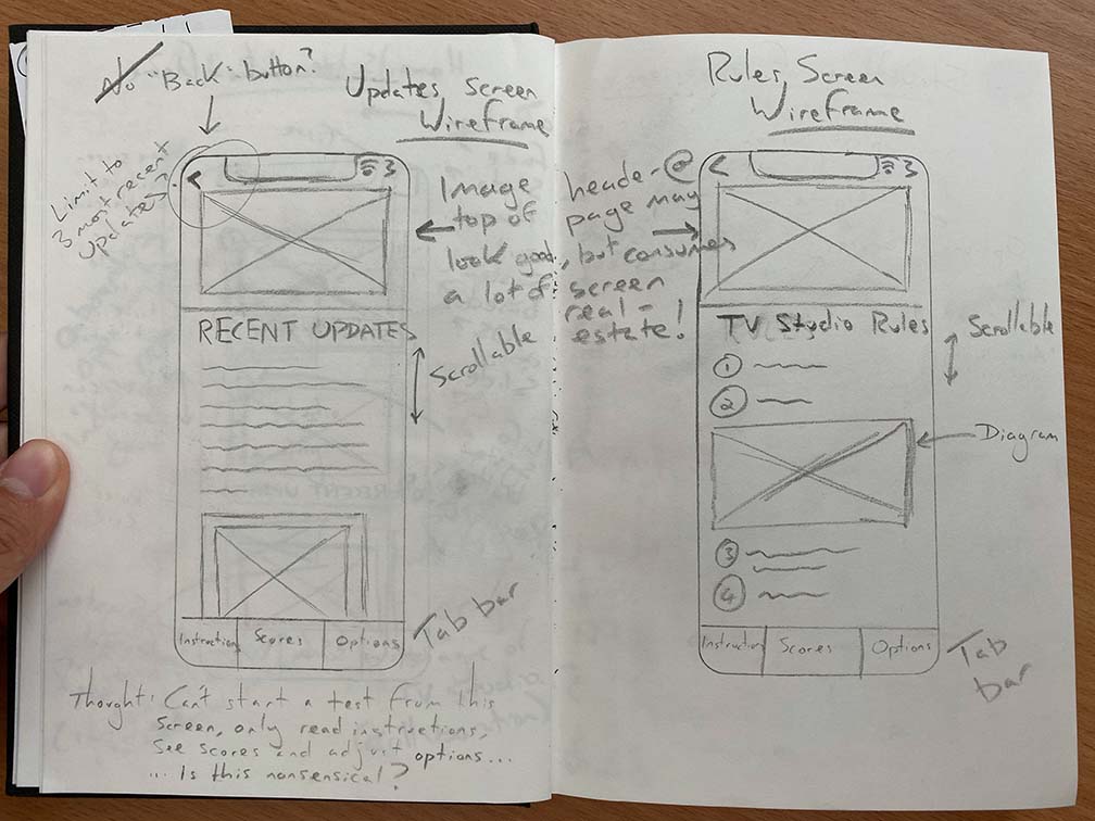
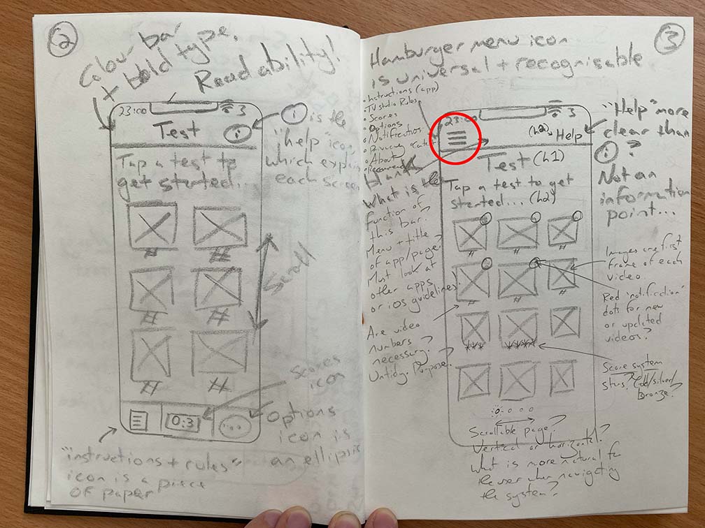
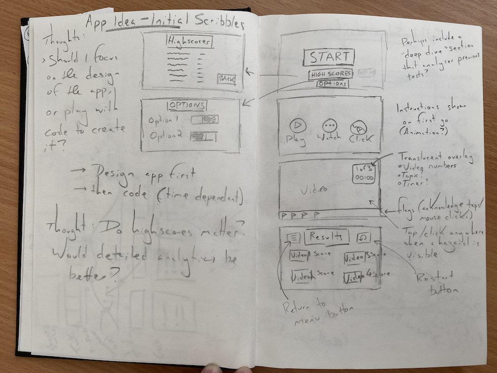
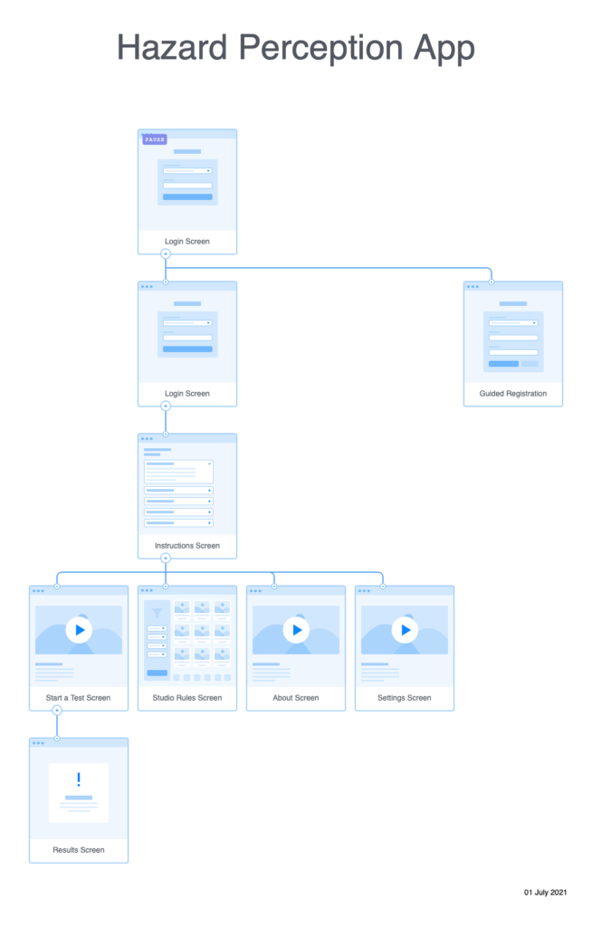
Prior to producing my first paper prototype, I have reviewed some of my initial wireframes, primarily to address the wayfinding mechanism. I was dissatisfied with having both a back button and a tab bar-it seemed to make more sense for me to use a hamburger menu as this would unify the functionality of both of them. The app itself has a flat information architecture (it doesn’t have many levels), and so all screens could be viewable in a hamburger menu without then need for the user to scroll. Pressing a back button would amount to the same outcome as pressing the hamburger menu and selecting the screen that the user would like to see. This is one more step/tap however it does remove the need for two user interface elements.

The other aspect of my wireframes that I wanted to revisit was the scrolling behaviour. In my last wireframes I decided to use vertical scrolling and stay consistent with this to not confuse the user. However I now understand that horizontal scrolling comes with a user expectation that it will reveal ‘stages’ rather than a long reveal one long screen/page. Provided that I use a page control element such as a scrolling indicator, uses should understand that they need to scroll horizontally rather than vertically, see the below quote from Apple’s Human Interface Design Guidelines:

“Consider showing a page control element when a scroll view is in paging mode. A page control shows how many pages, screens, or other chunks of content are available and indicates which one is currently visible. If you show a page control with a scroll view, disable the scrolling indicator on the same axis to avoid confusion.”
Source: https://developer.apple.com/design/human-interface-guidelines/ios/views/scroll-views/

Four iterations of the “Start a Test” screen

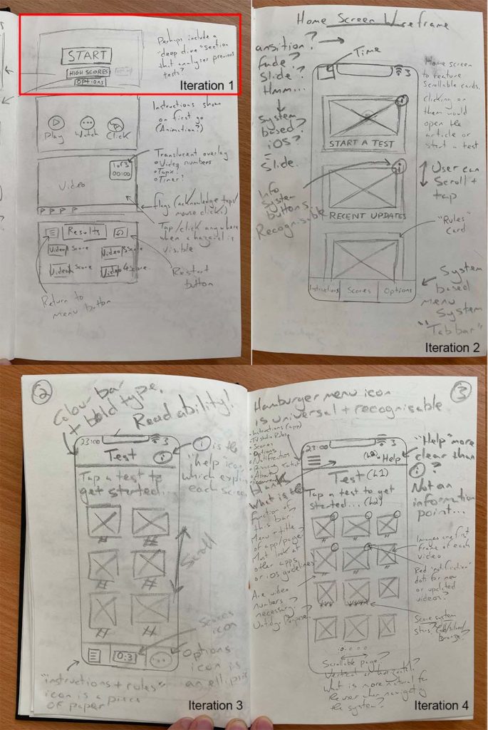
Horizontal scrolling could be used on the “Start a Test” screen to divide tests into sections based upon the difficulty level, this is illustrated in Iteration 4. Scrolling behaviour should be an indicator that psychologically divides the tests into groups.

Wireframe of the Scores/Results screen depicting use of horizontal scrolling

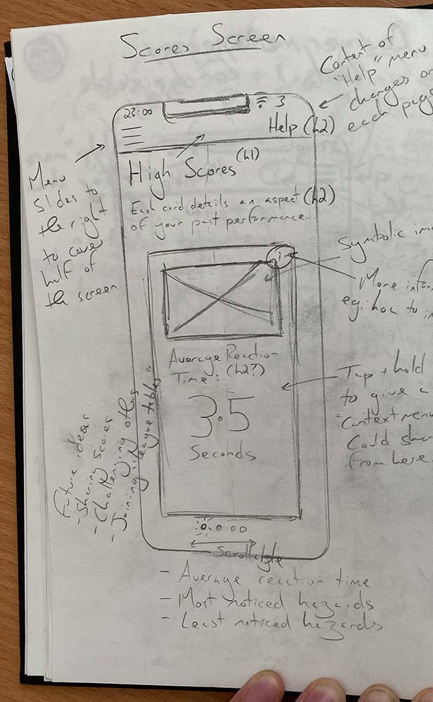
Horizontal scrolling could also be used on the Scores/Results screen to provide different metrics such as average reaction time, most noticed hazards, and least noticed hazards.

Final thought – Could the Instructions screen be presented in steps using the horizontal scrolling behaviour. A short amount of steps could be accompanied by a images in a process known as “Onboarding”. Onboarding presents snippets of information alongside minimalist imagery to present a fun, glance able and informative experience to help users understand a process.

Further information on Onboarding in iOS is available here: https://developer.apple.com/design/human-interface-guidelines/ios/app-architecture/onboarding/

DM7917 Week 4 – Creating Initial Wireframes

Note: This set of wireframes were created shortly after my first iteration of the User Flow Diagram for the New User Task Flow.

To produce this first set of wireframes I relied heavily upon the product research I had recently carried out. I tried to bring across many of the common UI elements that I had seen in similar apps, and combined those with standards that I found on Apple’s Human Interface Design Guidelines, found here: https://developer.apple.com/design/human-interface-guidelines/

When necessary, pages would be vertically scrollable, and this would not be deviated upon as that could be confusing for the user. In the interest of maintaining consistency a coloured menubar would feature at the top of each page, including a page title and an information/help button.

Wireframes featuring a tab bar (bottom of each screen) and back button (top right of each screen)

To aid navigation I have experimented with including a tab bar at the bottom of each screen as well as a back button in the top left. Both of these appear to be common features of many popular apps on the iPhone so would be recognisable and users should instantly know how to interact with them. However, I must consider that a tab bar only has enough space for a few buttons, and if using glyphs I must make sure that they are symbolic and recognisable of the screen that they will link to-otherwise this will cause noise that will confuse the user. Apple do supply a set of glyphs as part of the system APIs, which I could take advantage of. It may make more sense to include a hamburger instead of tab bar, as this can hold more links to other pages within the app.

In their Human Interface Design Guidelines, Apple address the limitation on tab numbers: “If some tabs can’t be displayed due to limited horizontal space, the final visible tab becomes a More tab”, which is a viable solution, and could serve as a hamburger menu of sorts.

As a final word on tab bars, I think I will need to put more research into this element, as navigation is going to be a key point of disseminating information across the app.

First and second iterations of the “Start a Test” screen

Users will be able to start a new test by tapping on a test thumbnail – each test thumbnail will feature an image which is the first frame of the video, alongside the test number and a star rating based upon the user’s previous performance (if they have already attempted that test). This idea is adopted directly from one of the apps that I have researched, and is notably used on other apps such as Duolingo, so I hope that it’s meaning will be instantly recognisable.

I will produce further wireframes over the next week as I review the information architecture and wayfinding mechanisms. I’m also very sure that the user testing process throughout low and high Fidelity prototypes will also see me iterate these wireframes further.

DM7917 Week 4 – New User Task Flow

In this blog I’ll be outlining my thought processes on creating my first user flow diagram. This particular diagram is focused on the task flow for a new user who is moving from the registration process to reviewing their performance in their first hazard perception test. I will also explain how I iterated upon this first attempt to include further functionality such as wayfinding mechanisms.

To produce the flow map I used the website “Flowmapp.com”. The website was easy to use as the controls were very intuitive. Standardised, universally recognised symbols were included, such as diamond shapes for decision-making and rounded rectangles for user input.

Comparison of first and second iterations of the new user Flow Map

In my first iteration I included a welcome screen, which might feature elements such as the University logo and buttons to allow users to login or register a new account. Later in my second iteration I realised that the welcome screen would not be needed as it had a little functionality. It would make more sense for users to immediately visit the login page and then be prompted to register a new account if they did not yet have login credentials. 

Once the registration process is complete, the user will be brought to the instructions screen. The screen will outline the basic flow for a user to complete a hazard perception test and review their results. Once viewed the user will proceed to the “Start a Test” screen, where they can select a test, complete it, and review their performance on the “Test Results” screen. 

Prior to taking the test, I realised that some new users may wish to revise the TV studio rules. To integrate this I added a wayfinding mechanism to my second iteration of wireframes in the form of a Hamburger Menu. Hamburger Menus are universally recognised by three horizontal lines. Including a hamburger menu would also allow users to move between different pages fluidly and in a non-linear fashion. I hope that being able to move between screens so freely will minimise any pain points relating to navigation around the app. 

Extract from second iteration of wireframes for the application with highlighted hamburger menu

My next task is to use this information architecture to visualise each screen in the form of a wireframe. I am particular keen to explore how I can integrate the menu system alongside all of the other elements in the Content Inventory.

DM7917 Week 3 – Initial Sketches and Information Architecture

This week I’ve been working on some sketches for the “Hazard Perception TV Studio Training” app idea. Having carried out a research process already, my intention with these initial sketches was to stimulate my thought processes – “How many screens will the app need?”, “What functionality should this application have?”, “Which elements would need to be on each page?”, “How will the user interact with each element?”

This first page of sketches brought about a lot of thoughts, which was overwhelming, and didn’t produce many comprehensible design solutions. I decided that I needed a more methodical workflow to make sense of all the variables first, so I began to plan the Information Architecture; this would include a “Structure of Experience” akin to a Site Structure Diagram, a Content Inventory, and a User-Flow Map. I did this by first producing a small mind map of the screens I would need, expanding on this to produce a Content Inventory, then using the website flowmapp.com to visualise a user’s flow between each screen.

Creating the Structure of Experience allowed me to take my initial mind map of screens and visualise how they might link together. By producing a holistic view of how each screen would link, I could make sure that the Information Architecture of the app was logical and that there were no structural issues.

The Content Inventory was my first opportunity to think expansively about which app elements belonged on each screen. I was aware that this process could require me to adjust my Structure of Experience, as I may have omitted required screens – one good example of this is that I did not include a Settings screen, and realised this when I considered that a “Dark Mode” option could be desirable.

Production of the User Flow map was the most critical part of producing the information architecture. It required me to revisit both my content inventory and Structure of Experience, as considering how the user flowed between each screen revealed a lot of omitted elements. My first challenge was to realise that new users could not login as they did not have an account; I would need to factor in a “Registration” page and the required elements such as email and password fields. This process also reminded me that apps almost always have menus to allow the user to navigate between pages – this is a critical part that I had not yet considered; I have not included the menu functionality in this first iteration, but will include it soon.

I am sure that I will need to revisit each of the tasks again as the app progresses through initial design and iteration processes, however for now I feel much more prepared to produce sketches and wireframe diagrams.

DM7917 Week 2 – Product and Market Research

In terms of Market Research, I intended to discover whether there were similar apps already in the market for users to access, and if not, whether there were similar websites or training solutions on offer. Although this module does not require me to be concerned with the marketing of the app, I do believe there are some valuable learning outcomes here, including how similar products are being distributed to users.

Secondly, by conducting some initial product research I could make observations about features, user experience/user interface design, and accessibility issues. 

I have collated my research of three similar mobile applications, and three similar websites- a PDF is downloadable here: https://www.dropbox.com/s/7bhzwp33imt2066/Market%20%26%20Product%20Research.pdf?dl=0

Moreover, I concluded with the following issues and thoughts:
Accessibility

  • All applications researched on the iOS platform use Apple’s default system typeface, “San Francisco”; a Sans-Serif typeface, used throughout iOS and MacOS. Lack of serifs increases legibility (Apple, 2019).
  • Instructions were often brief and to-the-point. Quick to read, requiring little of my time to get started. These were sometimes in the form of a ‘bread crumb trail’, whereas in other cases these were short, written instructions, to be read before proceeding
  • Assessment activities were usually short, about 1 minute each (probably short enough for attention issues – although arguable driving will require focus for much longer), with only one hazard for the user to spot
  • Many UI issues present accessibility challenges:
    • Two apps featured inconsistent placement of back/exit buttons in apps (right during playback, left on menus)
    • One app featured text hierarchy that was difficult to discern. Colours and sizes used for aesthetics rather than function. 
    • Many colour contrast issues are notable in current Hazard Perception tests, which may present a barrier to learning and readability issues for students with visual impairments 
    • One app did not feature any ‘help’ or offer and information access to explain each menu screen, beyond the initial breadcrumb trail
    • One app featured buttons that were linked to external pages (loading up Safari and taking the user out of the app), while others buttons would not. Inconsistency was irritating to use, and felt jarring
    • One app used system alerts for functionality of the app – I felt that this was poor UX design, as I momentarily thought there was a problem with my phone or the app. This feature would also limit the text size, typeface, and colour contrasts to the system defaults, rather that allowing the experience to be tailored to the user’s needs in-app
    • One app marked completed and passed tests as a Red-cross, which is a cultural signifier of failed test, or negative outcome. Confusing.

Privacy

  • Apple’s “Privacy Nutrition Labels” allow users to see which data is being collected by App developers. This form of regulation must be considered in the creation of apps for the Apple App Store. Many apps had not completed their “Privacy Nutrition Label”, meaning that they could not have been updated recently, as the labels themselves are mandatory (Peters, 2021).

Further Thought

  • Does the small screen size have an impact on reaction times? Is this factored into this assessment? Questionable accuracy/reliability (not sure). The user could also (without realising) hinder their own results by having their display settings too dark

References

Apple (2019). Typography – Visual Design – iOS – Human Interface Guidelines – Apple Developer. [online] Apple.com. Available at: https://developer.apple.com/design/human-interface-guidelines/ios/visual-design/typography/.

DM7917 Week 2 – Written Objectives and Learning Goals

As I begin this next project, I’ve decided to review my Learning Goals. I’ve listed each Learning Goal and mapped one or two processes that I will carry out to achieve them. I intend to explain this in more details in my written Proposal.

  1. Research User Centred Design (UCD) Regarding Accessibility, Education and Training
  • Identify flaws within the current TV Studio training assessment process and design a digital assessment solution to improve them
  • Examine and note accessibility flaws in existing hazard perception applications. Improve upon these floors in the development of my own application
  1. Practise Research, Analysis and Project Management Skills Required for PhD Study
  • Develop and use an ‘agile’ workflow to manage the development of prototype versions of the application
  1. Practise Iterative Design Processes Including Prototyping and Working with Personas
  • Use collaboration opportunities and prototypes to carry out a process of ‘user-testing’ to inform the development of an application
  1. Develop Proficiency in Specialist Software Packages
  • Learn and use a digital prototyping application such as Adobe XD or Figma

DM7917 Week 1 – Introduction and Project Management

This week I’ve started a new module, DM7917 Emerging Media Student Directed Project, which I’ll be using as an opportunity to improve my project management skills. 

Over the next ~15 weeks, I’ll be producing a working proof-of-concept for a mobile app. The app will be designed to assist students at the University of Winchester to work safely in their TV Studios; it will feature reminders of TV Studio rules as well as health and safety prompts, culminating in a digital assessment experience, much akin to the Hazard Perception tests that learner drivers undertake.

Timekeeping for my previous two modules had been planned and managed on an Gantt chart, however this presented challenges when particular tasks overran, or when new tasks needed to be introduced. Any changes would result in a need to readdress the timing for every future task. On both occasions, this has caused the latter stages of my projects to feel like a mad rush to the finish!

This time around, my initial plans will still be made using a Gantt chart. However, at that point onwards I will be using Trello and an Agile workflow to monitor my progression across each task. A few relevant positives of using an Agile workflow on Trello are:

  • An agile workflow permits me to move tasks back and forth across the workflow as they progress, stall, or need another iteration. Whereas a line model (such as a Gantt chart) would need constant revisions, which is inefficient to revise repetitively
  • All collaborators with a Trello account can view and adjust their responsibilities as I do. They do not need to ask me to make adjustments on their part
  • Collaborators can also see the state of the project; they can see my progression, all collaborators’ progression, and the holistic project progress
  • Tasks responsibility can be passed between collaborators and myself
  • I already have some working knowledge with Trello, so I know how to use its collaborative functionality and ‘power-ups’, such as labels, deadline dates, checklists etc

In the coming weeks I hope to identify some collaboration opportunities as the project progresses, and test out the benefits of an Agile workflow. I will also post some images below of my Gantt chart and Agile workflow.