DM7908 Week 10 – Experimenting with 3D Objects and Blender

This week my focus has been on creating 3D virtual versions of my client’s products (a makeup bag) and pulling these together to create a short video to place on the product page and to emulate an AR experience. In DM7903 I experimented with photogrammetry to create virtual 3D models, importing them into Apple’s Reality Capture software and screen-recording the outcomes; during this time I also dabbled with combining Adobe After Effects and Cinema 4D Lite with the 3D models to emulate an AR experience, but this resulted in very large render times.

Working within Constraints

Using Adobe After Effects and Cinema 4D Lite for this project would not be suitable due to the project constraints. An Adobe subscription is priced between £20-£30 per month, and the learning curve involved in learning both pieces of software would be too large. Instead, I have opted to use a 3D software package called Blender for this project, which is free, requires a smaller learning curve, and has a wealth of free tutorial information online to foster learning.

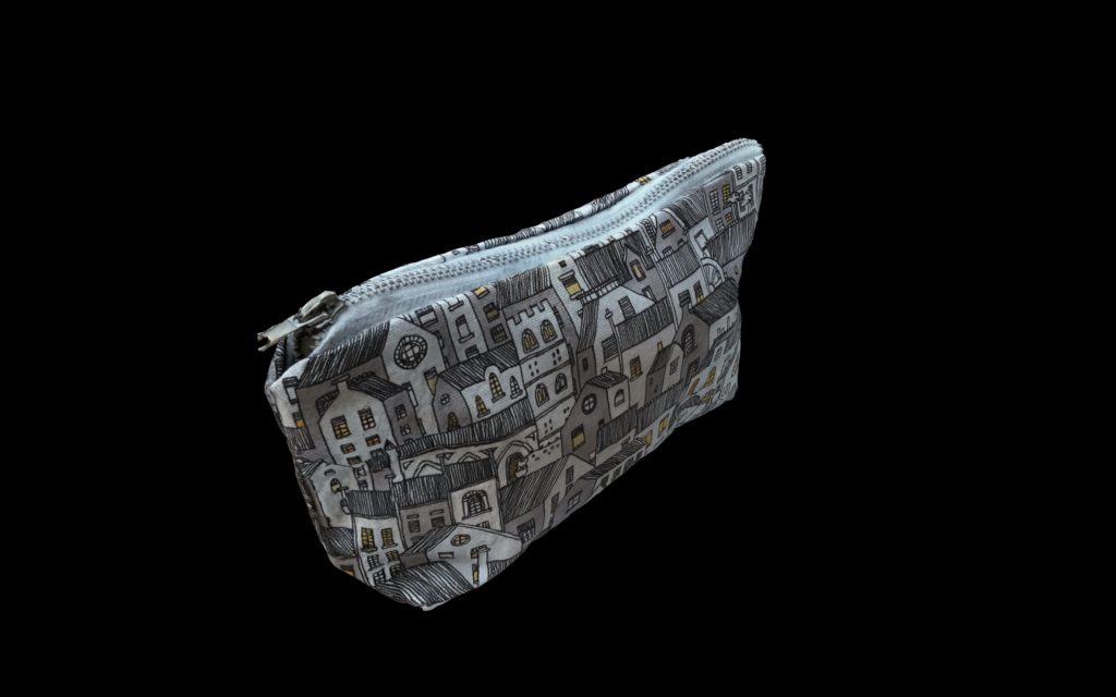
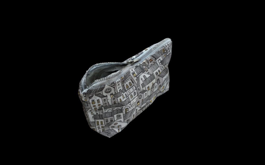
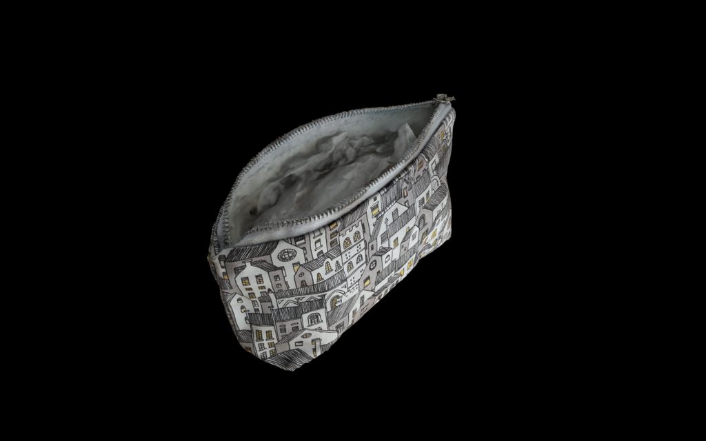
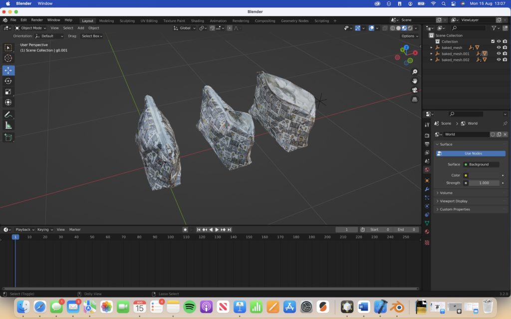
Having never used Blender before, I sat down with lecturer Rob Blofield for a tutorial on using Blender. I had already created three photogrammetry models of a make-up bag in different stages of being unzipped (see below). The tutorial was very beneficial in acquainting me with the user-interface and the possibilities available. The outcome produced in the session was very impressive, involving the makeup bag being animated so that it would effectively zip itself up during the animation; however, this was very complicated and advanced to achieve, so would not be suitable for my client.

Above: Three photogrammetry scans of a make-up bag

First Experimental Render

I decided to use Blender to create a stop-motion photogrammetry animation of the product rotating, tilting, and unzipping. My first attempt is shown below:

Above: My first experimental render in Blender

Step-By-Step Recorded Process and Troubleshooting

I have included a bulletpointed description of my creative process below:

  • Convert .USDZ files to .USDC, simply by zipping the .USDZ file and unzipping it again. This separates the textures from the model as a format that is compatible with Blender
  • Once each model was imported, I assigned the correct texture to each one. I made sure to set the surface parameter ‘Principled BSDF,’ as this would support transparency in the Cycles render engine
  • Then, I adjusted the positioning and scale data of each model so that they were all similarly aligned. Later, when transitioning between each model, their similar positioning should allow each transition to appear smooth
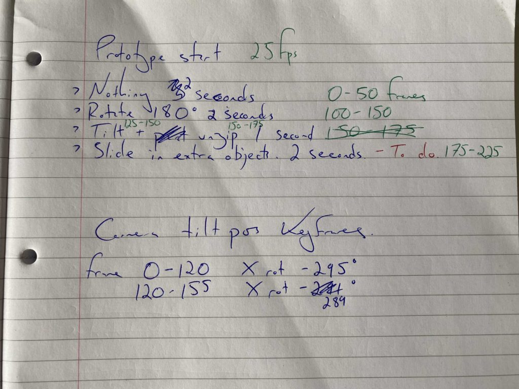
  • Next, using keyframes and the timeline, I began to animate the rotation, tilt, and visibility of each model. Timings of each movement needed to reflect the movement of the user interface in high-fidelity prototype, created in Figma. I noted the timings below in respect to working at 25 frames per second, and worked to those
  • Finally, I set the background for the render as plain white (sRGB colour space, default vector, strength = 2000). I decided to do this so that the resulting render would match the white background of Blossom & Easel’s product page, creating a seamless experience between video and page background.
Above: Three imported photogrammetry models
Above: A working document, noting animations and timings (at 25fps)

The one troubleshooting aspect that I needed to address involved the visibility/transparency of objects. I decided to use the Cycles render engine rather than the default, Eevee, as this handled transparency much better, as when using Eevee the transparency would be presented as solid black objects. Some mysterious black outlines still appeared when using the Cycles render mode, however I was able to address this by increasing the number of Transparency bounces in the Light Paths tab.

Lighting and Camera

When setting up the lighting and camera for the renders, I was able to use my background knowledge from studying a degree in Photography.

For lighting, I used three area lights, one placed above the 3D virtual object (set to 80W), and the other two placed either side of the object (set to 120W). The light above the object would lighten any dark shadows, allowing details to be seen, while the bright lights either side would emphasise the 3D qualities of the object.

The camera would be placed in-front of the object, with the object filling the frame. A 50mm lens would be used to reduce any chance of lens distortion, and no BOKEH effect would be applied, as although this would provide depth it may be self-defeating as it could impact the user’s view of the object.

When creating the second render, I needed to slightly tilt the camera during the animation so that the object would stay in frame. These was achieved simply using keyframes.

Second Experimental Render

Below is the second attempt of my experimentation:

Above: A Youtube video depicting the second experimental render

To create these previews, I’ve been experimenting with outputting the renders in different resolutions and qualities. I’m keeping both variables as low as possible for time efficiency reasons, however the final render will be optimised for the dimensions required by Figma for the high-fidelity prototype.

Third Experimental Render

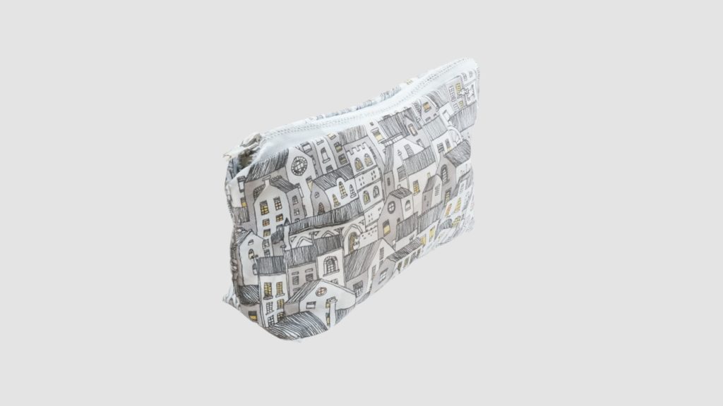
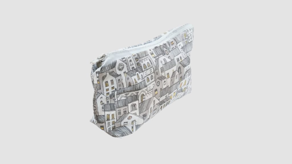
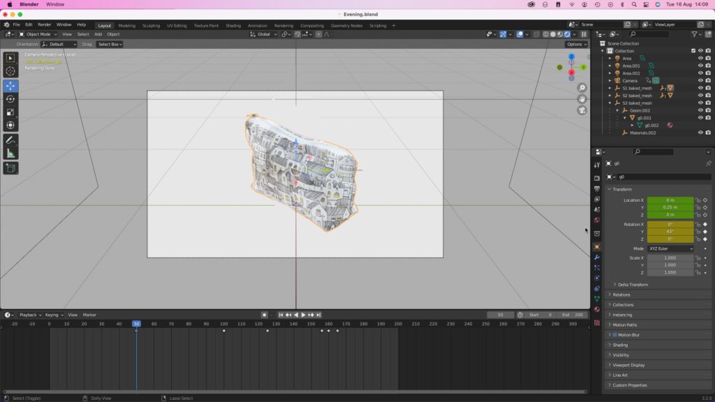
For my final experimental render, I had only a few elements to make. Firstly, I wanted the product’s first impression to be a side-view, as this would best showcase the design and artwork to the consumer, so I adjusted its datum rotation angle on the Y-axis to be 43 degrees (see below).

I also felt that the object was being slightly over-exposed by the light above it, causing it to appear ‘bleached’ and reducing the consumer’s ability to observe the design, artwork, and zip. Parts of the object nearest the camera were also a little darker than those further away, which felt jarring. To rectify this I reduced the light’s power to 70W, and moved it slightly nearer the camera’s position. Below you can see a side-by-side comparison.

Above: The 3D virtual object rotated to 43 degrees on its Y-axis

Above: A Youtube video depicting the third experimental render

Next Steps

My next step will be to create more photogrammetry models of the make up bag (approximately five – representing different stages of being unzipped) as well as some make-up paraphernalia such as lipsticks, which will be introduced to the final render for scale. I will then complete the above process again, and import the outcomes into the product page of my final prototype.

The AR experience will be created using Apple’s Reality Capture, as this is a free and user-friendly solution.

DM7908 Week 10 – Blender Tutorials

In this blog I’m posting links to Youtube tutorials that I’ve watched to supplement the tutorial that I’d organised with my lecturer, Rob Blofield.

Many photogrammetry applications on Apple’s platforms product virtual models at .USDZ files, which is Apple’s flavour of Pixar’s Universal Scene Description format. .USDZ files are not compatible with Blender and must be converted using the simple method outlined in the video above. Once converted, importing of the model and their textures is a simple process.

From observing the above two videos, I was able to learn how to adjust the transparency of models in blender to produce a fade in/fade out effect. This effect would be an imperative part of producing stop motion using my photogrammetry scans. The method in the lower-most video produced the most desirable effect when using the Cycles render engine and ‘Principled BSDF’ surface parameter for the objects.

Regarding lighting and cameras, these behave very similarly to those in Maxon’s Cinema 4D Lite, so the learning curve here was shorter for me. I referred to the below links to ascertain the types of lighting and camera controls.

Lighting: https://renderguide.com/blender-lighting-tutorial/

Cameras: https://docs.blender.org/manual/en/latest/render/cameras.html

DM7908 Week 9 – Figma Tutorial Notes

I began by watching a video of a UX Designer demonstrating the same design process in both Adobe XD and Figma. Her methods allowed me to see that on the whole the applications are similar, however they take slightly different approaches to some tasks.

Video link: https://youtu.be/r1alNWC2ZlU

Notes:

  • Adobe XD and Figma shortcuts are different
  • Adobe XD – “Icons for Design” plug in, might be useful for future mockups
  • Idea for ‘Design Selector’ on my prototype – Overlap circles, but move one slightly to the side, then use the intersect tool. Set the resulting shape and a blend of each circles colour (see Fig.1)
  • Figma – Scrolling may be inverted (could be Youtuber’s personalised setup)
  • Layout between applications is very similar, but Figma’s is simplified with advanced options in OS’ toolbar menu
  • In Figma, font size does not adjust with text box size, unlike Adobe XD
  • Figma’ – Auto-layout’ on buttons keeps padding size the same, despite button size
  • Icon plug-ins function in similarly to Adobe XD, but the selection is potentially smaller
Fig 1: Intersected circles

Having been reassured of the surface-level similarities between the applications, such as the functionality and layout, I decided to dive in a little further. I found a YouTube tutorial that claimed to teach Figma in 24 minutes, and I was hoping to learn more about the advantages of using Figma over Adobe XD, especially as I have heard of Figma being quite widely used by in-house designers at retailers such as New Look.

Video link: https://youtu.be/FTFaQWZBqQ8

Notes:

  • Figma has good collaborative functionality and can work in-browser (should the user reworking on a computer that doesn’t support the downloadable application
  • Figmaresources.com – Lots of free resources and templates available
  • “Evericons” = Resource pack with a lot of common icons
  • ‘Duplicate to your drafts’ function allows you to copy other designer’s graphics and files for a head start on prototyping or collaborating
  • Shortcuts
    • R = Rectangle
    • Option (Mac), Alt (Windows) = Show spacing to nearest objects on X/Y planes

It appears that Figma’s collaborative qualities as well as its ability to work on a large variety of machines is potentially why it is favoured so much in the UX industry. I’m really pleased to learn of its similarities to Adobe XD, and I’m looking forward to using it in this project to create my high-fidelity prototypes.

As I will be including 3D models in my prototypes (scanned using photogrammetry), they will likely need to be imported as video files. So, I have also watched the below tutorial on how to use the ‘Anima’ plugin with Figma to achieve this. I have some prior knowledge of using this plugin with Adobe XD for the DM7903 project.

Video link: https://youtu.be/gpAJ6hJ3eFk

References:

AJ&Smart (2020). Figma UI Design Tutorial: Get Started in Just 24 Minutes! (2021). [online] Youtube. Available at: https://youtu.be/FTFaQWZBqQ8 [Accessed 10 Aug. 2022].

Beard, M. (2022). Figma vs. Adobe Xd Design with Me | How Different Are they? [online] Youtube. Available at: https://youtu.be/r1alNWC2ZlU [Accessed 10 Aug. 2022].

Tech Phoenix Media (2021). Add Videos to Your Designs in Figma Using Anima Plugin. [online] Youtube. Available at: https://youtu.be/gpAJ6hJ3eFk [Accessed 10 Aug. 2022].

DM7908 Week 9 – Mockups and Medium Fidelity Prototyping

This week I’ve been adjusting my low-fidelity prototype in response to the usability test, and interpreting it as several iterative medium-fidelity mockups.

Please note: So I can allocate more time in this module to learning high-fidelity software such as Invision or Figma, I have decided to shorten the medium fidelity prototyping stage by producing non-interactive mock ups in Apple’s Keynote software.

At medium-fidelity level, I am paying closer attention to the colours, graphics, typefaces and font sizes, as well as the flow between the product page and the augmented reality experience. The prototype will be produced at some speed in order to maximise the amount of time I spend on producing a high-fidelity prototype using professional software, hence the use of Apple Keynote software, which I am very accustomed to using.

Stage 1

Above: A Keynote slide featuring screenshots of the first development stage at Medium Fidelity

Initially, I spent about 30 minutes interpreting my low-fidelity paper prototype using graphics available in both Keynote and Apple’s iOS 13 design resources (the latest available on their website). This permitted me to produce a convincing realistic user interface (at operating system level at least) efficiently and in a short space of time. I paid no attention to the Blossom & Easel corporate image (graphics, typeface, imagery etc) at this stage, but did consider layout, particularly implementing gestalt theory, linking and dividing sections using proximity and similarity, however this was still very rough.

Above: Designing of the heading bar in Apple’s Keynote

Some elements, such as the Blossom & Easel webpage header, needed to be created from scratch and were informed by my research of the client’s current mobile experience. I used a placeholder typeface for convenience, and borrowed icons from Apple’s ‘SF Symbols’ application, which catalogues all symbols available on iOS, Mac OS, TVOS, and WatchOS as vector graphics. I did need to create the hamburger menu icon myself, as these menus do not sit within Apple’s approach to UX design.

Above: Safe area guidance from Apple’s Human Interface Guidelines being applied to the Medium Fidelity Prototype

As a final consideration at this stage, I applied Apple’s safe area guidance as instructed for an iPhone 11. Due to the variation in pixel density available on the smartphone market, I am designing at 1x scale, which would be interpreted as 2x on my iPhone 11 (Belinski, n.d.; Apple, n.d.; karthikeyan, 2017). As I am designing with vector graphics, I do not need to be concerned with interpolation that may come with upscaling of raster graphics (Malewicz, 2021).

Stage 2

Above: Two Keynote slides with screenshots of the second development stage at Medium Fidelity

The following day I revisited my initial medium fidelity mock up, taking it to the second stage by adding placeholder graphics and imagery, amending typefaces to reflect the Blossom & Easel branding guidelines, and making further refinements regarding the gestalt principles.

A particularly interesting debate I had with myself was whether to left-justify or centrally-justify the ‘Seam’ and ‘Zip’ text. Centrally justifying the text would continue the corporate image established throughout the design and maintain visual symmetry, however left-justification would closely associate the text with the image adjacent to it (Buninux, 2021).

Another update to the experience was the inclusion of an onboarding prompt, “Drag to Rotate”. Without this prompt, it may not be clear to the user that they can swipe across the 3D model to rotate it and inspect its properties. My intention was for the prompt to display for a few seconds and then fade away, unless the user follows the prompt immediate, in which case the prompt will immediate fade.

Stage 3

Above: A comparison of two contrast ration options

In the final stage of medium fidelity prototyping, I was focused on criticising and improving some of the visual design decisions. One example of this was my critique of colour contrasts with an aim to address accessibility for users living with vision-impairments. In the above image I make an adjustment to the background colour of the product page’s footer, increasing its colour contrast ratio from 3.11:1 to 7:1, meeting WCAG AAA guidelines (WebAIM, 2021).

Above: Two Keynote slides with screenshots of the third development stage at Medium Fidelity

Further adjustments involved updating the design selector with real product design patterns, and amending the onboarding prompts to reflect the OS-level prompt graphics. By aligning the appearance of website prompts with the OS-level prompts, I aim to leverage the familiarity the user has with them, and so I can anticipate that the user will read and understand the prompts’ behaviour.

Although animations are not usually considered at medium-fidelity level, I made an exception for this module; as the interactivity between the 3D photogrammetry models and the page content is key to the experience it seemed necessary to visualise this incase further layout amendment were required (which must be completed before high-fidelity prototyping). This visualising process was successful and proved that only one amendment was required, which related to the design selector (see below).

When considering the animations, there was also an opportunity to apply the parallax effect. As well as serving a please aesthetic, the effect also enables the separation page elements and production of depth. A good example of this is the behaviour of the 3D object and the nail-polish graphic; as both graphics scroll upwards, the nail-polish moves faster, separating the graphics and providing a depth that could not be created if these elements were presented as one image.

In the above comparison video, two behaviours regarding the interaction between the 3D model and design selector are visible. I decided that the left-most option would be most appropriate, as down-sizing the design selector would reduce the size of it’s tap-targets, resulting in functional issues that would negative impact the user experience (Harley, 2019; Parhi, Karlson and Bederson, 2006).

AR Experience

Above: The AR Experience UI after the first stage of medium-fidelity prototyping
Above: The AR Experience UI after the second stage of medium-fidelity prototyping

When creating the medium-fidelity prototype of the AR experience, I was able to efficiently import many page elements from the product page, including the ‘Purchase bar’ and design selector. Some elements, such as the shutter button needed to be created from scratch though, so I opted to use vector graphics so that they were unscalable for many screen sizes.

In addition to the design selector that I created on the product page, I have added a stroke around the outside of each design, and small underline below the selected design. It seemed important to declare which design had been selected, and although a colour stroke alone could do this, it would be inaccessible for some users, so I decided to include a separate underline too (Guy, 2014). As this seems to be a good improvement, I will also work this into the high fidelity version of the product page.

This has been a successful and productive week of prototyping. In a real-world content, I would now be looking to complete usability testing in relation to areas-of-interest (AOIs) that have been introduced at this stage (colour, typeface, graphics, and imagery, to ascertain whether formative feedback could provide insight into further improvements. Now that the design process has reached a digital stage, there is possibility for technologies such as eye-tracking to be used, permitting a deeper understanding into how users will interact with page elements (Bergstrom and Schall, 2014).

Next week I plan to focus on creating photogrammetry scans on Blossom & Easel’s make-up bag(s), and experimenting with animating them, ready for the creation of a high-fidelity prototype.

References

Apple (n.d.). Layout – Foundations – Human Interface Guidelines – Design – Apple Developer. [online] developer.apple.com. Available at: https://developer.apple.com/design/human-interface-guidelines/foundations/layout [Accessed 12 Aug. 2022].

Belinski, E. (n.d.). Resolution by iOS device — iOS Ref. [online] iosref.com. Available at: https://iosref.com/res [Accessed 12 Aug. 2022].

Bergstrom, J.R. and Schall, A.J. eds., (2014). Eye Tracking in User Experience Design. Morgan Kaufman. doi:10.1016/c2012-0-06867-6.

Buninux (2021). Text Alignment Best Practises. [online] Medium. Available at: https://blog.prototypr.io/text-alignment-best-practises-c4114daf1a9b [Accessed 7 Aug. 2022].

Guy, T. (2014). Usability Tip: Don’t Rely on Color to Convey Your Message. [online] UX Magazine. Available at: https://uxmag.com/articles/usability-tip-dont-rely-on-color-to-convey-your-message?rate=ijTgGDWgA0pQifcW0TxUqd_wtNxkg8Jug4a0Z_cAolM [Accessed 10 Aug. 2022].

Harley, A. (2019). Touch Targets on Touchscreens. [online] Nielsen Norman Group. Available at: https://www.nngroup.com/articles/touch-target-size/ [Accessed 11 Aug. 2022].

karthikeyan (2017). Autolayout – iOS 11 Layout Guidance about Safe Area for iPhone X. [online] Stack Overflow. Available at: https://stackoverflow.com/questions/46344381/ios-11-layout-guidance-about-safe-area-for-iphone-x [Accessed 12 Aug. 2022].

Malewicz, M. (2021). UI Design Basics: Screens. [online] Medium. Available at: https://uxdesign.cc/ui-design-basics-screens-734bfbeffca9 [Accessed 12 Aug. 2022].

Parhi, P., Karlson, A.K. and Bederson, B.B. (2006). Target Size Study for one-handed Thumb Use on Small Touchscreen Devices. Proceedings of the 8th Conference on Human-computer Interaction with Mobile Devices and Services – MobileHCI ’06, [online] pp.203, 210. doi:10.1145/1152215.1152260.

WebAIM (2021). WebAIM: Contrast and Color Accessibility – Understanding WCAG 2 Contrast and Color Requirements. [online] WebAIM. Available at: https://webaim.org/articles/contrast/#ratio [Accessed 8 Aug. 2022].‌