This week I’ve been adjusting my low-fidelity prototype in response to the usability test, and interpreting it as several iterative medium-fidelity mockups.
Please note: So I can allocate more time in this module to learning high-fidelity software such as Invision or Figma, I have decided to shorten the medium fidelity prototyping stage by producing non-interactive mock ups in Apple’s Keynote software.
At medium-fidelity level, I am paying closer attention to the colours, graphics, typefaces and font sizes, as well as the flow between the product page and the augmented reality experience. The prototype will be produced at some speed in order to maximise the amount of time I spend on producing a high-fidelity prototype using professional software, hence the use of Apple Keynote software, which I am very accustomed to using.
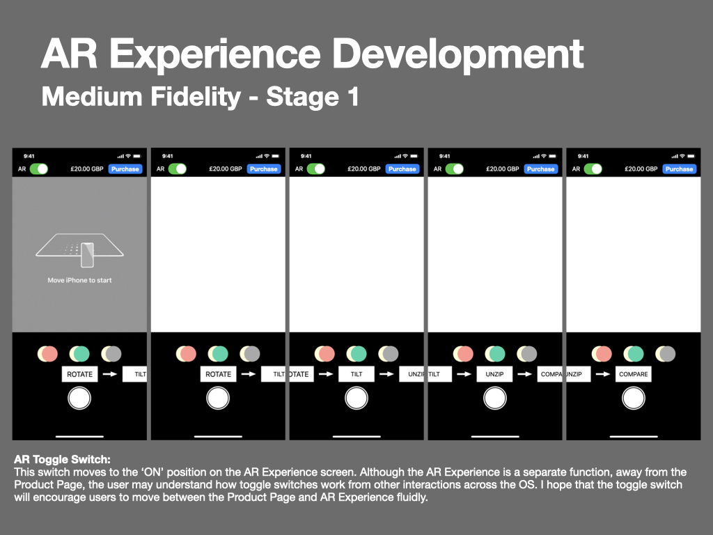
Stage 1
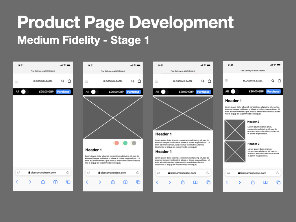
Initially, I spent about 30 minutes interpreting my low-fidelity paper prototype using graphics available in both Keynote and Apple’s iOS 13 design resources (the latest available on their website). This permitted me to produce a convincing realistic user interface (at operating system level at least) efficiently and in a short space of time. I paid no attention to the Blossom & Easel corporate image (graphics, typeface, imagery etc) at this stage, but did consider layout, particularly implementing gestalt theory, linking and dividing sections using proximity and similarity, however this was still very rough.
Some elements, such as the Blossom & Easel webpage header, needed to be created from scratch and were informed by my research of the client’s current mobile experience. I used a placeholder typeface for convenience, and borrowed icons from Apple’s ‘SF Symbols’ application, which catalogues all symbols available on iOS, Mac OS, TVOS, and WatchOS as vector graphics. I did need to create the hamburger menu icon myself, as these menus do not sit within Apple’s approach to UX design.
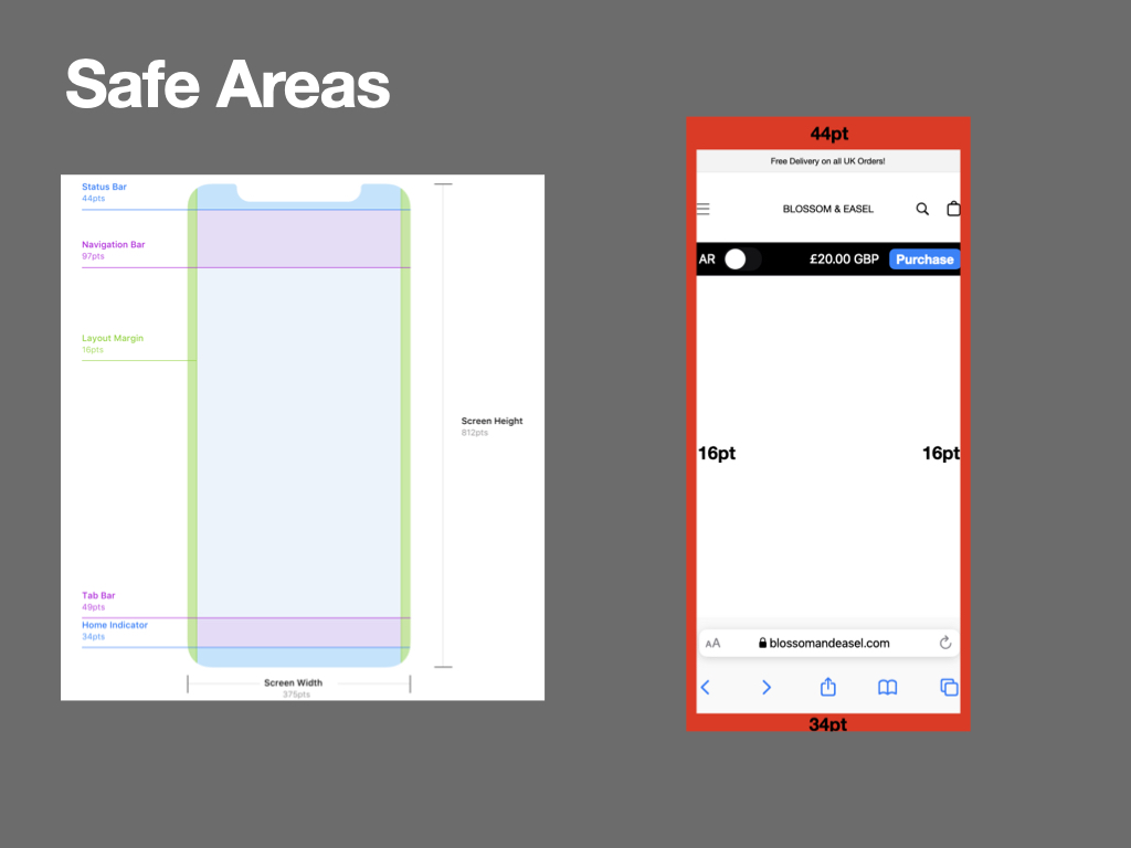
As a final consideration at this stage, I applied Apple’s safe area guidance as instructed for an iPhone 11. Due to the variation in pixel density available on the smartphone market, I am designing at 1x scale, which would be interpreted as 2x on my iPhone 11 (Belinski, n.d.; Apple, n.d.; karthikeyan, 2017). As I am designing with vector graphics, I do not need to be concerned with interpolation that may come with upscaling of raster graphics (Malewicz, 2021).
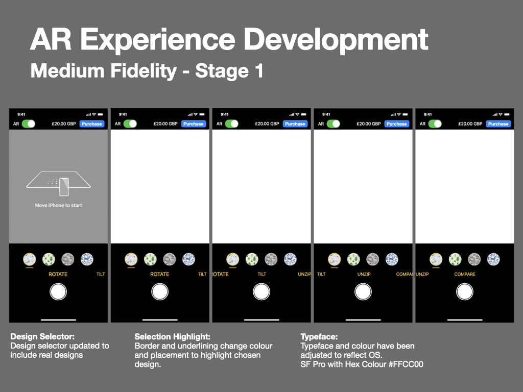
Stage 2
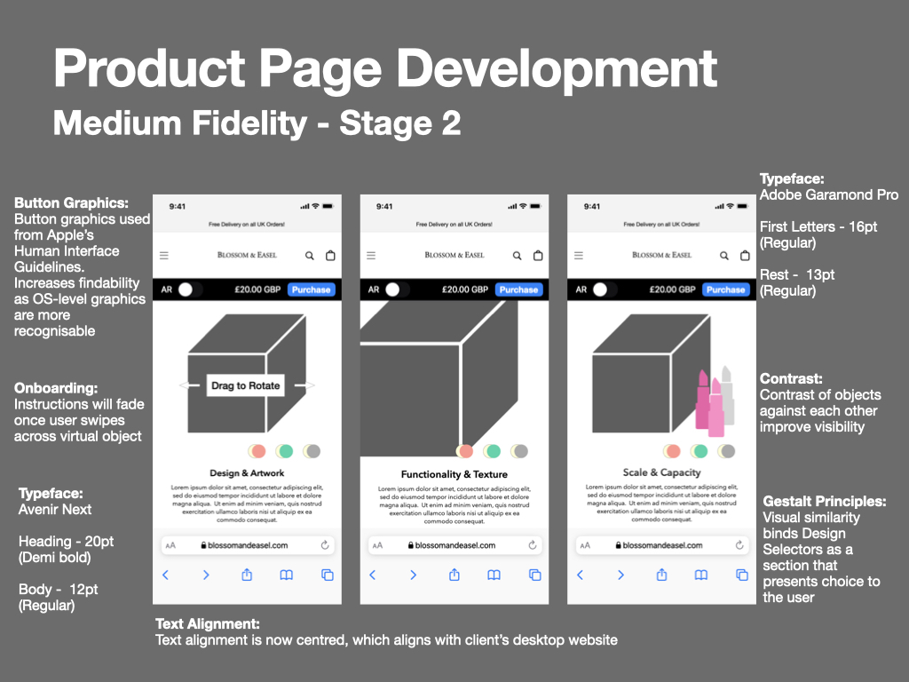
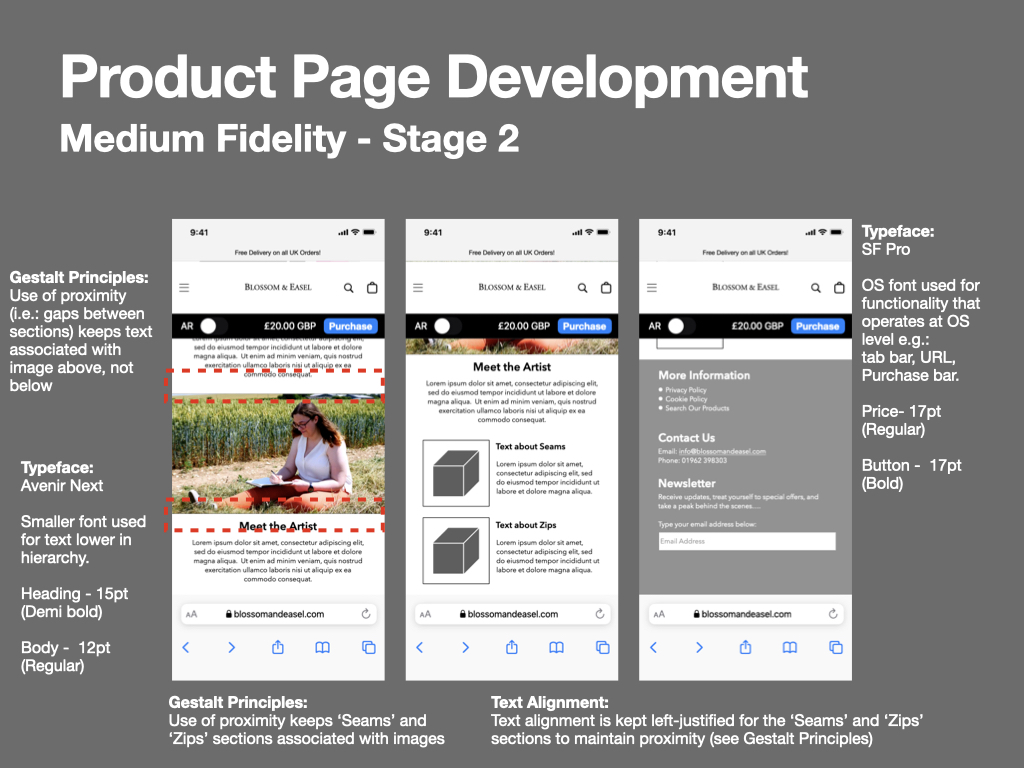
The following day I revisited my initial medium fidelity mock up, taking it to the second stage by adding placeholder graphics and imagery, amending typefaces to reflect the Blossom & Easel branding guidelines, and making further refinements regarding the gestalt principles.
A particularly interesting debate I had with myself was whether to left-justify or centrally-justify the ‘Seam’ and ‘Zip’ text. Centrally justifying the text would continue the corporate image established throughout the design and maintain visual symmetry, however left-justification would closely associate the text with the image adjacent to it (Buninux, 2021).
Another update to the experience was the inclusion of an onboarding prompt, “Drag to Rotate”. Without this prompt, it may not be clear to the user that they can swipe across the 3D model to rotate it and inspect its properties. My intention was for the prompt to display for a few seconds and then fade away, unless the user follows the prompt immediate, in which case the prompt will immediate fade.
Stage 3
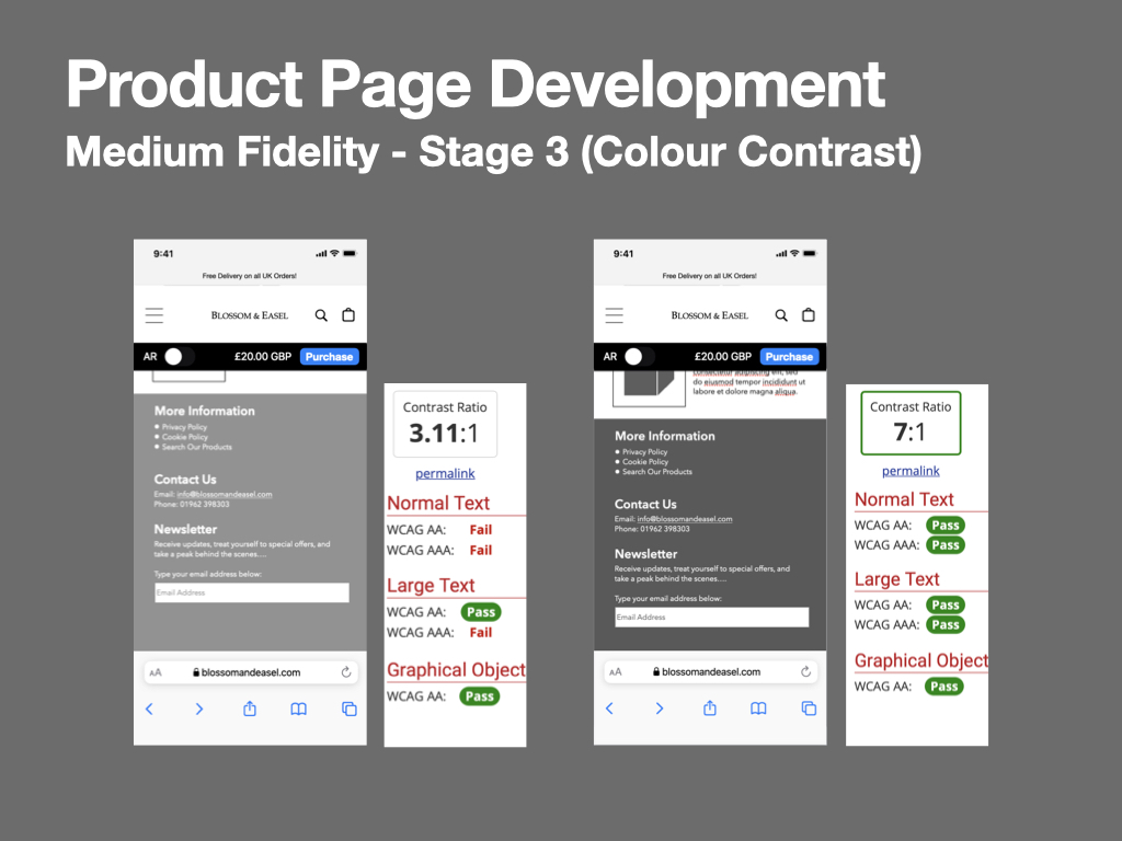
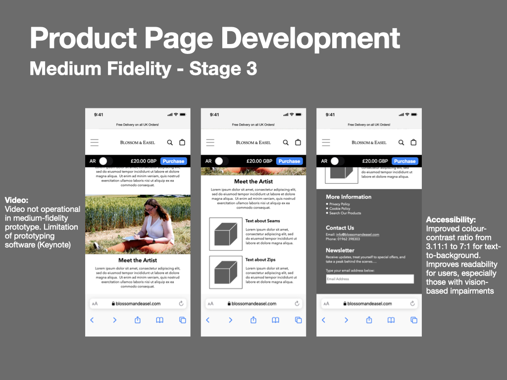
In the final stage of medium fidelity prototyping, I was focused on criticising and improving some of the visual design decisions. One example of this was my critique of colour contrasts with an aim to address accessibility for users living with vision-impairments. In the above image I make an adjustment to the background colour of the product page’s footer, increasing its colour contrast ratio from 3.11:1 to 7:1, meeting WCAG AAA guidelines (WebAIM, 2021).
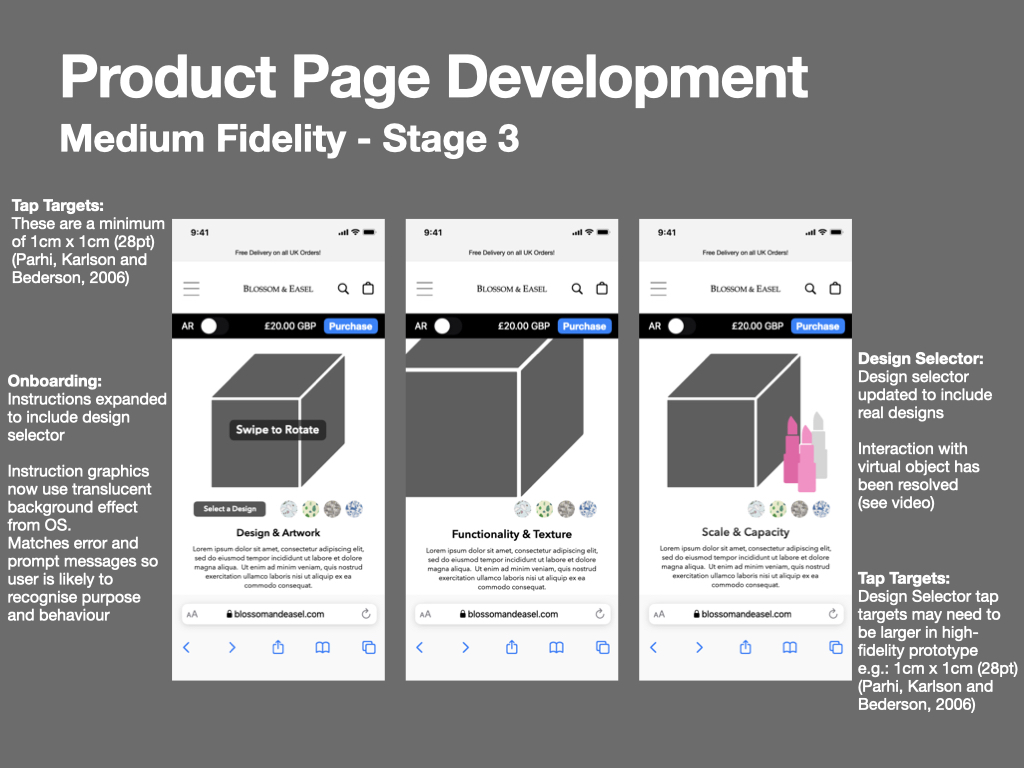
Further adjustments involved updating the design selector with real product design patterns, and amending the onboarding prompts to reflect the OS-level prompt graphics. By aligning the appearance of website prompts with the OS-level prompts, I aim to leverage the familiarity the user has with them, and so I can anticipate that the user will read and understand the prompts’ behaviour.
Although animations are not usually considered at medium-fidelity level, I made an exception for this module; as the interactivity between the 3D photogrammetry models and the page content is key to the experience it seemed necessary to visualise this incase further layout amendment were required (which must be completed before high-fidelity prototyping). This visualising process was successful and proved that only one amendment was required, which related to the design selector (see below).
When considering the animations, there was also an opportunity to apply the parallax effect. As well as serving a please aesthetic, the effect also enables the separation page elements and production of depth. A good example of this is the behaviour of the 3D object and the nail-polish graphic; as both graphics scroll upwards, the nail-polish moves faster, separating the graphics and providing a depth that could not be created if these elements were presented as one image.
In the above comparison video, two behaviours regarding the interaction between the 3D model and design selector are visible. I decided that the left-most option would be most appropriate, as down-sizing the design selector would reduce the size of it’s tap-targets, resulting in functional issues that would negative impact the user experience (Harley, 2019; Parhi, Karlson and Bederson, 2006).
AR Experience
When creating the medium-fidelity prototype of the AR experience, I was able to efficiently import many page elements from the product page, including the ‘Purchase bar’ and design selector. Some elements, such as the shutter button needed to be created from scratch though, so I opted to use vector graphics so that they were unscalable for many screen sizes.
In addition to the design selector that I created on the product page, I have added a stroke around the outside of each design, and small underline below the selected design. It seemed important to declare which design had been selected, and although a colour stroke alone could do this, it would be inaccessible for some users, so I decided to include a separate underline too (Guy, 2014). As this seems to be a good improvement, I will also work this into the high fidelity version of the product page.
This has been a successful and productive week of prototyping. In a real-world content, I would now be looking to complete usability testing in relation to areas-of-interest (AOIs) that have been introduced at this stage (colour, typeface, graphics, and imagery, to ascertain whether formative feedback could provide insight into further improvements. Now that the design process has reached a digital stage, there is possibility for technologies such as eye-tracking to be used, permitting a deeper understanding into how users will interact with page elements (Bergstrom and Schall, 2014).
Next week I plan to focus on creating photogrammetry scans on Blossom & Easel’s make-up bag(s), and experimenting with animating them, ready for the creation of a high-fidelity prototype.
References
Apple (n.d.). Layout – Foundations – Human Interface Guidelines – Design – Apple Developer. [online] developer.apple.com. Available at: https://developer.apple.com/design/human-interface-guidelines/foundations/layout [Accessed 12 Aug. 2022].
Belinski, E. (n.d.). Resolution by iOS device — iOS Ref. [online] iosref.com. Available at: https://iosref.com/res [Accessed 12 Aug. 2022].
Bergstrom, J.R. and Schall, A.J. eds., (2014). Eye Tracking in User Experience Design. Morgan Kaufman. doi:10.1016/c2012-0-06867-6.
Buninux (2021). Text Alignment Best Practises. [online] Medium. Available at: https://blog.prototypr.io/text-alignment-best-practises-c4114daf1a9b [Accessed 7 Aug. 2022].
Guy, T. (2014). Usability Tip: Don’t Rely on Color to Convey Your Message. [online] UX Magazine. Available at: https://uxmag.com/articles/usability-tip-dont-rely-on-color-to-convey-your-message?rate=ijTgGDWgA0pQifcW0TxUqd_wtNxkg8Jug4a0Z_cAolM [Accessed 10 Aug. 2022].
Harley, A. (2019). Touch Targets on Touchscreens. [online] Nielsen Norman Group. Available at: https://www.nngroup.com/articles/touch-target-size/ [Accessed 11 Aug. 2022].
karthikeyan (2017). Autolayout – iOS 11 Layout Guidance about Safe Area for iPhone X. [online] Stack Overflow. Available at: https://stackoverflow.com/questions/46344381/ios-11-layout-guidance-about-safe-area-for-iphone-x [Accessed 12 Aug. 2022].
Malewicz, M. (2021). UI Design Basics: Screens. [online] Medium. Available at: https://uxdesign.cc/ui-design-basics-screens-734bfbeffca9 [Accessed 12 Aug. 2022].
Parhi, P., Karlson, A.K. and Bederson, B.B. (2006). Target Size Study for one-handed Thumb Use on Small Touchscreen Devices. Proceedings of the 8th Conference on Human-computer Interaction with Mobile Devices and Services – MobileHCI ’06, [online] pp.203, 210. doi:10.1145/1152215.1152260.
WebAIM (2021). WebAIM: Contrast and Color Accessibility – Understanding WCAG 2 Contrast and Color Requirements. [online] WebAIM. Available at: https://webaim.org/articles/contrast/#ratio [Accessed 8 Aug. 2022].