DM7920 Design Communication
Introduction
My DM7920: Design Communication project has taken place across a 15 week period, and has seen me analyse and redesign the mobile experience of an e-retailer called Sobersauce, who specialise in low-alcohol / alcohol-free drinks.
Sobersauce’s website permits customers to join tasting programmes, purchase mixed cases of drinks, build their own cases of low-alcohol beer, and organise subscriptions for regular deliveries. However, an audit of the website’s user experience uncovers many issues and challenges that explain a high abandonment rate as potential customers leave the website. A high fall-off in online customers is a significant detriment to the business, especially considering Sobersauce do not own any brick-and-mortar shops or stores, and for this reason I have spent this project examining how the design communication could be adjusted to improve the business’s success.
As I present the outcomes of this project I will provide links to relevant blog posts that I have written for assessment. Each blog post provides deeper insight into each stage of the project, and it includes my reflections and documentation of personal development opportunities undertaken.
Learning Goals
When I first joined the MA Digital Media Practice course, I devised a set of four learning goals that I would try to meet within each module to help me improve my skill set and employability prospects. Reading the DM7920: Design Communication module brief, I identified several tasks I could complete to achieve three of the learning goals (dependent upon my client’s needs), and these are listed below:
- Research User Centred Design (UCD) Regarding Accessibility, Education and Training
• Learn WCAG AA / WCAG AAA criteria and understand strategies for achieving compliancy
• Explore the relationship between stakeholder needs in relation to UCD (i.e.: how does branding presence balance with achieving WCAG AAA compliancy?)
- Practise Iterative Design Processes Including Prototyping and Working with Personas
• Define and justify a clear purpose for each step in the iteration process
• Practice a targeted and purposeful approach to prototyping and usability testing
• Apply knowledge of iterative design processes to a complex project
- Develop Proficiency in Specialist Software Packages
• Explore the benefits and limitations of Adobe XD when prototyping a mobile website
Research and Stakeholder Considerations
As this is a design communication project, it has been imperative that I understand every stakeholder’s viewpoint regarding the design of the Sobersauce website – most notably the viewpoints of the client and their customer/user base. To do this I have undertaken four areas of research:
• Client and brand research
• Competitive audit of direct/indirect competing brands
• Sobersauce mobile experience audit
• User assumptions
The aim of completing such a wide range of research was to understand the shortcomings of the current mobile experience as well as who the customers are, then to justify my initial design decisions (prior to any usability testing).
Client and Brand Research
A preliminary examination of the mobile experience identified many aspects of Sobersauce’s brand identity, including primary, secondary, and tertiary colours alongside typefaces and graphics. I noted that buttons often featured ‘call to actions’ (CTA) and were coloured red to cause consumers to “react faster and more forcefully” (Khan, 2018).
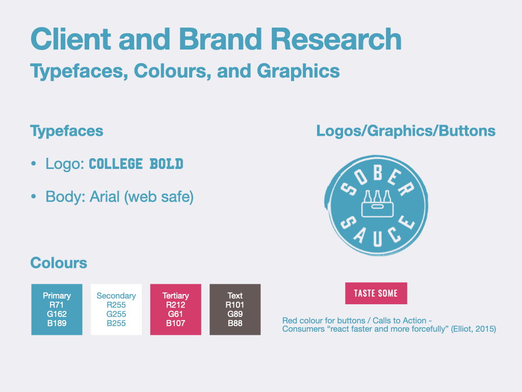
I didn’t have access to the client’s branding guidelines, but did have enough information to inform the sketches and wireframes that I would be making shortly. Any missing information such as font weightings and sizes would be informed by assumptions and then put forward to in-house designers and developers as recommendations/changes to the branding guidelines.
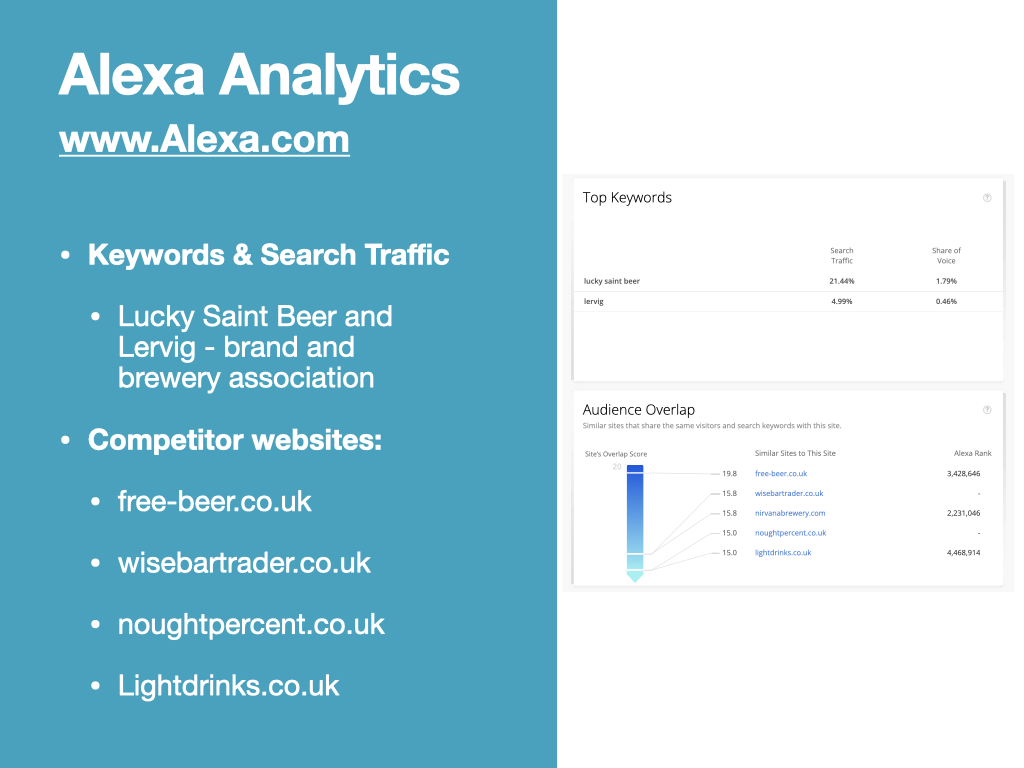
On the recommendation of a lecturer, I accessed some analytics data via Alexa Analytics, which identified keywords from search traffic that could give me some insight into who Sobersauce’s customer base might be. According to Alexa Analytics, “Lucky saint beer” and “Lervig” (a Norwegian brewer) drive over 25% of site traffic (Alexa.com, 2019). At this stage I could hypothesise that brand presence is important to the customer base. I also identified several related websites, which may be competitors, that I could analyse as part of an upcoming competitive audit. These websites might also have a similar customer base, so could help me to make some customer assumptions.
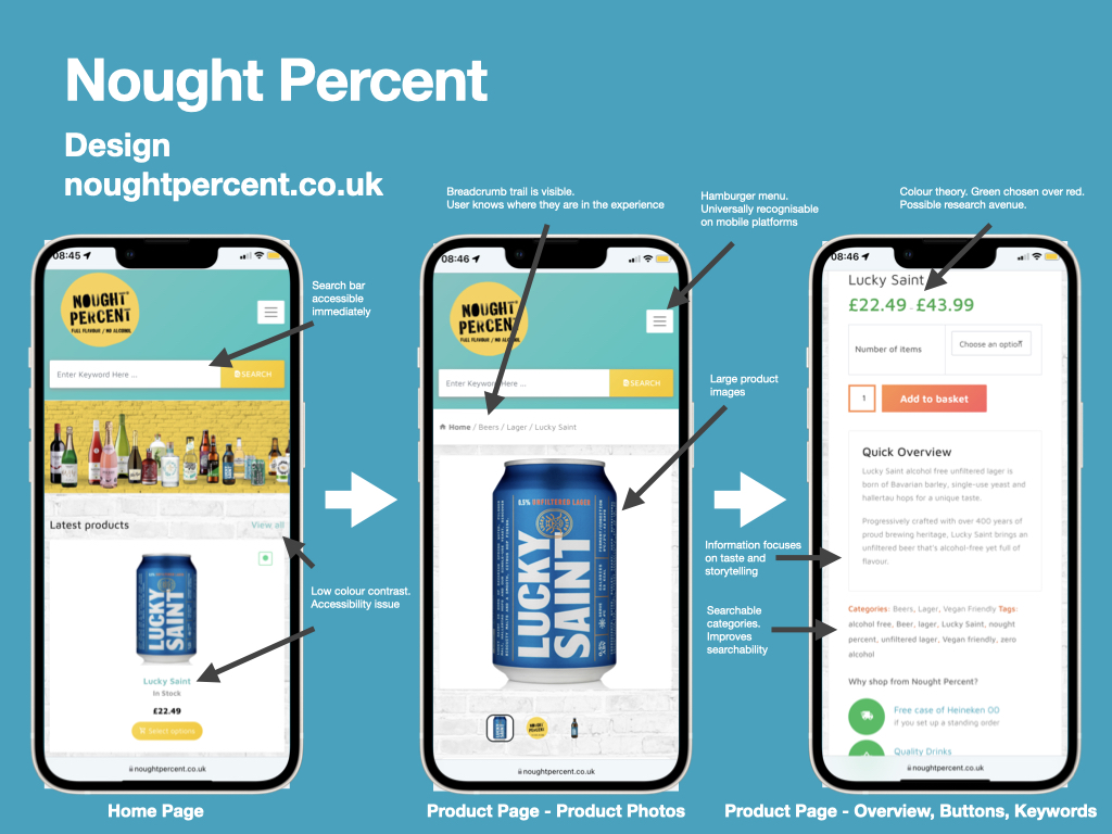
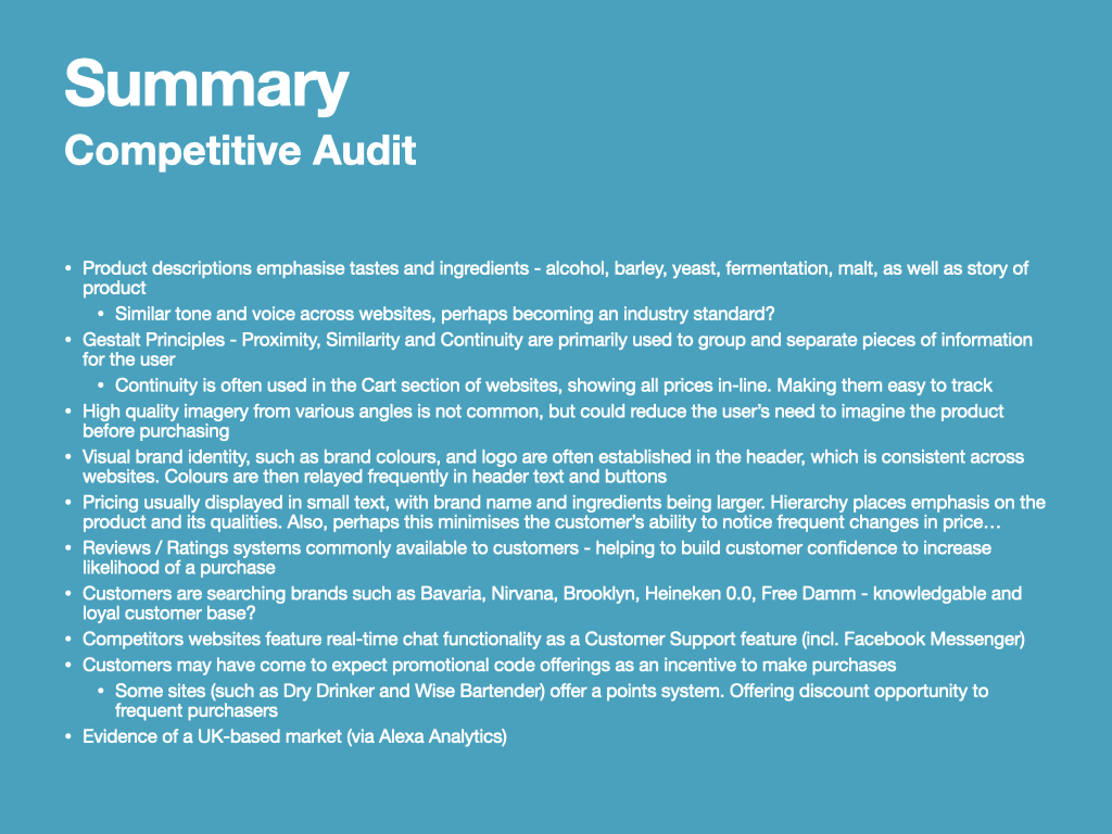
Competitive Audit
The next step of my project was to complete a Competitive Audit of direct/indirect competing websites. One of the main reasons for analysing these websites was to learn more about the customer base, as I couldn’t access the website analytics for Sobersauce. I hoped that by completing this task I’d be able to produce a set of personas / user assumptions that could help to justify my design decisions.
The key areas of interest for the Competitive Audit were as follows:
• Inform creation of an assumption-based persona
• Find patterns/trends in Tone and Voice
• Better understand Information Architecture and Wayfinding
• Learn how information hierarchy is structured
• Observe brand presence and vision-based accessibility (incl. WCAG AA / AAA compliancy)
I have presented the competitive audit in the below presentation video:
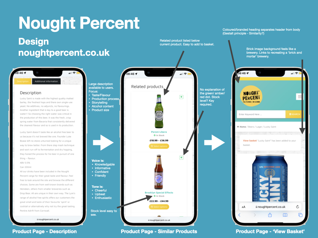
Carrying out a competitive audit was a fantastic idea; it was considerably more time consuming and repetitive than I expected (so I should have allowed an extra week to complete it), but it generated a large amount of data that could inform my design decisions. For example, I noticed that the tone and voice across similar websites was very much the same and so could be becoming an industry standard; I feel that this justifies the need to adopt a similar tone for the Sobersauce redesign. Also, reviews and ratings systems were very common across the websites and may have become an expectation of users.
Going further, if I was working in-house for the client then I feel a lot of this information would be useful to share across many other departments including marketing. I have included the full summary of findings from the Competitive Audit below:
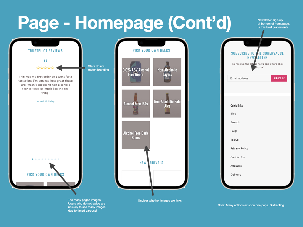
Sobersauce Mobile Experience Audit
Carrying out an audit of the client’s current offering was a tip I was given by a UX designer that I had recently interviewed. He explained that this was not only an important process that would allow me to apply my UX knowledge as constructively critical feedback (which could be presented in a pitch), but it would also be an early opportunity to learn the needs and preferences of both the client and their customers prior to any usability testing.
During the audit I applied my knowledge of UX principles that I’ve learnt while studying the MA Digital Media Practice programme, focusing primarily upon information architecture, hierarchy, interactivity, and accessibility. As below, I picked out key observations and described the issues that I had found. In reality, I might have presented this audit to a group of stakeholders to inform them of the issues before presenting my suggestions for improvements.
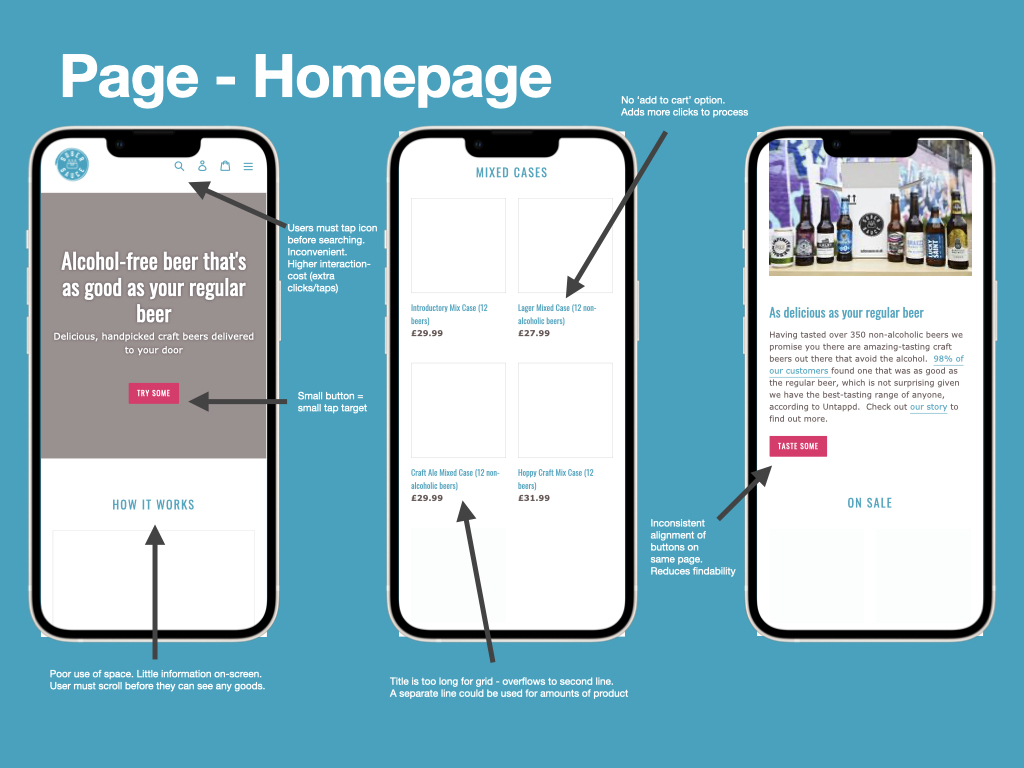
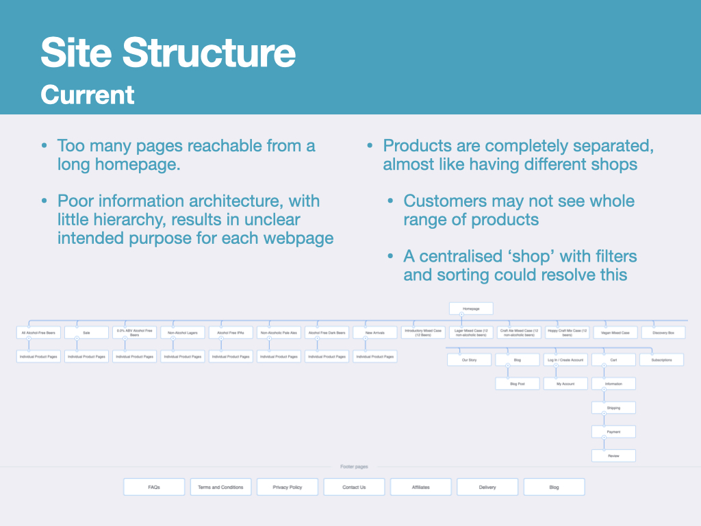
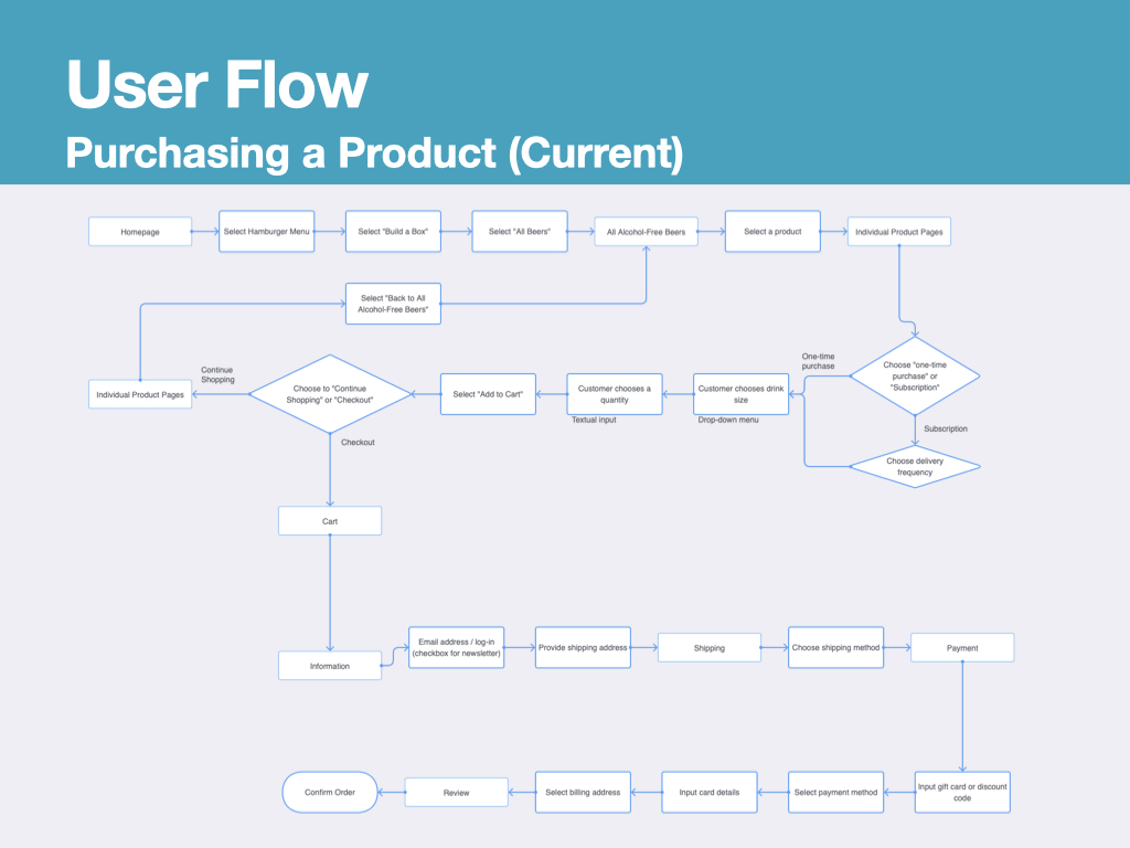
I also analysed both the site structure and user flow for making a purchase, and found them to be too complex, and in need of simplification to reduce the risk of abandonment. Despite not having access to accurate analytics, visualising these structures and flows permitted me to make and justify assumptions about the website’s failings.
Accessibility and Compliancy
As outlined in my Learning Goals, I intended to strengthen my understanding of the Web Content Accessibility Guidelines (WCAG). I already understood that there are two levels of compliancy, “AA” and “AAA”, however until now I didn’t know any distinction between them.
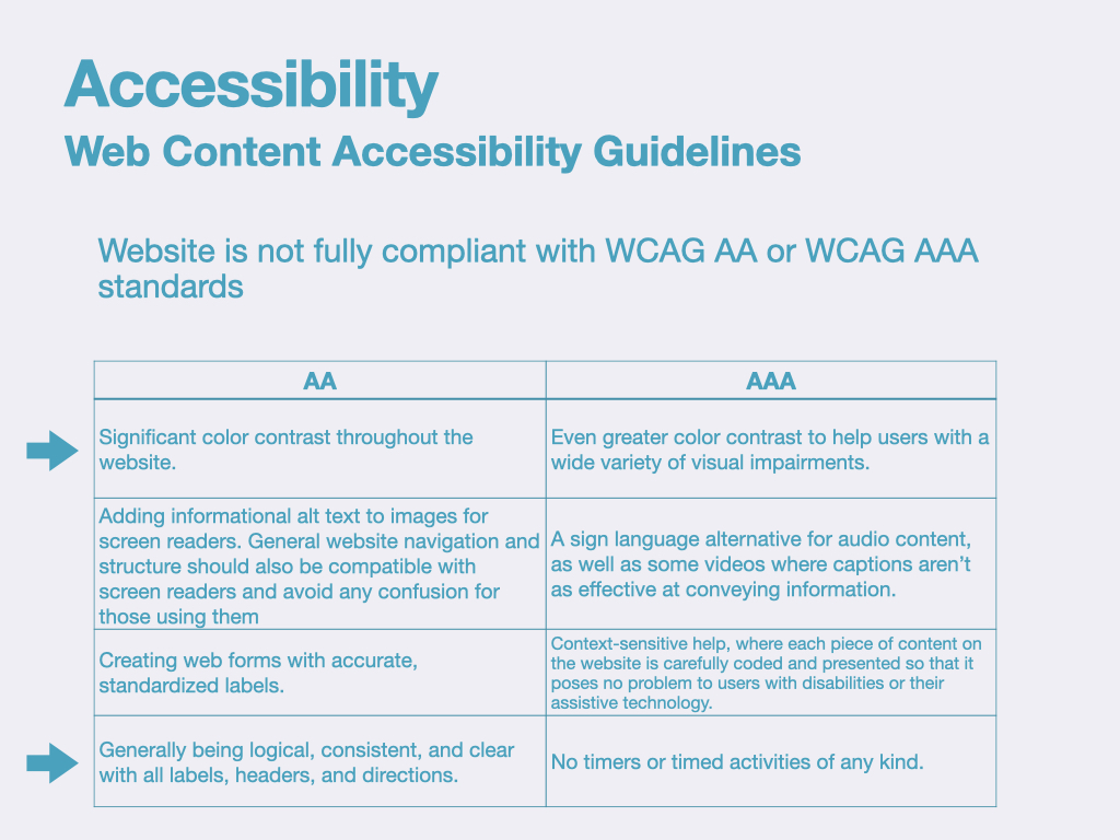
Judging by the criteria within the above table, the Sobersauce website falls short of WCAG AA compliancy as significant colour contrast is occasionally not present, and the website structure and information architecture do not present information logically or clearly – indicated by my Site Structure diagram.
My intention within this module was to produce a mobile experience for Sobersauce that achieves WCAG AAA compliancy (or at least WCAG AA). This meant that all content on webpages would achieve a colour contrast ratio of 4.5:1, help will be provided using contextual pop-outs, and information will be presented logically, consistently and clearly.
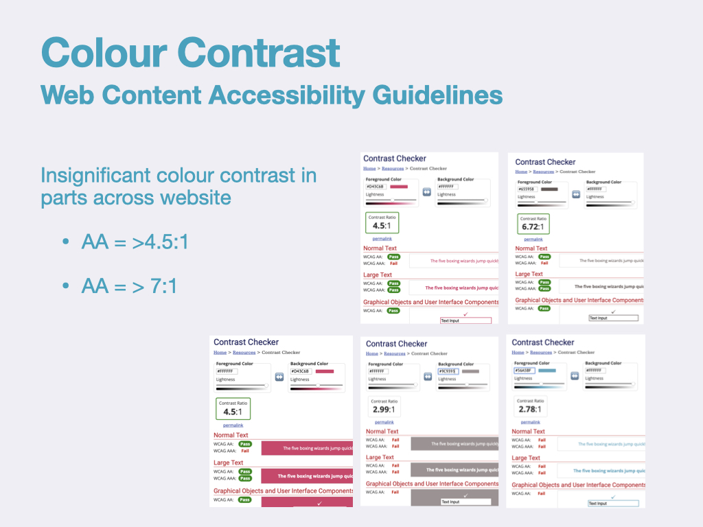
Regarding colour contrast specifically, the Sobersauce website almost achieves WCAG AA compliancy for colour contrast ratio, but falls down in two areas. These two areas are actually used for headings, so presents a significant accessibility issue for those users dealing with vision-based impairments.
In some areas WCAG AAA is almost achieved, however text is too thin to create a strong enough colour contrast. We can also see that ‘large text’, which could be bold text, improves this. So at this early stage I would suggest that slightly enlarging text could be enough of a tweak to meet compliancy needs.
Summary
Completing an audit of the client’s mobile experience had been a worthwhile task. I could better understand the shortfalls that the current offering has in terms of information architecture, hierarchy, interactivity, and accessibility. From this I produced the below bullet points that summarise the issues. I would later prioritise them according to the Design Hierarchy of Need and address the most important ones within this project (Bradley, 2010).
- Webpages are often extremely long, cramming too much information
- Unclear purpose of each page results in distractions for the user
- Webpages are potentially too white/bright, potentially fatiguing for the user, reducing browsing time
- Branding is minimal in parts and has low colour contrast in places
- Inconsistent formatting across pages appears disorganised and potentially disorientating
- Titles of pages do not always explain purpose of pages
- Interaction cost is higher that necessary in some places
- No quick option to add selections to basket
- Text fields used to specify amounts, +/- would require less textual input
- Wayfinding is repetitive and sometimes illogical, requiring many taps and different pages
- Links to helpful webpages are only present in the footer, these are difficult to find and would take considerable time to access when using a screen reader
- Inconsistent tap-target sizes between buttons could cause interactivity issues
Below I have provided an Issuu link to my presentation, which features a full audit of the Sobersauce mobile experience. It features larger versions of the above images.
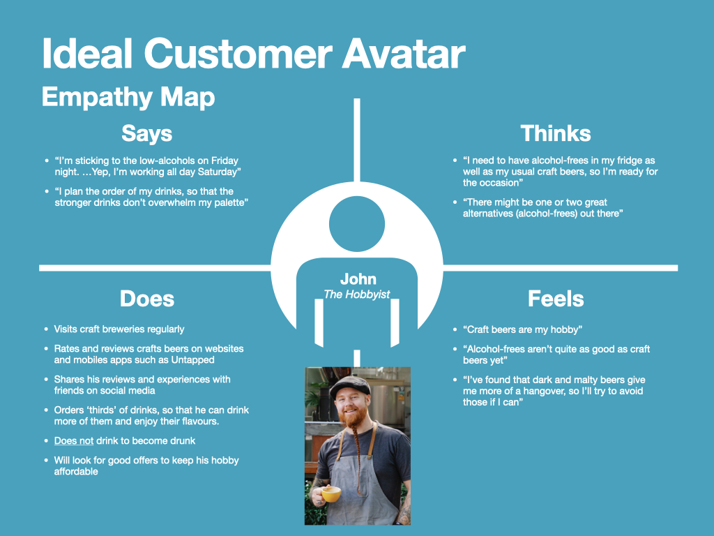
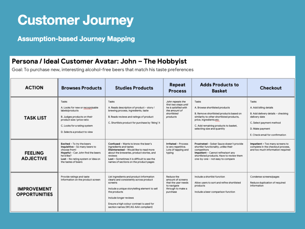
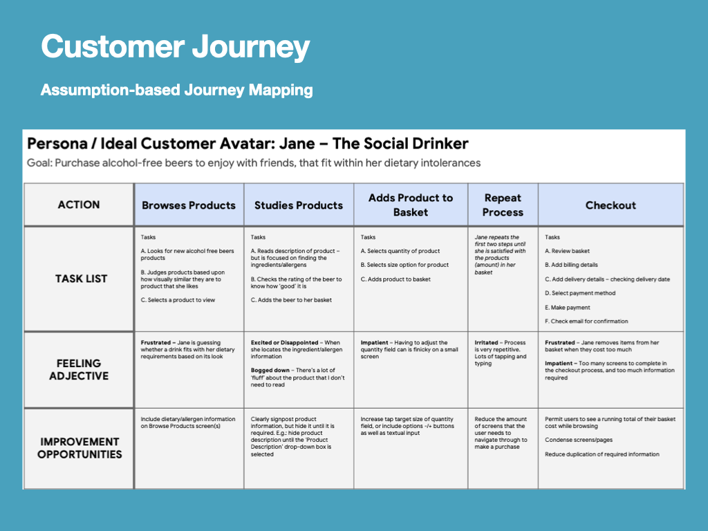
User Assumptions
Next, I created some assumptions about Sobersauce’s customer base / target audience. Within my blog, I have recorded this information via customer stories, empathy maps, and journey maps, but have also summarised it below. My intention with this information was to create two Ideal Customer Avatars / Protopersons / Personas, which would allow me to document the motivations and aspirations of the Sobersauce user base (Ferrer, n.d.).

Proposed Solutions
On week 6 I pitched my project and included the proposed solutions to my lecturers and peers. I presented some of my research and this culminated in devising three clear objectives that would measure the success of a redesign of the Sobersource of mobile experience.
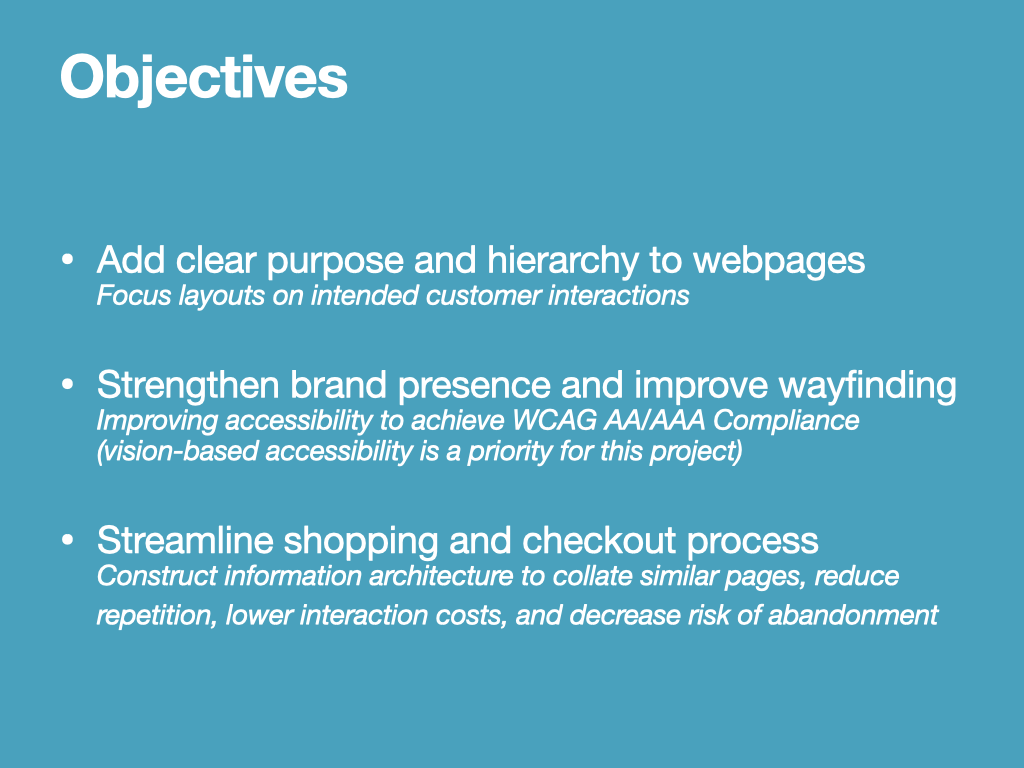
Initially, I would add clear purpose and hierarchy to the webpages. The current information architecture of the website is too confusing, with long webpages that have little hierarchy.
Next, I would strengthen the brand presence and improve wayfinding across the website. I must find a balance between promoting Sobersauce’s unique brand presence, and improving accessibility for visually impaired users.
Finally I intended to streamline the shopping and checkout process. The site structure appeared to separate out products into different shopping experiences, which could confuse users. The user flow charts for the shopping experience also contained many repetitive steps with a high interaction cost.
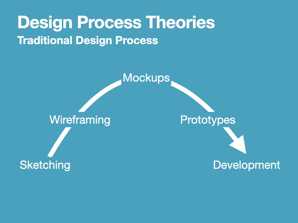
Time Planning and Design Theories
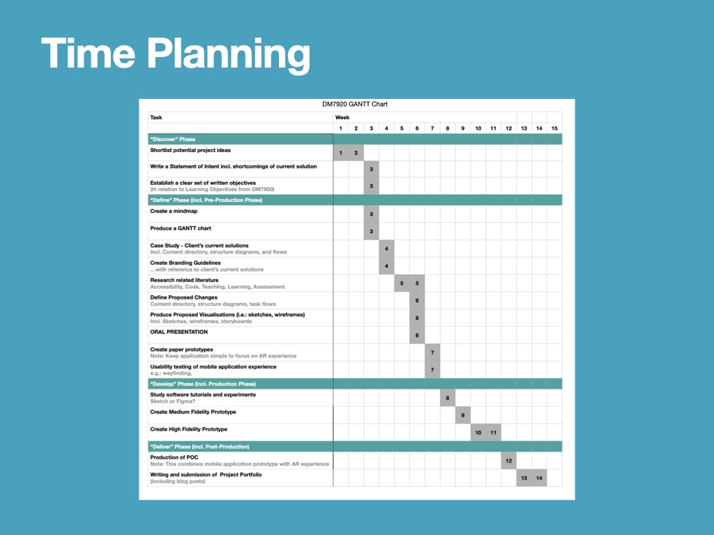
Within the pitch, I explained that I would be adhering to the traditional design process, as outlined in UXPin’s Ultimate Guide to Prototyping. This linear model accurately depicts the roadmap for a UX redesign, taking the design from rough and inexpensive sketches to record ideas and experiments, to more refined outcomes as we reach the prototyping stage (UXPin Inc, 2015).
Site Structure
By analysing Sobersauce’s current site structure, I identified some painpoints that could frustrate both of my Ideal Customer Avatars.
A) The repetitive process of adding products to a basket
B) Findability – it is difficult to find products that meet the user’s needs
C) A long checkout process requires too much information on too many pages
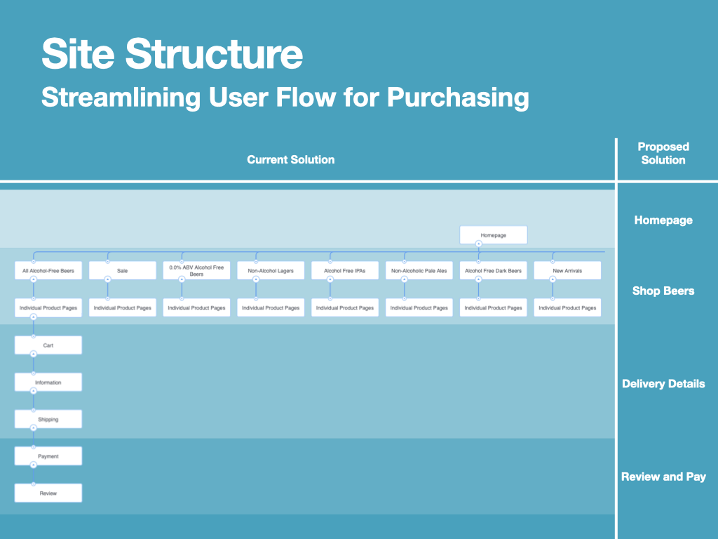
On the left hand side of the screen is Sober Sauce’s current site structure, and on the right hand side is a suggestion for how the current site structure could be compiled into a simplified solution. Minimising the amount of pages/screens the user encounters will help to lower the interactivity cost of the experience, while retaining all the product as a filterable and sortable ‘Shop Beers’ page, should make them easier to find.
In order to meet my three objectives and to produce a strategy for redesigning the Sobersauce website, I have categorised issues and observations from my audits according to the Design Hierarchy of Need (Bradley, 2010). Due to time constraints, this project may have to prioritise features; for this reason I intend to address the functionality, reliability and usability features.

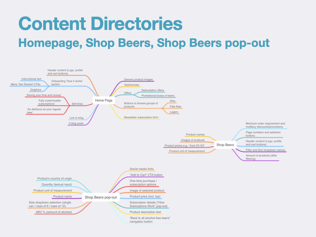
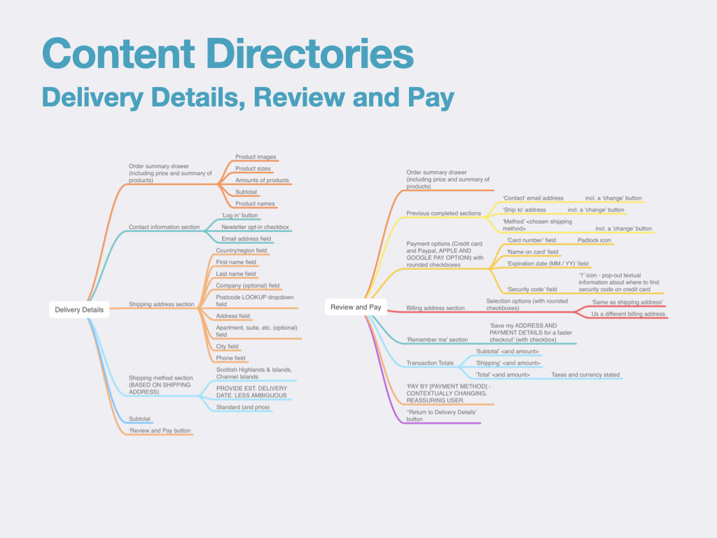
Content Directories
Across both Content Directory slides, I have mapped all of the information on webpages/screens in the current Sobersauce site structure against my proposed new structure. The outcome of this process also serves as a handy guide for making sure that all content is included in early sketches and wireframes.
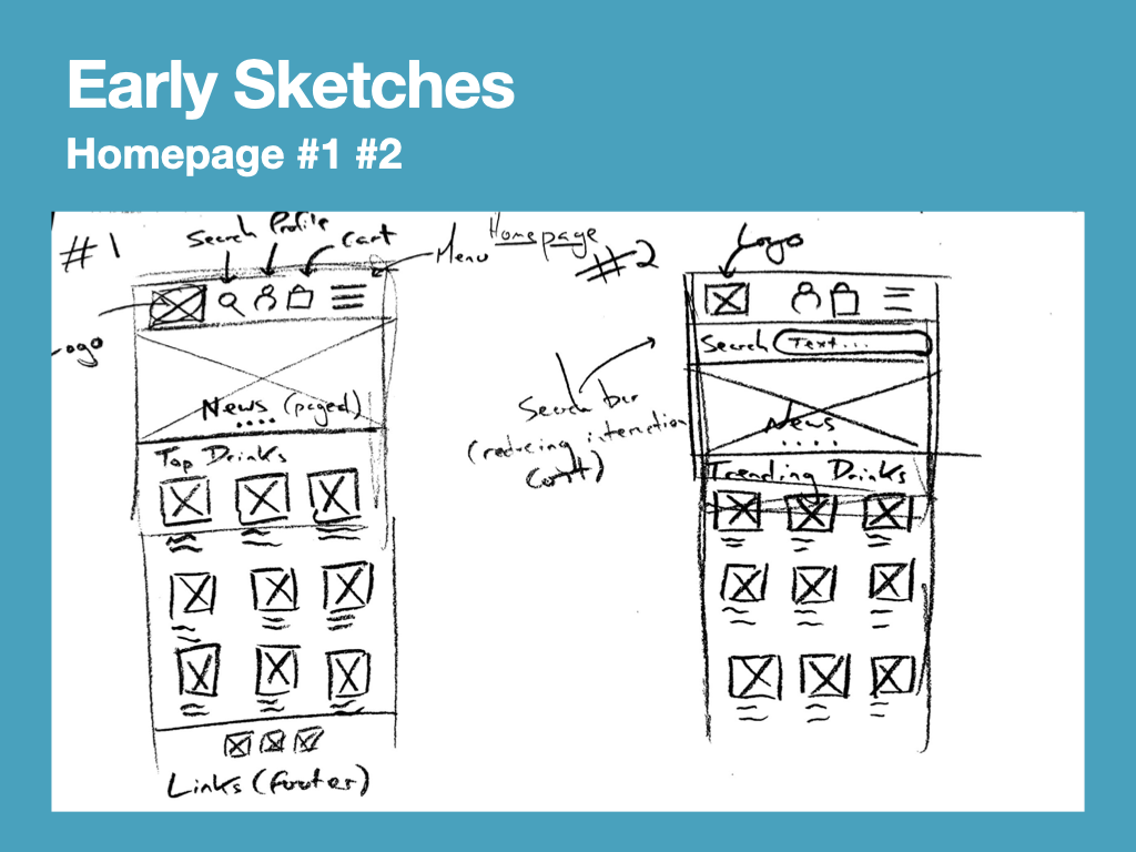
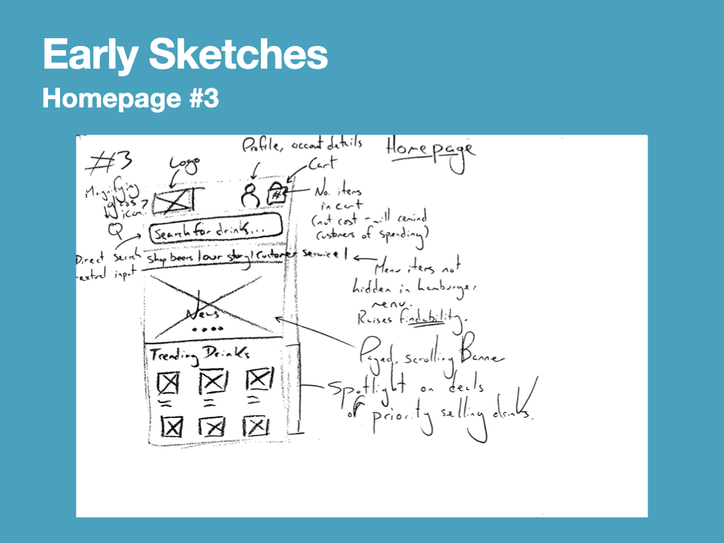
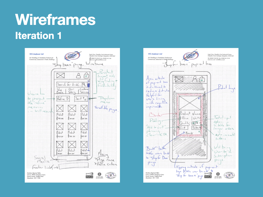
Early Sketches and Wireframes
Production of early sketches and wireframes allowed me to think broadly about how the information architecture and the webpage layout could be adapted to meet my three objectives. My blog post on early sketches and wireframes documents my iterative development process and reflections upon design decisions, including justifying my decisions against the outcomes of my research and user personas.
Ideation and Early Development
Sustainable Development Goal 3
To begin early development, and in line with the Learning Outcome: D, “Publicly demand and support the development of policies promoting health and well-being in relation to Sustainable Development Goal 3 – Good Health & Well-Being,” I explored how my role as a Design Communicator could help my client promote good health and wellbeing.
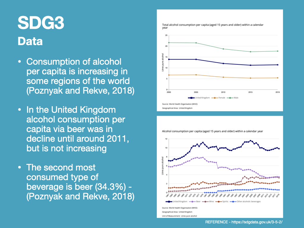
In response to these trends, it may be appropriate to encourage alcohol free/low alcohol e-retailers to publicise the benefits of alcohol free products more prominently. However, this may be a matter for government intervention. Competing brands within the drinks industry, such as Heineken and Guinness, have began advertising the alcohol free versions of their drinks alongside the alcoholic counterparts.
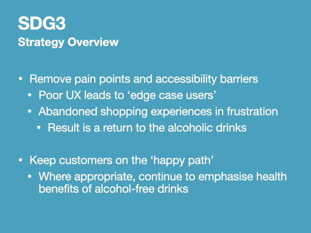
As a designer undertaking a ‘Design Communication’ module at university, I feel the extent to which I can promote health and well-being through reduction of alcohol intake is to remove pain points and accessibility barriers that my client’s customers may experience. Some customers may be trying alcohol free drinks for the first time, and poor UX could cause them to become an ‘edge case user’, abandoning their shopping experience in frustration, to return to the alcoholic drinks within their comfort zone (Google, n.d.).
By keeping my client’s customers on the ‘happy path’ within the UX, and emphasising the health benefits of alcohol-free drinks, customers can be encouraged to participate in alcohol-free experiences and hopefully enjoy a healthier lifestyle.
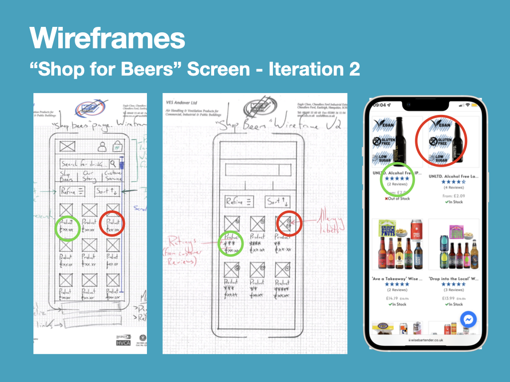
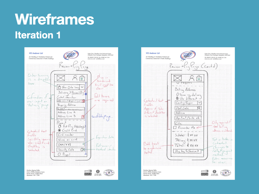
Low Fidelity / Paper Prototyping
I built a paper prototype of my design for the Sobersauce mobile experience. The paper prototype is essentially a rough, pencil-traced version of my recent wireframes, which can be adjusted quickly using a pencil and rubber. My intentions were to put this paper prototype in front of a prospective user to gauge their reaction (and hopefully inform further iterations of the design) – I could then make design changes and decisions quickly, recording the adjustments directly onto the prototype (Bowles and Box, 2011).
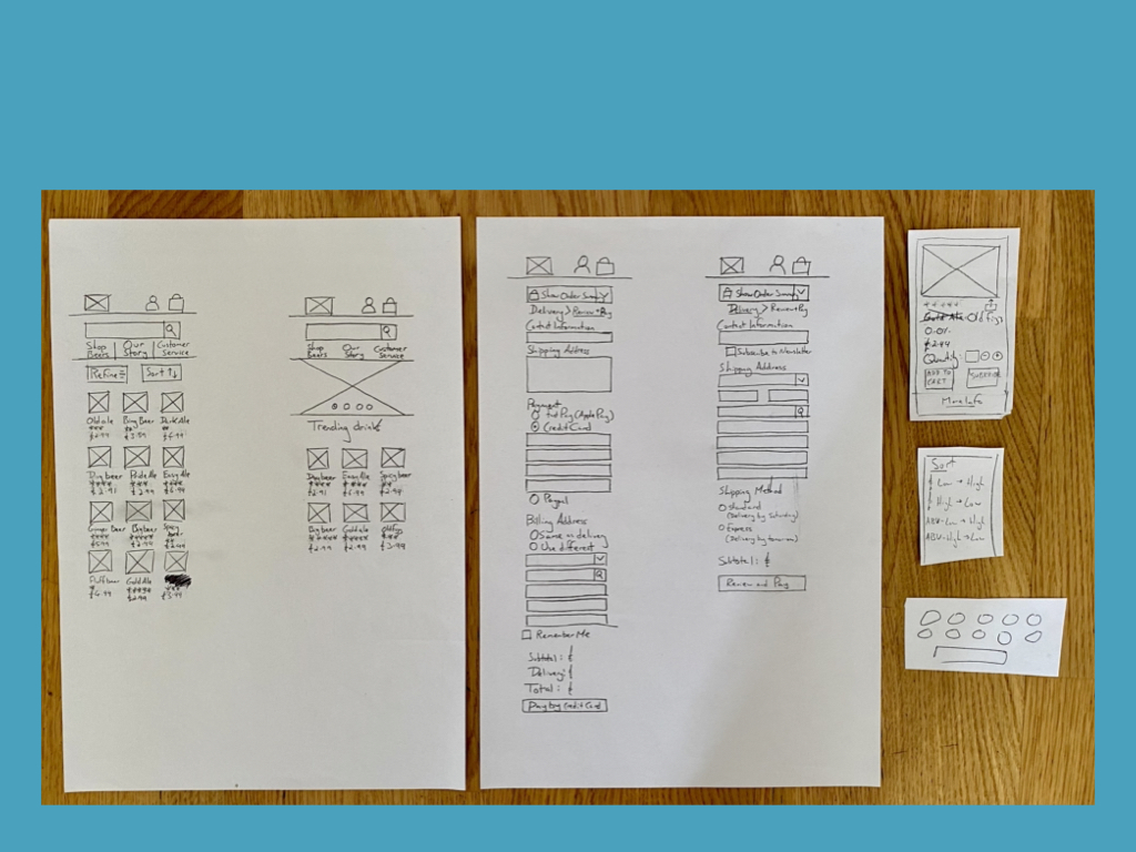
Using this paper prototype, I completed one round of usability testing. The objective for the usability test was to address the user’s ability to locate a product and then add multiples of the product to their basket. This would be a useful test because the Sobersauce homepage had been redesigned and the product pages had become pop-out windows. The impact this design change might have on the user’s ability to wayfind would be important to understand and may require further remedial work should it lead to undesired outcomes.
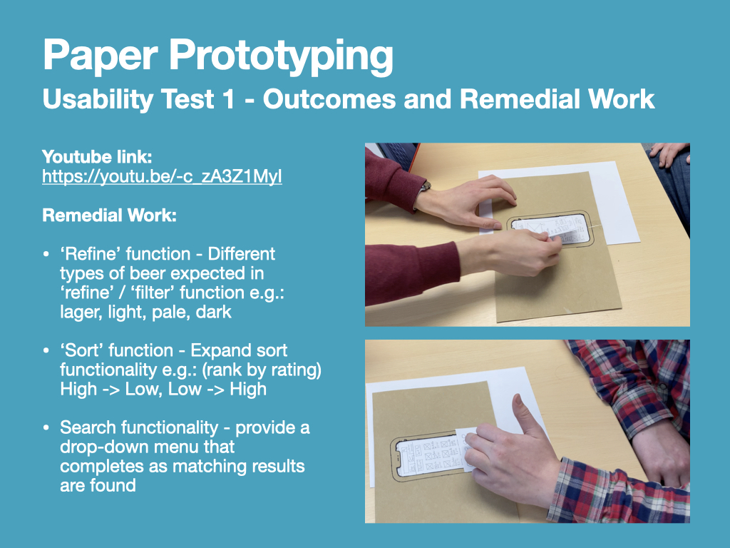
Small amounts of remedial work were required following the usability test, and these mostly related to the user’s expected behaviour of functions such as sorting, filtering, and searching. These remedial works would be implemented as part of the development process at medium-fidelity level.
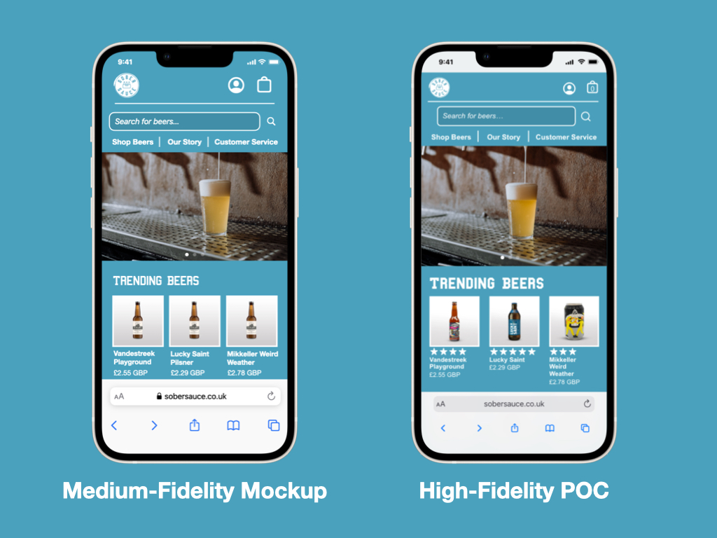
Medium Fidelity Mockups
The intention of this process was to produce a professional prototype that accurately depicted the design of the mobile experience. By producing a prototype at this fidelity level, the results could be presented to key stakeholders to reduce any ambiguity surrounding the UI elements and encourage them to offer constructive criticism on the newly included.
I began by colouring my previous wireframes, enabling me to make a mental note of where colour contrasts would be important, such as text fields and buttons, and how many different colours and shades may be required.
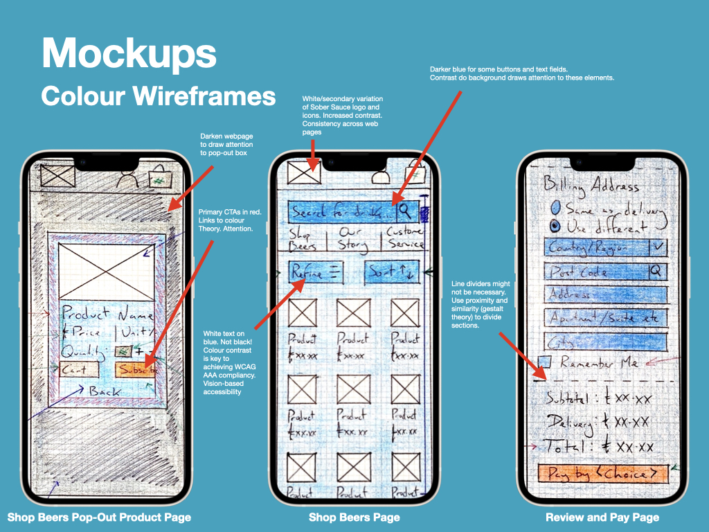
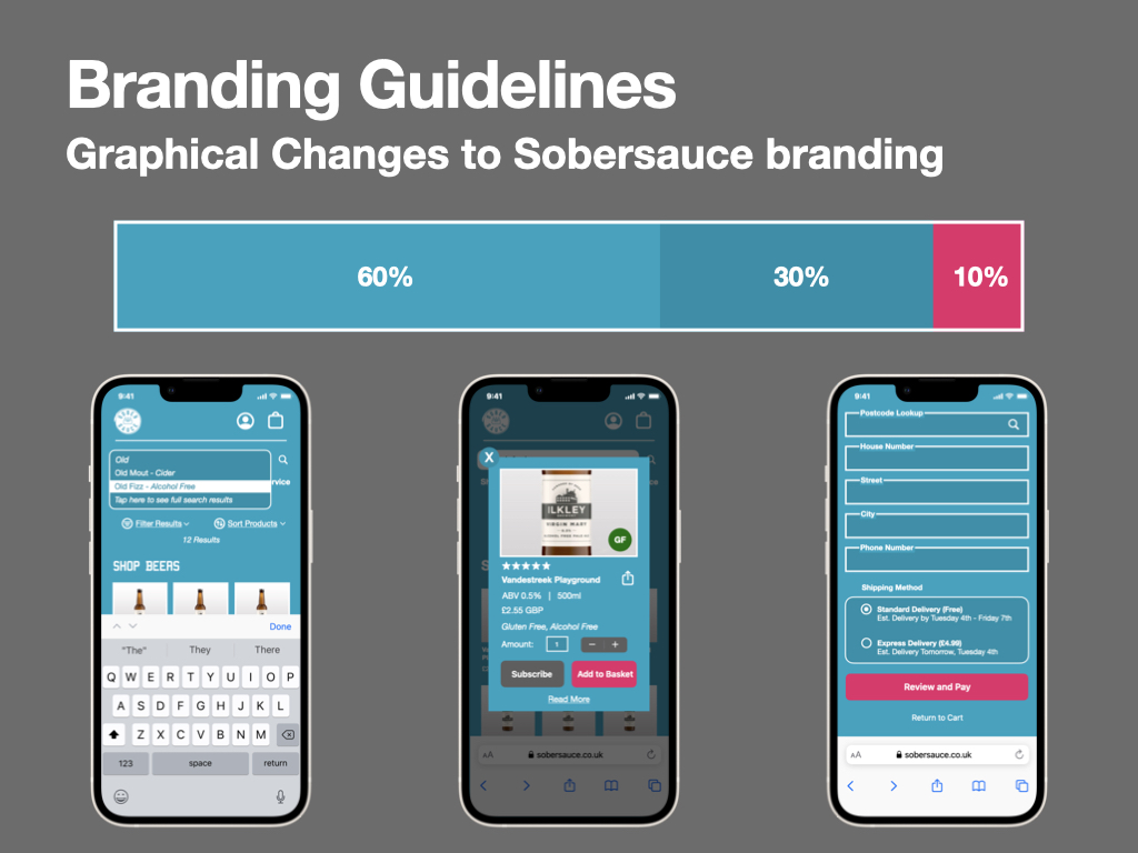
I then have to establish and record any design changes that might need to be made to the Sobersauce branding, then decide whether these might be acceptable if this were a live brief. In line with one of my objectives, I intended to make the Sobersauce branding more prominent on the mobile website, so I borrowed their blue colour for the website’s background. I then chose a darkened version of the blue and paired it with the red colour that Sobersauce currently use for their buttons.
The distribution for these colours would follow the 60-30-10 rule (Munro, 2019) – a rule taken from interior design that is frequently being adopted by UI designers for mobile applications to “create a sense of balance and allows the eye to move comfortably from one focal point to the next” (Adelugba, 2020).
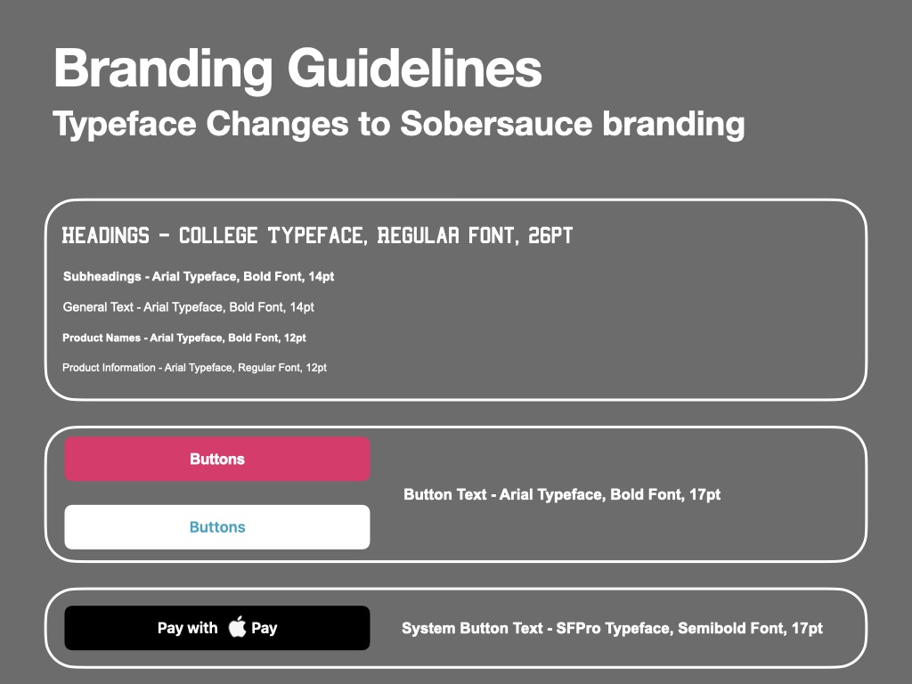
Changes to the branding guidelines were also needed regarding the typeface. To increase the brand presence, I decided that the “College” typeface could appear more frequently, rather than just within the logo, so I included it for all headings. Some adjustments were also needed to the font sizes across the website to provide hierarchy – I planned this using the Type Scale tool at www.type-scale.com.
The following images, ISSUU presentation, and blog post detail the iterative development of each webpage in the prototype. Some webpages are divided into upper and lower portions of the page, due to limitations in the phone screen size.
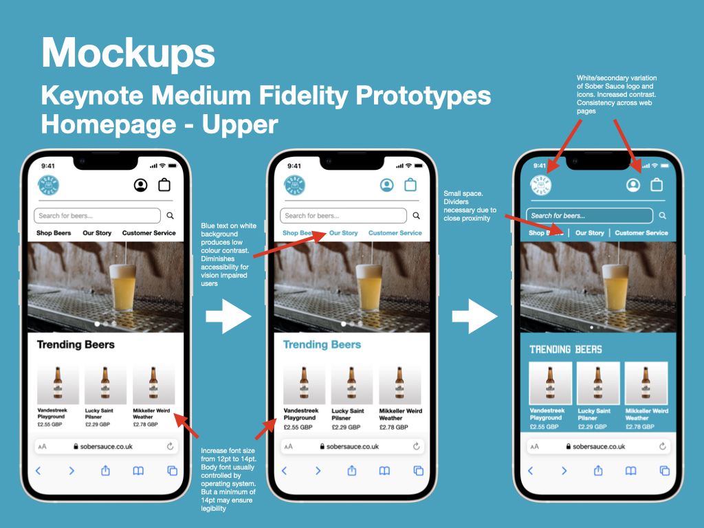
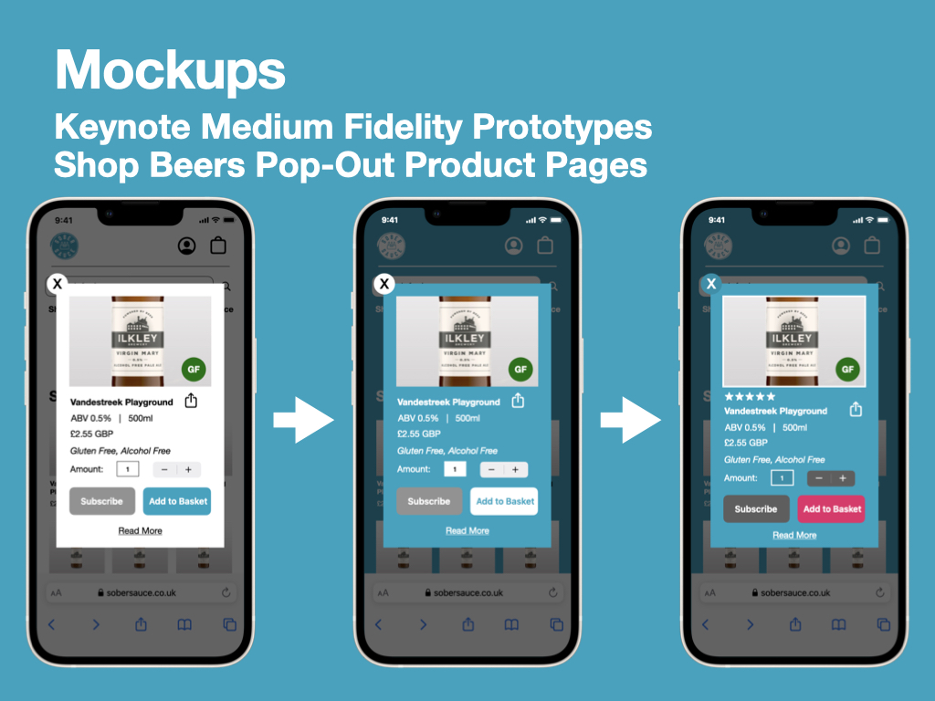
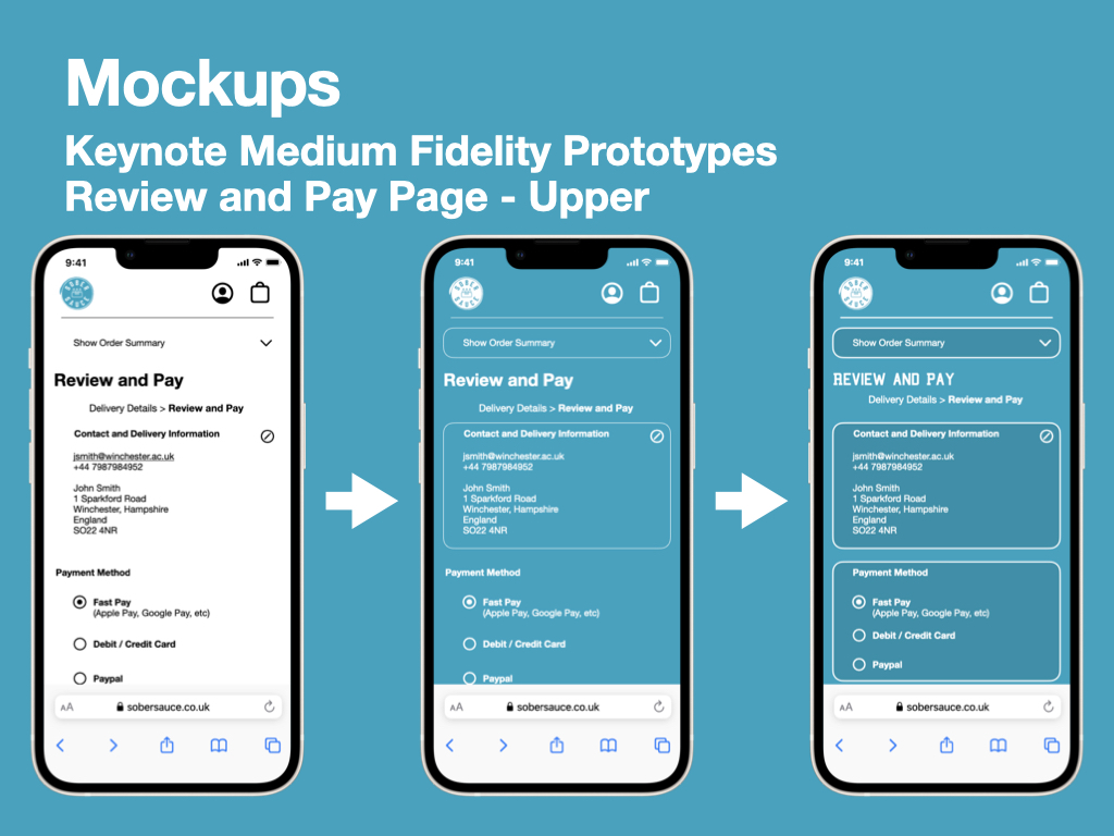
Please click on the below ISSUU presentation to see how each webpage was iterated upon to produce the final medium-fidelity prototype.
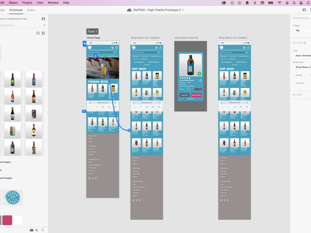
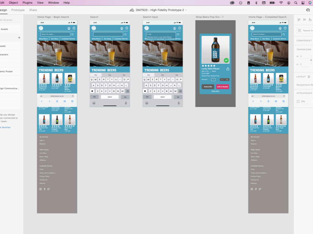
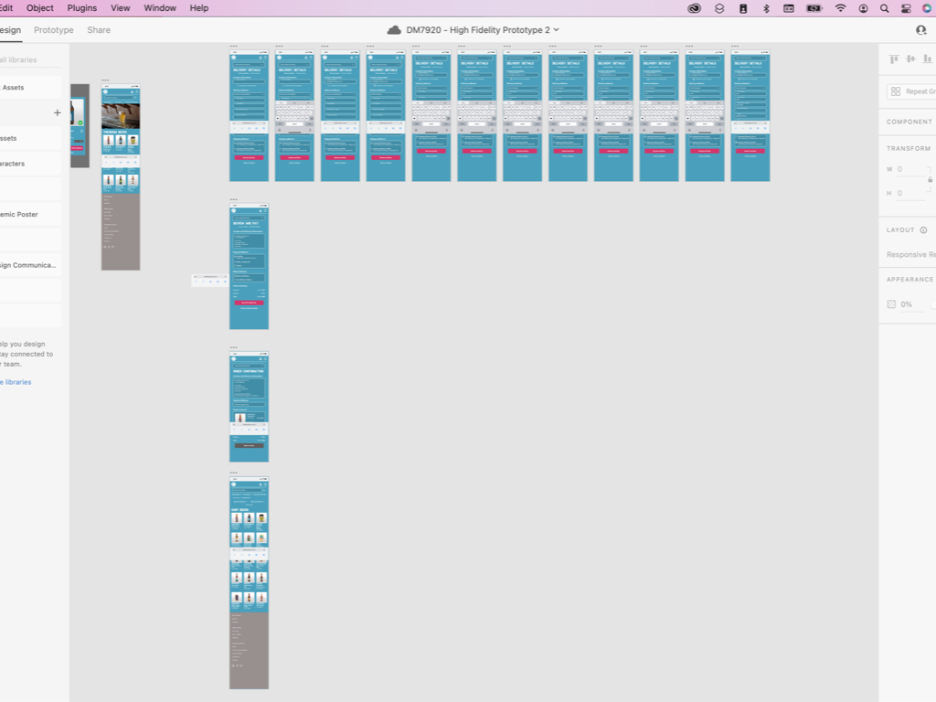
High Fidelity Prototyping
The final stage in this project was to produce a high-fidelity prototype to serve as a final proof of concept (POC) for the client. The intention of the POC was to closely replicate my final design, include all earlier iterations and refinements, and to present an interface that stakeholders can provide final criticisms on (Cronenwett, 2016). If required, stakeholders could decide to commission a final round of usability testing on the POC as it is a high-fidelity prototype, and this would enable them to gain rich feedback on newly included aspects such as transitions and realistic user interactions (UXPin, 2021). However, if they choose not to do this, then the prototype would serve as a useful tool for a collaborating with the development team, who will code the website to appear exactly the same as the POC (Ibragimova, 2016).
I decided to create the POC in Adobe XD, as this is a software platform that I feel most strong at using. I had also identified a couple of features that I had limited experience in using, so saw this project as an opportunity to improve on those skills too.
In my blog post linked below, I have recorded my thought processes and reflections upon my performance at this stage of the project.
Overall, I feel that the high-fidelity prototype (and final proof of concept) demonstrate that I have successfully met all three of my objectives and learning goals. My research and implementation of the WCAG AA guidelines have resulted in the adaption of the Sobersauce branding to both enhance the brand presence across the website and increase accessibility for users living with vision impairments.
My iterative and targeted approach to prototyping and usability testing has enabled me to refine the complex information architecture, reducing the amount of webpages and their length, making each web page’s purpose clear.
Finally, further exploration of Adobe XD features such as repeat grids and default states have enriched my high-fidelity prototypes, allowing me to demonstrate checkboxes and sort/refine functionalities to my stakeholders. This helps me demonstrate methods of streamlining the shopping and checkout experience.
Moreover, I believe that in completing this project I have challenged myself to apply my newly-acquired UX knowledge to a realistic ecommerce brief. I could have performed stronger in some areas, especially by conducting a more thorough usability testing process, and closer aligning my project to Sustainable Development Goal 3 – and so these areas will become a main consideration for my next project.
Final Proof of Concept
Below you will find my final proof of concept, demonstrated using three YouTube videos. Each video completes one of the user flows within the proof of concept. I have also included an interactive Adobe XD link that could be used as part of future usability testing and for interactive demonstrations with stakeholders. The interactive links do not require any further software, other than a basic Internet browser.
Flow 1: Adding Products to the Basket
Interactive link: https://xd.adobe.com/view/70d410f6-75a4-4624-9c69-ee2b1a465149-2587/?fullscreen
Flow 2: Using the Search Functionality
Interactive link: https://xd.adobe.com/view/084e8dec-f615-4b58-a306-0ed3c5ca819c-5d1d/?fullscreen
Flow 3: Completing the Checkout Process
Interactive link: https://xd.adobe.com/view/0f3733b0-f0da-4608-87a8-10becdc3066c-5a64/?fullscreen
References
Adelugba, A. (2020). How the 60-30-10 Rule Saved the Day. [online] Medium. Available at: https://uxdesign.cc/how-the-60-30-10-rule-saved-the-day-934e1ee3fdd8 [Accessed 12 Apr. 2022].
Alexa.com. (2019). Alexa – Competitive Analysis, Marketing Mix, and Website Traffic. [online] Available at: https://www.alexa.com/siteinfo.
Bowles, C. and Box, J. (2011). Undercover User Experience : Learn How to Do Great UX Work with Tiny budgets, No time, and Limited Support. Berkeley, CA: New Riders.
Bradley, S. (2010). Designing for a Hierarchy of Needs. [online] Smashing Magazine. Available at: https://www.smashingmagazine.com/2010/04/designing-for-a-hierarchy-of-needs/ [Accessed 5 Jul. 2021].
Cronenwett, D. (2016). Hands-On Mobile Prototyping for UX Designers Online Class. [online] LinkedIn. Available at: https://www.linkedin.com/learning/hands-on-mobile-prototyping-for-ux-designers?u=89462170 [Accessed 3 Apr. 2022].
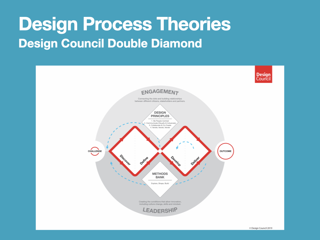
Design Council (2019). What Is the Framework for innovation? Design Council’s Evolved Double Diamond. [online] Design Council. Available at: https://www.designcouncil.org.uk/news-opinion/what-framework-innovation-design-councils-evolved-double-diamond [Accessed 30 Aug. 2021].
Ferrer, M. (n.d.). Online Course – Introduction to UX Writing (Mario Ferrer). [online] Domestika. Available at: https://www.domestika.org/en/courses/798-introduction-to-ux-writing [Accessed 28 Feb. 2022].
Google (n.d.). Start the UX Design Process: Empathize, Define, and Ideate: Week 3 – Crafting User Stories and User Journey Maps. [online] Coursera. Available at: https://www.coursera.org/learn/start-ux-design-process/home/ [Accessed 22 Mar. 2022].
Ibragimova, E. (2016). High-fidelity prototyping: What, When, Why and How? [online] Medium. Available at: https://blog.prototypr.io/high-fidelity-prototyping-what-when-why-and-how-f5bbde6a7fd4 [Accessed 2 Apr. 2022].
Khan, H. (2018). Why All Sale Signs Are Red: the Science of Color in Retail. [online] Shopify. Available at: https://www.shopify.com/retail/store-signs-and-red-signs [Accessed 18 Jan. 2022].
Munro, L. (2019). UI Color Palettes & Color Schemes. [online] Adobe XD Ideas. Available at: https://xd.adobe.com/ideas/principles/web-design/ux-of-color-palettes/ [Accessed 11 Apr. 2022].
Nodder, C. (2017). Become a User Experience Designer Pt.2. – UX Design: 1 Overview. [online] LinkedIn. Available at: https://www.linkedin.com/learning/ux-design-1-overview-2/welcome?contextUrn=urn%3Ali%3AlyndaLearningPath%3A56dfbc9b92015a33b4908fdd&u=89462170 [Accessed 8 Jul. 2020].
UXPin Inc (2015). The Ultimate Guide to Prototyping. [online] UXPin. Available at: https://www.uxpin.com/studio/ebooks/guide-to-prototyping/ [Accessed 31 Jan. 2022].
UXPin (2021). High-Fidelity Prototyping vs. Low-Filedity Prototypes: Which to Choose When? [online] Studio by UXPin. Available at: https://www.uxpin.com/studio/blog/high-fidelity-prototyping-low-fidelity-difference/ [Accessed 2 Apr. 2022].