One of the first steps in producing an augmented reality experience prototype is attaining 3D virtual object to superimpose onto the real world. For my project, this would involve finding a way to create 3D virtual objects from a real camera body and camera lens.
Before this week, I had no idea how to achieve this in a realistic timeframe. I had limited experience of working in 3D software and knew I would not be able to build an object from scratch for this module. However I was aware that Apple had unveiled a new API as part of Xcode in Mac OS Monterey called “Object Capture,” which aimed to put photogrammetry functionality into app developers’ and designers’ hands.
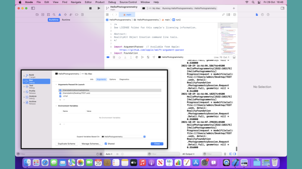
I signed up to the Apple Developer programme and downloaded Xcode, then managed to implement Apple’s “HelloPhotogrammetry” example code and produce the following scans:
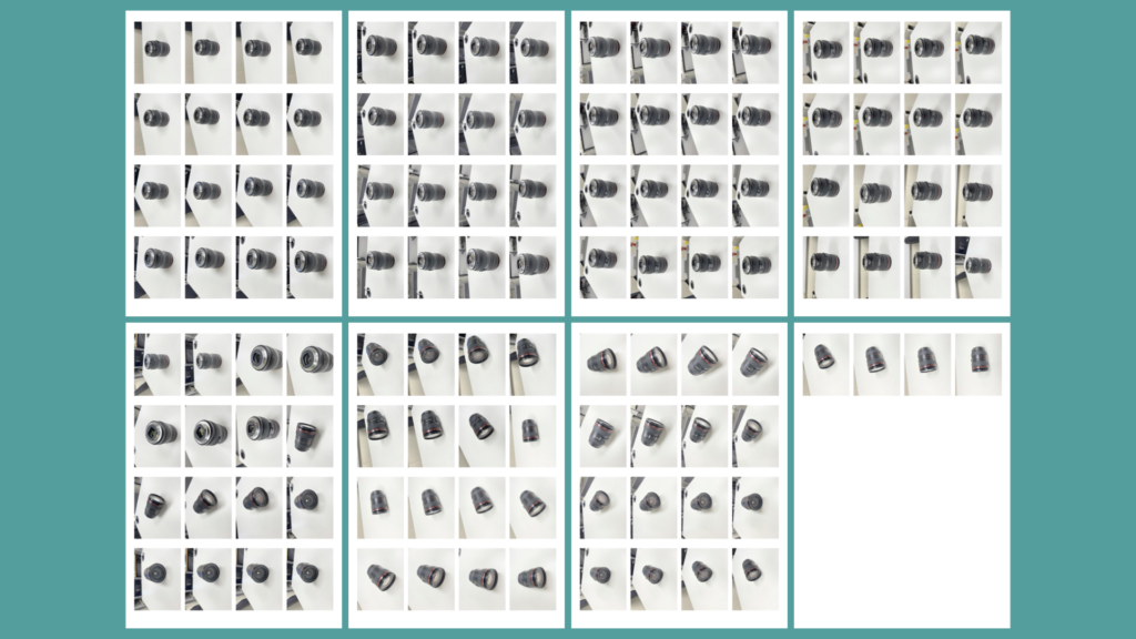
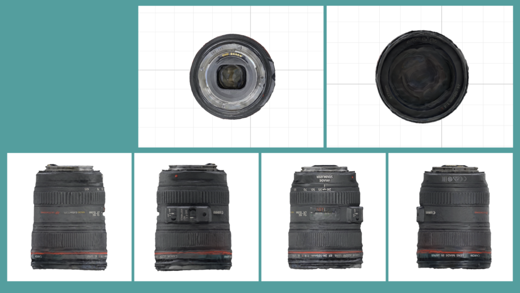
Above: Tearsheets or ‘Contact Sheets’ of each photo taken of the camera lensAbove: A screen shot of Apple’s ‘Hello Photogrammetry’ code running in XcodeAbove: Multiple angles of the resulting 3D virtual lens
After a few attempts, I arrived at fully rendered virtual versions of the scanned objects. Any ‘gaps’ in the scans could be filled by taking extra photos of those areas. The file size of these scans were huge – some were around 400mb. Despite being inaccurate in some areas such as texture, with minor issues with shape too, I thought that these would be perfect for producing a proof of concept. I would not be able to create anything better with the limited 3D knowledge that I have and the time constraints of this module.
Below, I have uploaded the models of the lens and camera body to Sketchfab:
This week I’ve been reflecting upon my strategy for addressing accessibility within the Multimedia Centre AR app. My research of existing AR applications and previous studies on accessibility within AR have revealed a wide scope for learning within this module. However, I have noticed that I’m feeling more drawn to addressing motor impairments within mobile application design. Some early considerations such as reachability and the creation of ‘freeze frames’ appear to be pointing towards an interest in resolving issues for users with motor impairments, so I’ve decided to lean into this. My strategy is that deep-diving into one area of learning will allow me to develop a deeper understand of it, as opposed to attempted to skim across the surface of many accessibility areas, such as tackling motor, vision, auditory, cognitive, etc impairments all in one project.
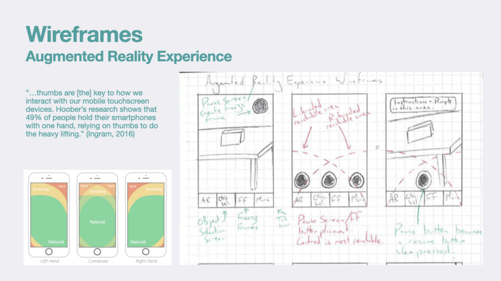
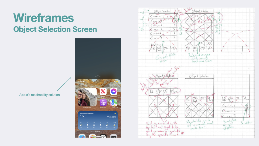
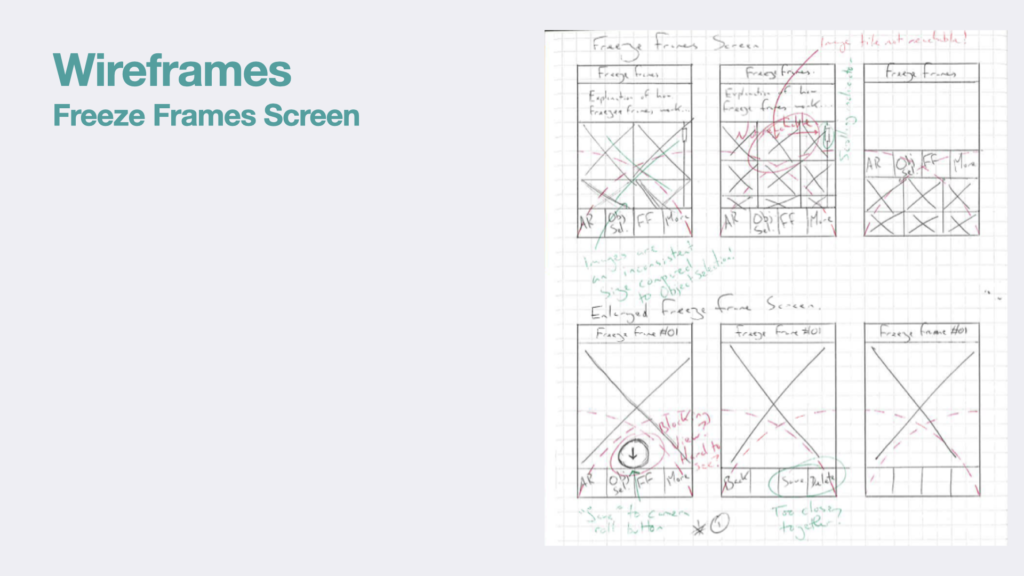
In some early wireframes that I have created, I considered the reachability of navigational elements and other interactive artefacts within the user interface. This will benefit many everyday users who cannot reach all areas of their screen with one hand. However, it could even be seen a revolutionary for users who only have full use of one arm, or users who suffer from an arthritic illness. By demonstrating how the “Freeze” functionality coined by Herskovitz et al. could be implemented into an AR application, I intend to increase accessibility to users who live with tremors or involuntary movements such as muscle spasms.
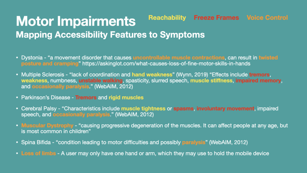
From my research I have found that there are a large variety of motor impairments that users could suffer from. Each of these impairments is characterised by a range of symptoms, which may not be the same for everyone. In the Keynote slide pictured below, I have identified many symptoms, including tremors or stiffness of muscles, paralysis, changes in posture, loss of limbs, or muscle degeneration. I’ve also categorised some of these symptoms by accessibility functionalities that I intend to build into the prototypes, ascertained from my earlier study of research papers.
Viewing motor impairments in this way has shown me that there’s quite a wide scope of challenge for developers who are looking to make their applications more accessible to these users. However, by categorising these symptoms, it looks as though catering for users who live with such impairments is a bit more manageable.
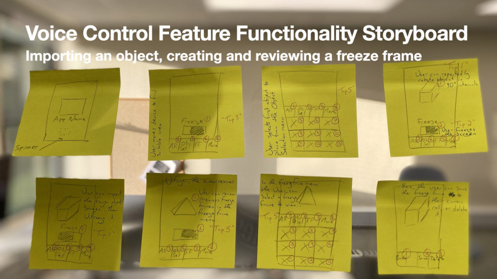
This week I’ve also taken a look into how different mobile operating systems, such as Android, have been accommodating for users with motor impairments. Within the screenshot below, I’ve recorded some tips that Android have provided to developers. I’m particularly keen on exploring the Voice Access / Voice Control functionality, which allocates numbers to each interactive on-screen element (such as buttons). I know this functionality is also present on Apple’s iOS devices, so I feel it’s an industry standard, which users with motor impairments may already understand the functions behaviour. I’ve produced a early visualisation of how voice access functionality could be integrated into the Multimedia Centre AR application below, and I’m considering how I could prototype this and produce a suitable usability test.
References
Herskovitz, J., Wu, J., White, S., Pavel, A., Reyes, G., Guo, A. and Bigham, J. (2020). Making Mobile Augmented Reality Applications Accessible. ASSETS ’20: International ACM SIGACCESS Conference on Computers and Accessibility. [online] Available at: https://dl.acm.org/doi/10.1145/3373625.3417006 [Accessed 26 Sep. 2021].
Ingram, S. (2016). The Thumb Zone: Designing for Mobile Users. [online] Smashing Magazine. Available at: https://www.smashingmagazine.com/2016/09/the-thumb-zone-designing-for-mobile-users/ [Accessed Oct. 2021].
WebAIM (2012). WebAIM: Motor Disabilities – Types of Motor Disabilities. [online] Webaim.org. Available at: https://webaim.org/articles/motor/motordisabilities [Accessed 28 Oct. 2021].
Wynn, P. (2019). How to Improve Fine Motor Skills Affected by Neurologic Disorders. [online] Brainandlife.org. Available at: https://www.brainandlife.org/articles/a-loss-of-fine-motor-skills-is-a-common-symptom/ [Accessed 26 Oct. 2021].
01:30 – Splash / Loading screen presented to tester
02:04 – Augmented Reality Experience screen presented to user
02:21 – Confirmation that placement ring/target is misunderstood as an object (could be due to drawing)
02:40 – Tester reads instruction and presses placement ring to place first object
03:10 – Tester would like to press the ‘freeze’ button to move the object. Voice concern of putting their finger over the object they’d like to move because they’d be ‘covering the object’
03:45 – Tester realises that a swiping gesture can be applied to move the object around the screen
04:15 – Tester understands how rotation functionality works
04:55 – Tester confirms they understands that they ‘can hold [their] phone and walk around the object’ to view it
05:15 – Tester confirms they understand the ‘Freeze Frame’ functionality
05:47 – Tester recognises expected behaviour of toggle switch, which they call a ‘bar’. Not a button.
06:40 – Tester is revising the briefing given to them on a computer screen (out of shot)
06:50 – Tester confirms understanding that they can visit the Object Selection screen by pressing the respective button in the tab bar
08:00 – Object Selection screen presented to tester
08:10 – Tester’s expectations of the screen’s behaviour matches my intentions
08:35 – Tester recognises repositioning of task bar and lack of ‘Freeze Frame’ functionality and camera on the screen
09:12 – Tester interacts with Object Selection screen as expected to select and place a new camera
09:47 – Augmented Reality Experience screen presented to Tester again
09:58 – Tester confirms that they expected to revisit this screen after selecting a camera on the Object Selection screen
10:05 – Tester explains they would expect the application to behave as previously when following the interactive walkthrough
10:29 – Interactive walkthrough was required again to prompt tester to continue to try reviewing a Freeze Frame. They did not continue to explore the functionality without prompting
10:42 – Unclear whether Tester is aware that their first ‘Freeze Frame’, taken during the walkthrough process, has already been stored in the app, but isn’t ‘saved’ to the OS’s Camera Roll…
Perhaps there is room for confusion here. The ‘Freeze Frame’ has actually been saved in the app, but not saved to the OS’s Camera Roll. Maybe clearer terminology and explanation needed? ‘Save’ vs ‘Export’?
11:32 – Freeze Frames screen presented to Tester
11:32 – Tester confirms that the screen matches their expectations
11:49 – Tester selects first ‘Freeze Frame’ as expected
12:11 – Tester presented with Freeze Frame #01 screen
12:19 – Tester selects the ‘Save’ option as expected from the tab bar
Summary
Watching back on the usability test I feel that I could improve some of my verbal communication. At times I am unclear or appear unconfident, when really I’m spending a bit of time thinking about what I’m saying as I try not to ask any leading questions. As I complete more usability testing and develop my techniques, I am sure this will improve.
I am very satisfied with the outcomes of this usability test. Many of the behaviours that I’ve incorporated into the design were recognised, and I think this is largely because I borrowed some recognisable artefacts from Apple’s iOS. Such artefacts include a toggle switch, a tab bar, and a drawer for images (much like common photo album applications). The Tester’s sudden recognition of the toggle switch’s change in state at 05:47 is testament to how recognisable UI artefacts and their resulting behaviours ease the user into a new experience. Recognition of gestures such as tapping to make selections, as well as swiping around the screen to move the object, also align with my earlier research, “standardised interaction schemes are required to overcome any limitation in user understanding” (Craig, 2013).
The tester embraced the interactive walkthrough, although there was some reliance on it, as evidenced by the tester not proceeding to the freeze frames screen without the walkthrough being reinstated. This raises an interesting debate between interactive walkthroughs and other forms of onboarding, which I haven’t explored in this project – a potential research idea for the future.
Actions:
There are three issues identified within the session that may require remedial work as I produce the medium-fidelity prototype. These are:
Confirmation that placement ring/target is misunderstood as an object. It is very likely that the ‘target’ (Andaluz et al., 2019) is confused as an object due to my drawing abilities and the paper prototype as a medium.
Tester would like to press the ‘Freeze’ button to move the object. Voice concern of putting their finger over the object they’d like to move because they’d be ‘covering the object’ To some extent this may be due to the presentation of a paper prototype. However from my research of other augmented reality experiences, I have noticed that small, translucent handles often appear around objects to give the use of something to hold onto and not cover the object itself
Onboarding process was required again to prompt tester to continue to try reviewing a Freeze Frame. They did not continue to explore the functionality without prompting I suspect this may be a pitfall of instructional walkthroughs, i.e.: How can the user be clear that the walkthrough has finished and not still waiting for them to continue? However having not yet thoroughly researched onboarding, there may be methods of producing them that prevents such reliance. I will explore this further!
Unclear whether Tester is aware that their first ‘Freeze Frame’, taken during the onboarding process, has already been stored in the app, but isn’t ‘saved’ to the OS’s Camera Roll…
Perhaps there is room for confusion here. The ‘Freeze Frame’ has actually been saved in the app, but not saved to the OS’s Camera Roll. Maybe clearer terminology and breadcrumb explanation needed? ‘Save’ vs ‘Export’?
There isn’t yet any confirmation for the user that freezing the screen, i.e. creating a freeze frame, actually saves that frozen image anywhere. This will need to be explained in the onboarding process. I do feel that the terminology also needs to be clarified.
Saving should happen automatically within the app, facilitating a review opportunity on the Freeze Frames screen. An option to ‘Export’ or delete each Freeze Frame should be given later, when each ‘Freeze Frame’ is being reviewed. This is keeping to the behaviour explained by Herskovitz et al.
Andaluz, V., Mora-Aguilar, J., Sarzosa, D., Santana, J., Acosta, A. and Naranjo, C. (2019). Augmented Reality in Laboratory’s Instruments, Teaching and Interaction Learning. Augmented Reality, Virtual Reality, and Computer Graphics : 6th International Conference, [online] 11614. Available at: https://ebookcentral.proquest.com/lib/winchester/detail.action?pq-origsite=primo&docID=5923384#goto_toc [Accessed 30 Sep. 2021].
Craig, A.B. (2013). Understanding Augmented Reality: Concepts and Applications. San Diego: Elsevier Science & Technology Books.
Herskovitz, J., Wu, J., White, S., Pavel, A., Reyes, G., Guo, A. and Bigham, J. (2020). Making Mobile Augmented Reality Applications Accessible. ASSETS ’20: International ACM SIGACCESS Conference on Computers and Accessibility. [online] Available at: https://dl.acm.org/doi/10.1145/3373625.3417006 [Accessed 26 Sep. 2021].
Last week in my blog post I established some desired functionality and expected interaction between the user and the augmented reality experience. I can now move on to consider how the experience could be accessed by the user.
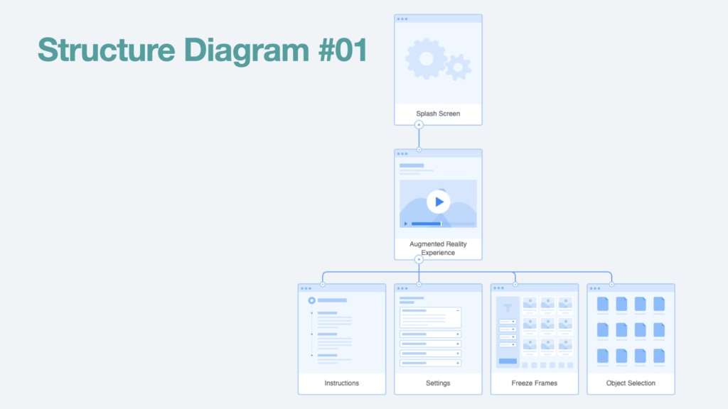
On the below presentation slide, I’ve illustrated the structure of a rudimental mobile application. I’ve kept it this way so that I can focus on learning to produce an augmented reality experience throughout module, and implement any further ideas in response to users needs in later research.
The user will begin by launching the mobile application and will see a splash screen while the application loads. At that point they will immediately be taken to the augmented reality experience. Via a menu the user could then access freeze frames, further instructions, an object selection screen, and a variety of accessibility settings.
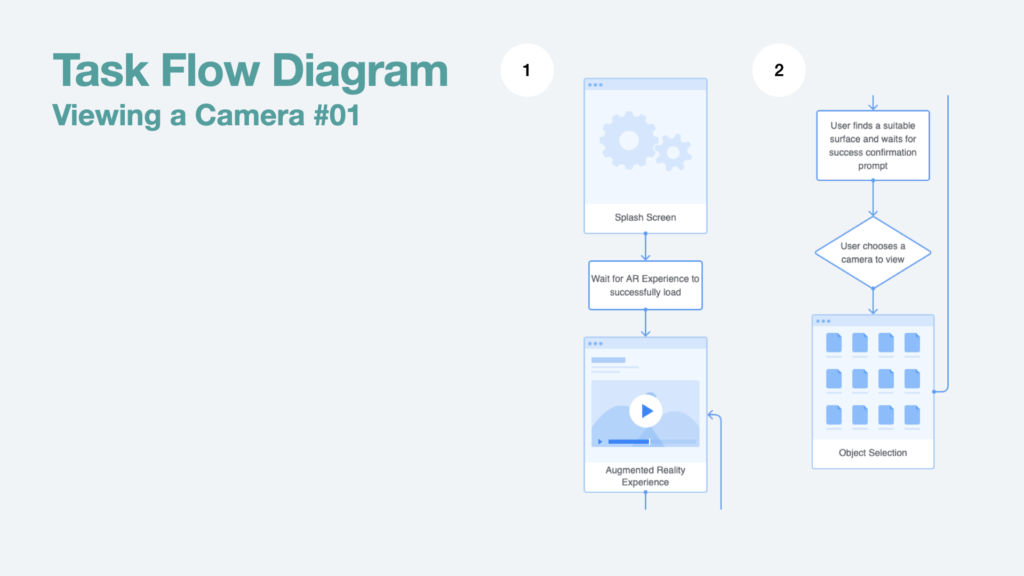
A key task flow that will need to be considered during my testing is the ability for the user to import an object into the augmented reality experience – an example of this is importing a virtual camera model into the experience. Once the user has selected the camera in the object selection screen they are then returned to the augmented reality experience. See below…
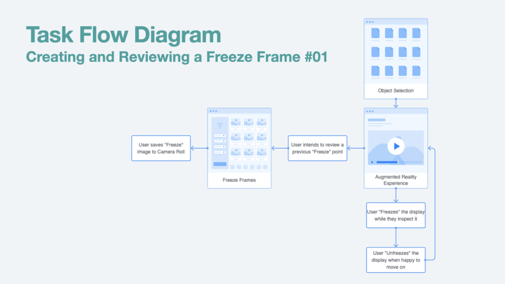
In terms of accessibility, a key task flow will be to create freeze frames, whereby the augmented reality experience is paused and the screen is kept static, regardless of the device’s movements thereafter. As illustrated on the presentation slide below, the user must be able to freeze the screen, and then unfreeze it, to continue the experience. Ideally, the user would also then be able to access a library of recent “Freeze” points for review, as they may feel unable to achieve the same positioning or recreate the same angle due to changes in their impairments.
Both of the task flows in this blog post will be a priority for usability testing at both paper prototype and medium fidelity stages. This usability testing may prompt further iterations relating to these task flow functions.
This week I wasn’t able to attend the critique in lecture due to a work commitment. However to make amends I decided to take stock of my progress with my project.
I’m in a good position so far – I’ve completed some research into Augmented Reality and it use in Higher Education/Teaching, including gaining some ideas on how accessibility issues can be approached.
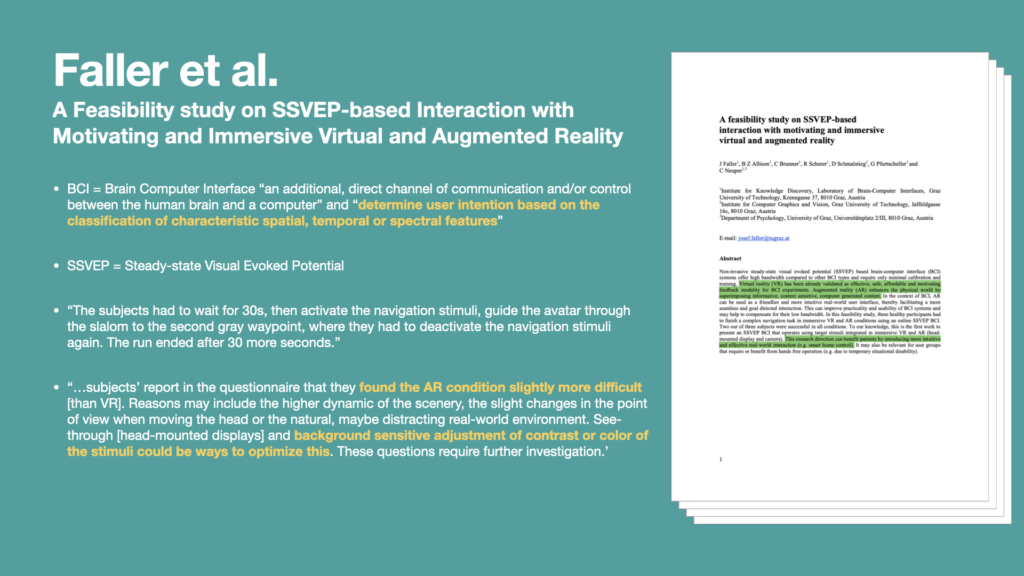
I was particularly interested in how Augmented Reality experiences could be responsive based upon “spatial, temporal or spectral features”. In their research paper, Faller et al. describe “Steady-State Visual Evoked Potential” (SSVEP for short), referencing the technology’s ability to respond to visual cues, such as recognising an object and its relationship in space to the user. This is further relayed by the phrase “brain-computer interface” (BCI), whereby there is constant communication between the user and the computer while the experience is taking place.
The navigation activity in the study involves the BCI responding mostly to the evolving scenario around the user, while they navigate the course; I can imagine a constant feedback loop, whereby the user reacts to the information given by the experience, then the experience (and information within it) updates based upon the user’s movements (and relationship with the obstacle course around them); in essence I think this epitomises what’s meant by a brain-computer interface, and is a fundamental example of how AR experiences can provide useful functionality for users.
Regarding accessibility, Faller et al. make comparisons between virtual reality and augmented reality, and I can see how an augmented reality experience could present more challenges compared to a virtual reality counterpart. The colour contrast between on-screen graphics and the background would be a particularly challenging aspect; in virtual reality the developer can have a larger degree of control over the placement of colour and light within the experience, however this is more difficult in augmented reality, because the user can initialise the experience in many real world scenarios where lighting, the colour of decor, and other aspects could make on-screen graphics more difficult to see. The idea of having “background sensitive adjustment of contrast”, as written in this paper, is an interesting one that I could implement into my experience in this module.
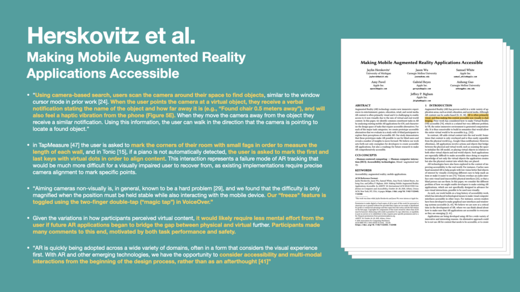
Another good example of the relationship between accessibility and AR would be the “Freeze Frame” functionality, coined by Herskovitz et al., which could be particularly useful for users with motor impairments. Herskovitz et al. found that “Aiming cameras non-visually is, in general, known to be a hard problem, and we found that the difficulty is only magnified when the position must be held stable while also interacting with the mobile device”. My thoughts on the “Freeze” ability would be to implement a toggle switch into the AR app’s user interface, enabling the user to freeze their device’s display to see a clear review of the augmented reality simulation.
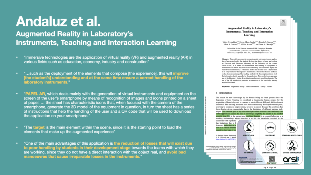
Another research paper, by Andaluz et al. provided some insight into how augmented reality is being used in the Higher Education sector to teach students on how to use laboratory instruments. In their research, Analuz et al.’s AR experience was triggered by the user aiming their mobile phone camera over a paper target. The example given was a piece of paper with six targets, which was provided to the students. When their camera phone was aimed at the target, a virtual laboratory instrument appeared in front of them. All instructions were distributed via a QR code on the paper target, which students could scan using the same smart phone.
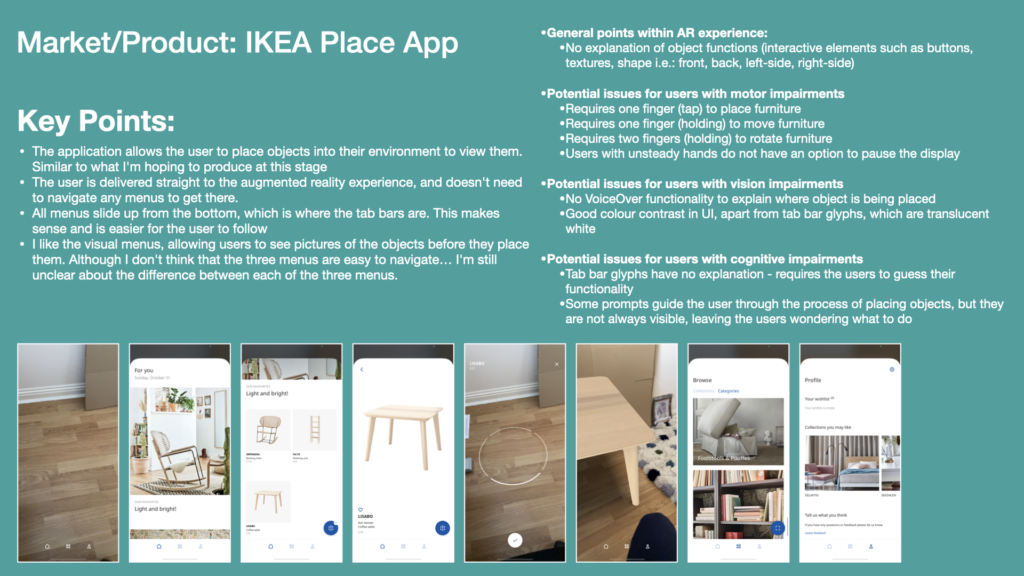
In my project I have a choice on whether or not to require a target to be used to initiate the augmented reality experience. I am already aware of mobile apps such as IKEA’s “Place” app, which doesn’t require a target, but instead requires the user to suggest a flat, horizontal plane for the virtual object to appear on – confirming by tapping their mobile phone’s screen. I suppose that the paper version could be seen as more accessible to users with particular cognitive and maybe vision impairments, as they would not need to interact with the user interface on the mobile device as much, as paper allows for a reasonably seamless blending of physical and virtual elements.
Andaluz et al. offer interesting justifications for pursuing this technology in laboratory based scenarios, which I believe could be transferable to the training of equipment within the Multimedia Centre at the University of Winchester. Enabling students to explore virtual versions of instruments and equipment could reduce the amount of losses and breakages caused by poor handling of them, and even avoid irreparable losses due to students learning bad practices; a good example of an existing issue is students breaking lenses by forcibly removing them without knowing the correct method for doing so.
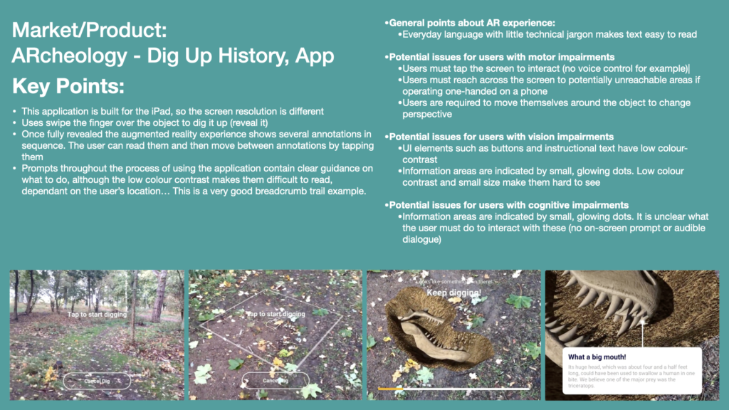
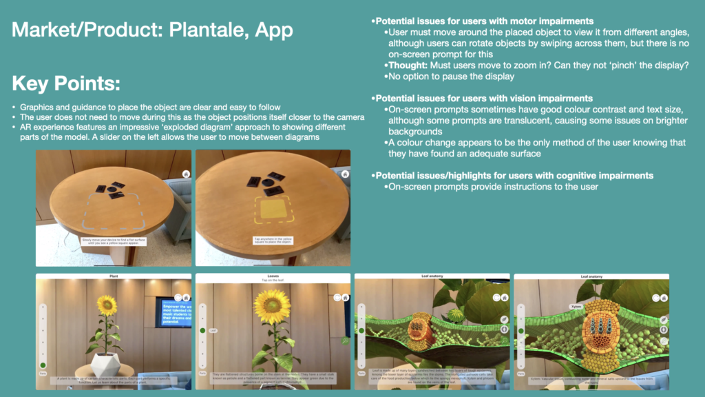
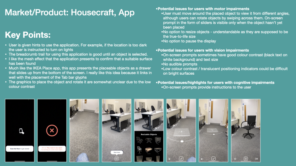
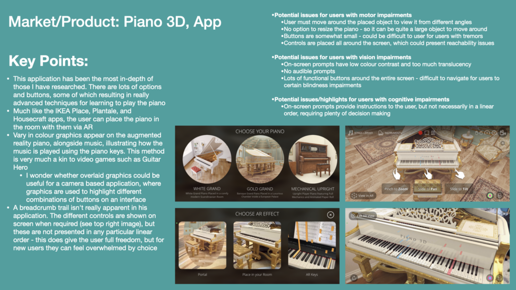
I’ve also completed some product research on existing augmented reality applications in Apple’s App Store. This has been pretty useful as I could point out shortcomings in other developers’ approaches to accessibility. I will attempt to remedy some of these shortcomings in producing a proof of concept for my own application.
From my research into existing AR applications, I have concluded:
The wide variety of environments that users can experience augmented reality in can present colour-contrast issues with on-screen buttons and instructions
Interaction with these applications is mainly through tapping and swiping
I found no evidence of applications allowing users voice control abilities – it is unclear how users who cannot use physical gestures could use these applications
Most applications do not provide VoiceOver for written information. The users must read instructions and annotations from the screen. This is made increasingly difficult when colour contrast issues are present
Menus which originate from the tab bar (such as drawers) are a common trait of these applications
Menus buttons tend to be placed in the lower portion of the screen, as when placed else where this can present difficulties for users with vision and motor impairments
Be careful when allowing users to place large objects, as they will need to move around them
Some applications aim to keep terminology simple and every day, increasing understanding for users and reducing barriers for users with cognitive impairments
Some applications allow users to progress time on their own accord. For example, a slider down one side of the screen that can be used to progress and exploded diagram. Alternatively users can tap the way between annotations of the virtual object
References
Andaluz, V., Mora-Aguilar, J., Sarzosa, D., Santana, J., Acosta, A. and Naranjo, C. (2019). Augmented Reality in Laboratory’s Instruments, Teaching and Interaction Learning. Augmented Reality, Virtual Reality, and Computer Graphics : 6th International Conference, [online] 11614. Available at: https://ebookcentral.proquest.com/lib/winchester/detail.action?pq-origsite=primo&docID=5923384#goto_toc [Accessed 30 Sep. 2021].
Faller, J., Allison, B.Z., Brunner, C., Scherer, R., Schmalsteig, D., Pfurtscheller, G. and Neuper, C. (2017). A Feasibility Study on SSVEP-based Interaction with Motivating and Immersive Virtual and Augmented Reality. eprint arXiv:1701.03981. [online] Available at: https://arxiv.org/abs/1701.03981 [Accessed 25 Sep. 2021].
Herskovitz, J., Wu, J., White, S., Pavel, A., Reyes, G., Guo, A. and Bigham, J. (2020). Making Mobile Augmented Reality Applications Accessible. ASSETS ’20: International ACM SIGACCESS Conference on Computers and Accessibility. [online] Available at: https://dl.acm.org/doi/10.1145/3373625.3417006 [Accessed 26 Sep. 2021].
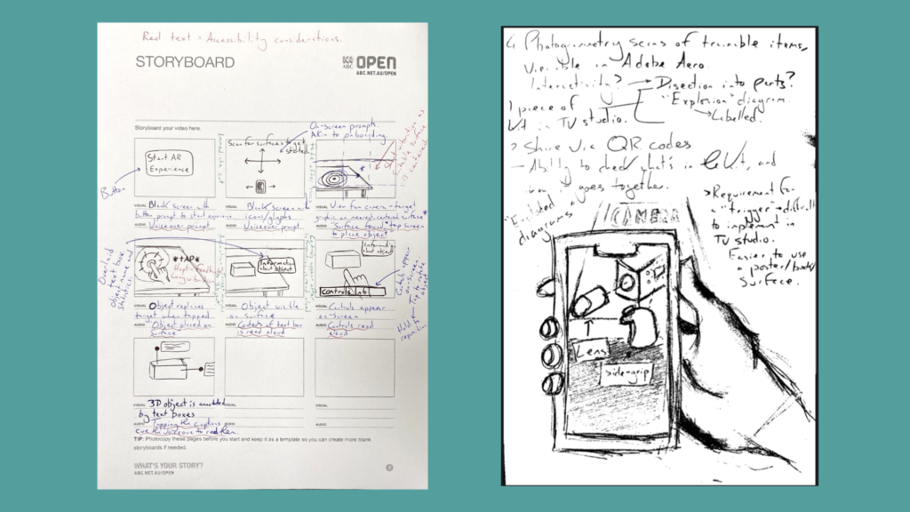
This week I’ve also started the visual design process by producing a range of sketches and storyboards. Aside from allowing me to think broadly and ideate through possible design options, these have provided a broad illustration of how I’d imagine a user would interact with the augmented reality experience. I’ve also been able to evidence some ideas of the functionality I’d expect to implement and expected user behaviour.
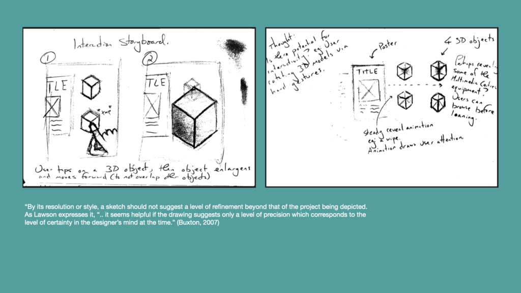
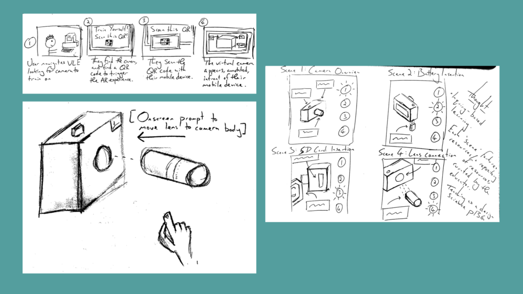
I’ve started the visual design process by producing a range of early sketches and storyboards. By no means do I expect to implement all features and functionality shown here – these are broad ideas that are not yet refined.
On the next few slides I’ve used found imagery to create montages that explain my ideas on how potential app functionality may work. I find this to be a quick method of conveying more refined ideas in an accurate manner, without the potential miscommunication or other questions arising from poorly drawn sketches!
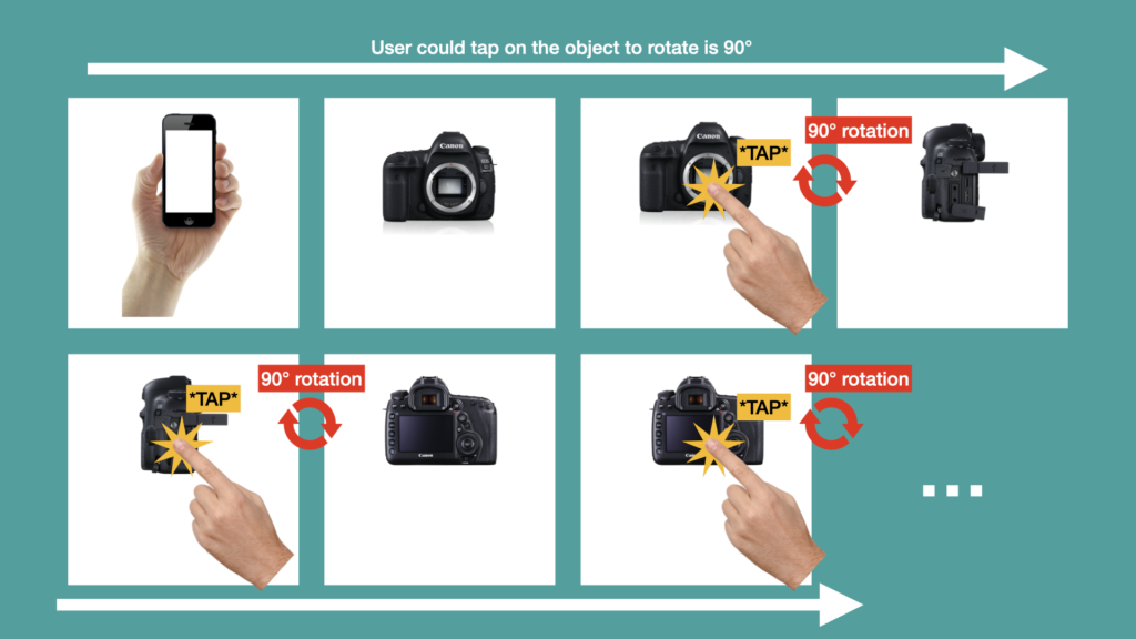
In the below screen I’ve depicted a storyboard of using a tap gesture to rotate the camera 90° with each tap. This will potentially reduce the need for swiping across interface which could be difficult for some users with motor impairments.
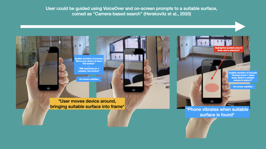
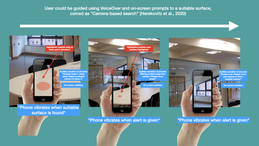
Below, I’ve documented my understanding of the camera–based search idea in Herskovitz et al’s research paper. The device will guide the user to finding a suitable place using both subtitles and VoiceOver accompanied by device vibrations. I am a little dubious about how well this will communicate with the user when multiple services have been found, but this is an issue that might need to be resolved later in the design process.
Another potential issue a camera-based search will be how the system responds when the user moves further away from the suitable surface. Will the device give audible/visual prompts alert the user about how far away they have moved? Will the device tell the user when they’ve lost sight of the suitable surface completely? Will phone vibrations be different depending on the message being communicated? Short vibrations for directions and along vibration for when the surface is lost completely? I don’t know, and these issues will need to be considered as the design process move forward if I implement this functionality.
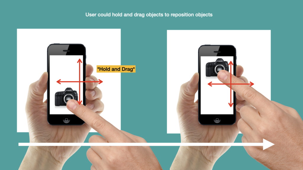
Below – Once the object has been placed, I would imagine that a hold-and-drag gesture could allow it to be moved around, however this would essentially involve the user swiping the object around the display – a task that some users with motor impairments may struggle with…
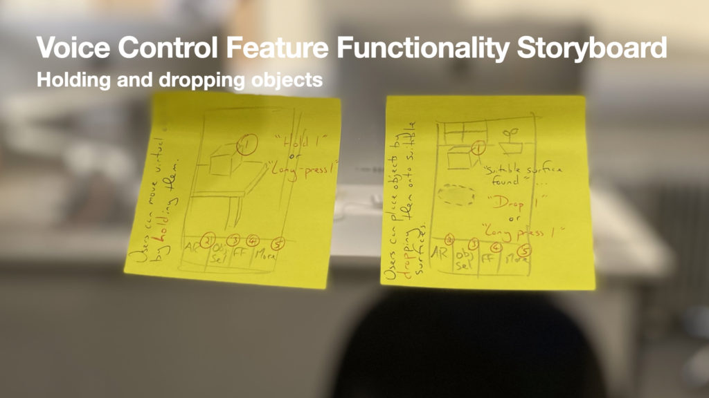
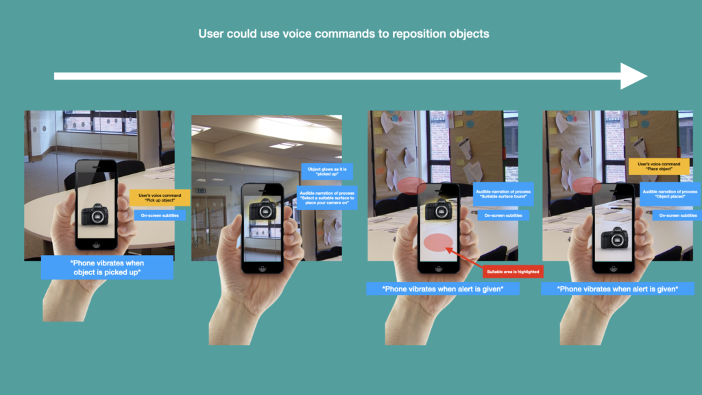
…Instead, it might be achievable to use voice commands. The user could be enabled to pick up the object with one voice command, then move around with their device, putting another another suitable surface in the frame, and then use another voice command to set the object down. See below…
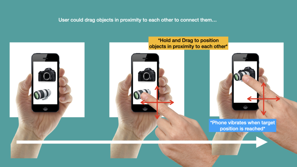
I had another idea involving swipe gestures which would allow users to move objects together in order to learn how they would connect and the routines of building cameras ‘setups’. A simple example is given on the slide whereby a user can hold and drag a camera lens to the mount on the camera body. As explained previously this could be problematic for users with motor impairments…
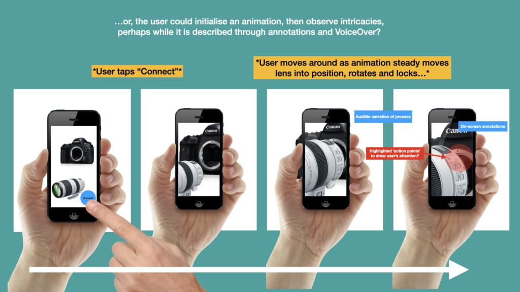
…a solution to this could be to create scenarios. In this scenario above the user will press the connect button to begin the animation. They could then move around the camera and the lens as they watch them steadily come together and connect. A really good reason for doing this would be that the users can observe key moments in the animation, which could also be highlight in some way, such as a glowing red orb around ‘action points’. Although this might not be considered active learning I do think that given the small screen real estate of mobile devices that have been more important they see the important aspects of animation rather than using the finger to drag objects together which doesn’t really wear much resemblance to the physicality of connecting a lens with a camera body. So all in all I see more value in this method.
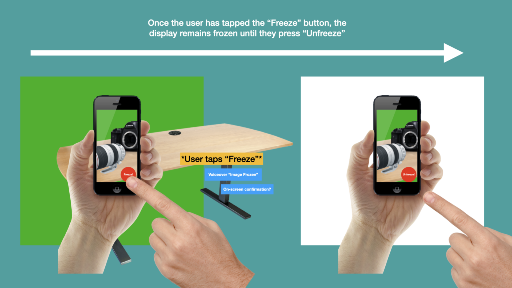
As below, the Freeze feature could also work in a very similar way. A button would enable the freezing feature which would keep everything on screen the same until the user presses the unfreeze button. This might allow them to temporarily freeze the image while they sit down and observe what is on the screen. The image will also be stored for later in case they want to refer back to it in their studies.
At this early stage of the project it is important to consider the needs of all stakeholders, as these will all have influence over the design of the final project.
Client Business Considations
To begin with, I must consider my client’s (the University of Winchester) business goals and company values. I understand the University to be a growing one, attaining full University status in 2005, and having 6,373 full-time equivalent students enrolled in the 2017 academic year (University of Winchester, n.d.). The University prides itself as ‘being known as a welcoming, inclusive and friendly community’ with staff and students ‘nurtured to embrace equality, diversity and inclusivity’ (University of Winchester, n.d.). This is demonstrated through figures collated by the University’s Student Services team, demonstrating a number of students living with either visual, audible, motor, or cognitive impairments.
The University also intends to become a ‘beacon for social justice and sustainability,’ by transforming its operations to adhere to the United Nations’ Sustainable Development Goals (SDGs). As part of its guiding principles, the University has declared its intentions to become carbon neutral by 2025, and has taken steps such as eliminating unnecessary single-use plastics and ensuring it has no investments in fossil fuels (University of Winchester, n.d.).
In summary, the University’s values are listed as:
Compassion
Individuals Matter
Spirituality
In the coming years, the University’s strategy involves a stage of growth in particular strong areas, although I cannot clarify this further within the public domain.
With the above contextual points in mind, I believe that to best accommodate the University’s values and business goals, I must produce a proof of concept that adopts them. Considerations should be made for improving inclusivity (and accessibility) in the development of my mobile application’s prototype, while I should also consider how a partnership between the University and myself could be a catalyst for achieving the Sustainable Development Goals.
Client Branding Considerations
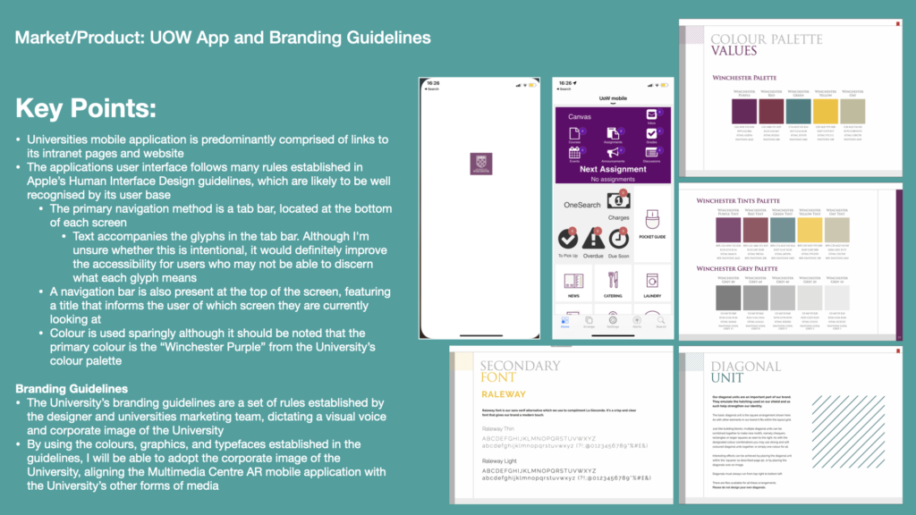
Furthering the alignment between my proof of concept and the University’s needs, I’ve also researched the University’s existing mobile application and Branding Guidelines document.
The University’s mobile app, ‘UoW Mobile,’ is primarily used to dispense information that is otherwise accessible on the university website and intranet, including catering, accommodation, and laundry. Students can also access portals to manage their attendances and grade metrics. There is no augmented reality functionality in the app, no training services, however this research has given me an understanding of the University’s corporate image in mobile application form.
The University’s branding guidelines primarily illustrate their visual voice. Guidance is given as to the branding colours, graphics, typefaces, and imagery. Communication elements such a written tone of voice are also mentioned. All of these factors are non-negotiable and create synergy between the University’s internal and external communications / media, resulting in a unique identity when combined with the University’s values.
Collaborative Partners
Another aspect of stakeholder considerations pertains to my collaborative partners, including the Multimedia Centre Loans Counter and the wider IT Services team at the University. In a real-life scenario, I would consult the Multimedia Centre Loans Counter team to ascertain their current stock-control levels are managed and seek the potential impact of an AR-based training application. There would also be a need to hear any concerns they have regarding Health and Safety and asset preservation issues that may arise from training on virtual equipment rather than physical counterparts.
I would also need to work alongside the University’s IT Services team with regards to the development of the application. At proof of concept stage, I believe it would be necessary for me to understand the specialisms within the IT Services team, how they would prefer a final prototyped design to be delivered to them, and to have an estimate for the amount of development time that would be required to develop the mobile application from prototype stage to final product.
I would also need to seek the IT Services team’s ongoing support for hosting the application and rolling out incremental updates.
End User Considerations
The end-users requirements are equally a concern throughout the prototyping stages of the application’s development. In this instance, ‘end users’ refers to students, support staff, lecturers, trainers, technicians, and researchers. To attain feedback from these users it would likely be necessary to devise a Design Research team to carry out contextual interviews, surveys, focus groups. An analyse of pre-existing quantitative data regarding usage of current systems such as the University app would also be required.
Information gathered at this stage could be interpreted using a variety of techniques, such as Affinity Diagrams and user Personas. I have created versions of these during my DM7921: Design Research module, and these are relevant to this project as I researched the same user-base (Helcoop, 2021).
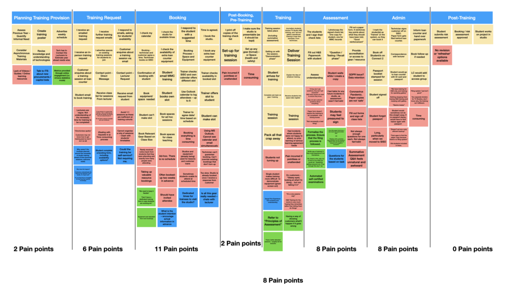
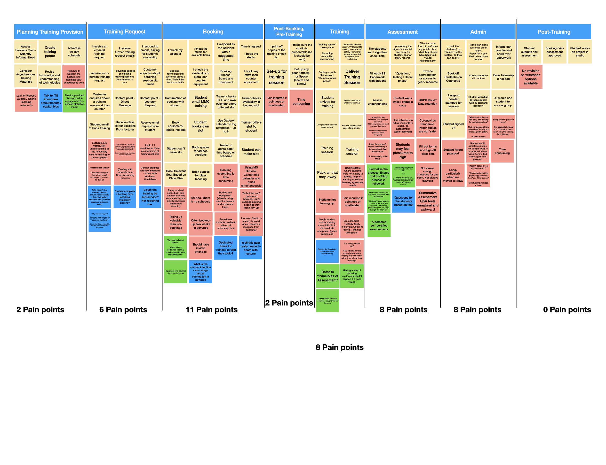
Above is an Affinity Diagram, compiling feedback from students and trainers on the current equipment training provision in the Multimedia Centre at the University of Winchester. From this diagram, I have identified the following pain points, which could be addressed by an AR-based training mobile application:
Lack of videos, guides, and online learning resources
1:1 training sessions are inefficient at training cohorts
Tending to training requests and organising equipment/room bookings is time consuming
Organising a rota of training sessions often leads to clashes with students’ timetables
Students rarely confirm their attendance before the session. Students are known to not turn up to their training session
Training sessions take up valuable resources for bookings
Trainers are often booked-up two weeks in advance
Studios and equipment are often unavailable due to lectures and customer loans
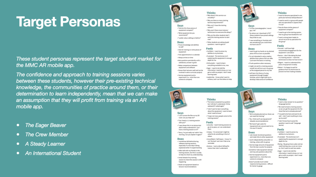
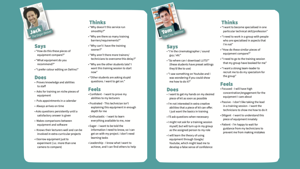
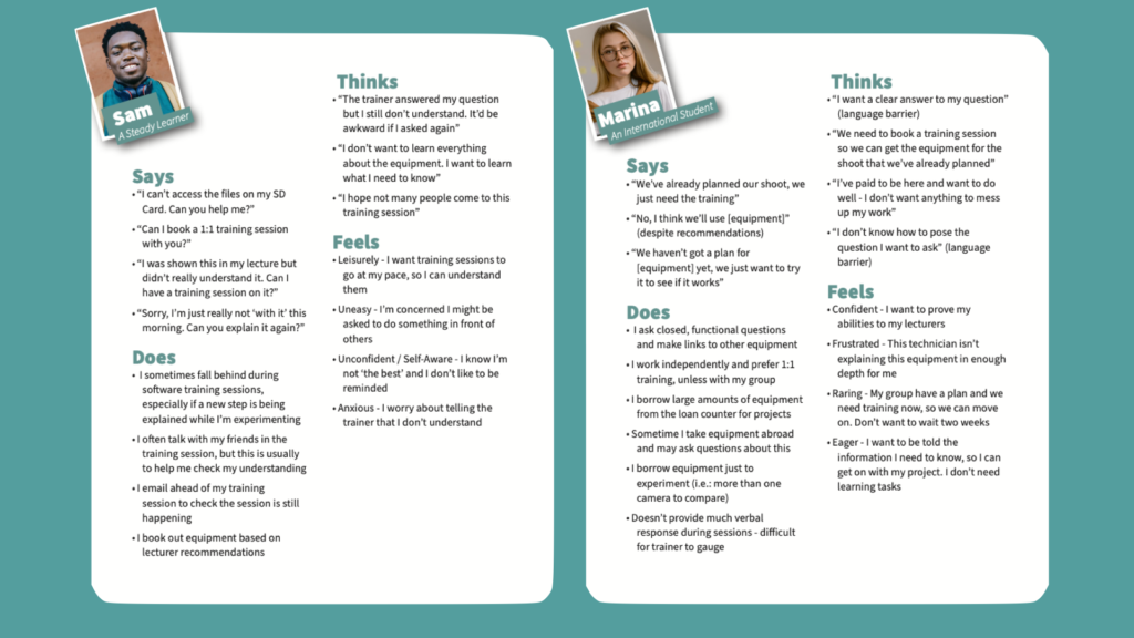
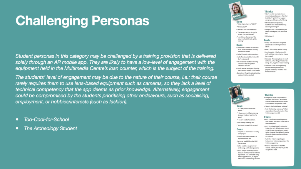
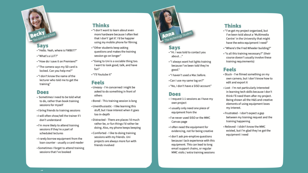
A deeper insight can be gained by categorising students into personas. The six personas below were compiled in my DM7921: Design Research project via the sharing of knowledge between experiences trainers and technicians at the University (Helcoop, 2021). These personas provide insight into the behaviours of end-users and identify particular personas who may be particularly challenging to appeal to.
Many assumptions and conclusions can be drawn from inspecting these personas, for example:
An AR mobile application may allow the training service to run smoothly and reduce bottlenecks caused by the availability of resources, technicians, and trainers. This addresses some concerns for ‘The Eager Beaver’
‘The Eager Beaver’ does like to ask questions to gain clarity. A future development could be an ‘Ask the Trainer’ live-chat, provided in-app. This functional would also address the needs of the ‘Steady Learner’ and the ‘International Student,’ often to ask the trainers to rephrase an explanation to overcome a a misunderstanding / mislearning or a language barrier
The immediacy of access to training, provided by the mobile app, would appeal to ‘The Crew Member’ as they would like to get access to their favourite equipment as soon as possible so that they can serve their group.
‘The Crew Member’ is already happy to self-train using free resources such as Google and Youtube. The Multimedia Centre AR application would be an additional resource for them to continue this learning preference
Students in the ‘Steady Learner’ category are aware that they may not learn as quickly as others, and this made apparent during group training activities. An independent approach, such as the one offered by the Multimedia Centre AR app, would allow them to learn at their own pace. They will also be able to dip in and out of the training at their own convenience, learning the aspects that they need at the time
The ‘International Student’ appears to build training into their project planning. For example, they will know the scope for their film shoots, itemise the required equipment and factor in the availability of their venues – they will then factor in when they would need the required training. An AR-based mobile training solution would offer them further flexibility
Due to the potential for lower engagement and pre-existing technical knowledge, ‘Too-Cool-for-School’ and ‘The Archeology Student’ may require a facilitator for least the first few occasions of using the application. An ‘Ask the Trainer’ live-chat may be useful here, but a FaceTime style face-to-face chat would be a better mobile solution, allowing the trainer to guide the user in real-time. In the early existence of the application, it may be more suitable to implement a face-to-face onboarding service for these students.
One limitation of these personas is that they are not inclusive, as I had not yet spent much time studying this area. The personas do not seem to give any consideration to users living with impairments, and this is problematic as it may results in these users being overlooked in the design phases of the mobile application; I must be conscious of this to ensure that it doesn’t jeopardise the usability of the app for these users. If this project involved a real-life brief, it would make sense to commission a Design Research team to conduct focus groups and usability tests with users living with impairments to accommodate this short-fall in knowledge.
Distribution Partners
Finally, I would need to accommodate all designs and development for the mobile application for the requirements of the Apple and Android-based app stores. Each store publishes parameters for what apps can/cannot do, and features they must/must not include. For example, Apple’s App Store Review Guidelines aim to maintain a safe experience on Apple products, offering designs and developers guidance on safety, performance, business, design, and legal requirements (Apple, 2019). Failure to adhere to these guidelines will result in the app not being rejected for publication, preventing any distribution to end-users via that platform.
References
Apple (2019). App Store Review Guidelines – Apple Developer. [online] Apple.com. Available at: https://developer.apple.com/app-store/review/guidelines/ [Accessed 1 Nov. 2021].
Helcoop, C. (2021). How Virtual Reality Could Transform the Training Provision for the TV Studio at the University of Winchester’s Multimedia Centre. The University of Winchester.
University of Winchester (n.d.). Our strategy. [online] University of Winchester. Available at: https://www.winchester.ac.uk/about-us/our-future/our-strategy/ [Accessed 1 Nov. 2021].
This week I’ve spent my time exploring the meaning of ‘proof of concept,’ and how this may differ from producing a prototype. I began by researching library books and online resources, and found two key online articles that explained proof of concepts from both a business and design point of view.
In business terms, I’ve learned that a proof of concept can be defined as “a presentation of the proposed product and its potential viability,” which is presented to clients and stakeholders by project managers. Proof of concepts include a “small-scale visualisation exercise” such as a prototype (Rodela, 2021), and also “outline how the idealized product or service would become market-ready, how it would function, if it’s needed, and who is the target demographic” (MacPherson, 2021).
It seems that if project managers want their clients and investors to understand and accept their ideas, then they must justify their commercial viability through research, combined with visualisations such as prototypes. This combination should then be presented appropriately, for example via a Keynote presentation, and must also present other managers and investors with information on potential obstacles or constraints so that they can plan to overcome them (Rodela, 2021).
By presenting a proof of concept in advance of a project, all stakeholders can decide whether or not to commit resources to the project. It is important that the project is presented in as much detail as possible so that managers can anticipate all of the resources needed, such as finance, human resources, technologies, and time; other factors such as market competition and the intended user base will also be considered. Without presenting these for consideration ahead of time, the project could be subject to ‘scope creep,’ whereby the resource requires of a project steadily become greater, despite the project already having been approved (Rodela, 2021).
From this research I’ve compiled an initial roadmap for creating a proof of concept. My Gantt chart has been updated with this in mind, and I’ll be trying my best to follow the roadmap throughout the project. My reading around proof of concepts has also raised my awareness of how much research is required to be presented in a proof of concept, however following a discussion with my lecturer, we have decided that I must focus upon ideation and iterative designing, as that is a key area for assessment within this module.
Road Map
Research the need for the product Who are the target market? What are the painpoints in the current process? Get answers by interviewing a representative sample and stakeholders. Consider how a new product might alleviate issues. Produce a list of feelings and perspectives. Draw upon research from the DM7921: Design Research module as evidence.
Map pain points with feedback from representative sample and stakeholders Draw upon research from the DM7921: Design Research module as evidence.
Ideate the solution. Brainstorm, research competition, and produce a timeline “The team should then assess each brainstormed solution according to the likely costs, timeline, technologies needed, required operational capacities, competition, resources, and other factors.” (Rodela, 2021)
Create prototype(s) and conduct usability testing Conduct at least one usability test for each fidelity stage of the prototypes. Be sure to resolve issues that arise and note them for the proof of concept presentation.
Gather and document feedback “…document the sample group’s feedback about their experience, their reactions, and any other valuable details, including what they think of the user interface.” (Rodela, 2021)
Present proof of concept for approval “…must present, among other things, the pain points that the product solves, features that address those problems, and technologies integrated to demonstrate the value of the idea.” “…include clearly defined success criteria or project management metrics, evaluation measures, timelines, next project management plans (should it be approved), resources needed, and other aspects” (Rodela, 2021)
References
MacPherson, L. (2021). 5 Steps to a Proof of Concept for Successful Software Development. [online] Designli Blog. Available at: https://designli.co/blog/5-steps-proof-concept-successful-software-development/ [Accessed 16 Oct. 2021].
Rodela, J. (2021). How to Create a Proof of Concept. [online] The Blueprint. Available at: https://www.fool.com/the-blueprint/proof-of-concept/ [Accessed 16 Oct. 2021].