As my project draws to a close, I have turned my focus to delivering a final outcome. Similarly to how a prototype could be delivered in industry, I am going to be supply a link to an online version of the high fidelity prototype, created in Adobe XD. In industry, this link could used to present the prototype for client or stakeholder review, or to inform a developer who will be tasked with creating the mobile application.
The process of developing this prototype through several iterations, from paper to high-fidelity, has given me a new-found appreciation for working in the user-experience field. Studying feedback on each prototype and completing usability tests has been instrumental to the decision making between iterations of the prototype, I intend to carry forward this method of working. In particular, I felt a great sense of achievement when I resolved the communication issues between the prototype and the usability tester relating to the onboarding process. There is potential for me to focus more heavily in this area during the upcoming DM7920 Design Communication module, however, in the meantime I plan to focus my attention on accessibility in the next module, DM7903 Design Practice. Design features such as responsive screen sizing, text resizing, and colour contrast, were all touched upon during this module, however I would like to expand my knowledge on them further, while building my understanding of how design can be more inclusive.
For further reflection, please read my Reflective Process Report.
The high fidelity prototype of the TV Training app can be accessed at the following link:
Leading on from my accessibility audit, I have decided to write an accessibility statement for the TV Training application. Although I do not strictly need to do this at the prototyping stage, I am interested in the accessibility of digital technologies, which I may focus on in my next module, so feel that it could be an interesting exercise to complete.
Before this project, I was unaware of accessibility statements and their purpose, although my exploration into colour contrast ratios led me to the Web Content Accessibility Guidelines (WCAG) and the UK Government website. Handily, the UK Government website includes a template for writing an accessibility statement, which has notably been used by other developers of websites and mobile applications, such as the NHS (The UK Government, 2020; NHS, 2020).
From reading example accessibility statements, I can see that the information in an accessibility statement needs to be presented clearly and concisely, stating the features and limitations of the application concerning accessibility. The language is plain (including little terminology as to be more accessible to users), and directs users to contact the developer if they have further queries or suggestions.
As someone who makes use of accessibility features such as screen readers and dictation functionality, I can appreciate why the UK government is enforcing the need for accessibility statements in the Public Sector Bodies (Websites and Mobile Applications) (No. 2) Accessibility Regulations 2018.
I have written the accessibility statement for the TV training application below. In part, I have not adjusted the UK Government’s template, as the wording relates to legalities, such as the “enforcement procedure” section. This document will also be placed on my portfolio with the most recent application prototype.
The UK Government (2020). Sample Accessibility Statement (for a Fictional Public Sector website). [online] GOV.UK. Available at: https://www.gov.uk/government/publications/sample-accessibility-statement/sample-accessibility-statement-for-a-fictional-public-sector-website.
As this project draws to a close and I meet my deadline, I’ve decided to carry out an Accessibility Audit, which will also inform the app’s Accessibility Statement and future development (potentially in my next module). For public sector bodies (such as the University of Winchester), the requirement to make applications and websites “perceivable, operable, understandable and robust” is mandated by the Public Sector Bodies (Websites and Mobile Applications) (No. 2) Accessibility Regulations 2018, brought about in September 2018. It is possible that the app may not need to adhere to these regulations. The UK Government state: “mobile apps for specifically defined groups like employees or students are not covered by the regulations,” however, completing an accessibility audit will be a good learning experience for me and will highlight areas for improvement that could be implemented in my next module, DM7903 Design Practice (Government Digital Service, 2018).
An Accessibility Audit would usually be carried out by an external, trained professional, as this would ensure high quality and impartial assessment against the “WCAG 2.1 AA accessibility standards”. In the interests of my learning journey, I will be completing this audit myself and recording my thoughts.
Principle 1: Perceivable To meet WCAG 2.1 Principle 1: Perceivable you need to make sure users can recognise and use your service with the senses that are available to them. This means you need to do things like:
provide text alternatives (‘alt text’) for non-text content
provide transcripts for audio and video
provide captions for video
make sure content is structured logically and can be navigated and read by a screen reader – this also helps if stylesheets are disabled
use the proper markup for every feature (for example, forms and data tables), so the relationships between content are defined properly
not use colour as the only way to explain or distinguish something
use text colours that show up clearly against the background colour
make sure every feature can be used when text size is increased by 200% and that content reflows to a single column when it’s increased by 400%
not use images of text
make sure your service is responsive – for example to the user’s device, page orientation and font size they like to use
make sure your service works well with assistive technologies – for example, important messages are marked up in a way that the screen readers knows they’re important
Principle 2: Operable To meet WCAG 2.1 Principle 2: Operable, you have to make sure users can find and use your content, regardless of how they choose to access it (for example, using a keyboard or voice commands). This means you need to do things like:
make sure everything works for keyboard-only users
let people play, pause and stop any moving content
not use blinking or flashing content – or let the user disable animations
provide a ‘skip to content’ link
use descriptive titles for pages and frames
make sure users can move through content in a way that makes sense
use descriptive links so users know where a link will take them, or what downloadable linked content is
use meaningful headings and labels, making sure that any accessible labels match or closely resemble the label you’re using in the interface
make it easy for keyboard users to see the item their keyboard or assistive technology is currently focused on – this is known as ‘active focus’
only use things like mouse events or dynamic interactions (like swiping or pinching) when they’re strictly necessary – or let the user disable them and interact with the interface in a different way
make it easy for users to disable and change shortcut keys
Principle 3: Understandable To meet WCAG 2.1 Principle 3: Understandable, you have to make sure people can understand your content and how the service works. This means you need to do things like:
not use words and phrases that people won’t recognise – or provide an explanation if you can’t avoid it
explain all abbreviations and acronyms, unless they are well known and in common use – for example UK, EU, VAT
make it clear what language the content is written in, and indicate if this changes
make sure features look consistent and behave in predictable ways
make sure all form fields have visible and meaningful labels – and that they’re marked up properly
make it easy for people to identify and correct errors in forms – you can find best practice for form design in the GOV.UK Design System
Principle 4: Robust To meet WCAG 2.1 Principle 4: Robust, you must make sure your content can be interpreted reliably by a wide variety of user agents (including reasonably outdated, current and anticipated browsers and assistive technologies). This means you need to do things like:
use valid HTML so user agents, including assistive technologies, can accurately interpret and parse content
make sure your code lets assistive technologies know what every user interface component is for, what state it’s currently in and if it changes
make sure important status messages or modal dialogs are marked up in a way that informs user of their presence and purpose, and lets them interact with them using their assistive technology
lets the user return to what they were doing after they’ve interacted with the status message or modal input
Thoughts As there are many criteria within each part of the audit I have decided to summarise them separately below:
Principle 1 – I believe that the content within my prototype’s is structured logically and is screen reader friendly because no text is placed as images. The fact that tab-bar elements are labelled also means that they can be read by a screen reader. I have not used colour as my only way of conveying meaning, and in most cases text has a high colour contrast ratio with its background (and the Dark Mode further improves upon this). Two key improvements that could increase accessibility in this area would be to plan for responsive resizing to adapt to uses different devices, and to allow text size to be increased by up to 400%. Both of these features would help visually impaired users, and would require me to make challenging adaptations to the layouts within my prototypes. This could be a great starting point for my next module.
Principle 2- Many criteria in this area address keyboard usage, which is not strictly relevant for my application. However, by including a toggle for a “reduced animation mode” I could limit the animations caused by gestures/interactions – this functionality is not yet active in any prototypes. I have met the criteria in at least two areas though – Firstly by using descriptive titles for each screen within the app, and by repeatedly testing the information architecture I have proven that the app allows “users to move through content in a way that makes sense”.
Principle 3 – My prototype’s have allowed me to make plenty of progress in this area. The textual information within the prototype is it written in plain English and does not include long sentences. TV studio specific terminology is kept to a minimum while there are no niche abbreviations or acronyms present. In working alongside Apple’s Human Interface Design Guidelines, I believe that features are consistent with iOS and behave in predictable ways. I have not been abundantly clear about which language the app’s content is written in, however in reality I believe that an assumption might be made by users who use either the Apple App Store or Google play store – I would expect them to assume that applications available in their region will accommodate for the most commonly spoken languages of that region. This is an area for me to do some further research.
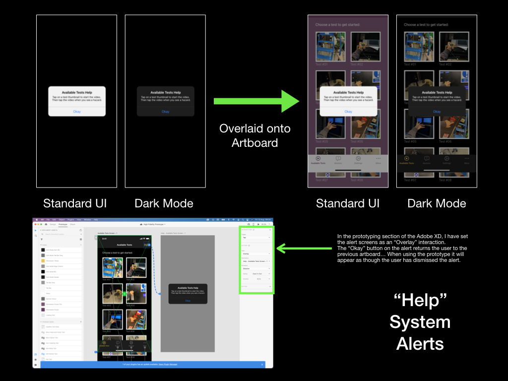
Principle 4 – Due to the nature of my skillset and prototypes, I have not needed to write code for this module. However, I have achieved one of the criteria in this area: When a user is shown a system alert (due to pressing the “help” button), they are able to read the alert text and then press the “Okay” button to dismiss the alert and continue their task.
The UK Government (2016). Making Your Service accessible: an Introduction. [online] Gov.uk. Available at: https://www.gov.uk/service-manual/helping-people-to-use-your-service/making-your-service-accessible-an-introduction#what-to-do-in-alpha [Accessed 22 Jul. 2021].
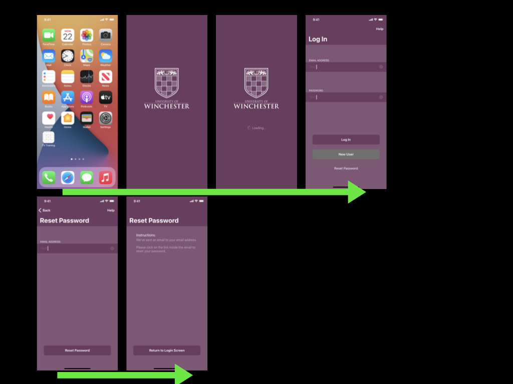
01:34 Registration page begins. Tester completes each of the fields using the auto-complete function that is native on an iPhone. Tester also notes the “Help” button as “handy”. I am pleased that the help button has been noticed so soon, although the tester did not need to use it
01:49 – Tester confirms that the prototype is behaving as they would expect
02:07 – Tester reads onboarding process and swipes through without issue. I have overcome the communication difficulties that were a real struggle when paper prototyping!
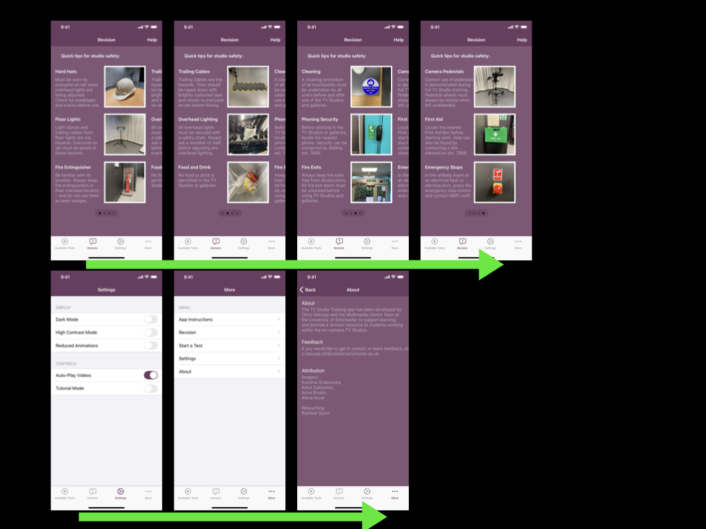
02:22 – Tester visits the “Available Tests” screen and proceeds to the “Revision” page using their own initiative. They read the contextual statement and are using the application correctly as part of their problem solving
02:35 – Tester expected to be able to click on the images the see more information… Perhaps this is an area for future development. It would give me more space to explain individual rules to the user
02:39 – Tester swipes through the rules as expected. Much akin to the onboarding screen, the tester must be understanding the communication from the page indicator that the screen is paged
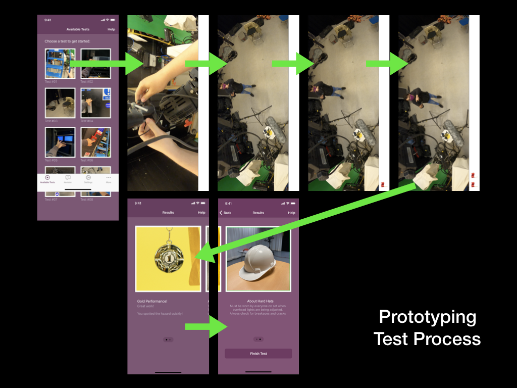
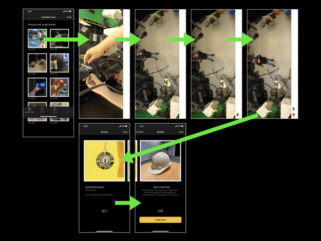
02:58 – Tester returns to the “Available Tests” screen and begins the first test. They are working to the contextual brief, and using the application’s tab bar alongside their own expectations to navigate the prototype
03:08 – The tester understands that they need to rotate their device to landscape mode, as the video is playing in landscape mode. This is communicating correctly. Unclear whether “push-in” animation communicated this to the tester, or the video frame itself
03:14 – I guide the tester through the hazard perception test process, as Adobe XD does not support video playback. Tester appears to confirm their understanding of what is happening through mention of the flags and confirmation of the hazard
03:39 – Tester reads their “Results” feedback and swipes through the paged screens, then finishes the test
04:14 – Tester provides feedback that the UI does not confirm that they have completed the test. I am already aware of this issue and have previously received feedback on this feature in a recent usability test. The feature, albeit useful, did not reach a high-enough priority threshold on the Design Hierarchy of Need and so I have not addressed it yet.
Summary
Overall, the testers ability to navigate the application, despite only having a contextual statement, have pleased me. They move through the “Revision”, “Available Tests”, and “Results” section with ease, and were able to locate the necessary information efficiently
Some unexpected behaviour occurred when the tester tried to tap on a rule in the “Revision” screen, but this did not derail their experience
The tester swiped through paged screens as expected. I suspect that the onboarding process and page indicator element evidenced this possibility to the tester, and then they identified it correctly on subsequent screens
Actions
Expand upon the “Revision” screens by making each rule tappable. A new screen could be made for each rule, which would permit me to have more space to explain and justify the rules
Research for prototyping solutions that support video playback
A second request for confirmation of completed tests means that I should probably address it sooner, even though it does not appear high-priority on the Design Hierarchy of Need.
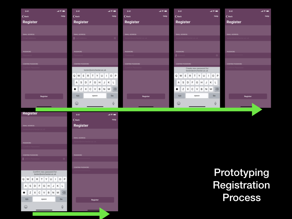
I have produced a fifth (and final) usability test for this module, to be conducted using the high-fidelity prototype. The task will request the tester to register a new account within the TV Training app, revise the TV Studio rules, and then complete a hazard perception test.
This task will be prompted by the following contextual statement, which will give the usability tester freedom to navigate the application in a way that feels natural to them:
“You have just downloaded the TV Training application for the first time. Youdo not yet have an account on the application, but would you to revise the TV Studio rules, and complete the first available test”
I will be recording the full usability test so that I can produce a final usability test report.
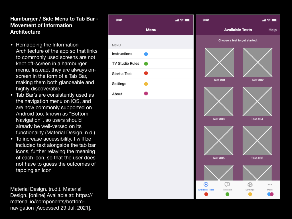
The remedial actions required from my fourth usability test were mostly small changes, such as the names of different screens within the app. However, the feedback I gained also suggested that I should introduce a tab bar to the app, rather than users relying on a hamburger-style menu for wayfinding. This change would intend to improve user navigation within the app and the findability of the Revision section.
To reach this point I decided to rebuild the prototype using Adobe XD rather than Apple Keynote. This change would permit me to carry out a usability test that allows the tester to use gestures such as swiping, and to test animations between different screens.
I hadn’t used Adobe XD before, so, admittedly I relied on several YouTube tutorials to grasp the basic concepts and controls.
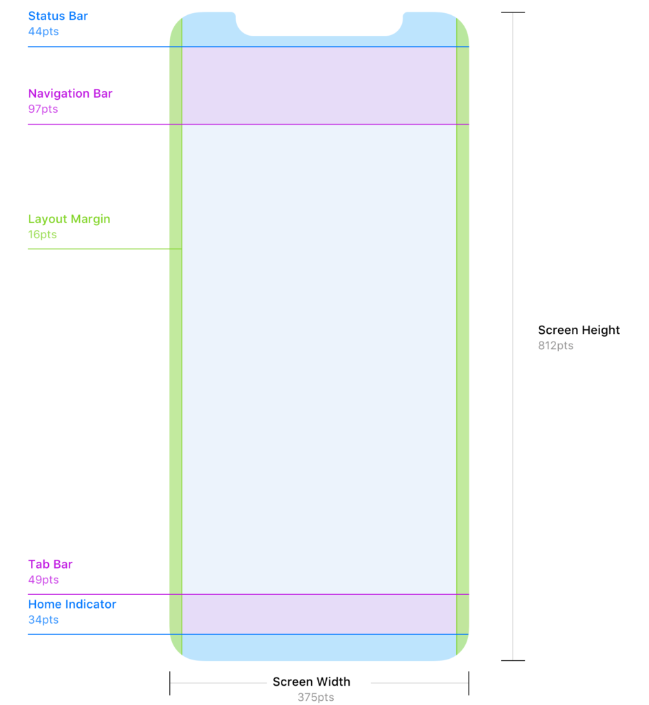
I began by downloading Apple’s Human Interface Design Guidelines so that I could access basic user interface resources that I could create a basic layout from. Further research on the Reddit user interface/user experience community revealed a more accessible set of guidelines for designing for iOS; this included guidance on adhering to strict layout conventions (including 16pt margins, and correct placement of both the navigation and tab bars).
Above: A Diagram of boundary areas on the iPhone X (which is true to iPhone 11 too). Source: Denis Rojčyk
I needed to more closely consider the sizing of the iPhone 11 screen that I will be using for my usability tests. When designing for iPhone displays the designer must use “points” (pt) as the unit of measurement; points are a resolution-independent measurement, which allows for scaling between different iPhone displays. With future development in mind, I developed this prototype at “1x”, where 1pt = 1px (pixel). The iPhone 11’s display is known as a “Retina display” and thus has higher pixel density – I would need to upscale my prototype when exporting by 2x to meet this requirement (Mynttinen, 2020).
I was also made aware of Adobe XD features such as responsive resizing, however as a newbie to the software I decided that this would be a feature for a future prototype, alongside the ability for the user to resize on-screen text.
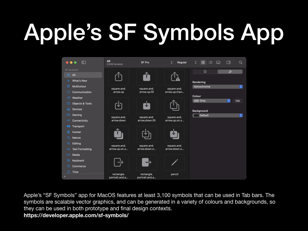
I found the glyphs to complete the navigation and tab bars within Apple’s “SF Symbols Beta” app on macOS. This is essentially a library of glyphs used across Apple’s operating systems. The glyphs I chose would be used for the sections of my tab bar, and the “back” button in the navigation bar. As these are “wayfinding” methods I had to consider how well each glyph communicated its functionality. For example, as the hazard perception tests within the prototype are videos, I decided to use a “play” triangle glyph for the “Start a Test” tab bar section. Similarly, I decided to use the ellipsis glyph for the “More” menu, as this is a common convention across iOS apps. By taking this approach I reduced the need for the user to guess the functionality of each glyph – instead opting to use their prior knowledge of symbols used in other media.
With the layout established, I set about implementing the University of Winchester colour palette and creating a dark mode, much akin to the previous prototype. This process was much quicker this time around, as Adobe XD has some efficient features that allow the user to extract colour palettes from images and to quickly apply them across all artboards in the current prototype. The same methodology is also applied to typefaces; it was incredibly quick for me to locate the typefaces in Apple’s Human Interface Design Guidelines, extract the typeface weightings and sizes that I needed, and then apply them across all of my artboards/screens.
Artboards that contain repeating elements such as the Available Tests, Revision, and Results screens, could be quickly created using the Repeat Grid function in Adobe XD. This function would intelligently recognise patterns in the placement of shapes, images, and text fields, then offer to repeat them. Although I struggled with this method at first, I can see how efficient functions like this speed up the process for a User Experience Designer to produce a quick digital prototype.
Filling the prototype with copy and placeholder images was also incredibly efficient in Adobe XD. I prepared the copy into a basic text file and then dragged this information to the correct artboard – the information would then automatically populate the correct fields. This negated the need for me to import text, or copy and paste repeatedly. I photographed a variety of items that are referenced in the current the TV Studio training provision; items such as hard hats and trailing cables, which could be imported into the prototype. Importing images worked in a very similar fashion, provided I had numbered them correctly.
In collaboration with a fellow technician, I also filmed a very short prototype of a hazard perception test. I didn’t want to spend too much time planning the test, as the mobile application itself is the main focus of my project, however, by equipping a Go Pro to the technicians hard hat we were able to film a short test video.
The video features a first-person perspective of making an adjustment to an over-head light. The hazardous scenario comes to light when the technician looks at myself, stood on the studio floor and not wearing a hard hat – a clear violation of the TV Studio’s Health and Safety rules. Unconcerned about the video’s sound (due to it being a first prototype), the technician can be heard talking to himself (getting into character), while I can be heard directing him.
Above: The short prototype video for a hazard perception test
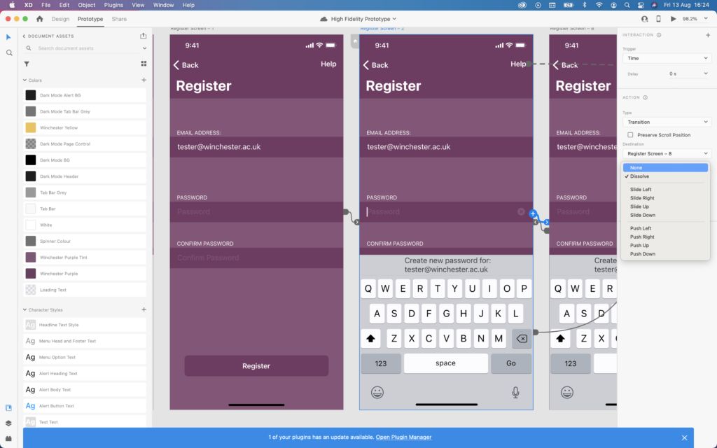
The final aspect of the developing process for this prototype was to implement links between pages and add animations. These animations would take place once a user had tapped on a hyperlink, and for this reason, it was important for the animations to communicate correctly. When selecting a tab in the tab bar there is no animation, the user is taken straight to their destination as they expect. However, when tapping on a test icon on the Available Tests screen, I have decided that the test video should “push-in”/slide on-screen from the right. I hope this animation prompts the user to rotate their phone (as if the video slid onto the screen from the bottom) – hopefully, I will receive feedback on this from the next usability test.
Above: Transition animations for the “Password” field link being adjusted
I’ve also used the swiping gesture in combination with the auto-animate feature in Adobe XD to simulate the effect of swiping across information on an artboard/screen. For example, on the revision screen, the user will be able to swipe their way through sets of tips that they believe are all on the same screen, however behind-the-scenes they will be navigating between different artboards/screens in Adobe XD.
Finally, Adobe XD features a handy mobile application for iOS, which I plan to use for the upcoming usability test. It allows users to preview the prototype as if it were a real app on their phone. I expect that this will be an improvement upon using Keynote for prototyping, as the tester will be able to complete the usual gestures they become accustomed to on phones. They could also view all glyphs and animations as if they are native on the device.
Limitations: • Many glyphs from Apple’s “SF Symbols Beta” app are not visible on iOS14 – instead, a box with a question mark is shown. To rectify this issue each glyph must be converted to a basic image file by selecting the glyph and pressing CMD+8 within Adobe XD • Adobe XD cannot preview video files within a prototype. One plug-in solution does exist for this called “Anima”, however, due to the nature of the hazard perception test, the user must tap on a playing video when they see a hazard, which unfortunately stops the video playing (or skips the video entirely) in Adobe XD. As a workaround, I have used several still-frames from the video to simulate a video playing and will explain this to the tester during the next usability test • The swipe gesture can only be used once on each artboard/screen. As a result, in this prototype users can only move forward throughout the Instructions/Onboarding and Revision screens. This is not a problem for a prototype, however, the end product would need to allow users to swipe in both directions so that they can review forgotten information
Above: The standard user interface artboards for the high-fidelity prototypeAbove: The “Dark Mode” artboards for the high-fidelity prototypeAbove: “Help” screens are system alerts that are overlaid the previous artboard
Above: A short video of the High Fidelity Prototype being used
Mynttinen, I. (2020). The iOS Design Guidelines. [online] Ivo Mynttinen / User Interface Designer. Available at: https://ivomynttinen.com/blog/ios-design-guidelines [Accessed 8 Aug. 2021].
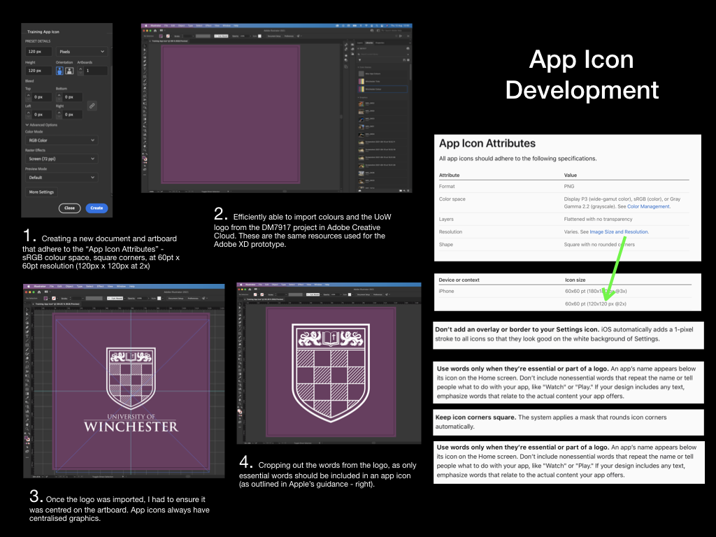
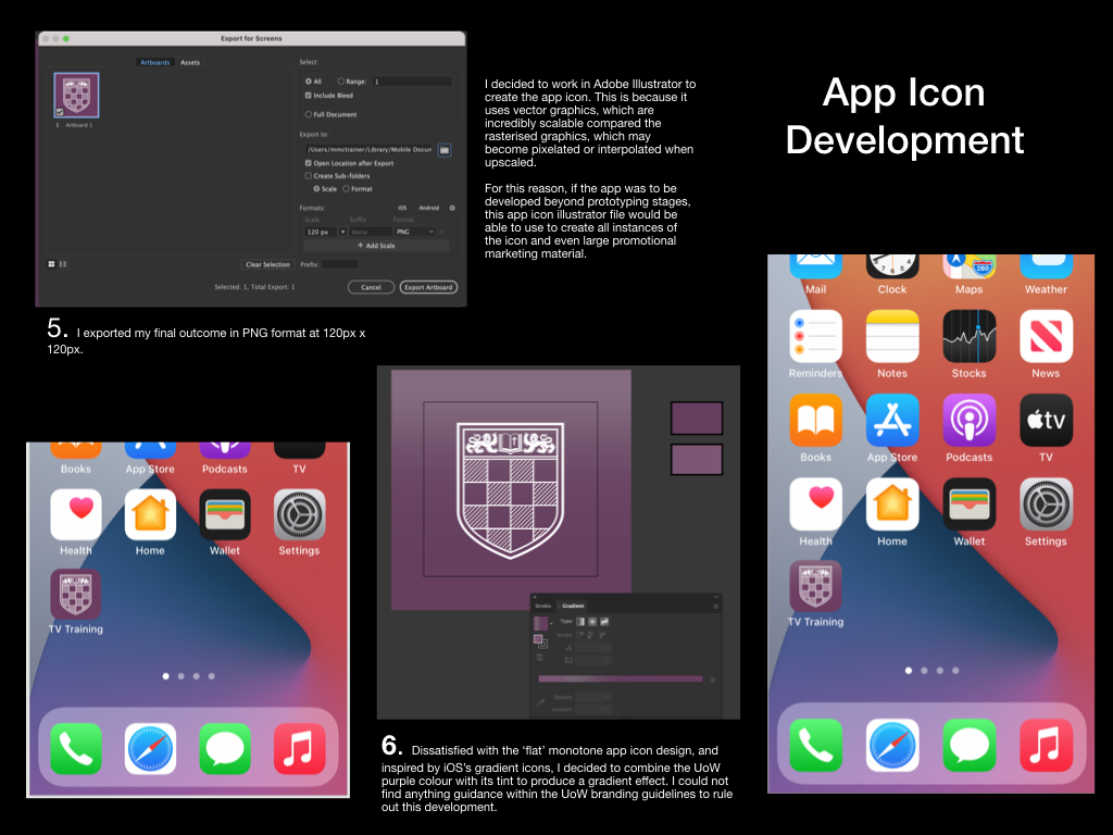
Each of my digital usability tests have placed the tester at the springboard/home screen as their starting position, whereby the tester is required to tap the app icon to launch the “app” within the prototype. To increase the sense of realism here, I have decided to create a mock up of the app icon. I have recorded my creative process below in two PowerPoint slides.
Perhaps appealing to my interest in user interfaces and graphic design, I was interested to learn all of the constraints that Apple place upon designers for something as small as the app icon. I have a followed many of these constraints, such as only including necessary text on the icon (none in this instance), producing the icon in PNG format (to permit transparency when imported into iOS), and creating the icon at the correct 2x resolution for prototyping on an iPhone 11.
Not satisfied completely with a “flat” colour design, I decided to introduce some gradient to the icon, as to assimilate better with the current trend on iOS devices. There appears to be no details in the University of Winchester’s branding guidelines to state that I should not do this.
I have decided upon the temporary app name “TV Training,” which can be used throughout further prototyping – making it easy for usability testers to discern the app from others on the springboard/home screen.