DM7903 Week 10 – UN Sustainable Development Goal 17

To ensure that I’m achieving the DM7903: Design Practice Learning Outcomes, I’ve decided to consider my project from the perspective of the United Nations’ Sustainable Development Goal 17: Partnership for the Goals.

Throughout my time on the MA Digital Media Practice course, I’ve established a partnership between myself (acting as an App Designer and Media Trainer) and the University of Winchester, with the primary goal of increasing student and staff access to technology in the University’s Multimedia Centre (MMC). By establishing this partnership with the University, I have demonstrated an awareness of an entity that consists of like-minded individuals, with whom I can build a working relationship (United Nations and The Partnering Initiative, 2020, p. 31). In collaborating with the MMC team, I have consequently been able to enquire about the needs of their students (e.g.: the research in my DM7921: Design Research module), and find opportunities for innovative projects such as my design work in DM7917 and DM7903 (United Nations and The Partnering Initiative, 2020, p. 31). 

This approach of aligning with a team and actioning innovative design ideas is an important one, which may epitomise the goal of partnering to achieve the UN Sustainability Goals. 

As the University is looking to grow throughout the next decade as part of its ‘smart growth target’, it may need innovative solutions that are scalable. I understand that the University is looking to expand its existing courses, teaching many more students, potentially placing strain upon areas such as the training provision in the MMC (The University of Winchester, 2021). This expansion may also increase the demands for media equipment as students continue to work towards meeting their module assessments. 

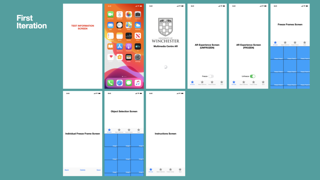
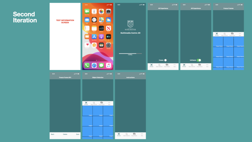
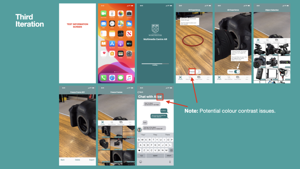
In this module, I am developing a proof-of-concept for an AR-based training provision, which has potential to be scalable as training demands grow. A mobile app would be a good distribution method for this AR experience, as it could be downloaded for free by many users across both iOS and Android platforms, then used as a training resource at any place and any time. Trainees would be permitted to train both remotely and asynchronously, reducing the need for students and staff to travel from training. 

The change in training provision and requirement of remote learning would take some time to be fully adopted. During this time, I would see the University as an ‘enabler… providing the space and time for the platform to develop’ (United Nations and The Partnering Initiative, 2020, p. 28).

The positive environmental impact of removing the need for on-campus attendance in training sessions would help the University on its journey to becoming carbon neutral, and address UN Development Goal 13 ‘Take urgent action to combat climate change and its impacts’ (United Nations, 2021). This may also reduce the capacity pressures of the University’s estate, as increasing capacity demands could be offset by training being delivered remotely.

However, one limitation of the Multimedia Centre AR application is that there are currently no plans to include any assessment tasks. This means that trainees’ competency with MMC technology cannot be assessed remotely or asyncronously. This limitation could be overcome by a mobile application such as the prototype I designed for the DM7917: Emerging Media project, which featured ‘hazard perception’-style assessments and reaction-time testing (Helcoop, 2021).

As well as increasing access to technology for its students, the AR-based training app could enable further knowledge sharing within the wider community, including providing support for commercial use of the University’s media equipment, even outside of office hours. An example of this would be a school whose staff book one of the University’s auditoriums and related equipment to host and record a nativity play. The app would enable the school’s staff to train themselves on the required equipment in advance of the booking date.

Furthermore, there is also potential for this AR-based training provision to be replicated by other universities and science/technology-based industries, as the UN strives for a common agenda on partnerships both nationally and globally (United Nations and The Partnering Initiative, 2020, p. 15).

References

Helcoop, C. (2021). DM7917 Emerging Media Student Directed Project. [online] Christopher Helcoop Portfolio. Available at: https://christopherhelcoop.winchesterdigital.co.uk/index.php/dm7917/ [Accessed 20 Nov. 2021].

United Nations (2021). Goal 13 | Department of Economic and Social Affairs. [online] United Nations Sustainable Development. Available at: https://sdgs.un.org/goals/goal13 [Accessed 23 Nov. 2021].

United Nations and The Partnering Initiative (2020). Partnership Platforms for the Sustainable Development Goals: Learning from Practice. [online] United Nations Sustainable Development. Available at: https://sustainabledevelopment.un.org/content/documents/2699Platforms_for_Partnership_Report_v0.92.pdf [Accessed 22 Nov. 2021].

The University of Winchester (2021). Staff Open Meeting with ELT.

DM7903 Week 9.1 – Usability Test 3 Report

Report

00:00 – Tester is asked to read introductory paragraph
00:39 – Test started
00:39 – Tester made aware of sound usage in the prototype
00:50 – Tester completes V/O instruction to tap the target to place a camera
00:55 – Facilitators observes as Tester begins to swipe screen, following instruction to move camera around. A limitation of the prototype is that swiping functions do not work. This function is skipped once Facilitator observes Tester’s behaviour
01:07 – Tester follows instructions quickly to rotate the camera
01:25 – Tester follows instructions to Freeze / Thaw the AR experience
01:48 – Tester follows instruction to proceed to the Object Selection screen

Summary

I felt that this is the best test was very successful. I feel more confident that I’ve been able to compile the tasks for these tests in a more succinct way; this has allowed them to become more purposeful and efficient to analyse.

Covering up the written instruction was a successful way of measuring the clarity and effectiveness of VoiceOver instructions within the application. Of course, a limitation of this is that the user cannot re-read instructions, so must be able to comprehend the instructions they are hearing. This was not a problem during this test, however, so I’m quite satisfied that the VoiceOver is sufficient.

No issues were highlighted during this test so I’m confident that I can proceed to the high-fidelity prototyping stage.

Actions

Proceed to high-fidelity prototyping stage. Export the VoiceOver instructions for the next prototype as they do not need further recording.

Informed Consent Form

DM7903 Week 9 – Justifying my Onboarding Process

When creating this project’s first paper prototype for usability testing, I decided to implement an onboarding process to help first-time users learn the process of using the app. Users of many productivity and media mobile apps become disengaged by the seventh day of use, and this could be exacerbated by the potential for users to lose interest due to confusing or challenging wayfinding navigation mechanisms (Kapusy and Lógó, 2020). 

In their Case Study of the popular social messaging mobile application, Snapchat, Kapusy and Lógó identify Snapchat’s ‘learn by doing’ approach to onboarding. Snapchat features no tutorials, opting to immerse the user instead. In their research Kapusy and Lógó, found that users who managed to ‘learn by doing’ felt a sense of satisfaction and relief after the onboarding process, although pragmatically it found that users could make mistakes due to lack of instruction, leading to frustration. 

Although I hadn’t yet read Kapusy and Lógó’s research prior to designing my onboarding mechanism for the Multimedia Centre AR app, their findings did tie-in with my expectations. I could have implemented a ‘learn by doing’ approach in the Multimedia Centre AR app, especially if I adopted a user interface and set of controls that behaved in a manner that the user recognised, i.e.: a standardised interaction scheme that is shared across many AR mobile applications (Craig, 2013).  The success of such a method is proven to function similarly to Jakob Nielsen’s Law of Internet User Experience, which states the users prefer websites to function in the ‘same way as all the other sites they already know,’ by adopting widely used conventions and design patterns (Nielsen, 2004). However, the user’s success in the onboarding process could then be seen as dependent upon their prior knowledge of other AR mobile applications. As my user base may feature students who have motor impairments, and knowing that many AR mobile applications are ’not specifically designed in advance for non-visual interactions’, I felt that relying upon prior knowledge could have been a weakness in my final design (Herskovitz et al., 2020).

When considering an onboarding process for the Multimedia Centre AR mobile app, I initially considered creating a set of paged screens that could be swiped across, otherwise known as a ‘Deck of Cards’ (Joyce, 2020). These screens would only be shown to user on first-launch of the app, and would comprise of short tips, explaining several features of the app in an order that resembled how to use it. Despite using this method in the DM7917 module, I decided against it for DM7903, as I thought that I would need to communicate quite a lot of information to the user (such as object placement, rotation, and movement controls, Freeze Frame information, amongst other interaction guidance), which could lead to memory strain (Joyce, 2020).

In contrast to the ‘Deck of Cards’ approach, which could used for promoting a few ‘need-to-know’ instructions, I resolved that the ‘Interactive Walkthrough’ methodology of onboarding would be more suitable for communicating instructions. This method would permit a ‘learn-by-doing’ approach to an extent, while also providing guidance to user as they follow a potentially unfamiliar and novel design (Joyce, 2020). The interactive walkthrough would only be shown on first launch and follows the the initial steps of placing an object, interacting with it, then creating a freeze frame and reviewing it – all basic functions that would be completed in the same order regardless of whether the user needed the onboarding process or not; for this reason, I believe that my choice of onboarding process does not come with a higher interaction cost or lower user performance (Joyce, 2020). 

In justifying my choice of onboarding process, I have undertaken a small journey of research into the world of onboarding. Prior to this, I did not realise the wealth of onboarding methods and relating studies that had already been conducted into this aspect of Human-Computer-Interaction (HCI). This is certainly an area that I would be interested to explore in the future, potentially in my DM7908: Independent Study module.  

References

Craig, A.B. (2013). Understanding Augmented Reality: Concepts and Applications. San Diego: Elsevier Science & Technology Books.

Herskovitz, J., Wu, J., White, S., Pavel, A., Reyes, G., Guo, A. and Bigham, J. (2020). Making Mobile Augmented Reality Applications Accessible. ASSETS ’20: International ACM SIGACCESS Conference on Computers and Accessibility. [online] Available at: https://dl.acm.org/doi/10.1145/3373625.3417006 [Accessed 26 Sep. 2021].

Joyce, A. (2020). Mobile-App Onboarding: an Analysis of Components and Techniques. [online] Nielsen Norman Group. Available at: https://www.nngroup.com/articles/mobile-app-onboarding/ [Accessed 10 Nov. 2021].

Kapusy, K. and Lógó, E. (2020). User Experience Evaluation Methodology in the Onboarding Process: Snapchat Case Study. Ergonomics in Design: the Quarterly of Human Factors Applications, p.106480462096227.

Nielsen, J. (2004). The Need for Web Design Standards. [online] Nielsen Norman Group. Available at: https://www.nngroup.com/articles/the-need-for-web-design-standards/.

DM7903 Week 8.2 – Usability Test 2 Report

00:00 – Tester is asked to read introductory paragraph
00:40 – Test started
00:53 – Tester visibly appears confused
01:05 – Tester explains that they intend to move/rotate the phone or swipe
01:13 – Facilitator explains the limitations of a medium-fidelity prototype test. Movement of phone will not work, but tester’s intentions are noted
01:25 – Tester attempts to swipe camera to rotate it – is this an expected behaviour? Swiping = rotation of object
01:39 – Tester taps “AR Mode” and facilitator assures tester that AR Mode is already active
01:50 – Tester taps “Object Selection” in an attempt to move the process forward – The testers are clearly stuck and unsure what to do
01:55 – Tester taps the “Ask the Trainer” button on screen – it took a long time to get to this? Perhaps it could move repeatedly to get the user’s attention?01:58 – Tester verbally confirms their realisation that the “Ask the Trainer” feature could help
02:08 – Facilitator explains that keyboard functionality is limited in a medium fidelity prototype
02:30 – Helpful factoid appears on screen
02:50 – Tester confirms they now understand how to rotate the object and explains that they’ve found the process helpful
03:05 – Tester presses the “Back” button
03:07 – Tester rotates object repeatedly according to the instructions given

Summary

I’m pleased I’ve been able to shorten my usability testing process. This makes it much easier to focus on a particular feature and to evaluate its performance in the test. After the test had completed I felt as though no issues had been found. However reviewing this report in hindsight a few days later I realise that some glaring issues have been pointed out…

  1. The tester’s instinct is to swipe on the object to rotate it, not to tap it. I wonder if this aligns with other augmented reality mobile applications i.e.: a “standardised interaction scheme” (Craig, 2013)?
  2. The Tester spent ~30 seconds in a confused state, rather than seeking help. There is a possibility that the tester only persisted because of their awareness of the test. An end user may have left the application frustrated and not achieved their training. Eventually, the test found the “Ask the Trainer” facility and was able to resolve the confusion. Perhaps the “Ask the Trainer” feature should be more prominent? I could consider placement, colour, and animation of the feature to make it more prominent 

Actions

  1. Support both tapping and swiping gestures for rotating the object
  2. Make the “Ask the Trainer” feature more prominent. I could consider making alterations to the placement, colour, timings, and animations

Informed Consent Form


References

Craig, A.B. (2013). Understanding Augmented Reality: Concepts and Applications. San Diego: Elsevier Science & Technology Books.

DM7903 Week 8.1 – Journey of Producing Medium Fidelity AR Experience

I’ve produced a short, narrated video of journey towards creating a medium-fidelity AR experience for the Multimedia Centre AR mobile app. The video shows development from photographs of objects, to experimentation in Adobe After Effetcs, Cinema 4D, and Apple’s Object Capture and Reality Composer applications. I also explain and rectify some of the challenges that I experienced along the way. 

DM7903 Week 8 – Marwell Zoo Mini Project

In lecture this week we were set a design challenge to produce a mobile application for Marwell Zoo, which built upon some of the current application’s shortcomings. I paired up with a fellow student to turn the challenge into a collaboration opportunity – my role was primarily to facilitate the ‘flow’ of the experience, so I chaired the development of the Content Directory, Structure of Experience, and wireframing, whilst my collaborator formalised our design research into a presentable format, contributed to our research, and worked on the visuals (graphics, logo, and gamification). 

First Thoughts
Our initial research involved making observations about the current mobile application. We found the usability to be quite poor, due to the placement of buttons, lack of tab bar, and lack of consideration for users vision impairments.

Marwell Zoo’s mission to connect people with nature and consideration of bio diversity inspired us to ‘gasify’ the app by producing a trail–like experience whereby users could visit different animal enclosures and steadily solve a mystery. We didn’t resolve what the mystery would be at this stage, but we did decide that uses could unlock new clothing items for an avatar that represented them on the zoos map, and they would unlock audio tapes which had information about the animals they were seeing.

Above: A list of our initial thoughts and notes

Design Research
Below is a diagram of our design research journey for the Marwell app, alongside some of our visual observations.

Above: Our design research journey for the Marwell app

Structure of Experience
Opting to create a small mobile application in the time that we had, we decided upon hey small structure of experience. The amount of screens required would fit nicely into a tab bar – allowing users to see all of the screens as possible from the ‘Safari/Map screen’ (essentially, the Home Screen), rather than hiding them in a hamburger menu.

Above: The structure of experience

Content Directory
A quick Content Directory was created within 10 minutes, allowing us to move on to the paper-based wireframing task ahead of us. We would use this Content Directory to make sure that all the required artefacts for each screen were place on their respective wireframe. 

Above: The content directory

Quick Wireframes on Paper
We decided that we wouldn’t commit time to wireframing the ‘Settings’ and ‘More’ screens, as these would essentially be lists of selectable menu items. We were more interested in producing the ‘creative’ aspects of this short challenge within the lecture time that we had.

Above: Our quick paper wireframes

Logo Design
Using some stock imagery and the Marwell zoo logo my collaborator produced a visualisation for a graphic/logo to be used in the mobile application. This was an excellent task to complete at this stage, as it established an agreed visual identity that could be carried across to the high fidelity prototype.

Above: The logo, designed by Tina Scahill


High Fidelity Prototype (in Adobe XD)
To begin producing a high fidelity prototype, we started by moving our paper wireframes onto Adobe XD. We took inspiration for the colour scheme from the Marwell Zoo logo (as above).

Above: How our initial paper wireframes translated on Adobe XD
Above: Our final high-fidelity prototype in Adobe XD
Above: A video walkthrough of our high fidelity prototype

DM7903 Week 7.2 – Medium Fidelity Prototype Creation

Having tested the navigational elements and the app functions in a usability on my paper prototype, I felt ready to begin the medium-fidelity prototyping phase. In real life I would have spent more time re-testing the paper prototype, however because this is a university module I don’t have that time. 

To begin I recreated each page from my paper prototype on Apple’s Keynote software. This software was perfect for my requirements, as it allowed me to make use of Apple’s Human Interface Design Guidelines, complete with user interface elements that I could borrow. It would also be able to function on my phone for usability testing.

The development process took much longer to build, compared to the paper prototype. I included fixes to issues identified by my previous usability tester (e.g.: change the ‘save’ terminology to ‘export’). I also included the University’s branding, such as colour palette, graphics, and typeface. This would enable the app to benefit from synergy – I.e.: the University’s good reputation would cause the app to feel like a trustable learning resource.

I also developed the prototype so that it adhered to common practices of app design, such as the inclusion of a loading screen, tab bars, and a navigation bar. I employed a cyclical, iterative, method to producing the prototype, allowing myself time for reflection between each version. 

In the final version of the medium fidelity prototype it was imperative that including hyperlinks between each screen and the tab bar elements. This allowed me to carry out a usability test with my own iPhone and the Keynote software built into.

Colour Contrast

The third iteration of the medium fidelity prototype highlighted some potential colour contrast issues. I researched each colour foreground and background colour combination and assessed them against the web content accessibility guidelines for WCAG AA compliance, which is an “acceptable level of accessibility for many online services” (Digital Accessibility Centre, 2017):

* The first colour combination on the above slide fails due to the combination of low-colour contrast ratio and small text size (on a small phone screen). To rectify this, I decided to replace the University’s green tint colour with the main tint colour instead (as below)

** System-based colour contrast issues can resolved in the operating system’s menus. I have no control over these, so must overlook them for now and focus on my app experience.

References

Digital Accessibility Centre (2017). The icing on the cake: The difference between AA and AAA compliance – Digital Accessibility Centre (DAC). [online] www.digitalaccessibilitycentre.org. Available at: https://www.digitalaccessibilitycentre.org/index.php/blog/20-diary/187-the-icing-on-the-cake-the-difference-between-aa-and-aaa-compliance [Accessed 28 Nov. 2021].

DM7903 Week 7.1 – After Effects and Cinema 4D Experimentation

This week I filmed some test footage for experimenting with with photogrammetry scans that I’ve created using Apple’s Object Capture API. The footage was filmed in a classroom and depicted the camera panning across the  room and then lingering on an empty table, steadily rotating and zooming in on the flat table surface. When filming, my thoughts were that if I placed a virtual object such as a camera on that table, I could give the illusion that I was purposefully getting a better look at the camera’s interface by moving around it.

In the following explanation, I follow some of the processes outlined in this tutorial: https://helpx.adobe.com/after-effects/how-to/insert-objects-after-effects.html

Having filmed some test video footage, I could proceed with initial experiments, starting with Adobe After Effects. As was not looking to create an interactive version of the prototype, but rather a version that I could present to potential investors and stakeholders, I only needed to create video footage that looked like the augmented reality experience. 

The below example evidences an experiment whereby I placed my photogrammetry scan of a lens onto a table using a combination of Adobe After Effects and Cinema 4D Lite. I found this process to be very difficult, as I am not au fait with working in 3D software – it is far from the two-dimensional, design field that I’m used to working within, such as photography and graphic design. Working with four program windows, covering the X, Y and Z axes, was challenging, however I feel I was able to use the effectively to create a rudimental example of my vision. 

The amount of time required for me to produce this video was easily the largest drawback of the method. The rendering time for this 25 second video was well over one hour. Although this doesn’t sound like much, it’s a lot when you consider the need for iterations and further tweaks. 

I carried out a similar experiment using Apple’s Reality Composer software, which is built into Xcode. In this software I could construct AR experiences using the .usdz objects that I had create via photogrammetry. My first attempt of this wasn’t very responsive, potentially due to the large file sizes of my photogrammetry scans. Once I had reduced the quality (and file sizes) of the scans, the outcome was much more responsive. I’ll post a blog post about this shortly…

DM7903 Week 7 – Interim Critique and Feedback

In this week‘s lecture we were tasked to present our module progress to the rest of the group for critique. Throughout the session I was intrigued to hear the prevalence of accessibility considerations, as I honestly hadn’t expected them. I had expected accessibility to be a common afterthought for many of my peers, as they instead focused on other design considerations. Design for vision impairments was most common, mainly by way of colour contrast and wayfinding (such as the inclusion of a tab bar). When appropriate, I shared my strategy for focusing on one area of accessibility and trying to excel at that, rather than lightly touch as many aspects of accessibility as possible.

When the time came for my presentation, I presented a Keynote of approximately 35 slides. Although this was a considerable amount for a 10 minute presentation, many of the slides were shown quite quickly as they lacked text and illustrated enlarged versions of diagrams and wireframes. I’ve presented the video again to create a Youtube version, which you can watch here: 

Overall, I was pleased to receive good, constructive feedback for my presentation. I had to clarify a few areas for some of my peers as I hadn’t explained certain aspects particularly clearly. Namely, peers who had no experience of the Multimedia Centre were unclear about the service it provided and the challenges that the Multimedia Centre AR app would address – this is certainly an aspect I must improvement upon for presenting a proof of concept; explaining the context and user need for this mobile application could be a determining factor of my proof of concept’s success. I could certainly profit from presenting to a group on a more frequent basis and reestablishing my confidence for pitching ideas to others, as this would be a valuable skill to take forward beyond the MA programme. Feedback from my lecturer commended the research and progress that I have made so far, whilst one of my peers praised my exploration of Adobe After Effects and use of Apple’s Xcode/Object Capture API. I’m glad these areas have been recognised because I’ve worked particular hard on them over the past seven weeks, and have certainly undertaken a large learning curve.