DM7920 Week 6 – Client Mobile Experience Audit

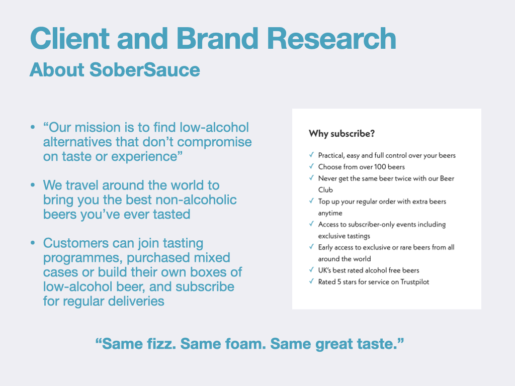
Having completed my client and brand research and a competitive audit of direct and indirect competitors, this week I’ve been looking to apply this knowledge to my client’s mobile experience. Carrying out an audit of the client’s current offering was a tip I was given by a UX designer that I had recently interviewed. He explained that this was not only an important process that would allow me to apply my UX knowledge as constructively critical feedback (which could be presented in a pitch), but it would also be an early opportunity to learn the needs and preferences of both the client and their customers prior to any usability testing.

Sobersauce do not have their own app – instead, their mobile experience is a responsively resized version of their website that offers the same features, but with a compacted user interface that’s in portrait orientation.

During the audit I’ve applied my knowledge of UX principles that I’ve learnt while studying the MA Digital Media Practice programme, focusing primarily upon information architecture, hierarchy, interactivity, and accessibility. 

Auditing the User Interface

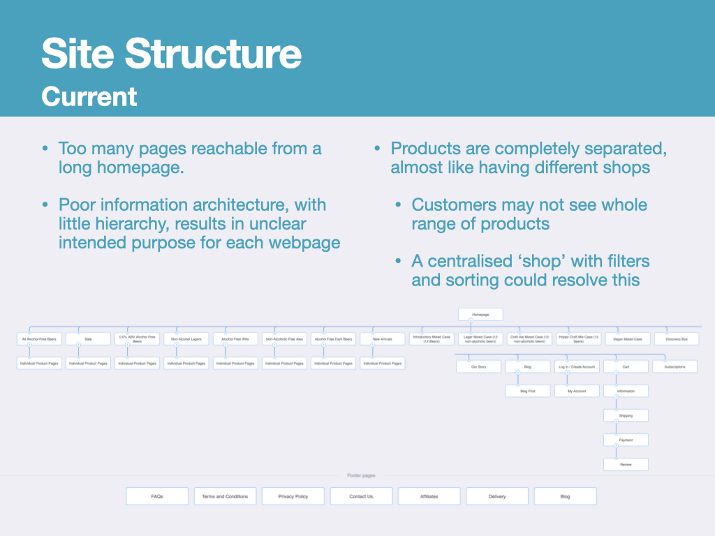
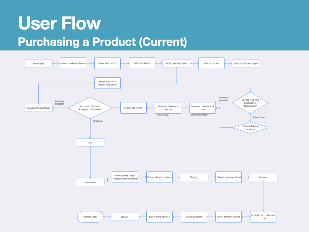
Site Structure and User Flow

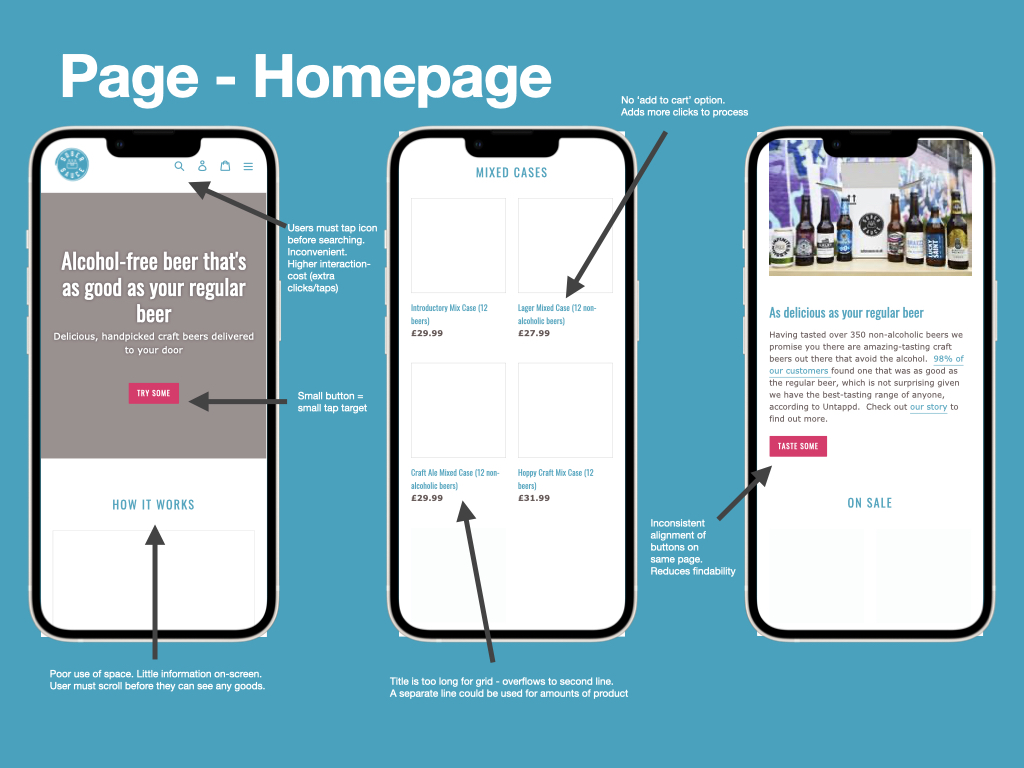
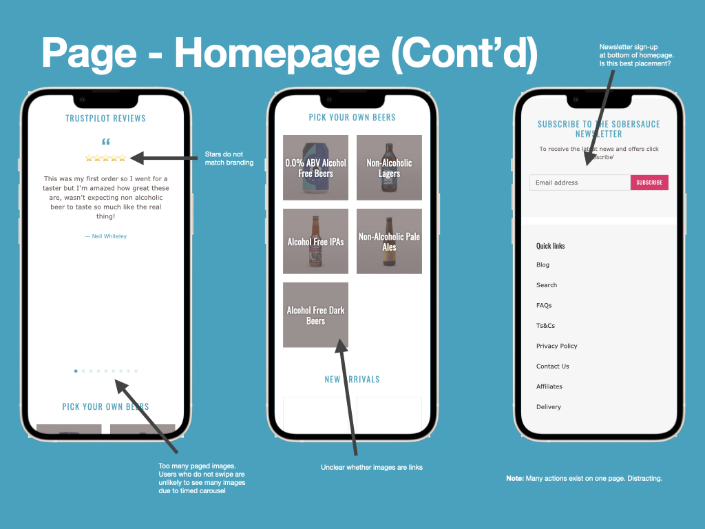
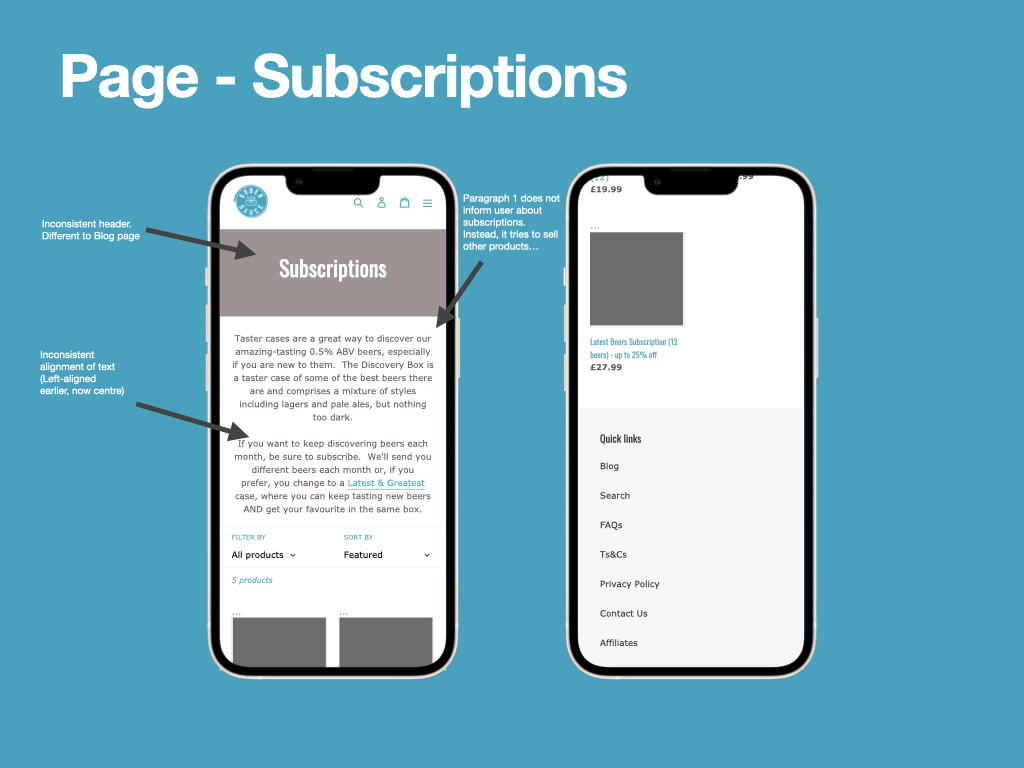
Both the site structure and intended user flow for making a purchase were complex. A plethora of long web pages, which often separated products from being purchased in combination, may have caused users to become confused and abandon their baskets. Information architecture was poor and caused some pages to lack purpose or have too many functionalities. Although I didn’t have access to accurate analytics, visualising these structures and flows permitted me to make and justify assumptions about the website’s failings.

Above: Diagrams of the SoberSauce website and purchase user flow

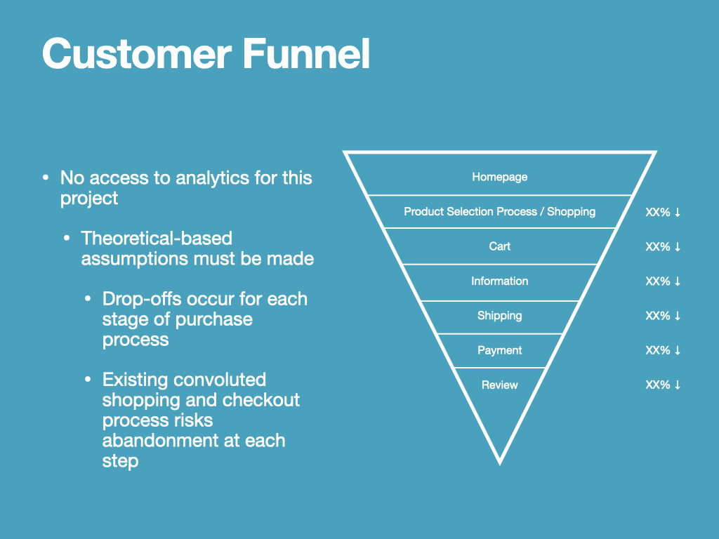
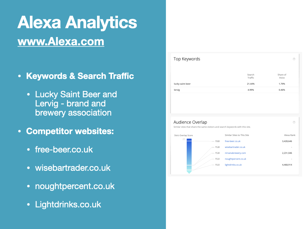
In ecommerce, the customer funnel is a common model, used to monitor and measure the flow of customers along several points of a purchase process (Isherwood, 2019). As I do not have access to specific analytics data for this project, I’m making reference to the customer funnel to demonstrate an understanding of its purpose. It is often used to illustrate how customers ‘drop off’ or abandon the purchase process at several points – often revealing one or two key areas that a UX designer may need to redesign to encourage more customers to complete their purchases. In my example I have noted how a convoluted shopping/checkout process could increase the abandonment rate, so this will become an area of focus for the project.

Accessibility and Compliancy

As part of this project I intend to strengthen my understanding of the Web content accessibility guidelines. I already understand that there are two levels of compliancy, “AA” and “AAA”, however until now I didn’t know any distinction between them. 

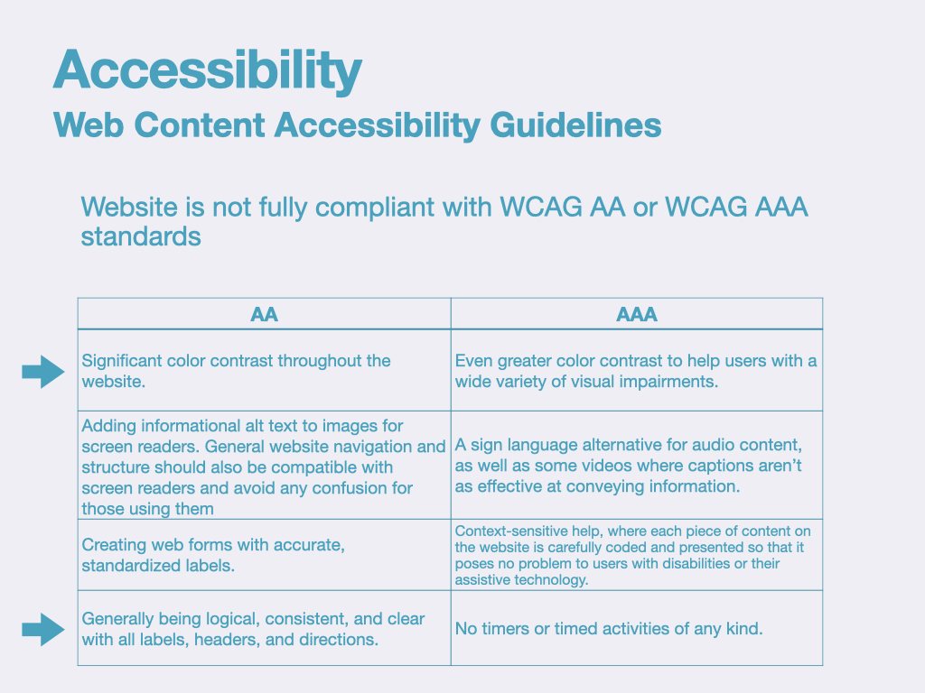
Judging by the criteria within this table, the Sobersauce website falls short of WCAG AA compliancy as significant colour contrast is occasionally not present, and the website structure and information architecture do not present information logically or clearly – indicated by my Site Structure diagram.

It is my intention within this module to produce a mobile experience for Sober Sauce that achieves WCAG AAA compliancy (or at least WCAG AA). This means that all content on webpages will choose a colour contrast ratio of 4.5:1, help will be provided using contextual pop-outs, and information will be presented logically, consistently and clearly. There will be no timers on website functions such as the checkout experience. 

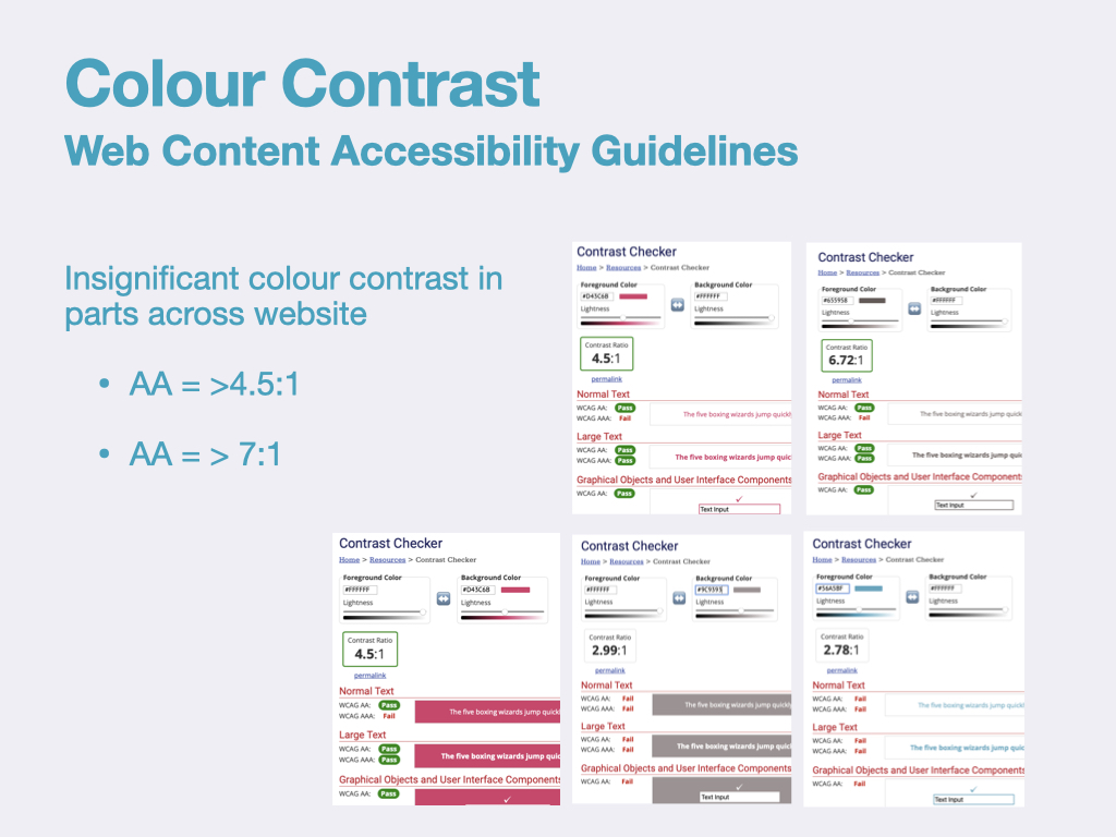
Regarding colour contrast specifically, Sobersauce website almost achieves WCAG AA compliancy for colour contrast ratio, but falls down in two areas. These two areas are actually used for headings, so presents a significant accessibility issue for those users dealing with vision-based impairments. 

In some areas WCAG AAA is almost achieved, however text is too thin to create a strong enough colour contrast. However, we can also see that ‘large text’, which could be bold text, improves this. So at this early stage I would suggest that slightly enlarging text could be enough of a tweak to meet compliancy needs.

Summary

Completing an audit of the client’s mobile experience has been a worthwhile task. I better understand the shortfalls that the current offering has in terms of information architecture, hierarchy, interactivity, and accessibility. From this I have produced the below bullet points that summarise the issues, which I intend to revisit later when planning my proposed solution – potentially, I will prioritise them according to the Design Hierarchy of Need and address the most important ones within this project (Bradley, 2010).

  • Webpages are often extremely long, cramming too much information 
  • Unclear purpose of each page results in distractions for the user
  • Webpages are potentially too white/bright, potentially fatiguing for the user, reducing browsing time
    • Branding is minimal in parts and has low colour contrast in places
    • Inconsistent formatting across pages appears disorganised and potentially disorientating
  • Titles of pages do not always explain purpose of pages
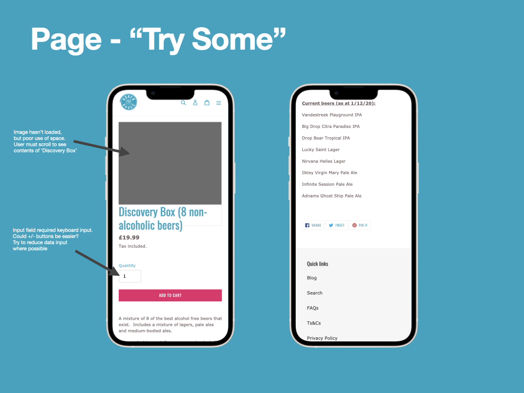
  • Interaction cost is higher that necessary in some places
    • No quick option to add selections to basket
    • Text fields used to specify amounts, +/- would require less textual input
    • Wayfinding is repetitive and sometimes illogical, requiring many taps and different pages
  • Links to helpful webpages are only present in the footer, these are difficult to find and would take considerable time to access when using a screen reader
  • Inconsistent tap-target sizes between buttons could cause interactivity issues

Below I have provided an Issuu link to my presentation, which features a full audit of the Sobersauce mobile experience. It features larger versions of the above images.

References

Bradley, S. (2010). Designing for a Hierarchy of Needs. [online] Smashing Magazine. Available at: https://www.smashingmagazine.com/2010/04/designing-for-a-hierarchy-of-needs/ [Accessed 5 Jul. 2021].‌

Isherwood, M. (2019). The Ecommerce Experience Funnel. [online] Medium. Available at: https://uxdesign.cc/the-ecommerce-experience-funnel-6e190aa2295 [Accessed 20 Feb. 2022].‌

DM7920 Week 5 – Competitive Audit

This week I’ve completed a competitive audit of the low alcohol/alcohol-free e-commerce market by selecting few of my client’s competitors and alysing the similarities and patterns between their mobile experiences. One of the main reasons for analysing these websites is to learn more about the customer base, as I cannot access the website analytics for Sobersauce. I hoped that by completing this task I’d be able to produce a set of personas that can help to justify my design decisions. 

Why Complete a Competitive Audit?

I discovered competitive audits via a UX design course I was completing online, published by Google (Google, n.d.). It stated several benefits and drawbacks of competitive audits, the most relevant to my project being:

Benefits:
• Informs the design process by illuminating what should and shouldn’t be included in proof of concept
• Provides reliable evidence to justify design ideas and decisions, and offers a deeper understanding user expectations
• Saves time, money, and energy, especially if completed before the iterative design processes begin

Drawbacks:
• Can stifle creativity, causing the designer to copy what other designers are doing, rather than trying innovative ideas and methods
• Audit is biased by subjective opinions of existing designs and does not supply the same definitive data as analytics might do
• Competitor’s features may not fit the use case for Sobersauce

Competitive Audit Presentation

Below, I have included an Issuu link that can be accessed to browse my competitive audit presentation slides.

References

Google (n.d.). Start the UX Design Process: Empathize, Define, and Ideate: Week 5 – Competitive Audits. [online] Coursera. Available at: https://www.coursera.org/learn/start-ux-design-process/home/ [Accessed 23 Mar. 2022].‌

Nielsen, J. (2019). Jakob’s Law of Internet User Experience (Video). [online] Nielsen Norman Group. Available at: https://www.nngroup.com/videos/jakobs-law-internet-ux/.‌

DM7920 Week 3 – Initial Client and Brand Research

In the past week I have identified a client for my project, carried out some initial client and brand research, and identified some methods for project planning and time management.

Introducing the Client

For this module I have decided that I will be creating a proof of concept that outlines some suggested changes to the mobile website design for an e-commerce company called Sobersauce. The project itself will be a simulated one, as I have little contact with the client themselves. Despite this, I feel that this client is ideal for the project as they are currently rebuilding their website – offering an opportunity for me to compare and contrast my design decisions with that of a design professional’s in three months time (when this module draws to a close). 

Who Are The Client?

Sobersauce are an e-commerce company who specialise in selling low-alcohol / alcohol-free drinks. It appears that they purchase their products from around the world and then distribute them in the UK. Their website permits customers to join tasting programmes, purchase mixed cases of drinks, build their own cases of low-alcohol beer, and organise subscriptions for regular deliveries. The company pride themselves on being able to provide drinks that are healthier to their alcoholic counterparts with compromising on taste or experience, and this feeds nicely into addressing Sustainable Development Goal 3, which refers to “[strengthening] the prevention and treatment of substance abuse” (Sobersauce, n.d.) (United Nations, n.d.). 

Mindmap

Before diving further into the module and researching Sober Sauce’s website more closely, I’ve decided to my map my thoughts and put a method of time management in place.

Below, I have included a screenshot of my initial mindmap, which outlines some of the opportunities/areas for focus within this project. I am particular enthusiastic to increase my knowledge of accessibility regulations and compliancy, particular pertaining to the Web Content Accessibility Guidelines, and to explore how the client’s branding can be reinforced while remaining conscious of accessibility considerations. 

So far on the MA Digital Media Practice course, my design projects have been limited to focusing on mobile application design, while the client has always been the University of Winchester. While this has permitted me to ‘cut my teeth’ on design theory and practice, I feel that now is the time to test myself further, beginning by turning my attention to website design and designing for a new client. 

I expect these changes to have a multitude of impacts, including designing to a different set of branding guidelines, catering for a different user base, and adhering to different set of design conventions. For example, much of wayfinding within mobile applications is carried out using a tab bar, however this is not the case for website design.

Time Planning

Further to this I have produced a Gantt chart that details a preliminary roadmap for this module. I fully expect the time parameters for each task to change, especially considering I am juggling two modules for this semester. If the GANTT chart requires updating I will be sure to include these updates in future blog post.

Client Branding

A short, preliminary examination of the mobile experience has given me an idea of Sobersauce’s brand identity. Primary, secondary, and tertiary colours are identifiable, as well as typefaces and graphics. Buttons often feature ‘call to actions’ (CTA) and are coloured red, as according to consumer psychology this causes consumers to “react faster and more forcefully” (Khan, 2018). This is likely because of the relationship red has with danger, which is embedded in human psychology.

A deeper understanding of the client’s brand could be found within their branding guidelines, which is likely made available to internal or contracted graphic designers / User interface designers only. As a result, I do not have access to these guidelines, but do have enough information to inform sketches and wireframes. It is likely that I will add adjustments to the client branding as the project moves forward, such as font sizes.

Analytics

Using Alexa analytics I’ve identified keywords from search traffic that could give me some insight into who Sobersauce’s customer base is. “Lucky saint beer” and “Lervig” (a Norwegian brewer) drive over 25% of site traffic (Alexa.com, 2019). Although I don’t intend to focus my project on SEO (Search Engine Optimisation), it is important to understand the key interests of Sobersource’s user base, such as branded products, and emphasise them to capture their attention.

I’ve also identified several related websites, which may be competitors, that I could analyse as part of an upcoming competitors audit. These websites may have a similar customer base, so could help me learn more about Sobersauce’s customers.

References

Alexa.com. (2019). Alexa – Competitive Analysis, Marketing Mix, and Website Traffic. [online] Available at: https://www.alexa.com/siteinfo.‌

Khan, H. (2018). Why All Sale Signs Are Red: the Science of Color in Retail. [online] Shopify. Available at: https://www.shopify.com/retail/store-signs-and-red-signs [Accessed 18 Jan. 2022].‌

Sobersauce (n.d.). About Us. [online] Sobersauce. Available at: https://sobersauce.co.uk/pages/about-us-1 [Accessed 10 Feb. 2022].

United Nations (n.d.). Sustainable Development Goals (SDG 3). [online] United Nations Western Europe. Available at: https://unric.org/en/sdg-3/ [Accessed 27 Jan. 2022].‌