I have previously carried out Usability Tests and rewritten copy in the onboarding section of the app, which improved the user experience.
However, until now, I still hadn’t addressed the imagery within the app.
To resolve this, I began by researching design theory regarding onboarding processes. I probably should have done this earlier in develop, but nevertheless, this app development is a learning process. Material.io has published some very useful guidance on this (Material Design, n.d.).
Reading the guidance, my attention was drawn to a few areas:
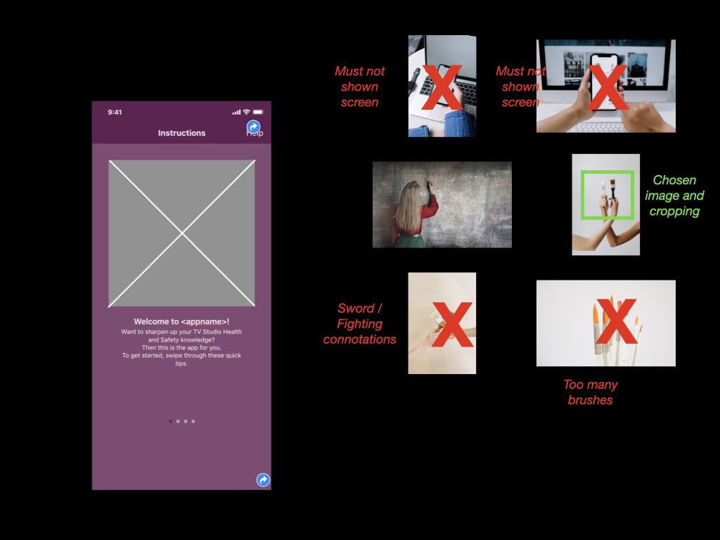
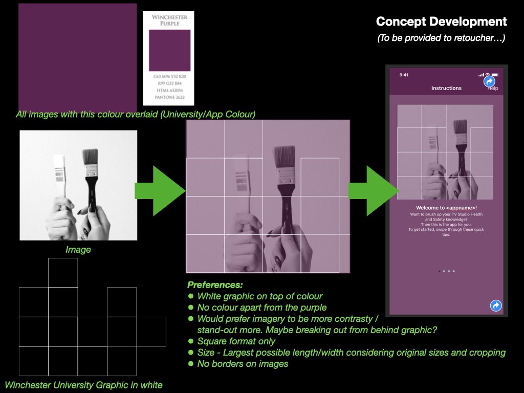
- “Maintain visual continuity” i.e.: build upon the visual voice of the app e.g.: graphics, colours, typeface, tone of voice
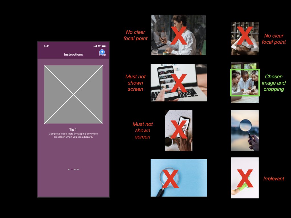
- “Simplify” i.e.: Onboarding images must have a simple concept and a focus point
- “Don’t be UI literal” i.e.: Show the app’s benefits, rather than aspects of the app (such as screenshots) that users haven’t yet experienced
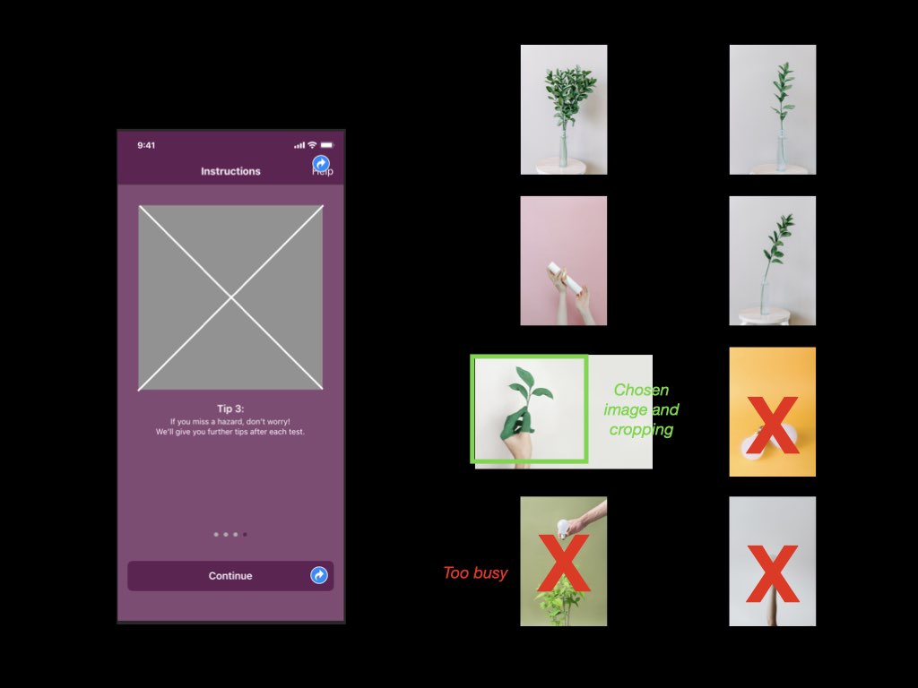
With these points in mind, I set about researching for imagery on the stock website, Pexels. I had previously used the this website for work and education purposes (such as my submission for DM7920). Images from this website can be modified “as [I] like” and “attribution is not required” (Pexels, n.d.). To my knowledge, this step clears the app (and myself) from copyright and attribution claims.
Each image was chosen for its link with the onboarding text, as below:
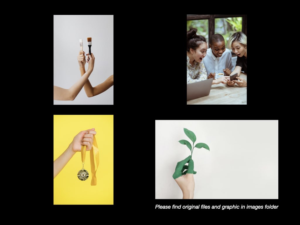
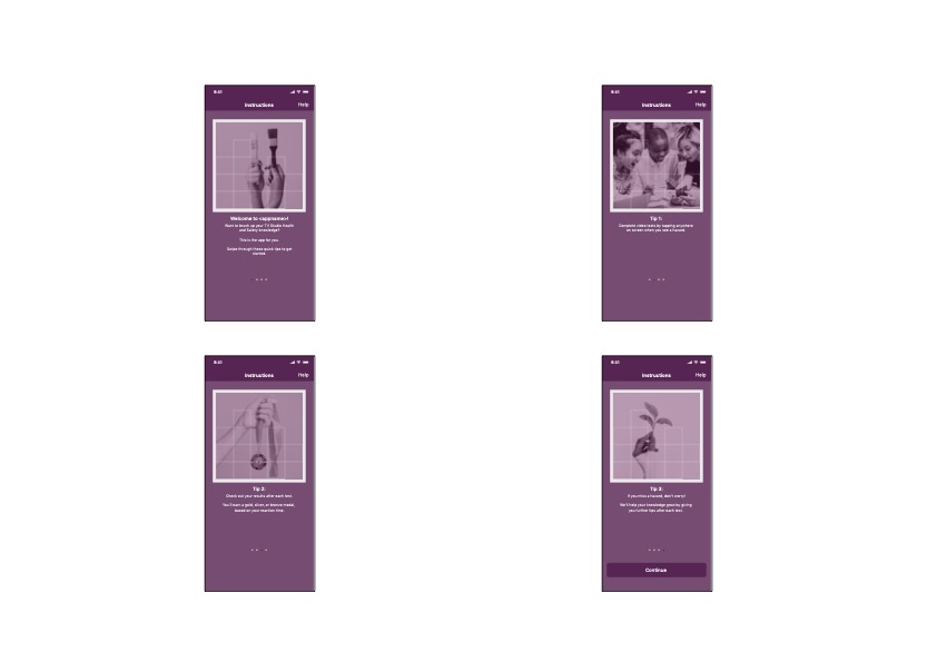
Screen 1: “Brush up” > Image of paint brush
Screen 2: “Completed a test” > Users having fun (laughing) with a phone
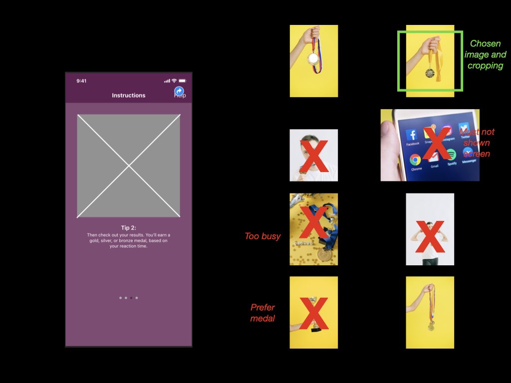
Screen 3: “You’ll earn a gold, silver, or bronze medal, based on your reaction time.” > Images of a medal
Screen 4: “We’ll help your knowledge grow” > Image of a plant (growing)
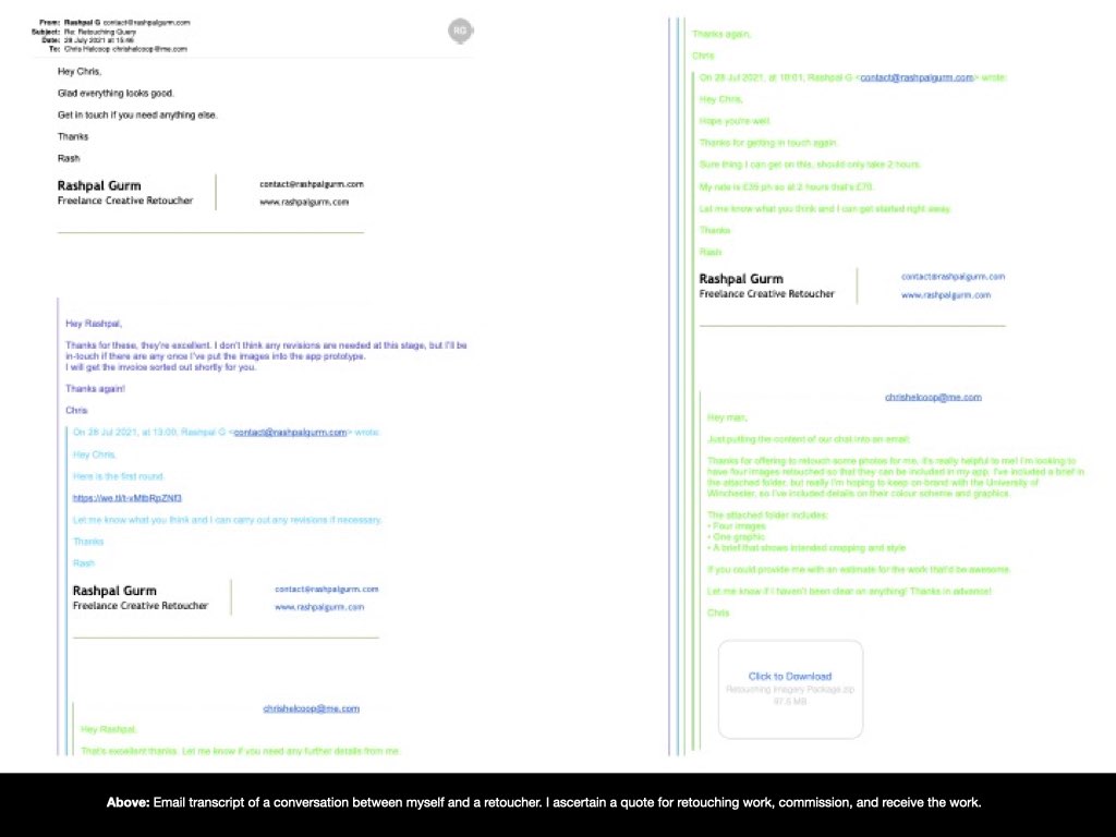
From my photography and marketing background, I was then able to draw upon my links with a professional retoucher, and provide him with a brief** that would note many of design choices to “maintain visual continuity”, including the University’s branding colours and graphics (Pexels, n.d.).
I contacted the retoucher, Rashpal Gurm, to brief him and attain a quote for the work. Upon agreement, he completed the work and delivered the images to me, ready to be included within the app’s design.
I’m pleased with the outcome of this process, and feel that the retouched images further the University’s brand while also relaying a fun and yet simple approach to the purpose of each onboarding screen.
** The brief provided to Rashpal Gurm was a PDF file comprising the first six images within this blog post
Material Design. (n.d.). Material Design. [online] Available at: https://material.io/design/communication/onboarding.html#top-user-benefits-model [Accessed 30 Jul. 2021].
Pexels. (n.d.). Legal Simplicity. [online] Available at: https://www.pexels.com/license/ [Accessed 30 Jul. 2021].