This week I started work on producing a Medium Fidelity Prototype to be used for future usability tests. To achieve this, I worked in Apple’s Keynote software, which runs natively on MacOS and iOS. The Keynote file will be accessible on an iPhone, so usability testers can use the prototype as if it were a real app, provided I make many hyperlinks between pages.
When transitioning my prototyping from paper-based methods to digital, there were a few things that I had to consider before starting. Firstly, I needed to consider the requirement for my prototype to be tested on an actual phone, as this would provide the truest reflection of the user experience. I’ve decided to use my iPhone 11 for this, so needed to make sure that I formatted my keynote file to the correct dimensions (375px x 812px).
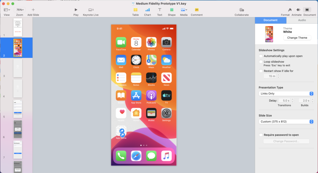
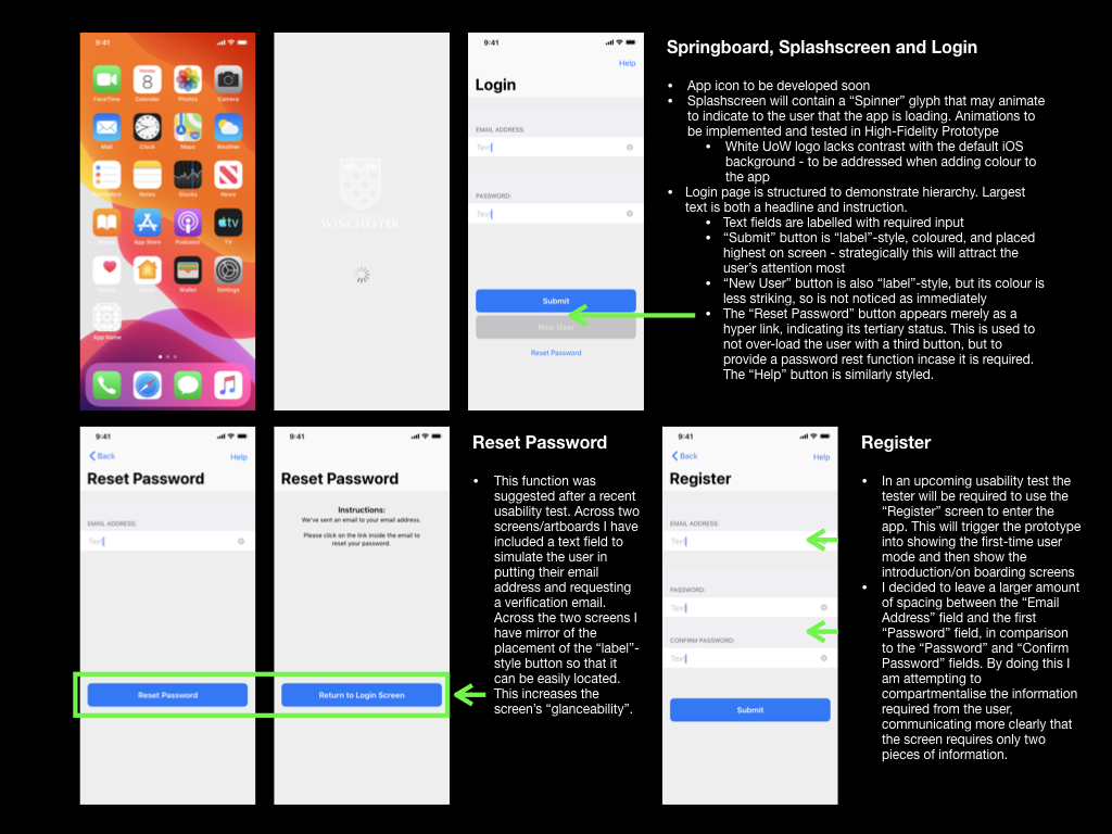
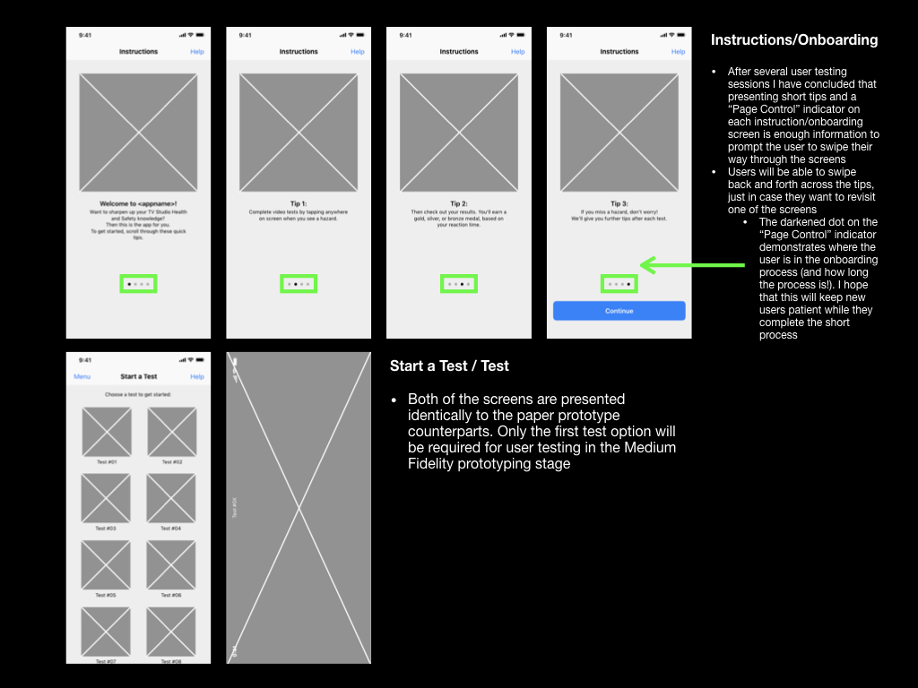
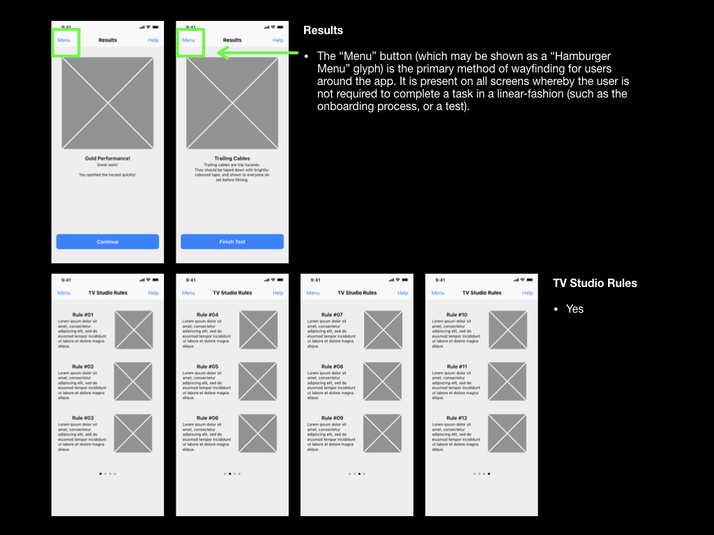
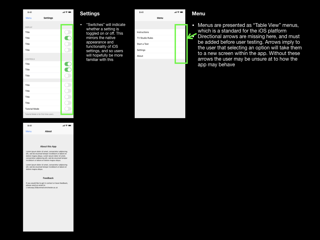
I also needed to adhere to the design principles set in Apple’s iOS platform so that my prototype would appear and behave in a manner that the user could expect. Apple’s Human Interface Design Guidelines and downloadable Keynote file included sample user interface elements, which could be integrated into a digital prototype. The navigation bar (at the top of each screen) and the tab bar (at the bottom of the screen) were commonly used elements across my app. I also made use of spinners (as loading indicators), “label”-style buttons, and “Page indicators”, which would communicate functionality and different states to the user.
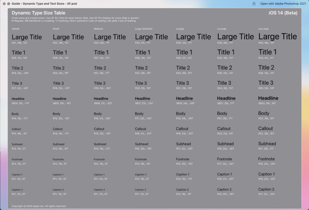
Apple’s guidelines also come with guidance on Apple’s colour palette and typefaces. Although I intend to replace the colour elements with those from the University of Winchester branding guidelines, I would be looking to adopt Apple’s typeface “San Francisco”. The San Francisco “Pro” typeface is commonly present across iOS as it is the default system typeface. Apple describes the font as “a neutral, flexible, sans-serif typeface,” the “sans-serif” element increasing the typeface’s legibility and scalability (Apple, 2019). The typeface also comes in 9 weightings, which can be used alongside variations in sizes to create a hierarchy of information.
Once I had created a rudimental version of the prototype, with its intended information architecture, layout, and hierarchical elements, I had to give it functionality. I did this by using hyperlinks to link the users between each of the screens. For “label”-style buttons, it was important to make the entire button a hyperlink rather than just the button text. This would result in a larger tap-target, which would suit usability testers and users who have large thumbs!
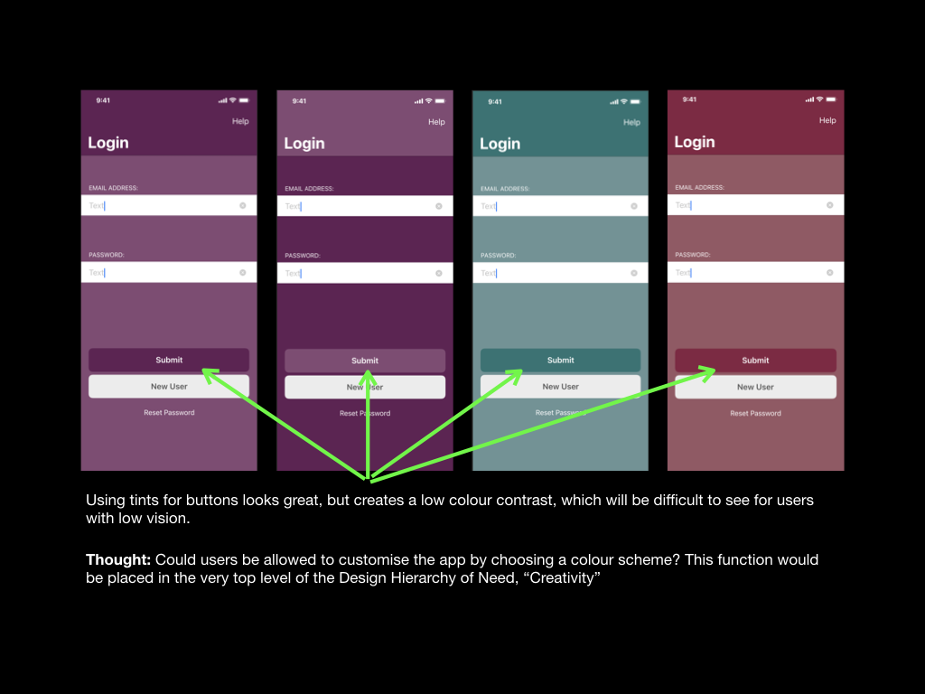
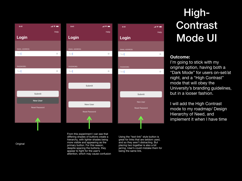
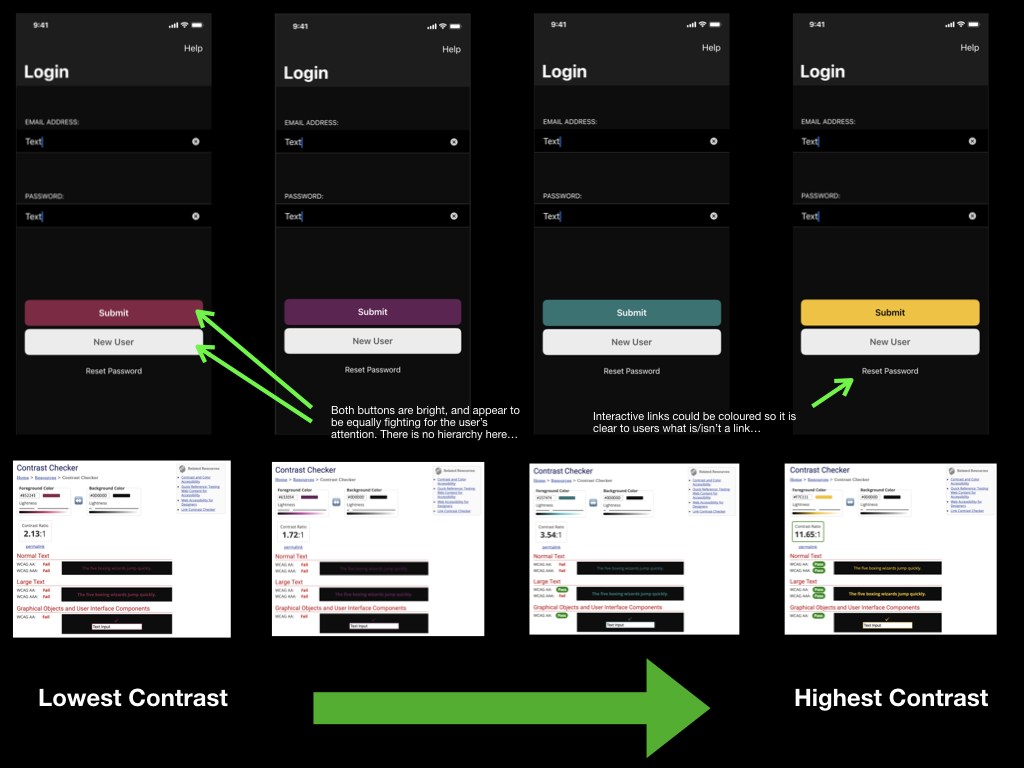
Next, I had to begin tailoring the app towards the University of Winchester’s branding. The primary method of achieving this was to incorporate the universities colour palette. The branding guidelines stated that I could combine any university’s main colours with its accompanying tint, however, I could not combine different colours. This guidance alone allowed me to create pages that had “depth” to them, rather than appearing one-colour and “flat.” Where possible I will try to use as high colour contrast as the colour palette would allow, however, this often fell short of WCAG standards – this would be especially problematic with interactive elements, such as buttons, that would have a low colour contrast ratio with their backgrounds.
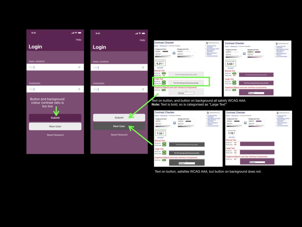
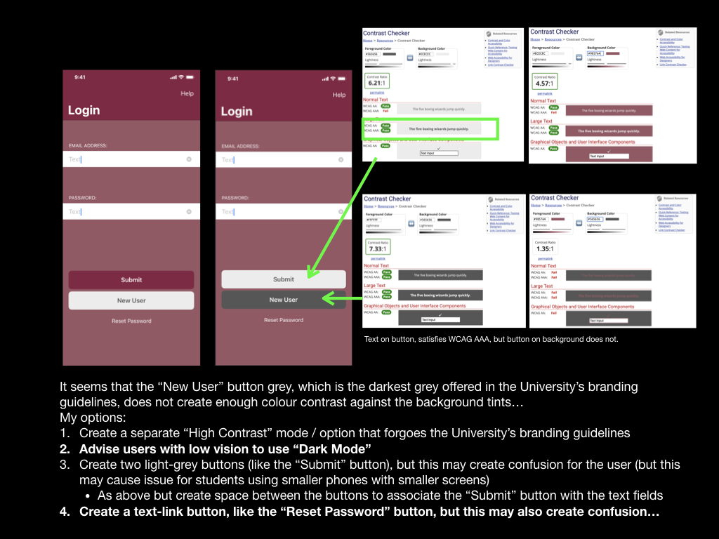
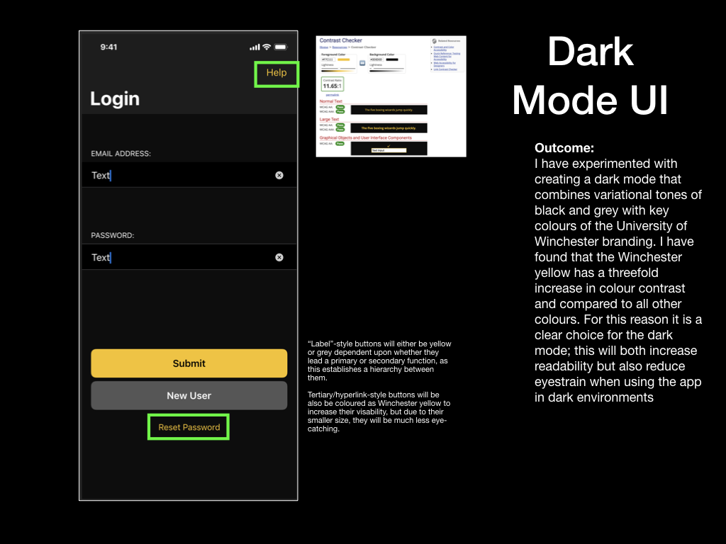
Having experimented with producing colour schemes using four of the University’s colours, I decided that I must create a high-contrast mode or “Dark Mode” so that I could increase accessibility for users of the prototype with vision impairments. A high contrast user interface would attempt to adopt the University branding as much as possible but would make compromises to prioritise high-colour contrast and readability when concerned with interactive elements like buttons, text fields and even labels for text fields. On the other hand, a dark mode would also feature high contrast elements, but with the bonus of being less bright and thus reducing the chance of the user developing eyestrain. Due to this added benefit, I prioritised creating the dark mode and included it as part of this prototype (Cole, 2019). The high contrast user interface could be developed at a later point in time.
I am very pleased with the visual outcome of this prototype. Its adherence to Apple’s Human Interface Design Guidelines, although not pushing many creative boundaries, has resulted in a professional appearance. This prototype is a true reflection of the application I wish to create at this stage, and so gaining valuable insight through a usability test will be key in identifying improvements for the next prototype. In particular, I’m interested to know whether a user could intuitively activate Dark Mode within the prototype and then seek some information in the “Revision” section. I will focus on producing a usability test that requests this.
I have noted a limitation of creating a medium-fidelity prototype using Keynote. I have listed these below and will inform my usability tester before testing:
• Interactions such as swiping are not supported on the iOS version of Keynote – usability testers will be advised that they may only tap during the test. This limitation will be resolved and tested using a high-fidelity prototype and different prototyping software
Note: I have since carried out Usability Test 4 and the report can be read as a separate blog post. I have also made adjustments to my prototype based on feedback.
Apple (2019). Fonts – Apple Developer. [online] Apple.com. Available at: https://developer.apple.com/fonts/ [Accessed 23 Jul. 2021].
Cole, S. (2019). Dark Mode Isn’t “Easier on the Eyes” for Everybody. [online] www.vice.com. Available at: https://www.vice.com/en/article/ywyqxw/apple-dark-mode-eye-strain-battery-life [Accessed 23 Jul. 2021].