Before conducting my next Usability Test, I’ve adjusted my paper prototypes to the feedback I was given. This includes:
- Log-in and Registration screens:
- App should require an email address and password for log-in, rather than a username and password (it’s worth matching these to the University credentials)
- Results and Start a Test screens:
- Add a star rating for users to glance at and see their previous performance(s)
- Results screen:
- Provide more detailed feedback for the hazard within each test, including the outcome of the hazard if it wasn’t noticed
- Change the “Continue” button at the bottom of the screen to either “End Test” or “Finish”
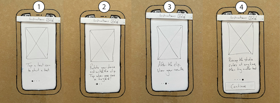
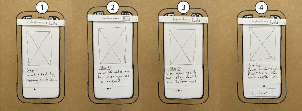
- Instructions screen:
- Remove the Hamburger menu button from the screen, as this took users out of the onboarding process
- Rephrase the onboarding process – perhaps remove command words from the beginning of each sentence to prevent users acting them out during the process
- Maybe reconsider how wayfinding methods could inform users about where they are in a process, such as “Step 3 of 5” (see below images)