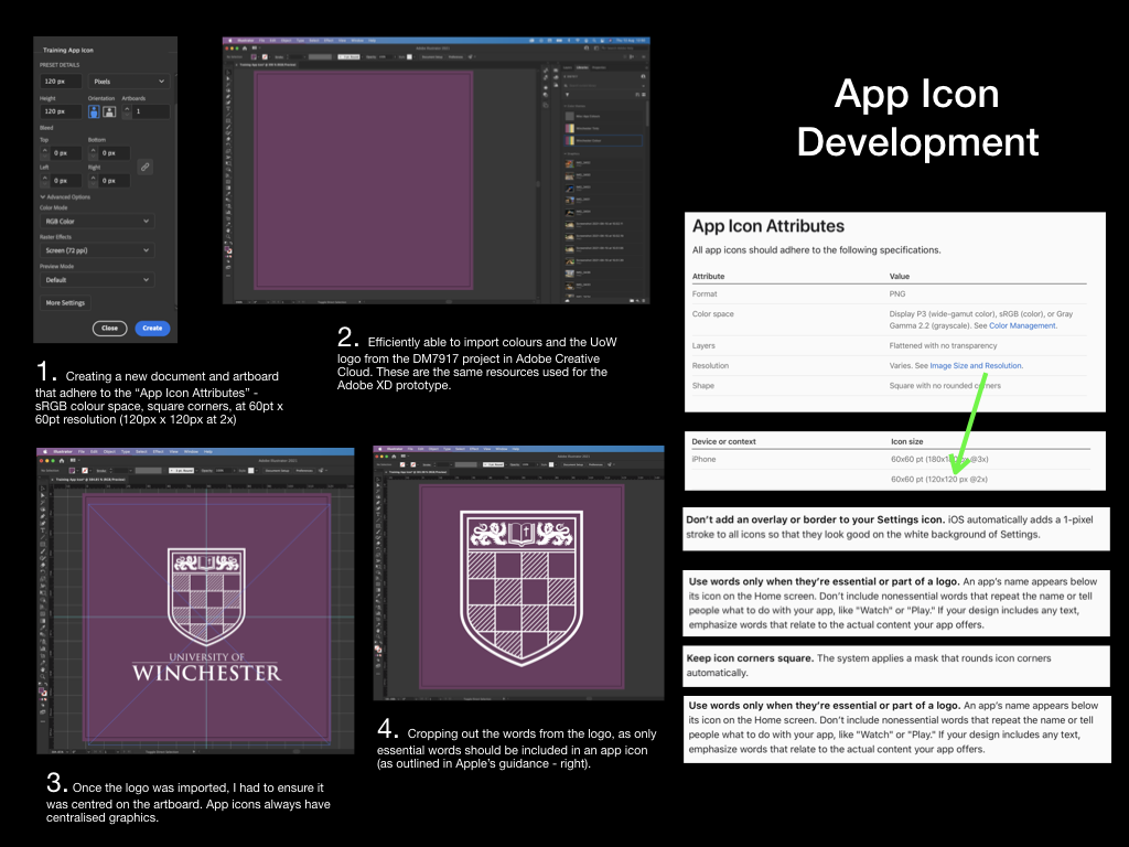
Each of my digital usability tests have placed the tester at the springboard/home screen as their starting position, whereby the tester is required to tap the app icon to launch the “app” within the prototype. To increase the sense of realism here, I have decided to create a mock up of the app icon. I have recorded my creative process below in two PowerPoint slides.
Perhaps appealing to my interest in user interfaces and graphic design, I was interested to learn all of the constraints that Apple place upon designers for something as small as the app icon. I have a followed many of these constraints, such as only including necessary text on the icon (none in this instance), producing the icon in PNG format (to permit transparency when imported into iOS), and creating the icon at the correct 2x resolution for prototyping on an iPhone 11.
Not satisfied completely with a “flat” colour design, I decided to introduce some gradient to the icon, as to assimilate better with the current trend on iOS devices. There appears to be no details in the University of Winchester’s branding guidelines to state that I should not do this.
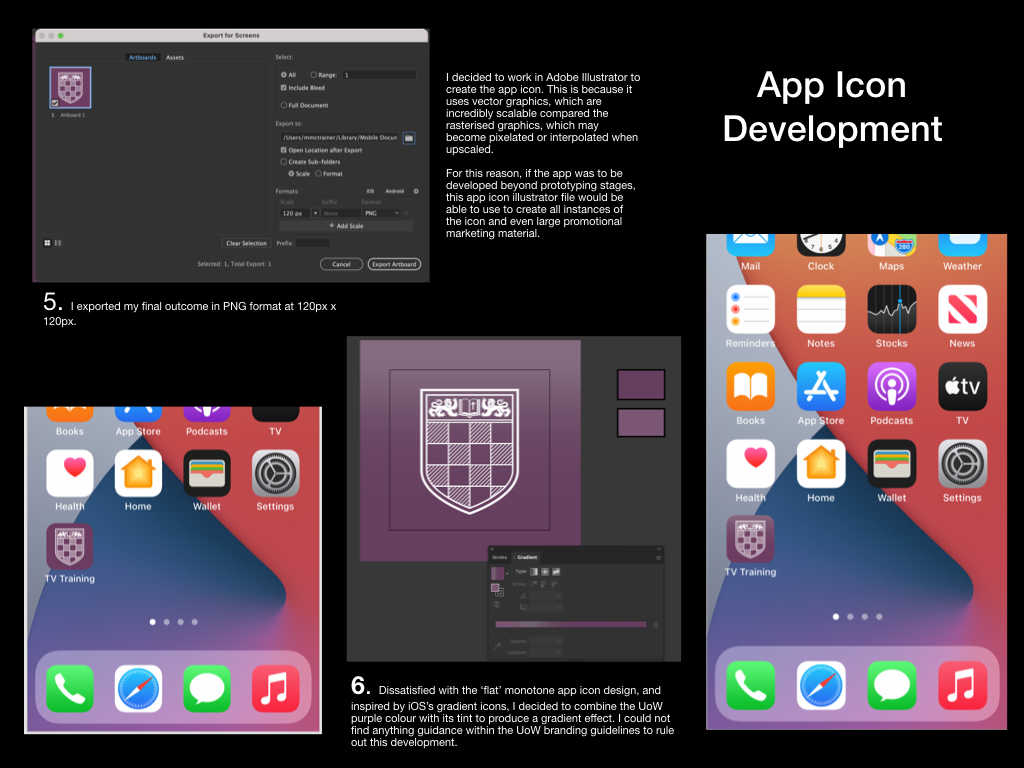
I have decided upon the temporary app name “TV Training,” which can be used throughout further prototyping – making it easy for usability testers to discern the app from others on the springboard/home screen.