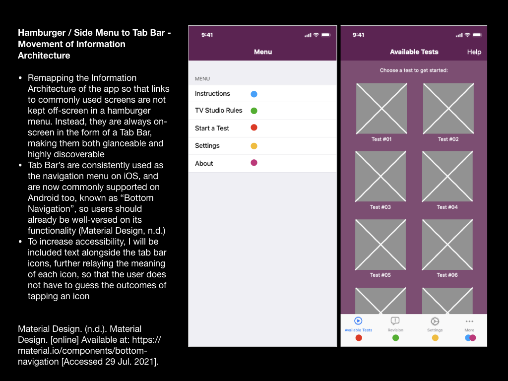
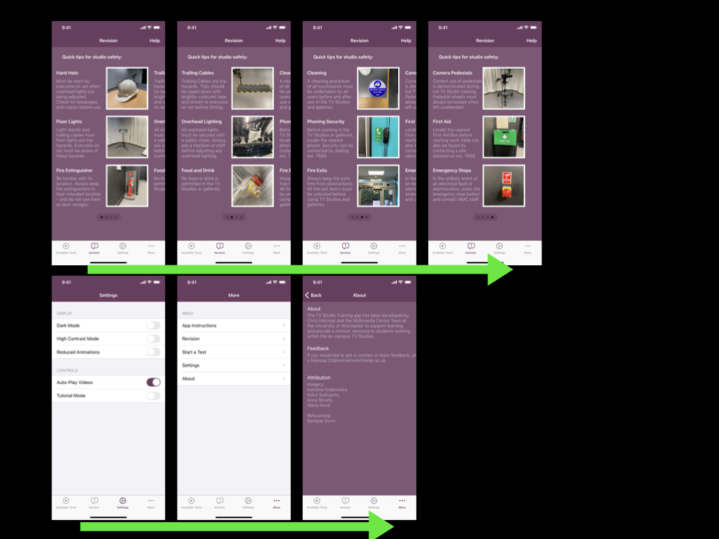
The remedial actions required from my fourth usability test were mostly small changes, such as the names of different screens within the app. However, the feedback I gained also suggested that I should introduce a tab bar to the app, rather than users relying on a hamburger-style menu for wayfinding. This change would intend to improve user navigation within the app and the findability of the Revision section.
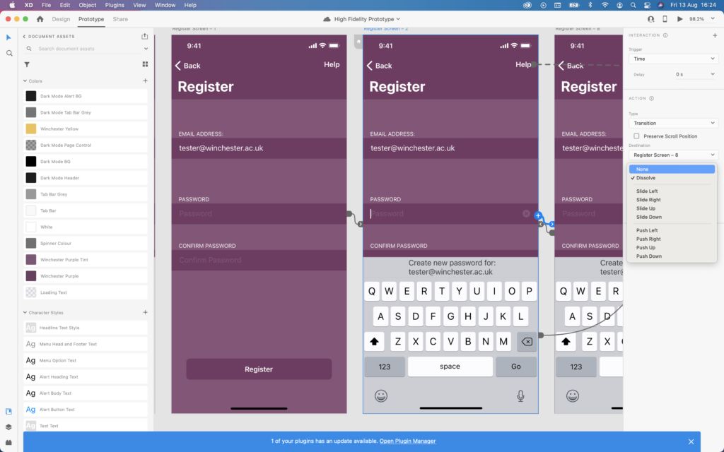
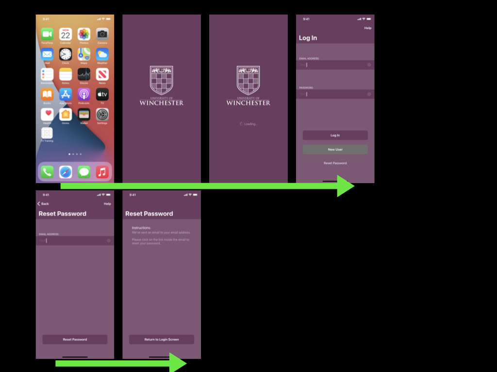
To reach this point I decided to rebuild the prototype using Adobe XD rather than Apple Keynote. This change would permit me to carry out a usability test that allows the tester to use gestures such as swiping, and to test animations between different screens.
I hadn’t used Adobe XD before, so, admittedly I relied on several YouTube tutorials to grasp the basic concepts and controls.
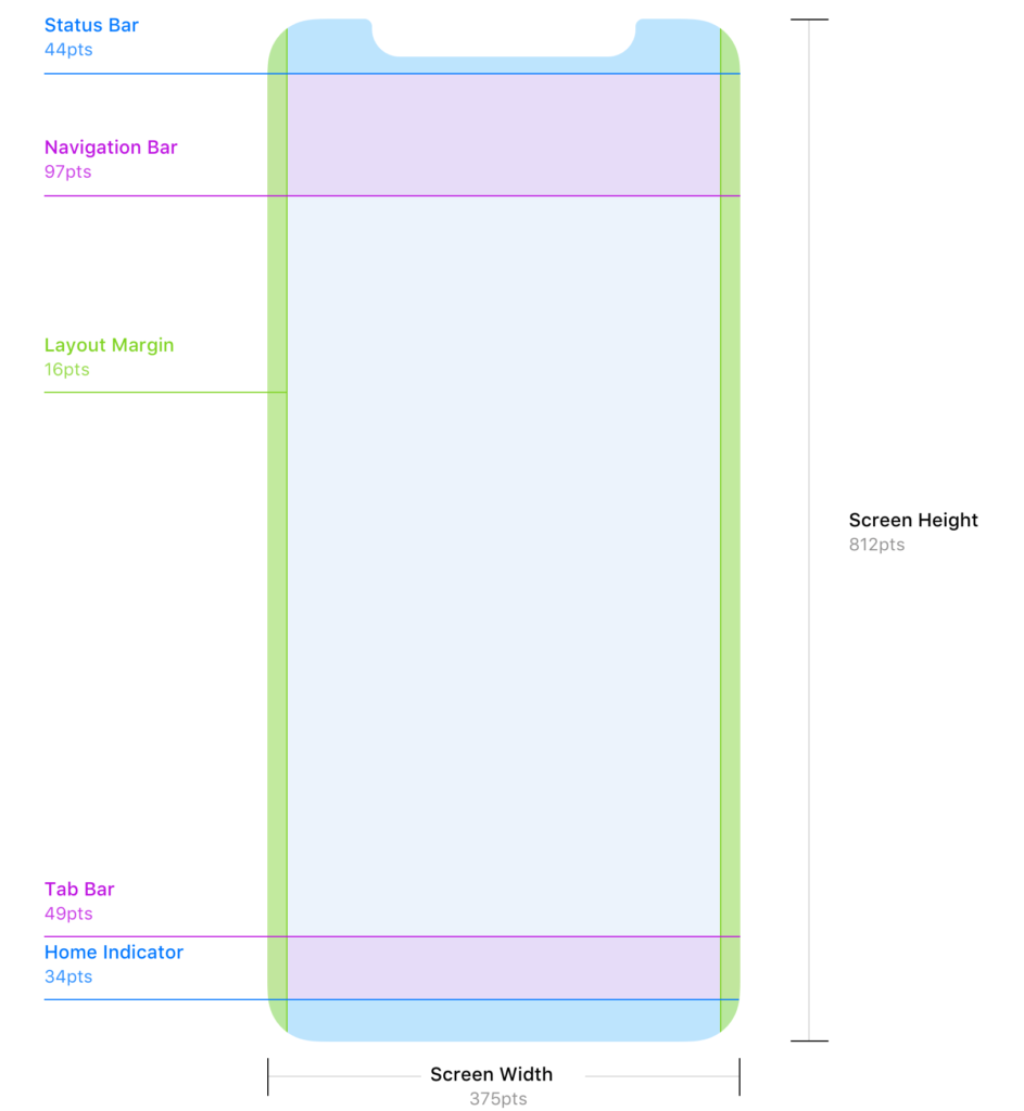
I began by downloading Apple’s Human Interface Design Guidelines so that I could access basic user interface resources that I could create a basic layout from. Further research on the Reddit user interface/user experience community revealed a more accessible set of guidelines for designing for iOS; this included guidance on adhering to strict layout conventions (including 16pt margins, and correct placement of both the navigation and tab bars).
Source: Denis Rojčyk
I needed to more closely consider the sizing of the iPhone 11 screen that I will be using for my usability tests. When designing for iPhone displays the designer must use “points” (pt) as the unit of measurement; points are a resolution-independent measurement, which allows for scaling between different iPhone displays. With future development in mind, I developed this prototype at “1x”, where 1pt = 1px (pixel). The iPhone 11’s display is known as a “Retina display” and thus has higher pixel density – I would need to upscale my prototype when exporting by 2x to meet this requirement (Mynttinen, 2020).
I was also made aware of Adobe XD features such as responsive resizing, however as a newbie to the software I decided that this would be a feature for a future prototype, alongside the ability for the user to resize on-screen text.
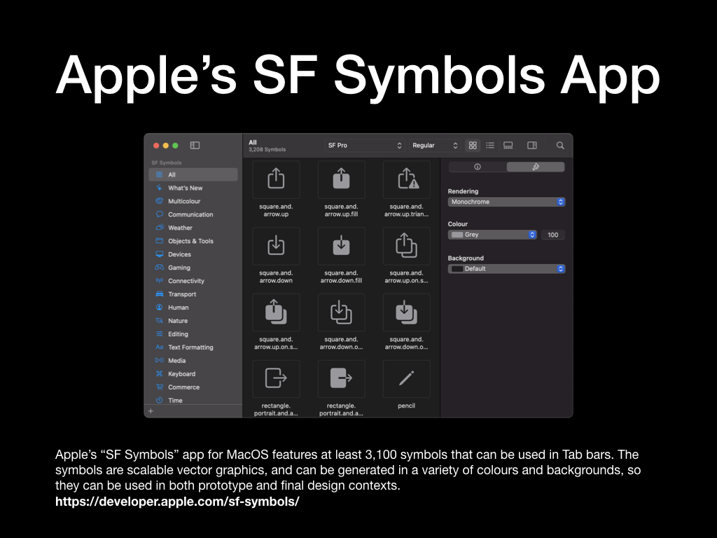
I found the glyphs to complete the navigation and tab bars within Apple’s “SF Symbols Beta” app on macOS. This is essentially a library of glyphs used across Apple’s operating systems. The glyphs I chose would be used for the sections of my tab bar, and the “back” button in the navigation bar. As these are “wayfinding” methods I had to consider how well each glyph communicated its functionality. For example, as the hazard perception tests within the prototype are videos, I decided to use a “play” triangle glyph for the “Start a Test” tab bar section. Similarly, I decided to use the ellipsis glyph for the “More” menu, as this is a common convention across iOS apps. By taking this approach I reduced the need for the user to guess the functionality of each glyph – instead opting to use their prior knowledge of symbols used in other media.
With the layout established, I set about implementing the University of Winchester colour palette and creating a dark mode, much akin to the previous prototype. This process was much quicker this time around, as Adobe XD has some efficient features that allow the user to extract colour palettes from images and to quickly apply them across all artboards in the current prototype. The same methodology is also applied to typefaces; it was incredibly quick for me to locate the typefaces in Apple’s Human Interface Design Guidelines, extract the typeface weightings and sizes that I needed, and then apply them across all of my artboards/screens.
Artboards that contain repeating elements such as the Available Tests, Revision, and Results screens, could be quickly created using the Repeat Grid function in Adobe XD. This function would intelligently recognise patterns in the placement of shapes, images, and text fields, then offer to repeat them. Although I struggled with this method at first, I can see how efficient functions like this speed up the process for a User Experience Designer to produce a quick digital prototype.
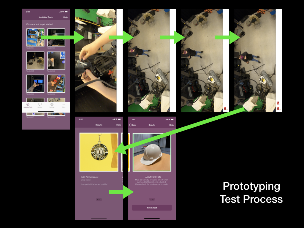
Filling the prototype with copy and placeholder images was also incredibly efficient in Adobe XD. I prepared the copy into a basic text file and then dragged this information to the correct artboard – the information would then automatically populate the correct fields. This negated the need for me to import text, or copy and paste repeatedly. I photographed a variety of items that are referenced in the current the TV Studio training provision; items such as hard hats and trailing cables, which could be imported into the prototype. Importing images worked in a very similar fashion, provided I had numbered them correctly.
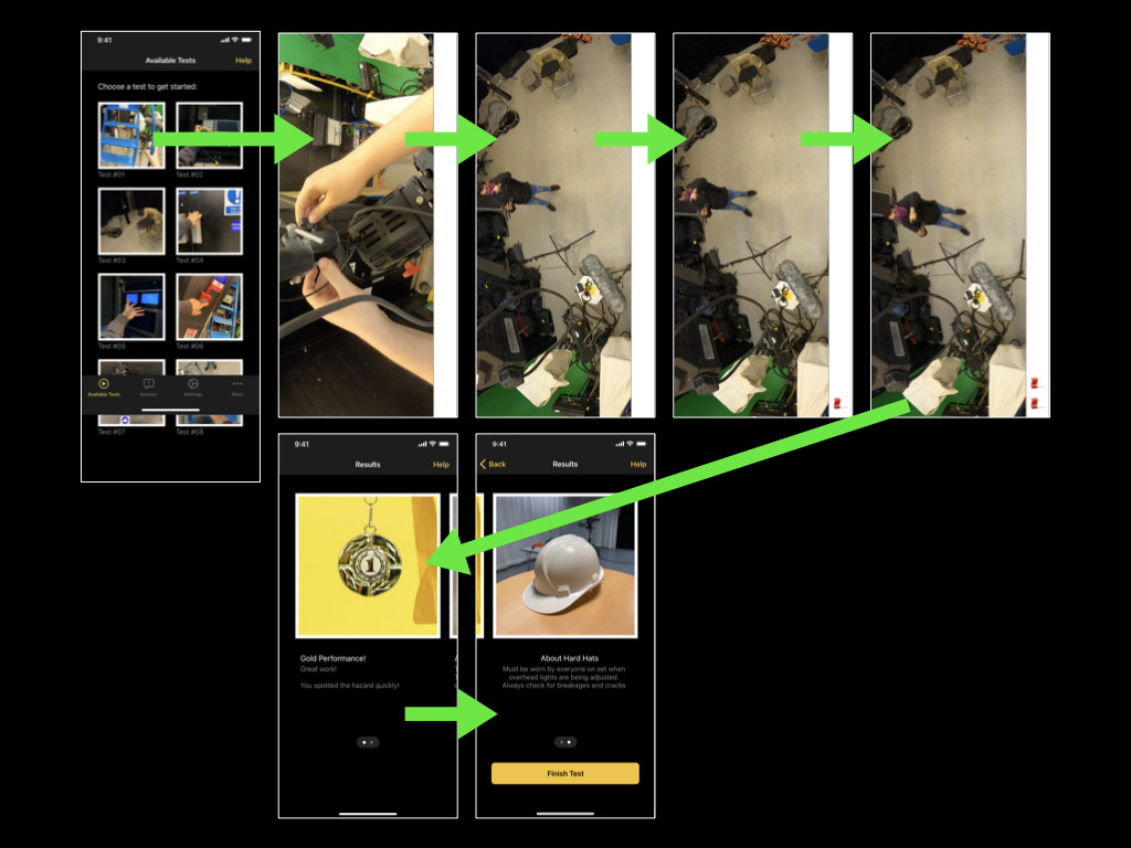
In collaboration with a fellow technician, I also filmed a very short prototype of a hazard perception test. I didn’t want to spend too much time planning the test, as the mobile application itself is the main focus of my project, however, by equipping a Go Pro to the technicians hard hat we were able to film a short test video.
The video features a first-person perspective of making an adjustment to an over-head light. The hazardous scenario comes to light when the technician looks at myself, stood on the studio floor and not wearing a hard hat – a clear violation of the TV Studio’s Health and Safety rules. Unconcerned about the video’s sound (due to it being a first prototype), the technician can be heard talking to himself (getting into character), while I can be heard directing him.
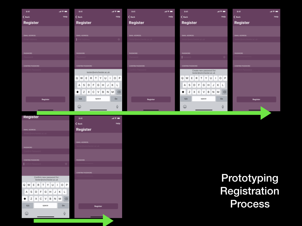
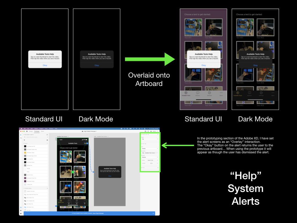
The final aspect of the developing process for this prototype was to implement links between pages and add animations. These animations would take place once a user had tapped on a hyperlink, and for this reason, it was important for the animations to communicate correctly. When selecting a tab in the tab bar there is no animation, the user is taken straight to their destination as they expect. However, when tapping on a test icon on the Available Tests screen, I have decided that the test video should “push-in”/slide on-screen from the right. I hope this animation prompts the user to rotate their phone (as if the video slid onto the screen from the bottom) – hopefully, I will receive feedback on this from the next usability test.
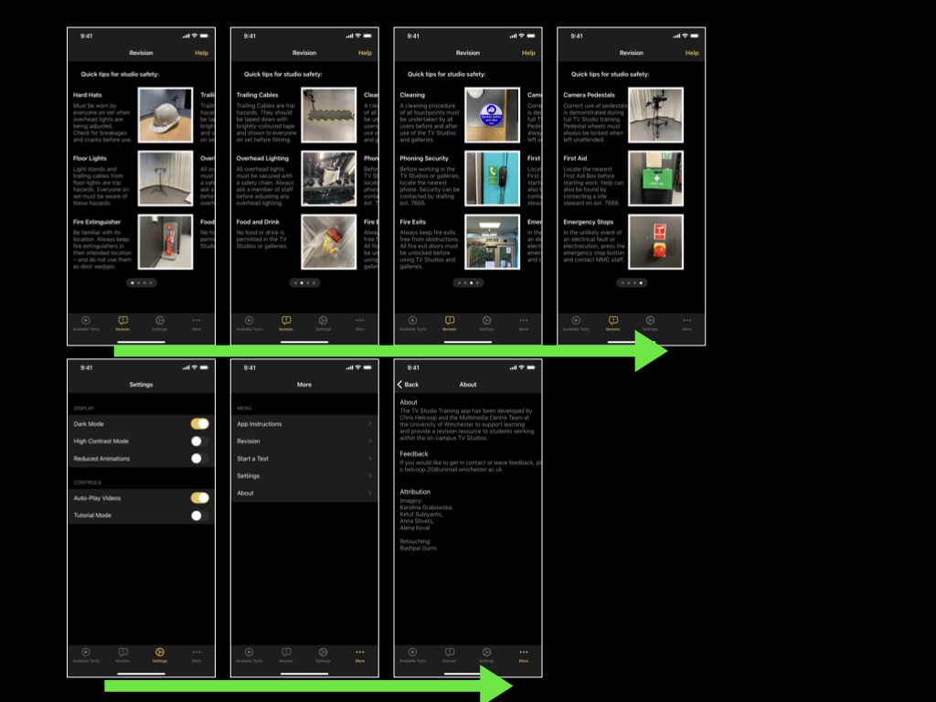
I’ve also used the swiping gesture in combination with the auto-animate feature in Adobe XD to simulate the effect of swiping across information on an artboard/screen. For example, on the revision screen, the user will be able to swipe their way through sets of tips that they believe are all on the same screen, however behind-the-scenes they will be navigating between different artboards/screens in Adobe XD.
Finally, Adobe XD features a handy mobile application for iOS, which I plan to use for the upcoming usability test. It allows users to preview the prototype as if it were a real app on their phone. I expect that this will be an improvement upon using Keynote for prototyping, as the tester will be able to complete the usual gestures they become accustomed to on phones. They could also view all glyphs and animations as if they are native on the device.
Limitations:
• Many glyphs from Apple’s “SF Symbols Beta” app are not visible on iOS14 – instead, a box with a question mark is shown. To rectify this issue each glyph must be converted to a basic image file by selecting the glyph and pressing CMD+8 within Adobe XD
• Adobe XD cannot preview video files within a prototype. One plug-in solution does exist for this called “Anima”, however, due to the nature of the hazard perception test, the user must tap on a playing video when they see a hazard, which unfortunately stops the video playing (or skips the video entirely) in Adobe XD. As a workaround, I have used several still-frames from the video to simulate a video playing and will explain this to the tester during the next usability test
• The swipe gesture can only be used once on each artboard/screen. As a result, in this prototype users can only move forward throughout the Instructions/Onboarding and Revision screens. This is not a problem for a prototype, however, the end product would need to allow users to swipe in both directions so that they can review forgotten information
Mynttinen, I. (2020). The iOS Design Guidelines. [online] Ivo Mynttinen / User Interface Designer. Available at: https://ivomynttinen.com/blog/ios-design-guidelines [Accessed 8 Aug. 2021].