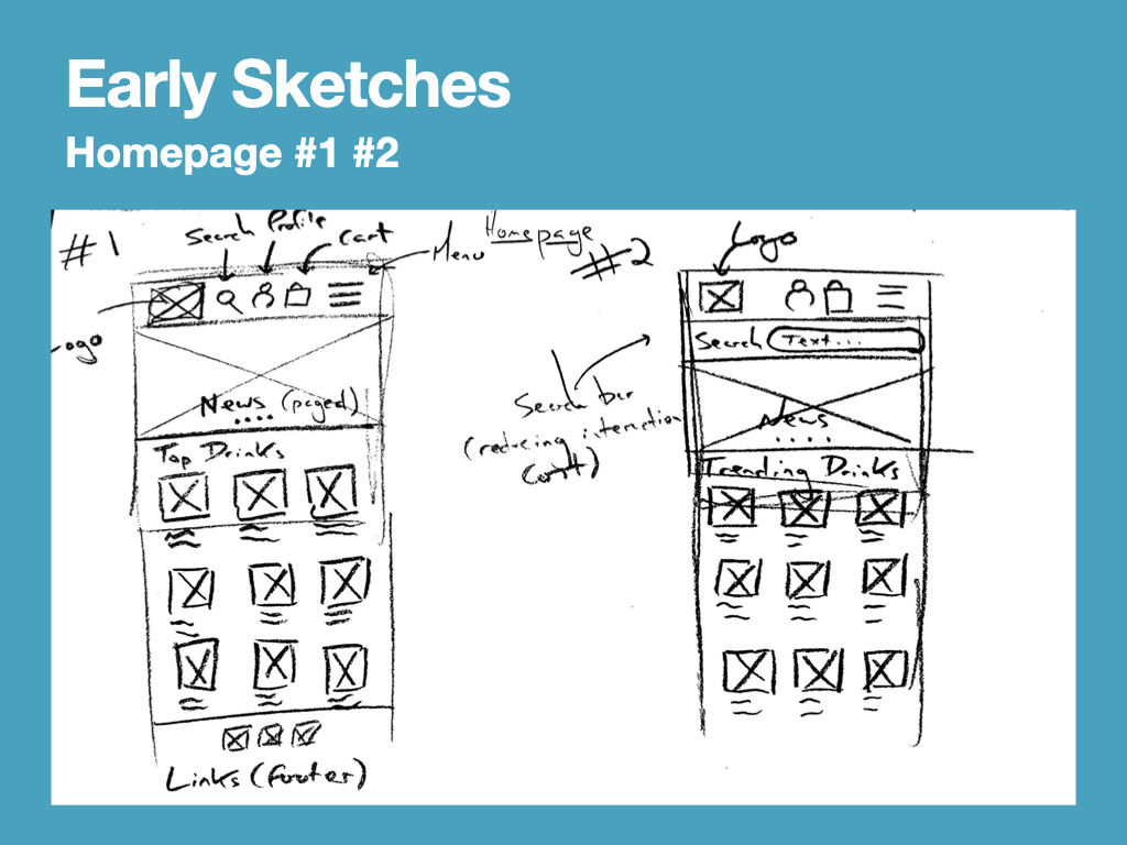
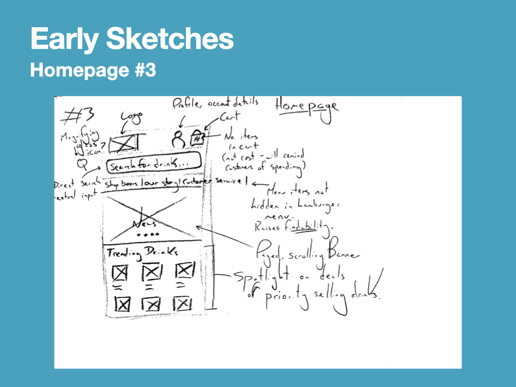
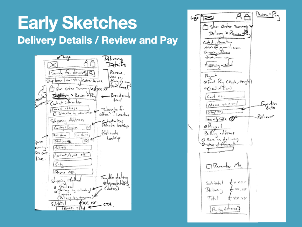
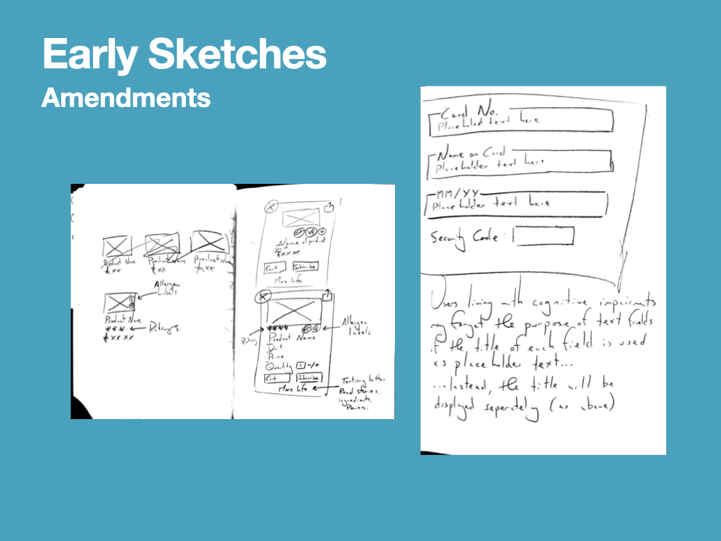
This week I began producing early sketches and wireframes for the project. This allowed me to think broadly about how the information architecture and the webpage layout could be adapted to meet my three objectives.
On each of the below slides I have recorded several iterations of my designs and have not omitted anything. A key mantra of my design decision making came from within a paragraph in User-centred Web Development by Jonathan Lazar, which reads:
“In general, users will not spend a lot of time trying to learn the interface of a web site. If previous knowledge is required, or if the interface is confusing, or if the user cannot find the necessary information or has to ask for outside assistance, he or she might just access another website, since there are virtually not costs involved in switching web sites” (Lazar, 2001)
This mantra, coupled with the knowledge from my Competitive Audit, highlighted that I should adhere to common layout and information architecture conventions established across similar websites, as this would be key to understanding users’ prior knowledge. The analytics in my Competitive Audit also established that the alcohol-free drinks market is especially competitive, so it would be true that users can switch to accessing another website if the Sobersauce interface was confusing.
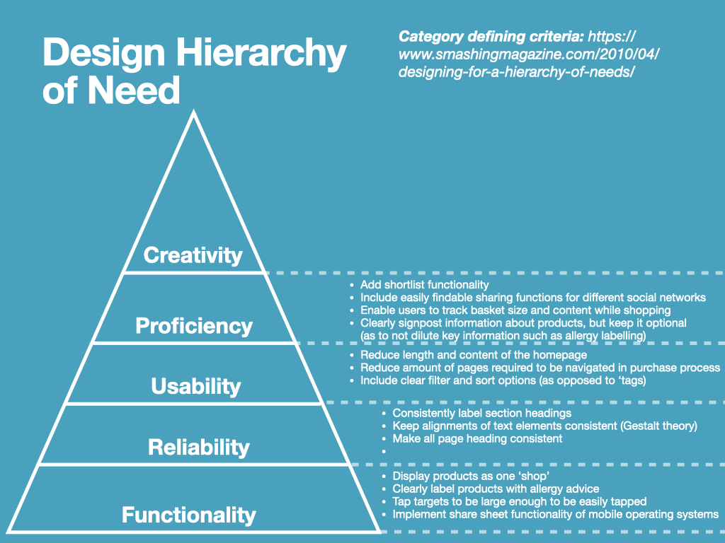
I resolved to design my initial sketches by borrowing from the conventions of Sobersauce’s competitors. However, I restricted the conventional elements I borrowed to those that satisfied the Functionality, Reliability, and Usability layers on the Design Hierarchy of need, as this would be most efficient (Bradley, 2010).
At this stage, if this project were to be a live brief, I would ensure that the client is shown the sketches alongside their competitor’s websites, then allowed to offer their insights and ideas before I commit more time to the project. Beyond the sketching and wireframing stages the designs would take longer to produce and iterate upon, so it might not be efficient to include any late-arriving feedback.
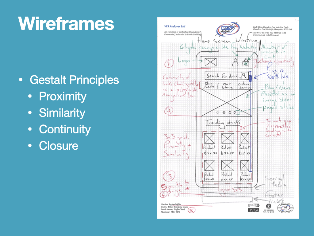
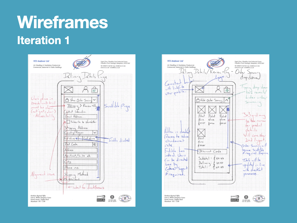
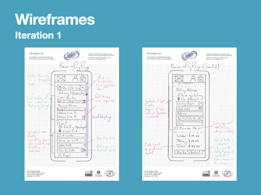
Wireframing
Satisfied with my early sketches, my attention turned to producing wireframes.
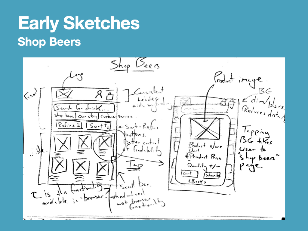
Wireframes are very similar to early sketches, however they are clearer and more refined, allowing for “focus on screen order, organisation, and function” (Hagen and Golombisky, 2017). Although not usually focused upon aesthetics, I decided that as my wireframes were scaled, I could experiment with applying the gestalt principles; this meant I could also consider how proximity and similarity could be used to group sections of the web page together. In the below example I have left too much gap between the ‘Trending Drinks’ header and the product listings below, causing the header text to appear lost. By reducing the white space / proximity between them, I could anchor the header to the content.
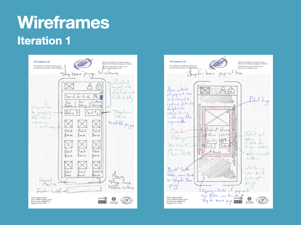
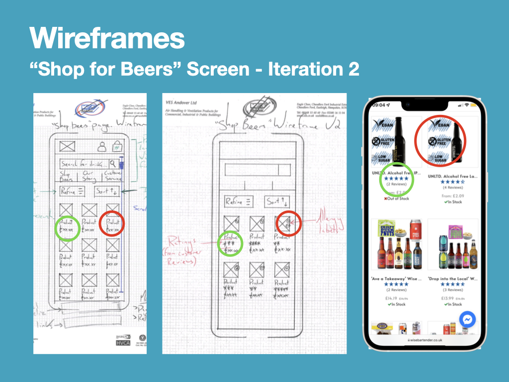
Wireframing – Second Iterations
A couple of changes were made in the second iteration of the wireframe. These were all on the ‘Shop for Beers’ screen. Based on my two personas/Ideal Customer Avatars, and some of the practices I observed in my competitive audit, I’ve now included customer product ratings and allergy labels. By including this information I’m satisfying John’s desire for seeing ratings from other craft-beer hobbyists, and building Jane’s confidence to purchase by displaying allergy-based information.
This information is also transferred onto the popout screen of the ‘Shop for Beers’ page.
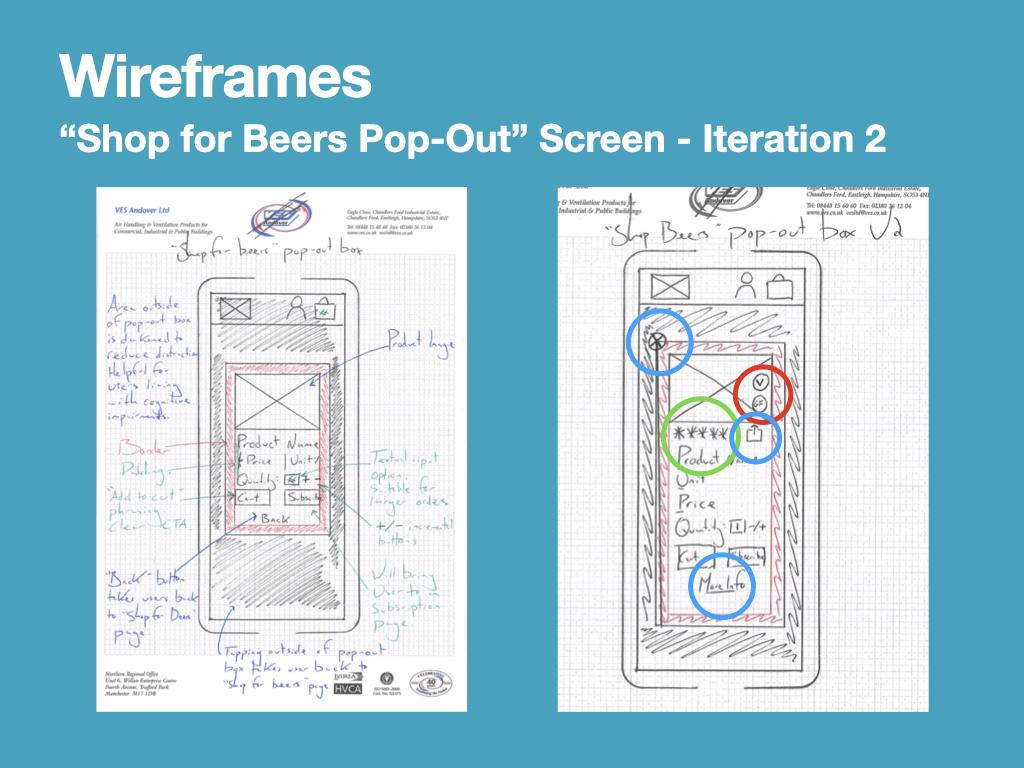
This page also benefited from some further user interface changes. Firstly I have placed across in the top left corner of the popout, making it clearer how to close the popout window. As a result I’ve been able to remove the ‘back’ option from the bottom of the window, replacing it with a ‘More Information’ link, which will take the user to a page where they can read more about the brand and product. This would satisfy John’s need to learn more about the product, while keeping Jane happy by not diluting key allergy information with less important details.
Finally, I’ve been able to add a share sheet icon next to the product rating. Depending on the mobile platform being used, for example iPhone or android phone, the platforms share sheet will appear enabling the user to share the product listing on social media. This is suitable for John’s persona, as he can share the product with friends as he intends on his empathy map.
I’m satisfied with the placement of these elements, so they should be carried across to the first paper prototypes.
References
Bradley, S. (2010). Designing for a Hierarchy of Needs. [online] Smashing Magazine. Available at: https://www.smashingmagazine.com/2010/04/designing-for-a-hierarchy-of-needs/ [Accessed 5 Jul. 2021].
Hagen, R. and Golombisky, K. (2017). White Space Is Not Your Enemy : a beginner’s Guide to Communicating Visually through graphic, Web & Multimedia Design. Boca Raton, FL: CRC Press, Taylor & Francis Group.
Lazar, J. (2001). User-centered Web Development. Boston: Jones and Bartlett Publishers.