In this blog I’ll be outlining my thought processes on creating my first user flow diagram. This particular diagram is focused on the task flow for a new user who is moving from the registration process to reviewing their performance in their first hazard perception test. I will also explain how I iterated upon this first attempt to include further functionality such as wayfinding mechanisms.
To produce the flow map I used the website “Flowmapp.com”. The website was easy to use as the controls were very intuitive. Standardised, universally recognised symbols were included, such as diamond shapes for decision-making and rounded rectangles for user input.
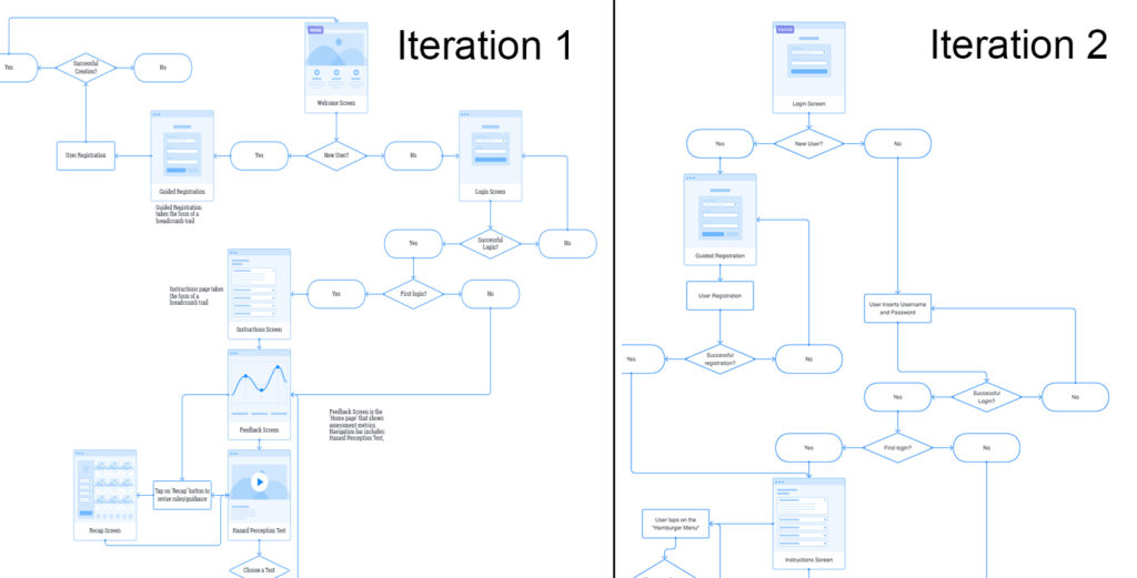
In my first iteration I included a welcome screen, which might feature elements such as the University logo and buttons to allow users to login or register a new account. Later in my second iteration I realised that the welcome screen would not be needed as it had a little functionality. It would make more sense for users to immediately visit the login page and then be prompted to register a new account if they did not yet have login credentials.
Once the registration process is complete, the user will be brought to the instructions screen. The screen will outline the basic flow for a user to complete a hazard perception test and review their results. Once viewed the user will proceed to the “Start a Test” screen, where they can select a test, complete it, and review their performance on the “Test Results” screen.
Prior to taking the test, I realised that some new users may wish to revise the TV studio rules. To integrate this I added a wayfinding mechanism to my second iteration of wireframes in the form of a Hamburger Menu. Hamburger Menus are universally recognised by three horizontal lines. Including a hamburger menu would also allow users to move between different pages fluidly and in a non-linear fashion. I hope that being able to move between screens so freely will minimise any pain points relating to navigation around the app.
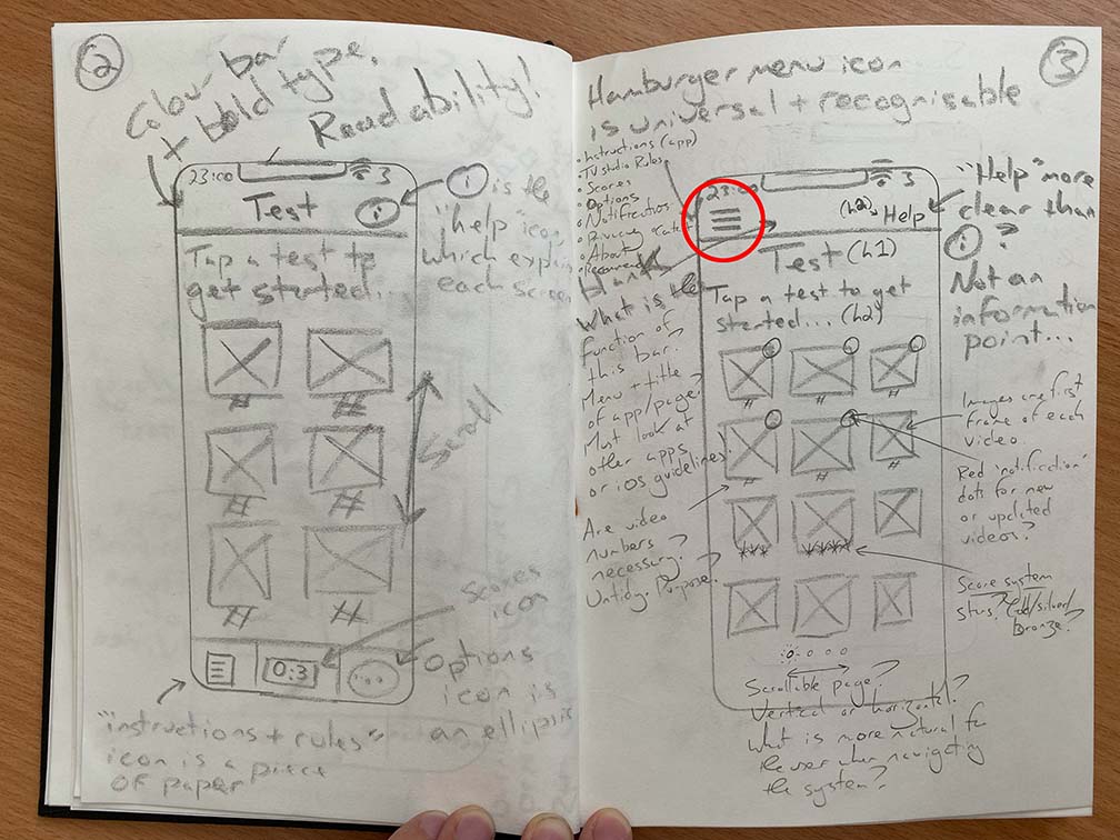
My next task is to use this information architecture to visualise each screen in the form of a wireframe. I am particular keen to explore how I can integrate the menu system alongside all of the other elements in the Content Inventory.