This week I’ve been working on some sketches for the “Hazard Perception TV Studio Training” app idea. Having carried out a research process already, my intention with these initial sketches was to stimulate my thought processes – “How many screens will the app need?”, “What functionality should this application have?”, “Which elements would need to be on each page?”, “How will the user interact with each element?”
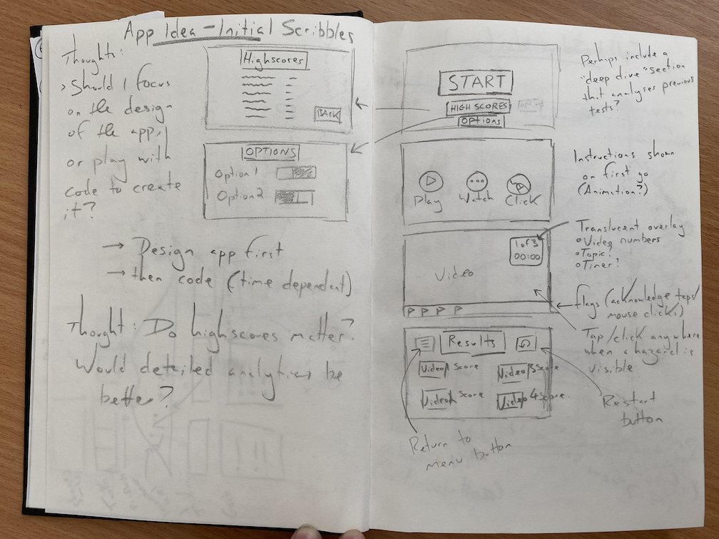
This first page of sketches brought about a lot of thoughts, which was overwhelming, and didn’t produce many comprehensible design solutions. I decided that I needed a more methodical workflow to make sense of all the variables first, so I began to plan the Information Architecture; this would include a “Structure of Experience” akin to a Site Structure Diagram, a Content Inventory, and a User-Flow Map. I did this by first producing a small mind map of the screens I would need, expanding on this to produce a Content Inventory, then using the website flowmapp.com to visualise a user’s flow between each screen.
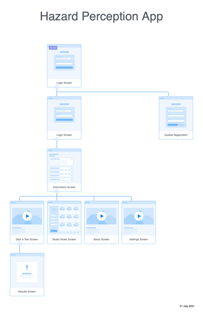
Creating the Structure of Experience allowed me to take my initial mind map of screens and visualise how they might link together. By producing a holistic view of how each screen would link, I could make sure that the Information Architecture of the app was logical and that there were no structural issues.
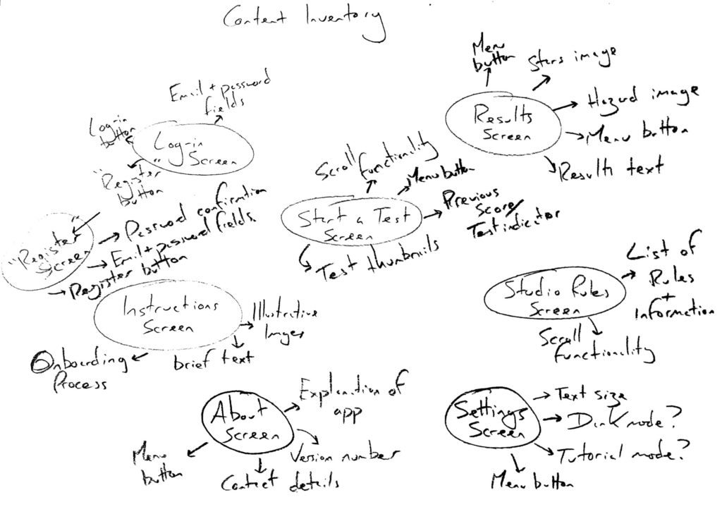
The Content Inventory was my first opportunity to think expansively about which app elements belonged on each screen. I was aware that this process could require me to adjust my Structure of Experience, as I may have omitted required screens – one good example of this is that I did not include a Settings screen, and realised this when I considered that a “Dark Mode” option could be desirable.
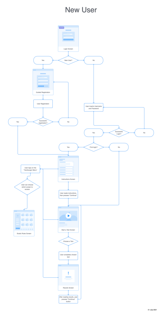
Production of the User Flow map was the most critical part of producing the information architecture. It required me to revisit both my content inventory and Structure of Experience, as considering how the user flowed between each screen revealed a lot of omitted elements. My first challenge was to realise that new users could not login as they did not have an account; I would need to factor in a “Registration” page and the required elements such as email and password fields. This process also reminded me that apps almost always have menus to allow the user to navigate between pages – this is a critical part that I had not yet considered; I have not included the menu functionality in this first iteration, but will include it soon.
I am sure that I will need to revisit each of the tasks again as the app progresses through initial design and iteration processes, however for now I feel much more prepared to produce sketches and wireframe diagrams.