Note: This set of wireframes were created shortly after my first iteration of the User Flow Diagram for the New User Task Flow.
To produce this first set of wireframes I relied heavily upon the product research I had recently carried out. I tried to bring across many of the common UI elements that I had seen in similar apps, and combined those with standards that I found on Apple’s Human Interface Design Guidelines, found here: https://developer.apple.com/design/human-interface-guidelines/
When necessary, pages would be vertically scrollable, and this would not be deviated upon as that could be confusing for the user. In the interest of maintaining consistency a coloured menubar would feature at the top of each page, including a page title and an information/help button.
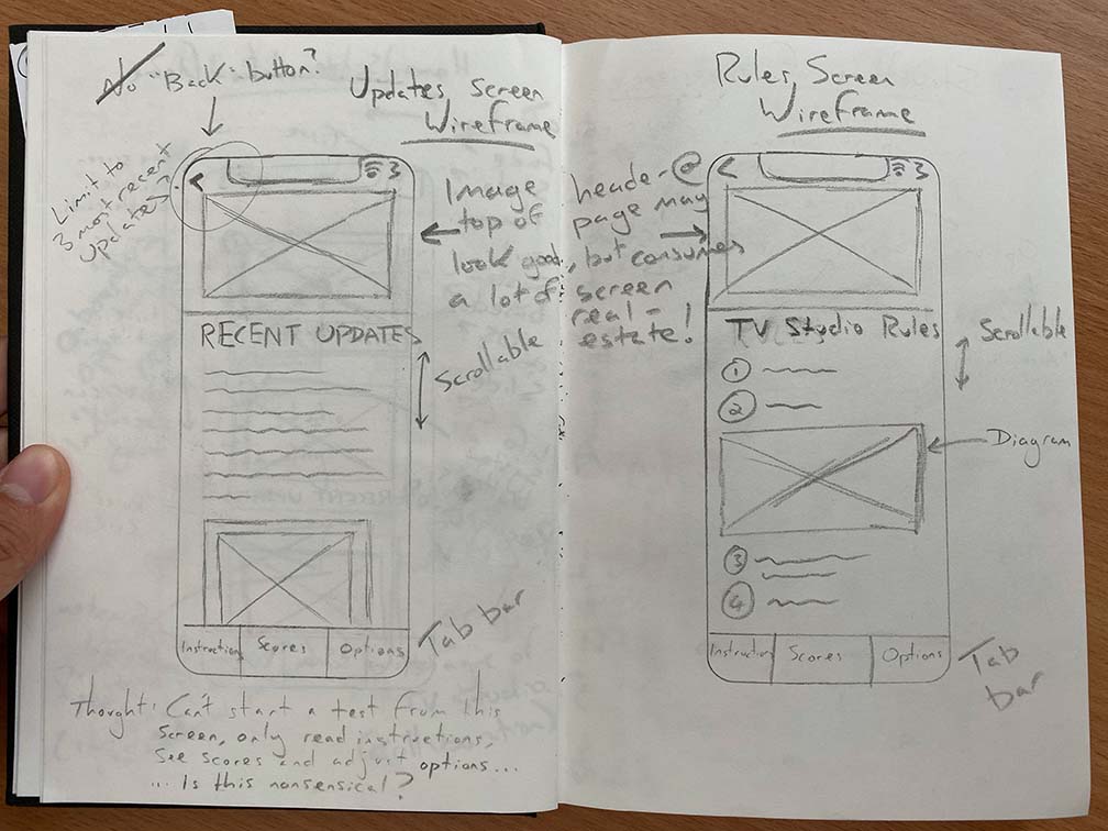
To aid navigation I have experimented with including a tab bar at the bottom of each screen as well as a back button in the top left. Both of these appear to be common features of many popular apps on the iPhone so would be recognisable and users should instantly know how to interact with them. However, I must consider that a tab bar only has enough space for a few buttons, and if using glyphs I must make sure that they are symbolic and recognisable of the screen that they will link to-otherwise this will cause noise that will confuse the user. Apple do supply a set of glyphs as part of the system APIs, which I could take advantage of. It may make more sense to include a hamburger instead of tab bar, as this can hold more links to other pages within the app.
In their Human Interface Design Guidelines, Apple address the limitation on tab numbers: “If some tabs can’t be displayed due to limited horizontal space, the final visible tab becomes a More tab”, which is a viable solution, and could serve as a hamburger menu of sorts.
As a final word on tab bars, I think I will need to put more research into this element, as navigation is going to be a key point of disseminating information across the app.
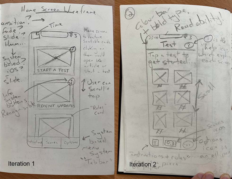
Users will be able to start a new test by tapping on a test thumbnail – each test thumbnail will feature an image which is the first frame of the video, alongside the test number and a star rating based upon the user’s previous performance (if they have already attempted that test). This idea is adopted directly from one of the apps that I have researched, and is notably used on other apps such as Duolingo, so I hope that it’s meaning will be instantly recognisable.
I will produce further wireframes over the next week as I review the information architecture and wayfinding mechanisms. I’m also very sure that the user testing process throughout low and high Fidelity prototypes will also see me iterate these wireframes further.