Having tested the navigational elements and the app functions in a usability on my paper prototype, I felt ready to begin the medium-fidelity prototyping phase. In real life I would have spent more time re-testing the paper prototype, however because this is a university module I don’t have that time.
To begin I recreated each page from my paper prototype on Apple’s Keynote software. This software was perfect for my requirements, as it allowed me to make use of Apple’s Human Interface Design Guidelines, complete with user interface elements that I could borrow. It would also be able to function on my phone for usability testing.
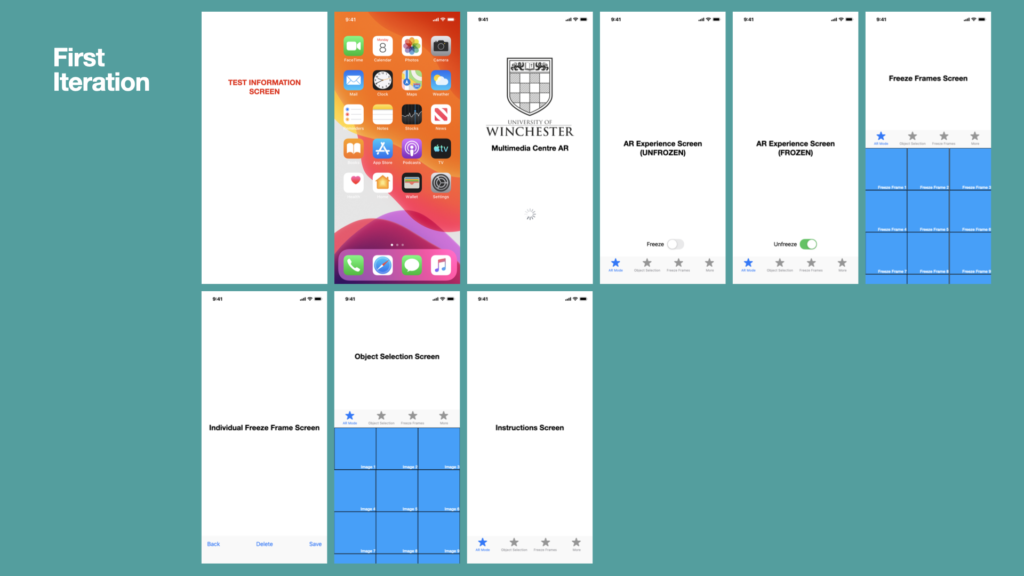
The development process took much longer to build, compared to the paper prototype. I included fixes to issues identified by my previous usability tester (e.g.: change the ‘save’ terminology to ‘export’). I also included the University’s branding, such as colour palette, graphics, and typeface. This would enable the app to benefit from synergy – I.e.: the University’s good reputation would cause the app to feel like a trustable learning resource.
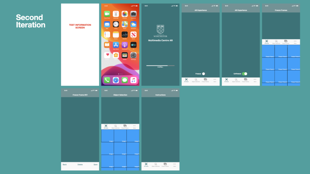
I also developed the prototype so that it adhered to common practices of app design, such as the inclusion of a loading screen, tab bars, and a navigation bar. I employed a cyclical, iterative, method to producing the prototype, allowing myself time for reflection between each version.
In the final version of the medium fidelity prototype it was imperative that including hyperlinks between each screen and the tab bar elements. This allowed me to carry out a usability test with my own iPhone and the Keynote software built into.
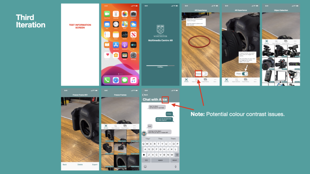
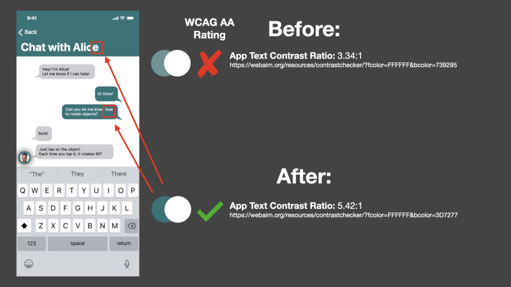
Colour Contrast
The third iteration of the medium fidelity prototype highlighted some potential colour contrast issues. I researched each colour foreground and background colour combination and assessed them against the web content accessibility guidelines for WCAG AA compliance, which is an “acceptable level of accessibility for many online services” (Digital Accessibility Centre, 2017):
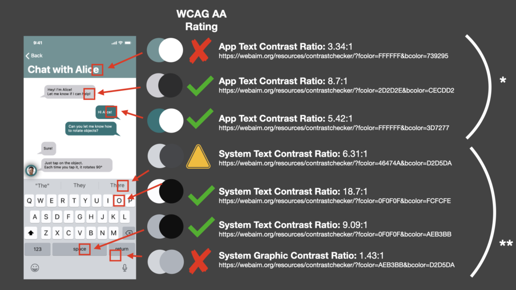
* The first colour combination on the above slide fails due to the combination of low-colour contrast ratio and small text size (on a small phone screen). To rectify this, I decided to replace the University’s green tint colour with the main tint colour instead (as below)
** System-based colour contrast issues can resolved in the operating system’s menus. I have no control over these, so must overlook them for now and focus on my app experience.
References
Digital Accessibility Centre (2017). The icing on the cake: The difference between AA and AAA compliance – Digital Accessibility Centre (DAC). [online] www.digitalaccessibilitycentre.org. Available at: https://www.digitalaccessibilitycentre.org/index.php/blog/20-diary/187-the-icing-on-the-cake-the-difference-between-aa-and-aaa-compliance [Accessed 28 Nov. 2021].